Individual Assignment 2: Heuristic Evaluation of Origami Resource Center

Arts and Crafts Group — Amy Feinstein

Origami Resource Center Website

When I am not busy making friendship bracelets, I also love doing origami. When I’m folding at home, I like to work on advanced models from my print book collection, but sometimes I find myself searching for an easier model that I can teach to a group of people. There are many instructional origami sites; for this assignment I am focusing on Origami Resource Center.

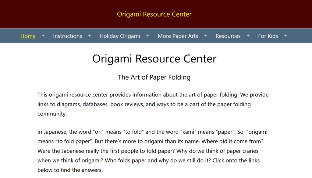
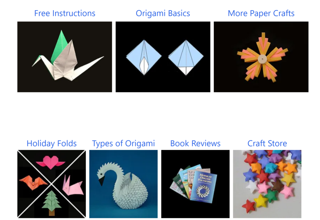
On its home page, Origami Resource Center describes itself as follows:  “This origami resource center provides information about the art of paper folding. We provide links to diagrams, databases, book reviews, and ways to be a part of the paper folding community.” The title of the page is in small print at the top, with several categories of drop-down menus underneath: Home, Instructions, Holiday Origami, More Paper Arts, Resources, and For Kids. Scrolling down past the introductory text, there are 15 hyperlinked pictures which partially correspond to the menus at the top, but are not exactly the same.

Top of the Home Page of Origami Resource Center — this is everything that is visible before scrolling.
7 of the 15 main categories linked in photos on the home page. They do not always line up with the menus at the top of the page.

Evaluation Scenario

For my scenario, I have decided to look for an easy-to-fold bird model on Origami Resource Center. I am not picky about the type of bird, but I would prefer it to be recognizable as a species or family of bird rather than a generic bird-shaped object.

Working Through the Scenario

I start on the home page, where the first thing I notice is that the “Home” menu is underlined and highlighted in yellow, and that all the drop-down menus have plus signs interspersed between them. Mousing over these menus expands them and turns the plus sign into a minus sign. I’m not sure exactly what the point of the yellow highlighting is (I’m guessing it’s to let you know what main section you are currently in) or why the plus sign is so far away from its related word. This violates the Consistency and Standards heuristic, as the drop-down menus look and act unconventionally. It also violates the Aesthetic and Minimalist Design heuristic – although the top of the page doesn’t have a lot of extraneous information, once you scroll down (and you do have to scroll to see anything besides the introductory text), the 15 categories to choose from seem excessive. Some of them could be grouped together under the same categories you have at the top – for example, the Resource menu at the top contains links to both Health Benefits and Educational Benefits pages, but those two pages each have their own link in the 15-category spread, while Resources does not. This violates the site’s own internal consistency as well as the consistency you expect from visiting other websites.

Finding the Models

Once I get past the oddly organized home page, there are several ways to start looking for specific models. I can click on the Instructions menu at the top and then click on Birds, I can mouse over the Instruction menu and click on the Birds drop-down, I can click on the Instructions photo in the middle of the page, or I can scroll all the way down past the 15 boxes and click on the Birds photo in the category links. This last option seems excessive and violates the Aesthetic and Minimalist Design Heuristic – there are just too many pictures on the page, especially when you consider that not until you scroll past even this last set of categories do you get to the search box. Having the search box so far down also violates the Consistency and Standards heuristic, since most sites have the search box in a top corner where it easy to access.

In the interest of testing more of the site navigation, I go to the main Instructions page before I go to the Birds page. Now, the Instructions menu at the top is yellow and underlined, as the Home menu was before, which seems to confirm my hypothesis about using the highlighting as a signpost – except that now the More Paper Arts menu is highlighted in the same way. This causes confusion and violates the Visibility of System Status heuristic – is the More Paper Arts menu connected to the Instructions menu in some way? When I click on it, it jumps me close to the bottom of the page under the headline Origami Fringe, which has links to only six of the seven categories found under the More Paper Arts menu up top.

After getting distracted by the extra yellow highlighting and following that path (a path I probably would not have taken were it not for the lack of Aesthetic and Minimalist Design), I finally make it to Origami Birds. After a brief text introduction, there are ten hyperlinks to different categories of birds (the first one being the extremely non-specific “birds”), each of which will jump you to the categories on the same page. Alternatively, you can scroll all the way down the page to see the categories as will as the list of the individual models.

Narrowing Down My Options

Since I don’t know exactly what kind of bird I want to make, I decide to scroll down and see what catches my eye. There are photos of completed models on either side of the list of birds, but they appear to be a random selection of models within the category. They seem to be a random selection of photos within the category, and they are not hyperlinked to anything, so there is no way to accurately preview a model. (After writing the rest of this blog and going back to take screen shots, I realized that you can mouse over the photo to see what model it is. They are still not hyperlinked, though.) This violates Visibility of System Status, since you do not have a visual cue of where to go next, as well as Match between System and the Real World, since the pictures do not line up with the appropriate models.

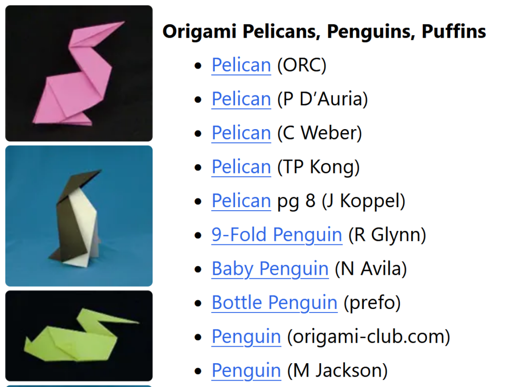
For no particular reason, I decide to explore the Origami Pelicans, Penguins, and Puffins category. There are 6 photos and 24 models to choose from, so I click on the first model (a pelican). It takes me to a page that corresponds to the third picture on the previous page (violation of Match between System and the Real World – the first link should not match up with the third picture).

Some of the photos and models from the Pelicans, Penguins, and Puffins section. The photos on the left do not directly correspond to the links on the right, nor are they hyperlinked to the appropriate instructions.

Evaluating the Instructions/Diagram Page

The description says the pelican is easy and less than 10 steps. It also more or less resembles an abstract pelican, which makes it matches my initial requirements. The text instructions are listed on the left side of the page, and the diagrams are in one image on the right. While it’s possible to follow this, it’s much easier when the instructions are visually linked with their matching diagrams (another problem with Match between System and the Real World). Despite it being an easy model, there are a few technical origami terms that aren’t explained, such as “valley fold” and “reverse fold.” You can find these under the Resources Menu –> Origami Basics at the top of the page, but there should be a more obvious link for it at the top of the instructions (one more issue with Match between System and the Real World, with the possible addition of Recognition Rather than Recall, since users will have to either memorize the meaning of the steps or go back and forth between two pages).

While in this case I have decided the pelican model is a reasonable one to teach to beginners, if I want to go back and explore the other models available, I have a couple more options at the bottom of the page. There is a link to “more origami pelican and birds” (which takes to you back to the top of the birds page, not the pelican/penguin/puffin section — also, every other link has been in title case and this one is all lower case) and then a photo gallery of “More Origami Birds.” This is perhaps the most egregious violation of Match between System and the Real World, and also of Visibility of System Status – when you mouse over one of the photos, it tells you exactly what model and artist it is, but when you click on any one of them, it takes you back to the general bird page again! Once you get there, you have to figure out what subcategory the model you liked was in and remember the name (Recognition Rather than Recall).

Design Recommendations

There are several design fixes that would make navigating Origami Resource Center less frustrating:

  1. On the home page, the drop-down menus at the top should match the photo icons halfway down the page. This would keep the user from feeling like they’re missing important parts of the site because the main categories and the subcategories don’t match (Visibility of System Status, Match between System and the Real World.
  2. Move the search box to the top of the page so it is easily noticeable and accessible (Consistency and Standards).
  3. Line up the photos of the completed models with their matching instructions and link said photos to those instructions (Visibility of System Status, Match between System and the Real World).
  4. Have an easy link to Origami Basics at the top of each instruction page so beginners can follow the diagrams (Recognition Rather than Recall).
  5. For the photo gallery for the related models at the bottom of the instruction page, link those photos directly to the pictured models rather than to the general category page (Visibility of System Status, Match between System and the Real World).

Matthew Post

Individual Assignment #2: : HEURISTIC EVALUATION

Website Selection

South Georgia Medical Center – https://www.sgmc.org/

I have selected the South Georgia Medical Center (SGMC) website for the assignment 2 heuristic evaluation. This website represents a small but surprisingly comprehensive medical center and hospital located in Valdosta, Georgia. The website serves as it’s public-facing virtual destination for those seeking information relating to its services in patient care, employment opportunities, patient portal access, its medical residency program, public health and hospital census data, and community events.

Retrieved from: https://www.sgmc.org/

Scenario Description

The scenario that I chose to center my heuristic evaluation on is that of an individual who is attempting to discover more information about South Georgia Medical Center’s palliative care program and what services the program provides. Palliative care is defined by the U.S. National Institute on Aging as “specialized medical care for people living with a serious illness…meant to enhance a person’s current care by focusing on quality of life for them and their family,” (NIA, 2021). Palliative care is different than hospice care, as hospice care does not contain curative treatment as part of its care planning and is designed for patients that will be terminal in the short term, typically within six months (NIA, 2021). I approached the SGMC site evaluation somewhat unconventionally based on the framework described by in Nielsen, as I was a single individual conducting the evaluation acting as both the evaluator and the observer with no additional participating evaluators to aggregate findings with (Nielsen, 1995). In the scope of these roles, I am evaluating my use of this website as a first-time user for this specific scenario without the possibility of guardrails or hints provided by an observer by requesting guidance – I am on my own as an evaluator.

Usability Flaws

The first usability flaw discovered is that the landing page is not branded with the full name of the organization, South Georgia Medical Center, and instead only displays the organizational acronym, SGMC. This lack of brand awareness connecting the more generally recognizable full name with the acronym violates the usability heuristic #2 match between system and the real world, as the website’s current state assumes that the user is familiar with identifying this organization by its acronym, which they may not. Due to this lack of identification, it is possible that an individual in the evaluation scenario could be confused about whether they have even arrived at the correct website after searching for a “South Georgia hospital” and being presented with two very similarly named organizations “Southeast Georgia Health System (SGHS.org)” and “South Georgia Medical Center (SGMC.org)”, two different health systems that are over 120 miles away from one another. When an individual visits the physical location of a South Georgia Medical Center campus or building, the full name is displayed outside (https://www.sgmc.org/about-south-georgia-medical-center/our-mission-vision-and-values/), and similarly, when an individual calls the main telephone line for SGMC, it identifies itself through its full name not an acronym. The website failing to follow real-world conventions by clearly identifying itself on its landing page violates usability heuristic #2 match between system and the real world.  

The second usability flaw that was encountered during the evaluation was in the medical service listing page while attempting to locate information on palliative care. The list of services contains “palliative care” in two different locations and the information that each links to is different, with no mechanism on the service list page or the following linked pages to explain the difference and route to the other. This flaw represents a violation of usability heuristic #4 consistency and standards and #7 flexibility and efficiency of use. The first link displays “Hospice/Palliative Care” and links to an external website for an organization called “Hospice of South Georgia” with no explanation of its affiliation to SGMC. The second “Palliative Care” listing in the services links to a SGMC page that very briefly describes the program, defines the difference between hospice and palliative care, and requests personal contact information to receive more detail about the program. The service list having two listings for palliative care violates usability heuristic #4 consistency and standards because it requires the user to click on both links to ascertain what the difference between the two are and even then, it is not readily apparent. This violation causes unnecessary confusion for the user and negatively impacts the user experience in a context that is likely serious and emotional. Furthermore, this design also does not allow the user to be routed from the palliative care page to the hospice care site, despite the effort made to make the user understand the difference. By not providing a link from the palliative care page to the hospice care site and vice versa, the design violates usability heuristic # 7 flexibility and efficiency as it requires the user to navigate between both links from the service list inefficiently despite acknowledging a confusing semantic difference.

Retrieved from: https://www.sgmc.org/our-services/  

Recommendations

The first design recommendation that I propose is to include a prominent display of “South Georgia Medical Center” on its landing page front and center. Additionally, I recommend including the full name under the website home icon located on the top left of the website throughout. Through the inclusion of these recommendation design optimizations, users can enjoy a higher level of brand awareness and thus less confusion regarding the website they are viewing while seeking information from this specific healthcare system.

The second proposed design recommendation is to remove the “Palliative Care” from the “Hospice/Palliative Care” link on the service list; the inclusion of it creates unnecessary confusion in the user experience. I also recommend creating a section on the remaining “Palliative Care” linked page that describes this available service through the affiliation with Hospice of South Georgia with a link to that website’s palliative care page in addition to the palliative care service option that SGMC provides independently. Additionally, on the SGMC palliative care page I recommend including a link to Hospice of South Georgia’s website in the section defining the difference between palliative care and hospice for navigational convenience.  

Retrieved from: https://www.sgmc.org/our-services/palliative-care/

References:

Nielsen, J. (1995). How to Conduct a Heuristic Evaluation. http://www.nngroup.com/articles/how-to-conduct-a-heuristic-evaluation/

U.S. Department of Health and Human Services, National Institutes of Health, National Institute on Aging. (2021). What are palliative and hospice care? Retrieved September 23, 2021, from https://www.nia.nih.gov/health/what-are-palliative-care-and-hospice-care#palliative

Individual Assignment 2

Target Website

https://www.gmha.org/

Guam Memorial Hospital Authority (GMHA) is the largest medical facility that serves the general population of Guam and the surrounding Micronesian islands.

Scenario – Acquire contact information about a GMHA Facility

In this analysis of the GMHA’s website usability, the most likely scenario involves a stakeholder (in this case, the user) searching for contact information about services offered at a GMHA facility. Such services can include radiological, urgent care, laboratory, physical therapy, and so forth. This scenario also considers how a user might approach navigating GMHA to reach their intended information through the various healthcare providers regarding said services.

Heuristic violations based on the scenario

In consideration of the suggested scenario, utilizing Jakob Nielson’s 10 usability heuristics is most applicable in testing GMHA’s website usability. The scenario aids in this heuristic evaluation by detailing the steps that a user would likely perform based on their information needs. For instance, a user’s health concerns would prompt them to seek out medical services from the largest healthcare facility in Guam. The first step a user would take is to browse GMHA’s website seeking relevant contact information regarding their health concerns with a specific medical facility at GMHA. On the homepage, they would seek any icons, links, or directories hinting at where they could locate such information. This approach should provide them with the relevant information from GMHA that would allow them to contact the appropriate healthcare facility. However, these steps are difficult to accomplish based on the identified usability flaws. Following is a brief overview of those usability flaws with their associated heuristic violation based on the said scenario:

#LocationUsability Flaw ExplanationHeuristic Violated
1HomepageA cluttered homepage disorients the user. Phone directory poorly placed#8: Aesthetic and minimalist design
2Areas of CareAll links lead to the same location confusing the user#1: Visibility of system status
3Areas of CareComplicated menu design hinders the user#8: Aesthetic and minimalist design
4Areas of CareNo contact information for any medical facility shows little concern for the user#2: Match between system and the real world
5Find a ProviderNo clear feedback that a provider could not be found. No user recovery#1: Visibility of system status
#9: Help users recognize, diagnose, and recover from errors

1. Homepage: Cluttered information

Based on the selected scenario, a user would be most interested in locating contact information for a GMHA medical facility. However, this information is difficult to find on the homepage. GMHA hosts a multitude of information on its homepage that can quickly disorient the representative user. Namely, there are too many links and action commands that populate the user’s screen making it needlessly difficult to locate relevant information to continue. What’s more, if the user scrolls down the page they could find the contact information but it’s too easy to skip over the link since it’s objectively dull. In its current state, GMHA’s homepage provides low information utility thereby reducing its website usability and information scent. These usability flaws directly violate Nielsen’s eighth heuristic for aesthetic and minimalist design.

2. Areas of Care: Burdensome Drop-Down Menu

Following the next logical step in the scenario, the user scans the homepage looking for whatever link most likely directs them to a specific medical department. They click on ‘Areas of Care’ and a drop-down menu displays links to various GMHA healthcare facilities. This menu makes it difficult for the user to locate the appropriate GMHA healthcare facility. The most obvious way is to click on the right-facing angle bracket to scroll for additional medical areas. However, if the user needed to locate the ‘Radiology’ department, it would take much longer because of clicking multiple times with the current alphabetized menu design.

This usability flaw directly violates Nielson’s eighth heuristic on aesthetics and minimalist design. The menu forces the user to navigate through irrelevant information until they can find what they wanted initially. Namely, the interface has too many unnecessary elements that hinder users from quickly finding relevant information thereby increasing its ‘noise’.

3. Areas of Care: Poor System Status Visibility

Continuing the scenario, the user will have selected the desired healthcare department and be directed to another webpage. The user expects to find information about that specific department. However, the webpage does not direct the user to the right department. Rather, the user is directed to all the GMHA medical departments along with brief descriptions and pictures of each. Given this unfortunate usability flaw, the user that painstakingly clicked through multiple departments to select ‘Radiology’ could have clicked on ‘Care Units & CIF’ and been directed to the same webpage. Added to that frustration, the user would at this point realize that they didn’t need to select the right department because it was all located on the same webpage, to begin with. This feature was only intended to search for the desired facility on this webpage to make it ‘easier’ for the user to locate it sooner. However, pictures in the drop-down menu behave inconsistently which may or may not indicate system failure. For instance, while clicking ‘Pediatrics’, the system will function as intended. Yet, other links like ‘Radiology’ will break the system which resorts back to the ‘Areas of Care’ page confusing the user as to what happened. Therefore, this usability flaw violates Nielsen’s heuristics of system visibility since it erodes the user’s trust because of little feedback as to what the system is doing.

4. Areas of Care: Medical Facilities Lack Expected Information

This last step in the scenario is the largest disappointment to the user. Locating their desired GMHA medical facility yields little information about it. A user in this scenario would expect at least the department’s contact information but to no avail. This usability flaw is a blatant disregard for user empathy in showing that GMHA cares about its stakeholders by simply providing highly relevant contact information under a webpage that explicitly states, ‘Area of Care’. While this information could be found on GMHA’s homepage, it’s obscurely placed amongst a plethora of similar-looking links making it unnecessarily difficult to locate this information.

As a result, this lack of contact information directly violates Nielsen’s heuristic of matching between the system and the real world. By not providing contact information, such as phone numbers, emails, or GMHA building locations, for this specific webpage, there exists a mismatch in expectations between GMHA’s website and its stakeholders. Such information should appear virtually on GMHA’s website as it does on contact cards, brochures, and other reading material in the real world.

5. Find a Provider: Results show blank white space

While this scenario differs slightly in its steps, the objective remains the same for the user. That is, they need to acquire contact information through a GMHA provider instead of a medical facility. Taking these steps, the user would click on ‘Find a Provider’ from the homepage. Another drop-down menu will display prompting the user to search for their provider through various means. The usability flaw arises when the user types in the last name, ‘Flores’ into the search box and selects ‘Search’. They are directed to a screen with GMHA header information and blank white space underneath ‘Find a Provider’. There is no indication or message that the system could not find a provider based on ‘Flores’.

This usability flaw directly violates Nielsen’s heuristic for users recognizing, diagnosing, and recovering from input errors. That is, the system should use plain language to notify the user of not being able to find a medical provider with that last name. Additionally, the system did not provide any solutions (or any indication) for recovering from said search criteria. Added to these usability flaws, the system’s lack of communication (feedback) to the user erodes their confidence in it. This demonstrates another heuristic violated–poor system visibility for the user.

Recommended Design Improvements

1. Re-work homepage design layout to better reflect the ‘essentials’

Reducing action commands on the homepage such as “GMHA in the News” and “Watch the Video” will improve readability by reducing ‘noise’. This will also keep users focused on locating essential information from the homepage. Additionally, the GMHA facilities phone directory must be clearly identified without requiring users to scroll down the page. Providing this directory in an easily identifiable way on the homepage greatly improves its aesthetics without frustrating users’ experience.

2. Minimalize the drop-down menu interface

The current menu layout does not present all the “essentials” that users need to make informed decisions. Therefore, it must be minimalized. Namely, removing all pictures, which can be considered ‘noise’. Additionally, presenting all GMHA medical facility directories immediately on the same menu with clear visibility (not at all like the homepage footer link arrangement). There will be an aesthetic element added to draw user’s attention to the medical facility directories. By implementing these two solutions, users will have better information scent that will keep the content and visual design of the menu layout simple.

3. Re-work programming logic to function as intended

The Area of Care webpage displays a long list of every GMHA medical facility. This webpage already has programming logic that will locate the appropriate facility based on the user’s selection from the drop-down menu. However, most selected facilities do not direct the user to their respective information on the webpage. If the user selects, “Pediatrics”, then the system will function as intended. Re-working the programming logic to function as it does for “Pediatrics” will tremendously improve webpage usability as it will improve system communication and user trust. Currently, the system simply resorts back to the top of the webpage (or anywhere else depending on the selected facility) with no clear feedback as to what happened, which leaves users confused and frustrated.

4. Provide contact information

Following real-world etiquette, providing contact information on the webpage matches GMHA’s interface with it. That is, users will know that GMHA is empathetic to their needs by displaying each medical facility’s contact information. Such information includes phone numbers, email addresses, and building locations. This approach solidifies expectations in the system with the user thereby improving website usability.

5. Provide system feedback and allow the user to recover from their search results.

Use plain language that clearly indicates the provider was not found based on the user’s search criteria. Additionally, the system must provide a link directing them back to the prior webpage. Providing immediate feedback for search tasks allows users to quickly assess their search results to make better decisions thereby improving system visibility. If the system could not find a provider, displaying a link that directs the user back to their search helps them recover from errors sooner in acquiring the right medical provider.

WORD COUNT: 1784

Individual Assignment 2 – Colin Webb

Website

The Boston Public Library, established in 1848, was the first large free municipal library in the United States. It was also the first library system to establish branches to serve their community. As of today, it has 26 branches throughout the city of Boston. After 175 years of serving the public, this public library system has seen many revisions throughout its years.

The Boston Public Library’s homepage (Boston Public Library (bpl.org)) seems clear and concise. At the top of the page, there are drop downs to guide me to different areas of the library. However, looking below those banners, there are two sections labeled, “Featured” and “Featured Events”. When chosen, each featured item took me to a dedicated webpage pertaining to that feature. I noticed that the targeted webpages did not always have the same titles as they did on the homepage’s “Featured” posting. This is a violation of the heuristic of consistency and standards because it could confuse users into thinking they are looking at the incorrect information. Confusion could be avoided if the titles of the features matched exactly the title of the webpage titles.

Evaluation

The focus of this evaluation is searching for available English-speaking classes in the Boston Public Library system. My approach for this evaluation was to see if there was a straight-forward way to obtain where in the Boston area I could take English-speaking classes. I started by moving through the dropdown menus on the homepage and noticed “classes” was located under the services dropdown. However, when I clicked on it, I was taken to the “Events” main page. Although classes can be considered events, it is not clear because classes were listed under the “Services” dropdown instead of the “Events” dropdown. This violates the heuristic of flexibility and efficiency of use because inexperienced users would be confused by accessing classes from two different paths. Under the “Services” dropdown, finding classes is a direct link, while under the “Events” main page, I had to additionally choose the “Workshops & Classes” filter. Even more confusing is under the “Events” dropdown, there is no mention of classes or workshop.

Once filtered down to just workshops and classes, there is no additional search for a specific class that someone may want. There were 287 items under workshops and classes which resulted in 15 pages to search through. I then took a different approach and used the main search bar which is present on every page. I chose events in the dropdown and when I typed in “English speaking classes” the results revealed ESOL classes, which stands for English for Speakers of Other Languages. Despite the abbreviation being described below the description of each event, the audience may not know what it means at first. This also violates consistency and standards because it is showing the abbreviations that users may not know until they open the page. It would be more informative if the abbreviation and its meaning were placed closer to each other.

All ESOL classes were listed in the results in chronological order. Some of the classes gave information on whether registration was full or required, while other classes did not have any information on how to register for them. This a violation of the help and documentation heuristic. Clicking on a class that did not have any information on registration will not tell the user how they can attend the class or any other information other than the date and the time. Every class available show information on how to participate. If registration for a class would be available at a future date, it should at minimum inform the user “Registration coming soon”.

Filters, located on the left side of the events page, can be used to further narrow the particular location and audience (by age). It would be more advantageous if there was a filter for the knowledge level of those wanting to learn English. For example: beginner, intermediate, conversational, etc. This would make the website comply more with the heuristic of flexibility and efficiency of use.

I additionally put “ESOL” in the event search tool and it resulted in the same list of classes. But there was a new “Computer/Technology Classes” event type filter to choose from. These classes were for non-English speakers and focused on strengthening their technology skills, which is unrelated to learning English. This violates the consistency and standards heuristic because English speaking classes specifically use the acronym ESOL, but the search results are different. ESOL is a broader search encompassing more than just English-speaking classes.

Analysis

One main flaw that I realized when searching for English-speaking classes is that the results are given in the English language. A suggestion would be to allow users of the website to choose an alternate language, especially since they may not read or understand much English. Another suggestion would be to create a separate section for classes only and not group them in with events. This would be a direct way for any user to find what courses are offered.

The Boston Public Library has proven itself a memorable and useful library, but its website still suffers from some of the issues that other libraries have with their own websites. It appears to be more focused towards patrons who have used their libraries before instead of new members. It needs to find a correct balance between assisting new users and old users.

Individual Assignment 2

Christopher Gregor – Libraries Group – LIS 5275

Website Chosen

For Assignment 2 I selected my local library, the St. Johns County Public Library System located at https://sjcpls.org/. This library has been an active part of St. Johns County and was first established in the county library system on September 27, 1977. However, the first library of St. Johns County was established in St. Augustine in 1874. Residents and especially students across the county have relied on these libraries to complete schoolwork, research, and access to community resources.

The website itself is the central site for all of the St. Johns County libraries and offers services ranging from virtual events, a calendar of upcoming news and events for the libraries, recommendations, and the books-by-mail service. Amongst the many services offered by modern libraries, the St. Johns County Public Library System website offers a long-distance platform to use many of its services, especially post-COVID lockdown.

https://sjcpls.org/ main page

Scenario

The user is asked to imagine they have research they need to do and are stuck at home during the lockdown, using the St. Johns County Public Library System website to find and use the Book-by-Mail service to search for and “borrow” a book on the United States Revolutionary War. Since the final part of this scenario requires an actual account and processed application the user would only be required to reach the screen prompting them to request the book and not to actually order it.

              I approached the scenario viewing of this site searching for usability heuristic flaws on the website. With the scenario described my user began interacting with the drop-down menus to search for Book-by-Mail to find the requested book. They began by interacting with the eLibrary drop-down menu and selecting FL Electronic Library. This redirected them to another site, Fl Electronic Library https://www.flelibrary.com/ immediately which did not contain any information Book by Mail as it was a completely different site. After going back to the main site via the back arrow my user then tried to access the Branches tab to search for Book by Mail through one of the local library branches, they were directed to helpful information about events at the branch, its location, and contact information but no mention of Books by Mail. Finally, they proceeded to the Explore tab where they found the link for Books by Mail.

              My user read over the process of Books by Mail and at this point, I instructed them to click on the link for the application to assume they were completing it; this link once again took them off the main site and to a pdf with no redirects to the main site. After using the back arrow to return I instructed them to assume they had completed the application and to access the link to the online catalog which they were able to find on the Books by Mail page and the Explore tab. Once on the catalog, they were able to easily search for the “United States Revolutionary War” and find several books requestable with the Books by Mail service, successfully completing the task.

Usability Flaws Found

              The first flaw I saw while my user was completing the scenario was when they accessed the FL Electronic Library link on the St. Johns County Public Library System. The link immediately sent my user to a separate website for the FL Electronic Library with no link on the site back to the home page of the St. Johns County Public Library System, requiring them to hit the back button several times (or type in the URL again to return to the start of the scenario). This lack of link back to the main website is a violation of the Usability Heuristic number three, User Control and Freedom. With no “Emergency Exit” on the second site or link back to the home site, this design failure leaves the user inconvenienced and essentially disconnected from the main site. In addition, this link to the FL Electronic Library website gave no warning or indication that this was a link to another website. This violates Usability Heuristic number six, without having been to the FL Electronic Library site before my user would have no reason to know it existed and had no signs of warning that this link would lead them off the main page.

              The second flaw involves the same failures as the first, when my user accessed the Book by Mail application the site informed the user that they would need to complete the application and submit it to the library virtually. However, once my user clicked on the link for the application it once again left the St. Johns County Public Library System main site and went to an online PDF. Not a downloadable but a whole separate page with no link to return back except for the back arrow.

Design Recommendations

              Following what my user completed and got stuck on in my scenario I would propose two design changes to improve the St. Johns County Public Library System, firstly when accessing the FL Electronic Library link on the website the user should be able to see a prompt on the new website to return to where they were. Since the websites were built for similar utilities of accessing library resources virtually it should be possible for each site to link to the other. On the main site though there should be a prompt or warning for the unfamiliar user to be aware they are leaving the St. Johns County Public Library System website, which may help them to know when they are going in the wrong direction for what they want to do a little earlier. The second recommendation I would give is to make the Book by Mail pdf link a downloadable document and not a separate page. It is more convenient for the user to download it anyway to fill out the form or open it in another tab than to effectively go to a separate site to view and then download the pdf. This is especially true since the pdf contains no instructions on submitting the application which was on the page before.

Heuristic Evaluation | Art Museums

“America’s First Modern Art Collection” https://www.phillipscollection.org/

The gallery was originally the home of Duncan Phillips, art collector and philanthropist. Several additions to the original house were required in order to accommodate the ever growing art collection, now consisting of nearly 6,000 modern and contemporary works.  

Evaluation Scenario

I will be using the website to plan art history lessons and a field trip for homeschooled high school students. Generally these lessons consist of studying several works of art by one specific artist, or works created during a specific time period and in a specific place (e.g. several works by Picasso, or works from the Hudson River School). Since it is hoped that through the field trip students will be able to see in person works of arts they have studied in class, I will broaden the parameters for choosing works for this course.

Analysis

The landing page for The Phillips website has two menu bars, a search bar, a ticket link, membership information, and a promotion of a current exhibition. A red banner at the top of the page gives museum hours, ticket information, and an additional link to “Plan Your Visit.”

If you hover your cursor over the main menu bar at the top, a dropdown menu appears which obscures most of the window. (See images above)

The original screen is busy and gives the user pause while trying to digest all of the options available. When the dropdown menu appears with even more options, and at the same time significantly changes the view of the screen, it only adds to the potential for “information overload” or cognitive strain and the potential for confusion. By trying to provide too many choices in the initial view, The Phillips website violates Usability Heuristic #8, Aesthetic and minimalist design.

The Recent Acquisitions section found towards the bottom of the homepage is another example of where too much is done in one space, again violating heuristic #8. The work being highlighted is obscured by the text – this is true as you scroll through the entire section.

However, it is possible to take minimalism too far. The image to the right shows the landing page when “Current Exhibitions” is selected from the “Exhibitions and Events” dropdown menu on the main page. This landing view feels like the page did not fully load, or is perhaps not formatted correctly for the screen.

Scrolling down does give a view of all current exhibitions, but for a moment the user can feel lost. Also, the breadcrumb trail is barely recognizable since it consists of only the menu category and a small, lightly colored arrow. These difficulties in navigation inhibit the visibility of system status by not making it clear where the user is within the website, violating heuristic #1.

An even more egregious error in keeping users informed about what is going on occurs when trying to search the collection.

The view above shows the search page prior to any filter applications.

Once a search is selected, the checkbox turns blue with a white checkmark. However, using the “Apply” button only adds a “Reset Filters” button. It does not start a list of applied filters or change the color of the “Apply” button or the selected filter’s checkbox.

The image above, right, shows selection of the Nineteenth-Century time period and the one on the left shows the view after that filter is added to the “On View” filter. Again, once the “Apply” button is clicked, the user does not have any confirmation of which filters have been applied. (Heuristic #1) This same issue occurs when selecting grades for lesson plans, but there, the dropdown menu for grades obscures the “Apply” button making it even more confusing whether or not the grade filter is applied. (See image below)

“Reset Filters” button is present here before and filters are selected, unlike the “Search the Collection” view. “Grade Levels” obscure the “Apply” button and there no confirmation that the filter has been applied.

As hoped, the museum did provide robust lesson plans for their collection and special exhibition. Unfortunately, my selection of six works from Nineteenth-Century French artists is not included in the lesson plans, but I will explore the lessons for Jacob Lawrence’s works on Toussaint L’Ouverture since that exhibit’s subject is familiar to the students.

While this is an excellent lesson plan, it is not especially friendly to the user. The text which is blue-green, and may only appear bold to color blind users, are links to other resources. Besides the problem of a color blind user being able to recognize the links, many of the links take the user to outside of the Phillips website. This move is made within the same browser window and without any warning asking the user if they want to proceed to a link outside of the current webpage. At least one of the links, “these paintings” – #3 in the lesson plan, takes the user to a press release issued by another gallery. This press release does not contain any images, which is what I expected to find when I used the link. Jumping to other websites without warning, violates consistency and standards, heuristic #4. Also, since there is no warning that the user will be moved out of the museum website, and therefore away from museum navigation tools, heuristic #1 is again violated. There is not communication or transparency from the website to the user about the consequence of using the links.

Recommendations

As a whole, The Phillips Collection website is attractive, informative, and fairly easy to use. With some minor changes addressing navigation and visibility exploration of the website would be streamlined, making the site more user friendly.

  1. Aesthetic and minimalist design, heuristic #8 improvements
    • Remove the red banner at the top of the homepage. All the information here is found in the “visit” dropdown menu directly below.
    • Change the dropdown menus to vertical view only; eliminate the large white box that takes over the entire homepage.
    • Remove the box insert on the lower right corner of the homepage. Again, tickets are available under the “visit” dropdown.
    • Move heading for “Recent Acquisitions” to the top of the field
  2. Visibility of system status, heuristic #1 improvements
    • Reformat all views for filter options: the “Exhibitions” filters should be reduced so they do not take up the entire window. Display filters that have been selected and applied.
    • Improve the visibility of the breadcrumb trail by putting dark colored arrows, using right to left directions
  3. Consistency and standards, heuristic #4
    • Changing the breadcrumb trail would also create consistency for users based on experience with other websites’ navigation tools
    • In the lesson plans, links should open in a separate browser window, and warn the user if the link leads to another website

Individual Assignment #2 (Hopper)

For my travel site I chose to review the app “Hopper,” due to its wide popularity and claims to provide the best possible deals. Hopper is a travel application designed simply to find users the best deals on flights and hotels. I recently came back from a trip to Aruba and booked my stay via AMEX travel for the hotel (Expedia) and directly through Delta.com for the flight. For this heuristic scenario, I have decided to book the same exact trip from beginning to end through Hopper and compare experiences and review hopper.com utilizing Jakob Nielsen’s 10 guiding principles.

First things first, I can’t use my laptop or desktop to book my trip?! Forcing a traveler to use their cell phone to book the entirety of their trip violates rules #4: Consistency and Standards and #7: flexibility and efficiency of use. The rule of consistency and standards states that an application should follow industry best practices, which in this situation would be to offer both mobile app booking as well as the ability to book on a website. Older users are much less likely to book a trip on their mobile devices than they are their desktop computers. The mobile application shrinks everything, which creates sensory overload for an app that depends on advertisements and a mass amount of options. The rule of flexibility and efficiency of use states that a user can personalize and customize their application. The fact that a user can only use their mobile application violates the principle of flexibility. Additionally, at no point was I able to customize or personalize my experience. In fact, I was only asked to create my account at the end of the experience right at the payment method step.

Moving on to booking my flight along with my hotel for the duration of my trip. This process was overwhelming. Again, an abundance of information all on a small screen was overwhelming and made for a stressful booking experience. I didn’t feel as though I was getting the best deal and didn’t find a way to combine booking my hotel and flight in the same process as I am accustomed to while using Expedia or similar sites. At the end of my booking experience I took to the airline and hotel websites directly and found cheaper rates! For a first time user this wasn’t a reassuring experience. Frankly, this is the point where I would delete the mobile app if this wasn’t for a graded assignment. These errors clearly violate the principles of aesthetic and minimalist design. More is less and in this case the UX designers need to reevaluate their mobile application layout. The designers need to be sure to make strong recommendations for the best possible flight/ hotel combination as well as the ability to book the both during the same process.

The final step that never happened were the recommendations. I was under the impression the Hopper app was the best at telling a user they weren’t booking the best deal, at the best price, at the best time. I was looking forward to the, “hey guy! don’t book this now! you can do better!” moment. This step violated the final principle, which is help. I was going to book a trip for way more than I should’ve and the app never helped me stop or even slow down. The app needs to have an automated help feature to assist the user with booking the best deal.

The Hopper concept is great and definitely one that had me thinking about using their product in the future. In order to more closely follow Nielsen’s heuristics principles, the developers can make a few significant changes. First, the developers need to bring the booking to desktop applications. By doing so, they’ll spread out their crowded interface and make the booking process easier for users accustomed to only booking trips using their preferred search engine. Second, if they’re stuck on solely using a mobile application they’ll need to reduce the amount of content each page has to display. Make it so a user can add to options as opposed to having them all laid out right from the beginning. I want to be able to do everything I can on this application as I can using a specific hotel or airline vendor. Points is life for frequent travelers and in order to stay relevant, Hopper should align their organization with other travel companies in order to provide the additional option of rewards points. Lastly, the application needs to constantly tell a user when they’re choosing the best deal at the best value. People use the Hopper app for helpful recommendations, they need to make sure a user is well-informed when making a poor decision, which is the helpful feature to ensure a user is making the best use of the product.

Individual Assignment #2: Heuristic Evaluation (Cummer Museum)

The Website

The homepage for the Cummer Museum website

The Cummer Museum of Art & Gardens is an art museum located in Jacksonville, Florida. The museum was established in the 1950’s when Ninah Cummer gave her humble art collection and home for the creation of a public art museum. Today the museum has grown exponentially to become one of the largest fine art museums in the region, encompassing over 5,000 pieces of art along with a manicured garden.

The Scenario

For my scenario I chose a very simple one, but one that is likely repeated frequently on the site: a potential visitor looking up hours, admission prices, and directions for the museum. As a public museum that is not well known outside of the region this scenario would be undertaken by potential out-of-area visitors, local residents who have heard of the museum but not visited, as well as returning visitors who need to refresh their knowledge of how to visit the museum. 

Knowing this, I focused my heuristic valuation on two main aspects: the ease of navigation to necessary information for a visit and how clearly and directly relevant information is presented to the user. While this evaluation does not focus on a specific user, I kept in mind that this scenario is likely very common amongst all demographics of site users.

The Analysis

As our user is likely to do, this analysis begins on the home page where we find the first usability issues with the site. These issues center around heuristic #8: aesthetic and minimalist design. In other words, keeping the interface centered around the information users need and not cluttering the site with extraneous or little used information. If a user was going to visit the Cummer museum, where does one suppose they will click on the homepage? Let’s try the large call -to-action on top of the page…

Call-to-action button at top of Cummer Museum website

Well, it’s unlikely a new visitor would want to become a member without even visiting the museum, so let’s move on to the main navigation menu…

Cummer Museum navigation menu

Again, our scenario has hit another roadblock. While learning more “about” the museum, looking up upcoming “events”, or trying to “donate” are useful links, none are the primary goal of the user in this scenario, which is to visit the museum. Assuming the user chooses to dig further into the “about” menu item, as it is likely to contain their required information, they will discover a submenu on hover…

Cummer Museum hover menu for the “About” page

In yet another instance of ignoring heuristic #8: aesthetic and minimalist design, all options are unrelated to the actual act of exploring the museum in person (while not within the scope of this blog post, it is worth noting that nothing on the Cummer Museum website, including this hover menu, supports tab/shift+tab functionality which presents a raft of accessibility issues). After much exploration, and scrolling, the user will eventually find the link for the museum hours and admission prices. In the footer

Footer for the Cummer Museum website

This link opens an external page, unlike all other pages on the website. While this choice still provides the information the user requires in this scenario, it violates the consistency of the website, heuristic #4: consistency and standards, and the ability for the user to quickly and easily reverse their action, heuristic #3: user control and freedom

Main “about” page for the Cummer Museum website

This page further strains heuristic #4 by actually being designated the main “about” page on the site, meaning that it is labeled on the main page as both “about” and “hours and admission”. Further, the hover menu as previously referenced does not reflect the contents of the actual “about” page in any meaningful way.  Exploring this page, the user will quickly find that they cannot purchase tickets online, but they may still want to know the price for tickets.

Admission pricing section for the Cummer Museum website

In this small section, there are clear issues surrounding heuristic #2: match between the system and the real world. It is operant of the designer to make sure terminology is clear and easily understandable without necessitating additional information seeking. In this section, it begs the question what age qualifies someone as a “senior”? Additionally, what about “students” who are 18-year-old seniors? While a minor infraction, the wording choices cause confusion in a prospective visitor.

At this point in our scenario, our hypothetical user has discovered the hours to the museum, and the cost to admission, as well as the fact that they cannot purchase tickets online. Assuming that they have decided to carry onward with their visit they will need the address to the museum. On this “about” page there are two locations for the address, in the “contact us” section and in the footer. Both require excessive amounts of scrolling. This is due to both the lack of jump links and corresponding menu items, a clear violation of heuristic #7: flexibility and efficiency of use. Without accelerators like jump links, the user is left to scroll through the entire page, analyzing all information until they come upon the required address.

The Recommendations

Overall, the Cummer Museum website needs additional work to improve navigation, providing a clear path to their users’ primary goals. The most direct way to do this is to redesign their navigation menu to better represent the page hierarchy while focusing on the most common user tasks on the website.

Another simple solution to improve usability would be to change the large call-to-action at the top of page from “become a member” to something like “visit us” or “buy tickets”. This way, users can more quickly and directly navigate to their desired information.

It would also pay dividends to bring the address and “hours and admissions” further up the page, instead of in the footer. Again, this will greatly aid users in navigating to their desired information.

And probably one of the most simple solutions would be to change the wording on the ticket prices page. By combining “Students (6-17)” and “College Students” to simply “Students (with valid I.D.)” the users will more easily be able to identify the admission category that reflects their reality.

###

Heuristic Evaluation – Individual Assignment # 2 (Tripadvisor)

  • Identified site to be evaluated: The site selected for the heuristic evaluation is Tripadvisor. This is one of the travel sites within our scope for the group project, as it is a leading site utilized by people searching for travel related topics.
  • Scenario to be evaluated: The situation selected was to find a highly rated restaurant in Houston, Texas that offers vegan and gluten-free options. The search will be within 25 miles of downtown Houston, however, I would expand the search up to 50 miles, if a vegan Tex-Mex option is available.  
  • Heuristic Evaluation for Tripadvisor: I started by clicking on the ‘Restaurants’ tab, which provided a search feature where I typed ‘downtown Houston.’ I was provided seven options, six of which were in Houston, TX. There was one results for Houston, Mississippi, which I believe violates Heuristic Principle # 2 – Match between system and the real world. The expectation is that all seven results would be in the downtown Houston, Texas and do not understand the logic of having an option appear in Mississippi, given that is very far from the desired location. Additionally, the ‘see all results for downtown Houston’ is placed all the way at the bottom of the results, which seems to be odd placement of this information. I then attempted to use ‘Houston, Texas’ in the search and I did not see any options for downtown, only ‘Houston’, ‘North Houston’, ‘South Houston’ and ‘Bay Area Houston’. I was surprised that the site did not have options for Downtown, Midtown or West Houston in the results, as these areas are far more popular than North or South Houston with tourists and locals alike.

When reviewing the results for restaurants in Houston, I did not see any filtering options on the web page. I checked on the Tripadvisor mobile application and could not find any advanced filtering options. The lack of ability to find anywhere on the page that could provide help or FAQs would violate Heuristic Principle # 10 – Help and documentation.

 I also tried to type in “vegan restaurants in downtown Houston” and did get options that seemed to be vegan based on their name, but there was no indicator to inform me whether a restaurant is vegan, had vegan options or other dietary restriction (e.g., gluten-free). This resulted in a very inefficient use of time, since I had to click on the individual restaurants to figure out if they were vegan or had vegan options on the menu. As such, I feel this violated the Heuristic Principle # 7 – Flexibility and efficiency of use, as it not allowing for an effective search on a specific need.

  • Recommendations for Tripadvisor: For the first issue identified, I would recommend that Tripadvisor add a filtering feature to allow searches within xx miles of a zip code / city or state. This would help target the search and avoid getting a result for Houston, Mississippi, when the desired results are for Houston, Texas. Another benefit is that the end user can ensure that the desired results are within a given proximity of where they are located and do not have to venture into an area of Houston that is significantly far from their current location. The mobile app does have the option to use GPS / Location Services, but not everyone is willing to have their location tracked, therefore, this is not the ideal way to solve the issue.

Additionally, they should move the ‘see all results for downtown Houston’ from the bottom of the results to above the first result provided. That way, the end user(s) have the option to view all of results, rather than the top recommended by Tripadvisor. This is most likely due to restaurants paying fees to be placed higher in the search results and not necessary being the best match for what is being asked.

Once the end user goes to the ‘all results’ page, there must be a better way to filter / sort through the results. I recommend adding an advance filter that allows for specific filters to be applied on type of cuisine, any dietary restriction (e.g., dairy-free, gluten-free, vegan, etc.), review score and price, as a few examples. If the location filter is applied, as recommended above, it would be beneficial to know the proximity of the establishment to your current location. This must be applied to both the mobile application and using the Tripadvisor site on a web browser. This will significantly improve the search features and produce meaningful results.

The last recommendation will be focused on a “Help or FAQ” section, where an end user can look for assistance to help them navigate the page or app, as well as provide guidance to refine search results. I currently could not find any such information and it was extremely frustrating to be provided 36 pages of results without any ability to find helpful ways to tailor the listing to what I was looking for.

Word Count – 811

Individual Assignment 2: Heuristic Evaluation

Website: https://ign.com

Scenario

Navigate to the IGN website and search for a specific game. Locate information about the game such as game statistics and the game walkthrough guide.

I started by opening the web browser on my computer and navigated to the IGN website. When the website loaded, the first thing I noticed was the home page was very busy. There were videos and links to articles about video games. There was also a top navigation menu. When I scrolled down the page, I noticed the page loaded more content. The top navigation menu contained a search function, which I used to search for a specific game: in this case Watch Dogs: Legion. The search function popped up a box in the middle of the screen and grayed out the content of the website. When I started typing the name of the game, the site presented me with options, trying to guess what game for which I was looking. I selected the correct game and was taken to the game profile page.

The game profile page contained information about the game at the top of the page including an image of the cover art for the game, release date, developer, rating, score, platforms, a highlighted button entitled ‘change status’, a wish list button, and a button with three dots. The button with the three dots contained two menu items: ‘go to guide’ and ‘share game’. Similar to the search function, this menu is also displayed in the middle of the screen and grayed out the rest of the website. Below this was a game rating (thumbs up or thumbs down), information on how long it takes to beat the game, community ratings, links to the walkthrough and tips, screenshots, reviews, summary, then news. The news section continues to load when scrolling down the page and doesn’t seem to end.

I located the game walkthrough, which I have used for other games, and I found it to be very organized. The left-hand side of the screen contains a menu with hyperlinks to specific chapters/missions, and each link contains a detailed walkthrough including videos and text. I found this part of the website very easy to navigate and use.

Analysis

Aesthetic and Minimalist Design Violations

  • Home page: The home page is very busy with videos, top stories, and news articles, and it never ended. I couldn’t reach the bottom of the home page. More content kept loading as I scrolled. I glimpsed the footer a couple of times, but the content loaded, and I couldn’t read what the footer said. I also think there are too many menu options in the top navigation menu.
  • Game Profile Page: the game profile page has a lot of wasted space, dedicating part of the first viewable area to thumbs up and thumbs down game rating options. Other space is wasted dedicating room to statistics and data on how long it takes to beat the game. Near the top of the game profile page is a button containing three dots. When clicked, the page is grayed out and two additional menu items are displayed: go to guide and share game.

Help and Documentation Violations

  • In the top navigation menu, there is an option labeled more. The more menu contains a lot of information and I feel the help or support options are missing or buried. The more menu has choices for the website theme, region, accessibility, ad choices, contact support, terms of use, standards, site map, privacy policy, and personal information opt-outs. Since this is listed under ‘more’, I feel many people will miss the information.

Design Recommendations

Aesthetics and Minimalist Design Recommendations

On the home page, I recommend using menu drop down/hover over to consolidate some of the menu options. A menu option called Media can contain news, videos, and playlist. Also, the login and register buttons can be combined to allow the person to register for an account if they do not have a login for the site. I also recommend having a set amount of content for the page instead of continuously loading content as you scroll. Website footers can be used to contain valuable information, and I cannot locate one on the home page.

On the game profile page, a lot of room is taken up unnecessarily, causing other information to be consolidated. My suggestion is to consolidate the ‘rate this game’, ‘how long to beat’ data, and ‘community ratings’ into the panel at the top. I also recommend creating a button for the guide link to be displayed along with ‘change status’ and wish list and using the universal share icon. This prevents a separate menu that grays out the rest of the page from popping up for two menu items. These minor changes will shift some more relevant content to the top of the page under the pertinent game information.

On both pages, and wherever else it is applicable, I recommend implementing a blog post type format for news articles and videos. The newest videos and articles should be viewable with the option to view older posts. This helps implement the other recommendation of including a viewable footer.

Help and Documentation Design Recommendations

On the home page, I again recommend including a viewable ‘footer’ that contains the support information, privacy policy link, terms of use, and accessibility information. I also recommend clearly labeling a support menu, possibly under a contact us page.