Target Website
Guam Memorial Hospital Authority (GMHA) is the largest medical facility that serves the general population of Guam and the surrounding Micronesian islands.
Scenario – Acquire contact information about a GMHA Facility
In this analysis of the GMHA’s website usability, the most likely scenario involves a stakeholder (in this case, the user) searching for contact information about services offered at a GMHA facility. Such services can include radiological, urgent care, laboratory, physical therapy, and so forth. This scenario also considers how a user might approach navigating GMHA to reach their intended information through the various healthcare providers regarding said services.
Heuristic violations based on the scenario
In consideration of the suggested scenario, utilizing Jakob Nielson’s 10 usability heuristics is most applicable in testing GMHA’s website usability. The scenario aids in this heuristic evaluation by detailing the steps that a user would likely perform based on their information needs. For instance, a user’s health concerns would prompt them to seek out medical services from the largest healthcare facility in Guam. The first step a user would take is to browse GMHA’s website seeking relevant contact information regarding their health concerns with a specific medical facility at GMHA. On the homepage, they would seek any icons, links, or directories hinting at where they could locate such information. This approach should provide them with the relevant information from GMHA that would allow them to contact the appropriate healthcare facility. However, these steps are difficult to accomplish based on the identified usability flaws. Following is a brief overview of those usability flaws with their associated heuristic violation based on the said scenario:
| # | Location | Usability Flaw Explanation | Heuristic Violated |
| 1 | Homepage | A cluttered homepage disorients the user. Phone directory poorly placed | #8: Aesthetic and minimalist design |
| 2 | Areas of Care | All links lead to the same location confusing the user | #1: Visibility of system status |
| 3 | Areas of Care | Complicated menu design hinders the user | #8: Aesthetic and minimalist design |
| 4 | Areas of Care | No contact information for any medical facility shows little concern for the user | #2: Match between system and the real world |
| 5 | Find a Provider | No clear feedback that a provider could not be found. No user recovery | #1: Visibility of system status #9: Help users recognize, diagnose, and recover from errors |
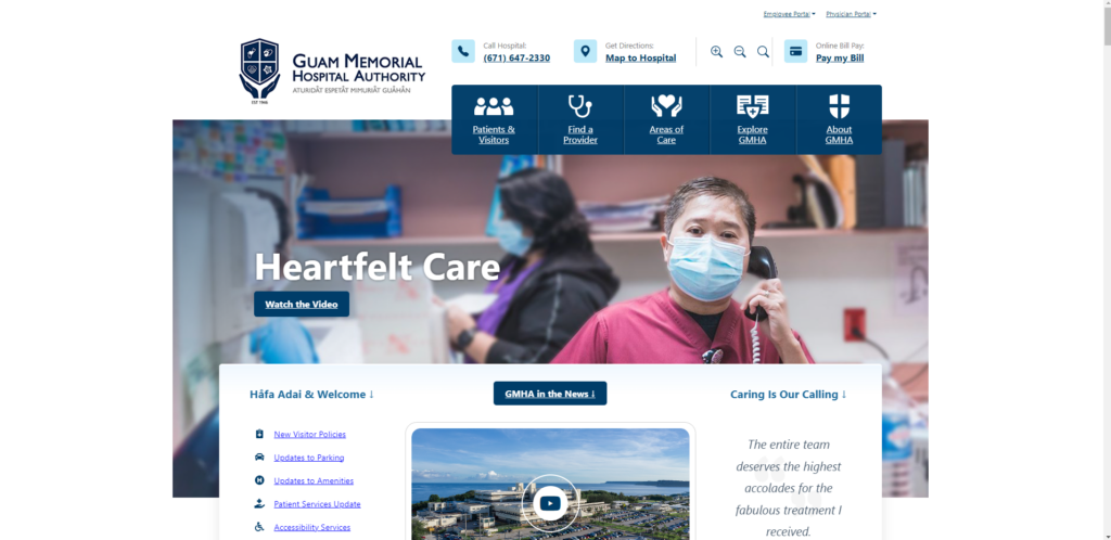
1. Homepage: Cluttered information
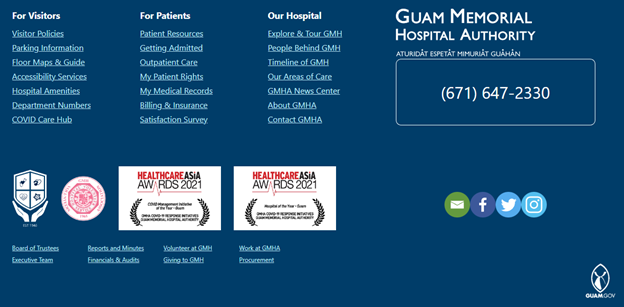
Based on the selected scenario, a user would be most interested in locating contact information for a GMHA medical facility. However, this information is difficult to find on the homepage. GMHA hosts a multitude of information on its homepage that can quickly disorient the representative user. Namely, there are too many links and action commands that populate the user’s screen making it needlessly difficult to locate relevant information to continue. What’s more, if the user scrolls down the page they could find the contact information but it’s too easy to skip over the link since it’s objectively dull. In its current state, GMHA’s homepage provides low information utility thereby reducing its website usability and information scent. These usability flaws directly violate Nielsen’s eighth heuristic for aesthetic and minimalist design.

2. Areas of Care: Burdensome Drop-Down Menu
Following the next logical step in the scenario, the user scans the homepage looking for whatever link most likely directs them to a specific medical department. They click on ‘Areas of Care’ and a drop-down menu displays links to various GMHA healthcare facilities. This menu makes it difficult for the user to locate the appropriate GMHA healthcare facility. The most obvious way is to click on the right-facing angle bracket to scroll for additional medical areas. However, if the user needed to locate the ‘Radiology’ department, it would take much longer because of clicking multiple times with the current alphabetized menu design.
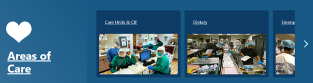
This usability flaw directly violates Nielson’s eighth heuristic on aesthetics and minimalist design. The menu forces the user to navigate through irrelevant information until they can find what they wanted initially. Namely, the interface has too many unnecessary elements that hinder users from quickly finding relevant information thereby increasing its ‘noise’.
3. Areas of Care: Poor System Status Visibility
Continuing the scenario, the user will have selected the desired healthcare department and be directed to another webpage. The user expects to find information about that specific department. However, the webpage does not direct the user to the right department. Rather, the user is directed to all the GMHA medical departments along with brief descriptions and pictures of each. Given this unfortunate usability flaw, the user that painstakingly clicked through multiple departments to select ‘Radiology’ could have clicked on ‘Care Units & CIF’ and been directed to the same webpage. Added to that frustration, the user would at this point realize that they didn’t need to select the right department because it was all located on the same webpage, to begin with. This feature was only intended to search for the desired facility on this webpage to make it ‘easier’ for the user to locate it sooner. However, pictures in the drop-down menu behave inconsistently which may or may not indicate system failure. For instance, while clicking ‘Pediatrics’, the system will function as intended. Yet, other links like ‘Radiology’ will break the system which resorts back to the ‘Areas of Care’ page confusing the user as to what happened. Therefore, this usability flaw violates Nielsen’s heuristics of system visibility since it erodes the user’s trust because of little feedback as to what the system is doing.
4. Areas of Care: Medical Facilities Lack Expected Information
This last step in the scenario is the largest disappointment to the user. Locating their desired GMHA medical facility yields little information about it. A user in this scenario would expect at least the department’s contact information but to no avail. This usability flaw is a blatant disregard for user empathy in showing that GMHA cares about its stakeholders by simply providing highly relevant contact information under a webpage that explicitly states, ‘Area of Care’. While this information could be found on GMHA’s homepage, it’s obscurely placed amongst a plethora of similar-looking links making it unnecessarily difficult to locate this information.
As a result, this lack of contact information directly violates Nielsen’s heuristic of matching between the system and the real world. By not providing contact information, such as phone numbers, emails, or GMHA building locations, for this specific webpage, there exists a mismatch in expectations between GMHA’s website and its stakeholders. Such information should appear virtually on GMHA’s website as it does on contact cards, brochures, and other reading material in the real world.
5. Find a Provider: Results show blank white space
While this scenario differs slightly in its steps, the objective remains the same for the user. That is, they need to acquire contact information through a GMHA provider instead of a medical facility. Taking these steps, the user would click on ‘Find a Provider’ from the homepage. Another drop-down menu will display prompting the user to search for their provider through various means. The usability flaw arises when the user types in the last name, ‘Flores’ into the search box and selects ‘Search’. They are directed to a screen with GMHA header information and blank white space underneath ‘Find a Provider’. There is no indication or message that the system could not find a provider based on ‘Flores’.
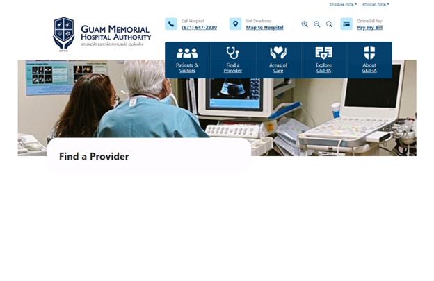
This usability flaw directly violates Nielsen’s heuristic for users recognizing, diagnosing, and recovering from input errors. That is, the system should use plain language to notify the user of not being able to find a medical provider with that last name. Additionally, the system did not provide any solutions (or any indication) for recovering from said search criteria. Added to these usability flaws, the system’s lack of communication (feedback) to the user erodes their confidence in it. This demonstrates another heuristic violated–poor system visibility for the user.
Recommended Design Improvements
1. Re-work homepage design layout to better reflect the ‘essentials’
Reducing action commands on the homepage such as “GMHA in the News” and “Watch the Video” will improve readability by reducing ‘noise’. This will also keep users focused on locating essential information from the homepage. Additionally, the GMHA facilities phone directory must be clearly identified without requiring users to scroll down the page. Providing this directory in an easily identifiable way on the homepage greatly improves its aesthetics without frustrating users’ experience.
2. Minimalize the drop-down menu interface
The current menu layout does not present all the “essentials” that users need to make informed decisions. Therefore, it must be minimalized. Namely, removing all pictures, which can be considered ‘noise’. Additionally, presenting all GMHA medical facility directories immediately on the same menu with clear visibility (not at all like the homepage footer link arrangement). There will be an aesthetic element added to draw user’s attention to the medical facility directories. By implementing these two solutions, users will have better information scent that will keep the content and visual design of the menu layout simple.
3. Re-work programming logic to function as intended
The Area of Care webpage displays a long list of every GMHA medical facility. This webpage already has programming logic that will locate the appropriate facility based on the user’s selection from the drop-down menu. However, most selected facilities do not direct the user to their respective information on the webpage. If the user selects, “Pediatrics”, then the system will function as intended. Re-working the programming logic to function as it does for “Pediatrics” will tremendously improve webpage usability as it will improve system communication and user trust. Currently, the system simply resorts back to the top of the webpage (or anywhere else depending on the selected facility) with no clear feedback as to what happened, which leaves users confused and frustrated.
4. Provide contact information
Following real-world etiquette, providing contact information on the webpage matches GMHA’s interface with it. That is, users will know that GMHA is empathetic to their needs by displaying each medical facility’s contact information. Such information includes phone numbers, email addresses, and building locations. This approach solidifies expectations in the system with the user thereby improving website usability.
5. Provide system feedback and allow the user to recover from their search results.
Use plain language that clearly indicates the provider was not found based on the user’s search criteria. Additionally, the system must provide a link directing them back to the prior webpage. Providing immediate feedback for search tasks allows users to quickly assess their search results to make better decisions thereby improving system visibility. If the system could not find a provider, displaying a link that directs the user back to their search helps them recover from errors sooner in acquiring the right medical provider.
WORD COUNT: 1784