Individual Assignment 2: Heuristic Evaluation

The Website

I chose to do a heuristic evaluation on one of our travel sites, Hotels.com. As an avid traveler, finding a place to stay in is a hard part of a vacation with many different new sites coming up such as Airbnb, Trivago, Expedia, etc. The website specializes in booking hotels, rental cars, and vacation rentals.

Method

In evaluating this website, I took the approach of navigating through the site first and looking at how it works as I have used it before but it is not a regular site I use to book trips. I used the 10 principles of Jakob Nielson’s approach for usability analysis and checked off each one to see which ones had flaws. I went step by step as if I were booking a trip to view the different outcomes of the prices and how the page gets set up when you input a new travel date. I decided to choose the travel destination as New York City and the dates will be during Thanksgiving week, November 22-27.

Usability Flaws

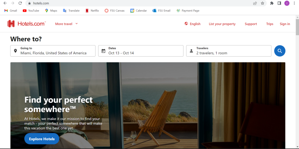
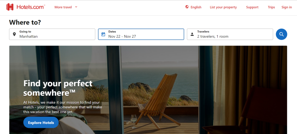
So on the homepage of Hotels.com, it seems very easy to navigate and has a lot of information on the main page. At the top of the screen, you can effortlessly search different locations and dates. Once you scroll down it has some information on different ways to travel and stays. So on the homepage, I input the travel stays I will be looking into which is New York City from November 22 – 27.

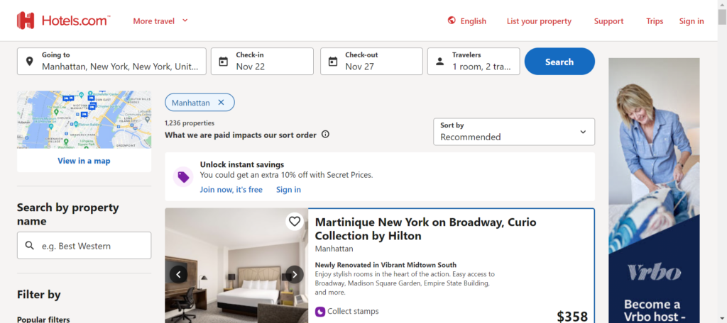
So once I searched up the travel plan, it showed me a list of different hotels with the price showing next to the hotel and a small description of the hotel. You can choose different filters and assortment to your liking. In the image below, I scrolled down a bit and you see some good deals labeled as “Secret Price available”.

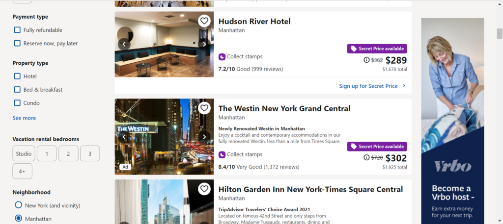
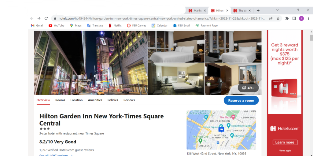
I clicked on the Westin New York Grand Central hotel to see how it worked since it was such a big price jump. When clicked on, it sent me to a different tab which violates the 6th heuristic of recognition rather than recall. This means that a user should not have to remember dates and there should also be a back button to correct any mistake if made. If the user was one that does not understand different tabs then this would be a big problem for them. I can see how if you end up on a new tab, you are going to start a whole new search and it is just repeating all the steps. I went on my phone as well to see if it opened a new tab or not and it did. This means that the user will have to keep switching between tabs to view each and every hotel.

Another violation was number 7, Flexibility and efficiency of use. An expert at tabs and the internet know they can switch between tabs and if need be they can close the tab. However, a newer user may not know that information and since each time you click on a hotel it opens up a new tab. A user may not know that they can either close the tab or navigate to the original tab. They might start the same search again which lose the efficiency of the website. Rather than it being a quick and easy task, it might take a while to view each hotel and its amenities.

Design Recommendations

I recommend that this website has more flexibility for more novice users but also for anybody that travels which is a majority of the population. Hotels.com does have great options and outcomes, but the design of opening a new tab every time you press on a new hotel can get exhaustive and causes a slower performance. There should be a way that a person can review the hotel they want and see it with the option of going back but also having that hotel in a recently viewed box if you want to keep browsing different hotels. This recommendation will solve both heuristic flaws, 6 and 7, which have to do with remembering what was searched and which hotels were viewed, as well as, navigating through the different tabs that allow you to know what information you viewed beforehand.

Individual Assignment 2: HappyCow.net

(917 words)

The Website 

The website I chose for this assignment is HappyCow.com, which is a search tool to help find vegan restaurants based on location. This can be used by tourists in a city they are unfamiliar with.  

Evaluation 

The scenario I am in when navigating this website is that I have a vegan diet and am visiting Queens, New York. I am trying to find a restaurant that offers vegan food but still has other options because I am traveling with my boyfriend who is a carnivore. He respects my dietary needs but since we both have not been to New York it is worth trying to find food we can both enjoy.  

On the homepage of HappyCow there is a large search bar where you can find a location by city, address, or zip code. There is little text or ‘noise’ around the search bar which keeps the layout simple and points me to the direction I wanted to go in. By meeting my expectations as to how I would start my search in looking for places to eat, this fulfills the Consistency and Standards heuristic.  

Once I type in the address that we are staying at and hit enter I am brought to the search results. On the right pane is a map with pins on all the food locations and on the left is the list of them. Above the list are the filters so you can sort through the restaurants in a specific way.  

One thing I appreciate about the filters is that you can click through them and mess around without updating the results. The only way the results will be updated is if you select the ‘apply’ button at the top of this section. You also have the option to select ‘cancel’ which would not apply any changes to the current results or select ‘rest’ which out clear the filters already applied.  

This feature allows the user to back out of the changes they were going to make. Utilizing the User Control and Freedom Heuristic, this provides an emergency exit and does not commit to any changes they were attempting to make.  

Usability Flaws 

The first usability flaw that I came across was going down the filter options. At the top selection to filter by was vegan or vegetarian food establishments, or places with vegan options. In the next section below, you can then filter by the type of food establishment, such as coffee shops, bakeries, and food trucks. As you go down the list the options became more nuanced including health stores, market vendors, organizations, and professionals. Then In the next category below were types of food which included breakfast, buffet, fast food, and bakery (again). I was confused why these sections were separated and why these chose to filter by these categories.  

This failed the Consistency and Standards of Use heuristic by confusing the user with too many irrelevant options. There is no way to distinguish the use of filtering bakery from the first set of categories from the second use of bakery in the subsequent category. This leaves users wondering what these filters could mean by selecting them.  

The second usability failure I was tied up on was assessing the food establishments in my results. After adding filters and sorting through the results you can select a restaurant and see more information about it. HappyCow provides reviews, ratings, and photos all provided by other users. On the right pane of the page is contact information, operating hours, and hyperlinks to the restaurant’s website and social media. This is useful information, but the major factor in how I was going to choose a restaurant would be what was on the menu. So now when I click on a restaurant for more information I must click on another link, be brought to a new website and sort through the menu then return to the HappyCow’s page on that restaurant and then return to the search results to move on to the next option.  

This multi-step process violates the recognition rather than recall heuristic by forcing the user to stretch out to the restaurant’s actual website to recall the food menu. If the user was then deciding between two restaurants, they would have to jump back and forth between websites to weigh their options.  

Design Recommendations 

My recommendation for remediating the Consistency and standards of user heuristic is for the creators to do extensive user testing on what people want to filter through and know about a restaurant. These current category options aren’t clear and don’t feel relevant for the everyday person. By knowing what is most important for users to find, the design can then list those categories by most popular. For more experienced vegans, they should have a shortcut to the more nuanced categories so the site can meet both needs for novice and knowledgeable users.  

For the violation of recognition rather than recall, I recommend adding a pane on the side of the reviews that shows the menu. Users can scroll through this on the HappyCow page of the restaurants as they also browse through reviews. This way the user won’t have to jump to different sites and recall the menu information. 

HappyCow should also have a feature where users can save different restaurants and review them side by side so they can compare their options. This would also free the user so they can evaluate the different food establishments without having to remember the menu of each one.  

Individual Assignment #2 (Hopper)

For my travel site I chose to review the app “Hopper,” due to its wide popularity and claims to provide the best possible deals. Hopper is a travel application designed simply to find users the best deals on flights and hotels. I recently came back from a trip to Aruba and booked my stay via AMEX travel for the hotel (Expedia) and directly through Delta.com for the flight. For this heuristic scenario, I have decided to book the same exact trip from beginning to end through Hopper and compare experiences and review hopper.com utilizing Jakob Nielsen’s 10 guiding principles.

First things first, I can’t use my laptop or desktop to book my trip?! Forcing a traveler to use their cell phone to book the entirety of their trip violates rules #4: Consistency and Standards and #7: flexibility and efficiency of use. The rule of consistency and standards states that an application should follow industry best practices, which in this situation would be to offer both mobile app booking as well as the ability to book on a website. Older users are much less likely to book a trip on their mobile devices than they are their desktop computers. The mobile application shrinks everything, which creates sensory overload for an app that depends on advertisements and a mass amount of options. The rule of flexibility and efficiency of use states that a user can personalize and customize their application. The fact that a user can only use their mobile application violates the principle of flexibility. Additionally, at no point was I able to customize or personalize my experience. In fact, I was only asked to create my account at the end of the experience right at the payment method step.

Moving on to booking my flight along with my hotel for the duration of my trip. This process was overwhelming. Again, an abundance of information all on a small screen was overwhelming and made for a stressful booking experience. I didn’t feel as though I was getting the best deal and didn’t find a way to combine booking my hotel and flight in the same process as I am accustomed to while using Expedia or similar sites. At the end of my booking experience I took to the airline and hotel websites directly and found cheaper rates! For a first time user this wasn’t a reassuring experience. Frankly, this is the point where I would delete the mobile app if this wasn’t for a graded assignment. These errors clearly violate the principles of aesthetic and minimalist design. More is less and in this case the UX designers need to reevaluate their mobile application layout. The designers need to be sure to make strong recommendations for the best possible flight/ hotel combination as well as the ability to book the both during the same process.

The final step that never happened were the recommendations. I was under the impression the Hopper app was the best at telling a user they weren’t booking the best deal, at the best price, at the best time. I was looking forward to the, “hey guy! don’t book this now! you can do better!” moment. This step violated the final principle, which is help. I was going to book a trip for way more than I should’ve and the app never helped me stop or even slow down. The app needs to have an automated help feature to assist the user with booking the best deal.

The Hopper concept is great and definitely one that had me thinking about using their product in the future. In order to more closely follow Nielsen’s heuristics principles, the developers can make a few significant changes. First, the developers need to bring the booking to desktop applications. By doing so, they’ll spread out their crowded interface and make the booking process easier for users accustomed to only booking trips using their preferred search engine. Second, if they’re stuck on solely using a mobile application they’ll need to reduce the amount of content each page has to display. Make it so a user can add to options as opposed to having them all laid out right from the beginning. I want to be able to do everything I can on this application as I can using a specific hotel or airline vendor. Points is life for frequent travelers and in order to stay relevant, Hopper should align their organization with other travel companies in order to provide the additional option of rewards points. Lastly, the application needs to constantly tell a user when they’re choosing the best deal at the best value. People use the Hopper app for helpful recommendations, they need to make sure a user is well-informed when making a poor decision, which is the helpful feature to ensure a user is making the best use of the product.

Heuristic Evaluation – Individual Assignment # 2 (Tripadvisor)

  • Identified site to be evaluated: The site selected for the heuristic evaluation is Tripadvisor. This is one of the travel sites within our scope for the group project, as it is a leading site utilized by people searching for travel related topics.
  • Scenario to be evaluated: The situation selected was to find a highly rated restaurant in Houston, Texas that offers vegan and gluten-free options. The search will be within 25 miles of downtown Houston, however, I would expand the search up to 50 miles, if a vegan Tex-Mex option is available.  
  • Heuristic Evaluation for Tripadvisor: I started by clicking on the ‘Restaurants’ tab, which provided a search feature where I typed ‘downtown Houston.’ I was provided seven options, six of which were in Houston, TX. There was one results for Houston, Mississippi, which I believe violates Heuristic Principle # 2 – Match between system and the real world. The expectation is that all seven results would be in the downtown Houston, Texas and do not understand the logic of having an option appear in Mississippi, given that is very far from the desired location. Additionally, the ‘see all results for downtown Houston’ is placed all the way at the bottom of the results, which seems to be odd placement of this information. I then attempted to use ‘Houston, Texas’ in the search and I did not see any options for downtown, only ‘Houston’, ‘North Houston’, ‘South Houston’ and ‘Bay Area Houston’. I was surprised that the site did not have options for Downtown, Midtown or West Houston in the results, as these areas are far more popular than North or South Houston with tourists and locals alike.

When reviewing the results for restaurants in Houston, I did not see any filtering options on the web page. I checked on the Tripadvisor mobile application and could not find any advanced filtering options. The lack of ability to find anywhere on the page that could provide help or FAQs would violate Heuristic Principle # 10 – Help and documentation.

 I also tried to type in “vegan restaurants in downtown Houston” and did get options that seemed to be vegan based on their name, but there was no indicator to inform me whether a restaurant is vegan, had vegan options or other dietary restriction (e.g., gluten-free). This resulted in a very inefficient use of time, since I had to click on the individual restaurants to figure out if they were vegan or had vegan options on the menu. As such, I feel this violated the Heuristic Principle # 7 – Flexibility and efficiency of use, as it not allowing for an effective search on a specific need.

  • Recommendations for Tripadvisor: For the first issue identified, I would recommend that Tripadvisor add a filtering feature to allow searches within xx miles of a zip code / city or state. This would help target the search and avoid getting a result for Houston, Mississippi, when the desired results are for Houston, Texas. Another benefit is that the end user can ensure that the desired results are within a given proximity of where they are located and do not have to venture into an area of Houston that is significantly far from their current location. The mobile app does have the option to use GPS / Location Services, but not everyone is willing to have their location tracked, therefore, this is not the ideal way to solve the issue.

Additionally, they should move the ‘see all results for downtown Houston’ from the bottom of the results to above the first result provided. That way, the end user(s) have the option to view all of results, rather than the top recommended by Tripadvisor. This is most likely due to restaurants paying fees to be placed higher in the search results and not necessary being the best match for what is being asked.

Once the end user goes to the ‘all results’ page, there must be a better way to filter / sort through the results. I recommend adding an advance filter that allows for specific filters to be applied on type of cuisine, any dietary restriction (e.g., dairy-free, gluten-free, vegan, etc.), review score and price, as a few examples. If the location filter is applied, as recommended above, it would be beneficial to know the proximity of the establishment to your current location. This must be applied to both the mobile application and using the Tripadvisor site on a web browser. This will significantly improve the search features and produce meaningful results.

The last recommendation will be focused on a “Help or FAQ” section, where an end user can look for assistance to help them navigate the page or app, as well as provide guidance to refine search results. I currently could not find any such information and it was extremely frustrating to be provided 36 pages of results without any ability to find helpful ways to tailor the listing to what I was looking for.

Word Count – 811

Individual Assignment 2: Heuristic Evaluation

The Website

The website that I want to perform a heuristic evaluation on is Zomato. The platform of this website is for searching and discovering restaurants; reading and writing reviews; ordering food delivery; booking a table; and making payments while dining-out at restaurants (I think the last three services are for an app feature – the site was not specific about it).

Method

The evaluation method was browsing the website while keeping tabs on the usability flaws. After getting familiar with Jakob Nielsen’s 10 general principles for interaction design, I went back to where I found the usability flaws and connected each one that I found.

Usability Flaws

Visibility of the System Status

The flaw that I found with this heuristic is the search bar. The first thing that welcomes you when you get to the site is the search bar. But the problem is, it is already showing the last place that I did a search. It can’t be deleted or cleared, and can’t be removed by clearing the browser’s history. Another problem with it is that when you type your location and hit enter, it just looks like nothing happened. A few tabs at the bottom show up, but not what I am looking for (the list of restaurants). The third is the right-side of the search bar. When I first browsed the site, I thought I could search for any keyword on the search bar. But after careful inspection, you must enter a location and then do a search that pertains to a restaurant, cuisine, or a dish. I call this a flaw because people go to a site and do a search on a search bar, not enter a location, and follow the next direction, which, by the way, there is no direction.

This is a violation of the “visibility of the system status” because the site is supposed to always keep users informed about what is going on, through appropriate feedback within a reasonable time, and clearly this site doesn’t.

Match Between System and Real World

After entering the site, once you scroll down from the search button, you will see “Popular localities in and around Venice, Florida” (remember the previous searched location is automatically inputted). The word “localities” caught my attention because I am not looking for a particular place, but a place to dine.

This violated the usability heuristic “match between system and the real world” because it did not ensure that the user’s understanding of the word match the understanding of the programmers.

User Control and Freedom

So, I was finally able to search for restaurants. When I click on a specific one, it takes me to the restaurant’s profile. But there is no way of going back to the previous page, which is the results. To go back, I must press the back arrow button, or at the top of the image of the loaded curly fries, there is a directory type of addressing. You can click on any part of the directory and hope that you will land back where you want to go back. The problem with that is that not a lot of users can understand that.

The “no return button” is a violation of the usability heuristic “user control and freedom” because there is no clear way of exiting the current interaction.

Flexibility and Efficiency of Use

I noticed that in the search results there is no way to pick different restaurants and compare them, nor is there any way to personalize the view. The design is stuck on three columns and endless scrolling (if there are a lot of results – like searching a rural area). So, if you want to get to the bottom of the page, you scroll to what you think is the bottom of the page, but when you hit the bottom, it will load more results. When I searched for restaurants in Cebu City, Philippines, it kept doing that for at least five times. The design is not very convenient and it is annoying to get to the bottom of the page.

These violated the heuristic “flexibility and efficiency of use” because they don’t provide a way to personalize the functionality and they don’t allow customization on how the user wants the product to work.

Help and Documentation

There isn’t a help button, or I can’t find it.

This violated the last usability heuristic because a site needs to have documentation in context right at the moment the user requires it.

Recommendations

Visibility of the System Status

Since the site is already known for restaurant reviews, I recommend that the search bar be set to search full sentences, like “the best place to eat in Sarasota”. People already visit the site because they are looking for a good place to eat, so by doing so, they should get a list of restaurants. Or they can at least have a talking bubble to direct you to the process of getting search results (instructions).

Match Between System and Real World

I recommend changing the label to “restaurants and bars in the neighboring area”. This way, people will know that the section is still relevant to their search.

User Control and Freedom

For this usability flaw, I recommend a clear exit path. It must be correctly labelled and easy to find.

Flexibility and Efficiency of Use

For these flaws, I recommend adding an option/button for the users to change the view of the results, and adding a list view will solve the never-ending scrolling.

Help and Documentation

Add a “help button” to help users when they require it.

Group Topic Selection: Travel

1. The name of your group, and the names of your group members.

Group Name: Eager Explorers 

Group Members: 

Gina Gatti 

Paul Kwek 

Andrew Martin 

Isabella Restrepo 

Meagan Russell 

Marinel Stancu 

2. The type of site your group has selected, along with a short list of sample websites. 

Type of Site: Our group selected travel sites that recommend dining and places to go within different countries across the globe. Some examples of related websites would be TripAdvisor (https://www.tripadvisor.com), Yelp (https://www.yelp.com), Zomato (https://www.zomato.com), Hotels.com (https://www.hotels.com), and Kayak (https://www.kayak.com). If you are traveling internationally, there are those country-specific sites that offer dining and “places to go” tips. 

3. A brief statement explaining why your group is interested in this type of site — why does it appeal to you? why you think it would be useful to explore the usability of this kind of site? 

Justification for Site: The group finds this explicit theme interesting, as in many cases, we have traveled to a location that we have not explored yet and would need recommendations and guidance on the best and safest places to eat, venture, and explore. Some individuals have dietary restrictions and having information on restaurants that have vegan, vegetarian, and gluten-free options would be essential. Regarding safety, some locations pose a higher risk for tourists than others. Knowing which neighborhoods tend to have higher crime rates would be valuable information to keep travelers safe. Obtaining information on other people’s experiences with dining and local tourist attractions is also essential to planning respective trip itineraries. 

Exploring the usability of travel sites will help the end users navigate and find the desired information for a particular location. Travel sites need to have a very user-friendly interface and provide accurate results in a usable format. Since the demographics of the end users will vary, the travel sites need to be developed in a way that a novice user with a basic understanding of the web applications can use them. To easily populate required fields and be able to use advanced filtering to limit results by a set of criteria. Additional consideration should be given to providing information about COVID-19 restrictions (e.g., mask requirements and other local restrictions) that will be extremely important when traveling to novel places. 

Word Count: 301