Designing for Users

by Jennifer Ritter

Context: the app, the “expert”, and the test-user

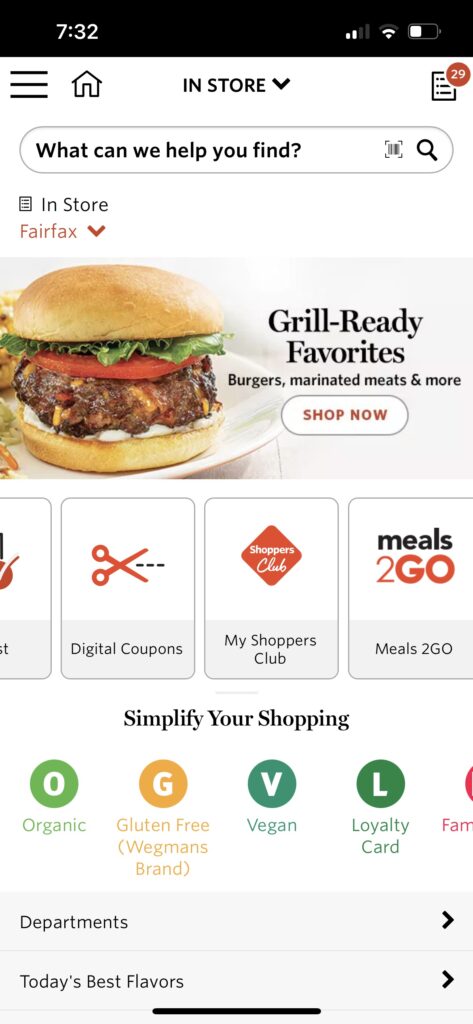
The Wegmans grocery store app is used to create shopping lists, store customer loyalty cards, digital coupons, and so much more…

The Wegmans app was selected as the test site because it is the only technology that I use which the millennial test-user has never used before. 

The “expert” in this test is a 50+ year old who uses technology very pragmatically. When a need arises, the “expert” discovers how to meet this need and then typically explores no further. For these reasons quotation marks are used with the expert label for this individual, and for the remainder of the post “I” will be used instead. 

The user-tester is an 18 year old millennial who has used technology extensively for school, entertainment, and communication for the last 5 years or so.

Test-user performance

The user-tester was asked to download the app and then determine what it would be used for. He scrolled through the app, both vertically and horizontally, and decided to try the “meals2go” feature. This feature opens a page in the web browser which has the option to download a separate app for meal ordering, or the user can order prepared meals directly from the web page.

He was then instructed to go back to the app and make his guess about the purpose of the app. He thought it was best used to browse the store’s product selection and he would use it to find out if they sold items he was interested in. The app actually performs poorly for product searches. Items known to be on the store shelves are often not found at all in the database, and even items in the database are not found when exact product names are used, including name-brands. I have learned which words will help me locate the products but often I have to scroll through a number of other items as well.

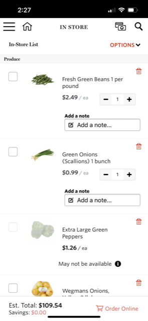
The tester was then informed that I use it make shopping lists and he was asked to compile a specific list of items. He did not encounter any problems doing so. 

Usability evaluation

“In trying to make it convenient, they made it overly complicated.” This was the final analysis of the user-tester after using his list to shop.

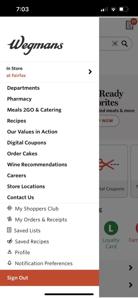
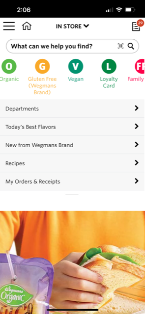
The user-tester also expressed confusion over the main purpose of the app due to its cluttered appearance. We jointly explored the app after his testing and he reiterated his opinion expressed above, that the app is simply trying to do too much. Besides browsing products and making shopping lists, you can clip digital coupons, find and save recipes, look at store locations, see past orders and receipts, link to the catering site, and even apply from a job, amongst other things.

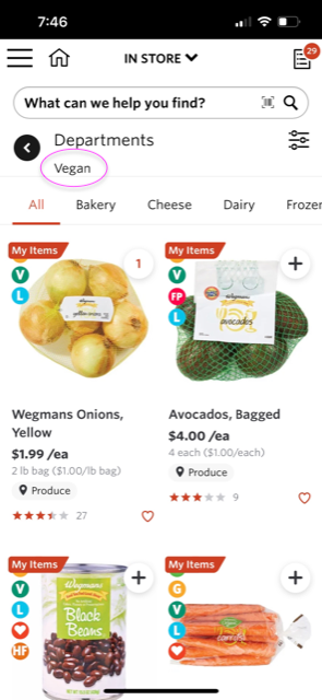
Besides doing too much, the app itself and its database are poorly organized. Ironically “Simplify Your Shopping” is written on the bottom half of the initial view when the app is opened. I think this is describing the icons just below that statement which have very little value. For example, the first page displayed using the “V” vegan icon is the produce department. As a sometimes vegan, I would have expected it to link to vegan alternatives of non-vegan products – but no vegan “cheeses” are found here. Applying the filter for cheese and dairy gives a “No products” message, when in fact, the store has plenty of options.

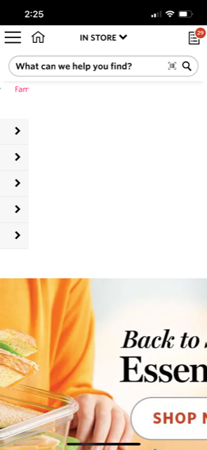
In addition, the app is not formatted for mobile devices. There are multiple horizontal scrolls and two advertisement photos that do not fit on the page. While the entire photo is a link to the product page it is advertising, users have to scroll to the left in order to see any text and the actual button to link to the department. 

Wegmans would have more users if they reorganized their database, reformatted their app, and simply removed some options. A simple layout using only a vertical scroll would assist users decide what tasks are available and which actions they want to take. 

Individual Assignment #1

Andrew Martin

User Profile

My chosen user is a 29 year old female with a doctorate in Pharmacy. She loves to travel to different locations throughout the world, however typically goes straight to specific vendors when booking flights and vehicles. When searching looking for events or hotels she uses google and the first application that usually pops up is Trip Advisor. With a trip planned to Sedona, AZ coming up, I put her to the test to plan and book the entire vacation via Expedia and at the end we would compare prices and experiences.

Novice Actions

The user went to expedia.com with the task of booking a trip to Sedona, AZ for four nights at the end of September. She needed to book a flight, hotel, car, and find 3x local activities while on the vacation. She began with entering the destination location, amount of people, dates, services desired, and then began the search.

Right away I could tell she was confused. The hotel prices were astronomical when compared to looking at prices via Google. This immediately seemed like the biggest ripoff and almost enough to click X on the tab and give up on this search. What she didn’t know and what wasn’t explicitly clear for a novice user was that the hotel price was the package deal. The flights and rental car are semi included in that huge price. I encouraged her to continue on and pick a hotel she would genuinely enjoy staying in. Right away she clicked on the 4/5 star rating filters and chose a $950 basic hotel room (something she would never do). She moved on to the flights, which is where she found out the hotel price included the base flight rates as well as the rental car. By the end of the booking process she was extremely satisfied with the end result and ease of use even with the initial confusion.

Next came time to book the activities for the trip. She lined up 3x great touring events and was excited to book, except when it came time to click they were all reserved for our selected dates. We went to sites to book directly through the venue and there was still plenty of spots available. We definitely appreciated Expedia providing free recommendations, but we had no luck booking our tickets through the website.

Recommendations

Overall, my user had an easy time navigating through Expedia and making selections for everything we needed to have for our trip. A few things she would’ve like to have been able to do. 1. Points are king when it comes to travel. While there are Expedia points, users want to be able to use their specific sky miles or hotel rewards points. A suggestion would be for the site to partner with hotel chain or airlines to make that possible when booking through their third party application. 2. While I haven’t had any confusion booking through Expedia, the site needs to make it very very clear to new users that they are booking a package deal price right from the beginning in order to avoid users clicking X right after seeing the initial sticker price.

Just like myself, my novice user enjoyed using all the various filters provided by Expedia. Right from the beginning she was able to eliminate dozens of hotel choices by selecting the 4/5 star ratings and reviews. From there was she was to deep dive various amenities and narrow down the location of the resort.

Individual Assignment 1: Navigating BraceletBook

Amy Feinstein

Exploring BraceletBook

Lately, I’ve gotten back into making friendship bracelets (they’re a lot more complicated than you might remember from summer camp!). I found a site, www.braceletbook.com, that lets you find friendship bracelet patterns, generate patterns, see photos, watch video tutorials, and participate in a forum. I’ve been spending a fair amount of time on this site recently, and so I asked my friend to take a look and see what she thought.

BraceletBook Homepage

The Tester

My friend describes herself as moderately technically proficient, knowing “just enough to get by on most websites” but also notes that she knows how to look up anything she is unsure of. Her initial impression of BraceletBook is that it seems like a combination of Pinterest and Instagram. She is familiar with both of those sites and uses them relatively frequently.

Initial Exploration

Since my friend had not seen or heard of BraceletBook before, I gave her a brief overview while letting her start to explore on her own. The home page shows previews of a few different sections of the site, including Hottest Patterns, Latest Patterns, Latest Photos, and Latest Videos. The first thing she mentioned was that it reminded her of Instagram because many of the patterns showed “likes” underneath the thumbnails. She clicked on a pattern that interested her and immediately noted all the information that showed up at the top of the page – the dimensions of the pattern, the number of strings required, and the number of colors required. She wondered how to find what colors were needed and then scrolled down and realized that you had to look at the pattern itself to find the colors. I asked her how she would find out if that pattern had a photo attached – she didn’t see the little camera icon at the top of the page that had a “0” next to it but did scroll down to the bottom of the page, where she thought photos might be based on where she would find them on Amazon. While that is where they show up when they are available, this pattern didn’t have any photos attached (hence the “0” at the top).

Colors and knotting instructions for a pattern

After looking at that first pattern, my friend started exploring different aspects of the site, from the photo page to the tutorial page (she liked that the video on the tutorial she picked was embedded) to the video page (which she discovered also had video tutorials). I then asked her to find a specific pattern by its number, and she clicked on the pattern page to search for it, which was the correct path to take. If she had searched directly from the video page, she wouldn’t have been able to find it because there is no video listed for that particular pattern. Because the filter options look the same on each main page except for the title, this isn’t necessarily clear to a novice user. However, she navigated it well.

Filter options on the Patterns page. The filters look the same on all the pages, which makes it confusing to find a specific pattern if you are, for example, on the Tutorials page and the pattern you want doesn’t have a tutorial.

I asked her to do a few more specific tasks on the site to observe her process. I asked her how to tell if specific patterns had photos and/or videos attached to them, and at that point she was able to find the icons at the top, although it wasn’t until she found a pattern with multiple photos that she noticed the numbers next to the camera and recorder icons. I then tried a more abstract question – could she find a description of the difference between “alpha” and “normal” style bracelets? She used the keyword search in the patterns, which was a good thought, but it did not get her to the answer. She ended up opening another tab and googling the answer. (For those who are curious, alpha bracelets are more like pixel art and go straight across row by row, where normal bracelets tend to be more geometric in design and have diagonal rows.)

Alpha bracelet with keyword tags and bracelet info
Normal bracelet with keyword tags and bracelet info

The trickiest task I had her do on the site was to filter only by alpha or normal patterns. She tried the keyword search at first, but while “alpha” is a tag in at least some bracelets, “normal” rarely is. I eventually gave some hints for her to find the option to filter by type at the top of the page – most of the other filter options are pretty straightforward, but you have to be at least semi-familiar with bracelet making and the site in order to know to choose that filter.

Novice vs. Expert

I hesitate to call myself an expert yet on BraceletBook, as I am sure there are features I have still not discovered, but I noticed a difference in ease of navigation between myself and a first-time user (further discussed below under User Interface). One area my friend clicked on that I had never looked at was the social media link section at the top of the page. She clicked on the Facebook link, which opened a pop-up window with an error message. (While typing this up, I just tried it on my own computer and it took me to a link to share the pattern page I was on). She also tried Pinterest, which on her computer just showed a window with the BraceletBook logo and on mine showed the actual pattern. She was using Chrome while I use Firefox (as it turned out, she and I also discovered that the print function worked much better on her browser than on mine).

User Interface

There were several times when the interface hindered my friend’s navigation, most of which I also encountered when I began using the site. For instance, when clicking on videos from the video page rather than the tutorial page, it took her a few tries to exit out of them, as there is no handy “X” at the top of the video. Eventually she managed by clicking far outside of the video screen; I usually exit with the ESC key. Once, she was looking at pictures on the photo page and wanted to navigate to a particular pattern but clicked on the photo thumbnail rather than the pattern number, which just opened the photo. It takes some time to realize that clicking on a pattern thumbnail takes you to a pattern, but clicking on a photo thumbnail only takes you to that particular photo.

Suggestions for Improvements

There are several improvements that could be made to help novice users. Both the About section and the FAQs are extremely tiny links at the bottom of the page – not an unusual place for them to be, but because there is so much information on each page, it takes a lot of scrolling to find them. They should be more prominently featured at the top, which would have made it is easier for my friend to get some of her questions answered. For example, she was wondering what user rankings meant, and the answer is in the first FAQ.

That said, one of the questions I originally asked her, about the difference between alpha and normal patterns, is not specifically answered in the FAQ or the About section – there is only a link to the general tutorial page. That seems like a big omission for beginning bracelet makers. Another major issue we ran across is the keyword search functionality. My friend noticed a pattern with the Disney character Stitch and clicked on it. Since I am also a fan of that character, I had previously done searches for patterns with Stitch and asked her to do the same. It turns out that when you write “Stitch” in the search box you get a lot of irrelevant patterns, since the knots of a bracelet look like stitches for sewing, making it a common tag. Logically, you would think the next step would be to search for both “Disney” and “Stitch.” Unfortunately, when you do, the keywords are additive rather than subtractive, and now you get every pattern that is tagged with both “Disney” and “Stitch,” and using Boolean operators doesn’t change the results. (Again, for those who are interested, it turns out that you can search for “Lilo” and suddenly all the Stitch patterns show up as well.) Adding keywords that filter rather than add extra patterns would be a major improvement to the site. Overall, the site has a lot of great functionality, but a few design tweaks would make it friendlier for both expert and novice users.

Individual Assignment 1: Designing for Users

The Website

The website that I chose was the FSU Office of Admissions main landing page, which requires a user to navigate a series of buttons and menus in order to reach the content that they are looking for. I use this webpage every day, as it is the main reference page that prospective applicants to FSU must navigate to receive important information regarding admissions requirements and deadlines (and we try to reference students to the webpages so that they have easy access to these resources). I know the vast majority of the content on the pages that are housed within the admissions.fsu.edu domain and exactly how to navigate to important information in the most direct way possible. However, I also know (based on my use of the site before my current role, in addition to the plethora of confused emails I get each day) that this site is overwhelming and often unnavigable, especially for the young adults exploring their college options for the first time. (It is currently being worked on though! Many of the subsidiary pages have already been majorly revamped!) 
 
Although the initial landing page seems pretty standard and benign, as seen here: 

An attempt to make the process more digestible is made with the use of photo buttons, which (although still a little bit of a lot it) does help chunk it nicely into our most common inquiries, but….  

….if you scroll down just a bit more, it quickly becomes a mass of buttons and text with minimal organization.  

The User 

For this assignment, I wanted to see how a prospective student might engage with the admissions website to find necessary admissions information to begin their application and know relevant materials and deadline info.  
 
I asked someone who may be interested in applying at some time in the near future to run the test for me. Their aims were to find out more about how the application process differs between First-Year and Transfer, and to see which cohort they should apply to, what majors they can apply to and what the requirements may be, and information about scholarships.  

The user is a young woman (18-24) who is very technologically savvy; she has taken computer coding courses, is a social media marketing chair for an organization, and has built her own computer. She is likely more technologically competent than many of the users who utilize this site on a regular basis. She also has lots of opinions and is emphatic about design choices, so I had a lot of fun watching and listening as she went through the pages. 

User Actions 

The user began by navigating to her Google Chrome browser….on her phone. I honestly did not think to specify at first that we should do it on a desktop/laptop. So, we started with that, since I felt like it would be more authentic to most of our user’s experiences anyway. (The main difference between the two layouts is that everything is stacked on top of each other, so slightly less overwhelming than the desktop layout.) 

The user ignored the hamburger menu (which concealed the options for “First Year,” “Transfer,” “Graduate,” etc.) and chose instead to open a new tab from the Apply Now button……which loops back to the main Admissions homepage… This brought about from the user a fun expletive and a quizzical head-tilt. She clicked the button to open in a new tab again, and the same thing happened. After a small grrr at the screen, she went back and simply clicked the button and saw that it opens a pop-up menu to the different application types. She chose First-Year (“since it’d be my first year there!”), clicked the “Apply Now” button on the new webpage that opened up and got to a User Log In screen where she had to make an account to continue. Getting annoyed with the relative lack of info on previous screens, and not sure if she was entirely in the right place, she decided to back out to go look at the different application types and their requirements. 

Since she noted how annoying it was to have to back out and try to find the pages again (since opening new tabs had so far been futile), I mentioned she could use my laptop to finish going through everything. We moved to the Google Chrome browser on the laptop, booted up the landing page, and as soon as she scrolled down and saw all of the picture buttons and Quick Links, she screamed and flopped back on the couch.  

At this point the user looked at me dejectedly, but said they were going to try one more time to find the info. She decided to ignore the Apply Now! button “because [she] hates it” and instead scroll back down to center the page on the photo buttons. She chose requirements, grumbled at the pop-up menu before choosing First-Year, screamed when she saw the wall of buttons (see below) and closed the laptop. Overall, the user test was an adventure for both of us. 

(To be fair, I did help her find what she was looking for later that evening, and she said that it honestly wasn’t that bad once I showed her where to find what she was looking for…but she just got so frustrated with the looping and walls of buttons that she just stopped caring at first. Granted, she did say that she eventually would have had to come back and try again, since she was actually interested in potentially applying…but that she got so overwhelmed with it all as a first experience that she would have had to wait a while before diving back in. She also said she would have probably called or emailed for help (both of which she hates having to do) because she did not feel like she could find what she needed without feeling overwhelmed.) 

Recommendations 

The biggest thing I think this site needs is fewer text buttons. Just that change alone is probably the most important thing. However, I also know that many of these buttons are necessary, and many more must remain on the landing page. To that end, I think what would really help is to organize the buttons into main sections throughout the page, so that the buttons are all grouped together in closer proximity to relevant other buttons. The page could also be delineated in a variety of ways, although delineating by application type seems the most logical to me. I think, also, utilizing the photo buttons more intentionally (fewer of them grouped together, for starters) could be very useful as well. As they are, the photo buttons offer some reprieve, but are still themselves relatively overwhelming since they are arranged as a double-stacked wall.  

Additionally, I feel like sectioning out the page to include relevant info by application type (such as a section for First-Year that includes a button for Requirements, Deadlines, Majors, etc.) would solve the looping problem that my user had. The pop up menu is not always intuitive, and the fact that so many of the broad categories include the pop-up menu instead of each of the app types from the pop-up menu having its own section with relevant informational buttons lead to a lot of frustration and confusion. Perhaps it is less of an issue with less tech-savvy users (not everyone is going to try to open something as a new tab instead of just clicking the link), but the sections would also help less tech-savvy users quickly scan and find relevant information.  

Overall, the site is not unusable, it is just a lot. And most of the information presented on the site is relevant and required, so it is not as simple as just taking out extraneous information. A lot of work is being done to make this site more navigable, and I am excited to see the changes (and receive fewer confused emails). 

Individual Assignment 1 – Novice Users and Lancasterarchery.com

Overview of Website and User Profile

Lancasterarchery.com, shown in Figure 1, is a shopping portal specifically for archery equipment and supplies. In 2021, eHouse Studio redesigned the site due to previously poor usability and an aging theme (Maas, 2021)(Lancaster Archery Supply Case Study, 2022). Similar to Amazon, Lancaster Archery Supply earns margin on sales by selling and shipping products. Also, educational media and tournaments at their headquarters are provided as a service. In the sport community, the company is considered the leading website to buy archery equipment within the United States.

Figure 1. Homepage. From Lancaster Archery Supply, 2022. Retrieved from https://lancasterarchery.com/

Lancaster Archery’s site was selected to contrast usability opinion of a novice user with someone like myself as an expert user that practices target archery and bought equipment there. The site was presented virtually through a desktop web browser to a novice user pseudonym named “Jess,” who is female (identified as she/her), 35 years old, White-Caucasian, married with children, and resides in Florida. Jess understood the idea of archery and considered it as a hobby for her daughter, but never attempted the sport or shopped for equipment. She is educated as a UX/UI Designer through a professional bootcamp, which did aid in describing the website design elements. Ideally, Jess represents a Guardian User Persona of a parent looking to buy equipment for their child as a beginner archer.

Task and Action Observations – Finding a Bow

Jess as a novice user was asked to view the homepage to gather initial opinion and then complete a task to find a bow to purchase for her 7-year old daughter. Reflecting on the homepage, she commented how the site content itself felt oversized, intimidating, and did not provide any articles on starting the sport. Jess hovered over the top left menu and noted a hamburger menu for “Shop” but no content to see what “Brands,” “Deals,” and “Blog” sections offer to help learn more about the sport. Generally, she noticed that many of the products showcased were for bowhunting and that there was very little diversity of the people pictured. As an expert user, I normally ignore the homepage unless there are upcoming events or podcasts in the center, which are very infrequent throughout the year. Confirmed in a 2012 survey by the Archery Trade Association reported by Archery360, 55% of archers ages 18 or older in the United States practiced both target archery and bowhunting or bowhunting exclusively, making up the largest demographic of consumers. (18.9 million Americans participate in archery, 2013).

To find a bow for her daughter, Jess began the task by typing in “kid’s bows” into the homepage search bar. As an expert user, I first generally define the type of bow, like “Compound” or “Recurve” and then browse through the “Shop” Hamburger menu to navigate to Bows and then Youth Bows or the more specific bow type categories. When Jess viewed the search results, only two products displayed with only one being a bow based on SEO interpreting product titles with the word “kid.” Since both seemed undesirable, she selected the “Youth Bows” Category in the Hamburger menu, which offered more results. Looking at results page, shown in Figure 2, the left filter menu seemed well organized but lacked any context its attributes like “Draw Weight” and “Speed.” As a previous user, the site filters are a utility if the context is known, but less desirable in practice since sometimes filters hide products that are not configured properly for metadata. When Jess selected “Galaxy Bullseye 54 Takedown Recurve Bow,” the product page included configuration items, some she assumed correctly like handedness with others like Limb Weight and “Nok Set” unknown.

Figure 2. Youth Bows Results Page. From Lancaster Archery Supply, 2022. Retrieved from https://lancasterarchery.com/collections/youth-bows

Finishing the purchase when the bow was configured and added to cart, Jess noticed how the bundled items were separated but equaled the total, showing a gray warning about removing them, as shown in Figure 3. As an expert user, I also found this behavior confusing especially if the exact individualized products are added from the catalog as spare parts. Jess was generally uncertain about the checkout process and did not feel confident in buying a bow based on these culminating issues. Overtime her experience was less desirable as a guest user when she kept being prompted a 10% Off Button for an email sign-up and a pop-up to donate to the Lancaster Archery Foundation non-profit, as shown in Figures 4 and 5.

Figure 3. Cart and Bundled Items Warning. From Lancaster Archery Supply, 2022. Retrieved from https://lancasterarchery.com/cart
Figure 4. Pop-Up for 10% Off. From Lancaster Archery Supply, 2022. Retrieved from https://lancasterarchery.com/
Figure 5. Pop-Up for Donation Pre-Checkout. From Lancaster Archery Supply, 2022. Retrieved from https://lancasterarchery.com/cart

UX Considerations: Expert v. Novice

Evidently, lancasterarchery.com, even with its 2021 redesign, favors more experienced users but has the potential to make enhancements by observing novice users like Jess. Despite a slim-majority consumer demographic, the company has an incentive to attract new and younger generations to archery. In comparing to my experience as the expert user, prior knowledge of filter terms and understanding the site’s disjointed queries led to multiple attempts with browsing, chaining, and differentiating akin to the Ellis Model of Information Behavior (Case & Given, 2016, p. 151). While this model is robust, a more linear approach may be better suited for novice users that need a directed interface. This can be accomplished by developing a guide or questionnaire that aids in deciding a bow, perhaps displaying it on the homepage. Jess also suggested adding YouTube Videos of product category guides similar to reviews on product records already created by Lancaster staff. Likewise, tooltips with definitions in the filter menu or more curated filters per category can help define attributes. In general, SEO and the product metadata need improvements to include more accurate search results.

Word Count: 874

References

18.9 million Americans participate in archery. Archery 360. (2013, August 9). Retrieved September 6, 2022, from https://archery360.com/2013/08/09/18-9-million-americans-participate-in-archery/#:~:text=Of 235 million total Americans,participated in archery and bowhunting

Case, D. O., & Given, L. M. (2016). Looking for information : A survey of research on information seeking, needs, and behavior. Emerald Publishing Limited.

Lancaster Archery Supply Case Study. eHouse Studio. (2022). Retrieved September 5, 2022, from https://www.ehousestudio.com/work/lancaster-archery-supply-1

Lancaster Archery Supply. (2022). Homepage. Lancaster Archery Supply. Retrieved September 6, 2022, from https://lancasterarchery.com/

Lancaster Archery Supply. (2022). Your Shopping Cart. Lancaster Archery Supply. Retrieved September 6, 2022, from https://lancasterarchery.com/collections/youth-bows

Lancaster Archery Supply. (2022). Youth bows. Lancaster Archery Supply. Retrieved September 6, 2022, from https://lancasterarchery.com/collections/youth-bows

Maas, D. (2021, November 24). Lancaster archery supply launches New Dealer Website. Archery Business. Retrieved September 5, 2022, from https://www.archerybusiness.com/lancaster-archery-supply-launches-new-dealer-website

Individual Assignment 1

Christopher Gregor

Website and User

Website – roll20.net

Roll20 is an online toolset allowing people to host Tabletop Role-Playing Games remotely on a virtual tabletop. People primarily use it to play games when they are far apart from each other and increased in use over the pandemic lockdown. I personally use Roll20 to manage and run multiple Dungeons and Dragons games via this online tool system with friends across Florida.

Roll20.net main page

User – Brother

My tester was my younger brother who does not play Tabletop Role-Playing Games or use any similar website to Roll20. He is a Risk Management major and while familiar with the common use of computers and websites is mostly experienced in the Microsoft programs like Excel which are used heavily for his major.

User Actions

My brother began by exploring the main page’s header links and drop-down menus. He attempted to use Play Now but it directed him to a sign-in page, after exploring other links he found the only link he could use without a sign-in was to view the community discussion threads about the site and games. Following this, I provided my brother with a temporary email to create an account and continue to explore the site.

Now logged in, he proceeded to attempt to join a game and I noted his confusion at trying to view other people’s games and what they were playing. He then explored the tools and marketplace section which he was able to navigate fairly easily with only some confusion on jargon and terminology from the Tabletop Role-Playing community found across the site.

Finally, I asked him to attempt to create a new game and delete it. Creating a game was pretty easy, he was surprised how many options there were for gaming systems, but he found it difficult to adjust the settings for a created game and locate how to delete it.

Novice vs Expert Users

Novice

The interface seemed to be useful for my user to follow along with their exploration only getting caught up on the settings for an individual game and being confused with the Jargon, names of gaming systems, and terminology indicative of the Tabletop Role Playing culture and not the interface itself.

Screenshot of some of the settings (Without an account you can’t see this page)

My user detailed that he found the site navigable and useful, the systems for the marketplace used to buy new books and assets for games were easy to search and use despite not knowing any of the names of systems or books being sold. He remarked that if he played Dungeons and Dragons or any other game on this website, he probably would understand what’s going on better.

Expert

I have used Roll20.net for 8 years and over that time it has seen many updates and changes to parts of its user interface design. With the knowledge I have on Tabletop Role-Playing games I find this site very easy to navigate and design entire campaigns for players to use with journal segments, specific sheets, and handouts. I am even able to effectively use some of its advanced features like Dynamic Lighting which allows me to design game maps with the ability to limit each player’s visibility of the map to only their token.

Individual Assignment 1: Designing for Users

Kansas Department of Transportation (KDOT) Home Page

The Website and the User

The Kansas Department of Transportation (KDOT) website (https://www.ksdot.org/index.asp ) is the one I chose. My tester is an expert user of the internet. She is in her early 40’s. She is pretty good at online shopping, she uses social media a lot, she is good at navigating the internet, and she can do research on the net. She has been to this website a couple of times but has never checked out the RWIS page.

A User’s Actions

The task was to check the status of the weather station in Chanute, KS. In order to get this information, she has to get to the road weather information system (RWIS) webpage from the KDOT home page and locate Chanute, KS. The first thing she did was search for “RWIS” (road weather information system) (she is familiar with the term) on the search bar of the home page of the KDOT site. It returned 10,022 results, and for me, the only relevant page was the top one: KDOT: RWIS. She clicked on it, and it took her to the old RWIS webpage, where everything looked legit. But it was not interactive, some of the RWIS sites on that page were not existent, and the information on that page was not up-to-date. Basically, she was on the wrong webpage. Then she went back to the home page and started exploring the site. She clicked on some links, but none of them took her to the RWIS site. Eventually, she was able to put two and two together. She found the link she was looking for in the “Travel Information” tab and chose “Road Weather Stations.” She is familiar with the map of the state of Kansas, so, when she got to the RWIS site, she was able to find Chanute quickly.

Search Results for “KDOT RWIS”

Problems Encountered

The thing that she did that I found unexpected was when she started with a search, instead of exploring the site first. The problem that she encountered was not becoming familiar with the site. I would have explored the site before jumping to do a search. To make it worse, the search capability of the KDOT website is not the best either. Another issue is the “KDOT: RWIS” link (https://www.ksdot.org/burcompser/generatedreports/weather.asp ), which took her to an old webpage of the RWIS stations. KDOT should have removed that site because the site has irrelevant information and it would be dangerous for people travelling and referring to that site for updated weather conditions. Take, for example, the Oakley site. How do you get a 159 mi/h wind gust?

As a novice to the site, she did know the location of the RWIS page link. The site is confusing, and there are links everywhere. Links to news, links to reporting, links to the other areas of KDOT, links to their social media, and links to getting around the state. All the links are a distraction, because the real information was on the tabs at the top of the page. She mentioned that she did not focus on any of those because they were confusing, and she was expecting a link to the RWIS sites on the page. The last issue that I found was that the RWIS site (https://rwis.ksdot.gov/ ) is not user-friendly at all. The stations on the map are not labelled properly, and the lists of the stations and their status are not arranged alphabetically but rather based on the state’s districts, and there is no way of manipulating the arrangements. For somebody who is not familiar with the map of Kansas, they will have a hard time figuring out which is Chanute, and it will be hard for users to figure out where to find Chanute on the list.

RWIS Map View
RWIS List View

Suggestions

Since weather conditions are very important to the people of Kansas and the people traveling through it, the main page needs to have a direct link to the RWIS site’s page, not under some tabs, which are hard to find. As for the RWIS webpage, it needs to have a clear label for the stations on the map and a better arrangement of the lists of stations that can be manipulated by the user on how he/she wants to view them. It would also be nice if the items on the list would link to the location of the map or vice versa, and lastly, people have no need for the site ID. How about removing that tab and replacing it with the names of the sites?

Individual Assignment 1: Designing for Users

Website

The website I asked my user to test was jaxpubliclibrary.org, a website that I use or look at almost every day for work purposes. I work at one of the Jacksonville Public Library branches and am very familiar with this website, and was interested to see how someone would interact with it that was not familiar with it. My user is older than me and most of their technology knowledge comes from the interfaces they use for work.

https://jaxpubliclibrary.org/

User Usage

To start the test, I let me user look around the website as there is immediately a lot to see and look at. The user does have a library card but has never logged on or accessed anything from the library website. The first thing the user clicked on was the “Events & Classes” tabs it immediately takes you too just a really long list of events in date order. After scrolling down this page the user then clicked on one of the options at the top of the page that says “Find Your Next Read.” This took the user to a page with a form to fill out of their interests and then book recommendations would be emailed to you. When on this page, there is not a search bar at the top like there normally is on the other website pages. So when the user then wanted to search for a book there was mild confusion on how to do so. Since having the user look for a book was one of the tasks I wanted the user to do I told the user to click back to the home page of the website which would show the search bar again.

https://jkpl.ent.sirsi.net/client/en_US/default/search/results/?ln=en_US&q=where%20the%20crawdad%27s%20sing&rw=0

For the first task I asked the user to look up Where the Crawdads Sing, as I knew the user has read this book and was familiar with it. I told the user I wanted them to look for the physical book, not an e-book or audiobook, to see how many holds were on it. The user went to the search bar and wanted to change the filter to search by author but the filters do not have options like that. They are set up to change the search to search the catalog, databases, events, or the website. So the user then typed the book title into the search bar and searched. Immediately the results are for e-materials, which I knew would happen but the user was confused by that. They thought that it would make more sense for the physical copy of the book to come up first. The physical book is the third thing on the list. I asked the user to see how many holds were on the book, and it is clearly shown that there are 179 holds on the items by patrons. The next task was to find a certain event back on the events page, the user had already been there so they were pretty quick to find their way back. They then just searched the event that I asked for and it popped up immediately.

www.jaxpubliclibrary.org search box features, home page

Suggestions

For the most part, it seemed like the user had a good interaction with the website and of the tasks I asked them to do, they accomplished them easily. The website is initially overwhelming as there is a lot of information on the home page. I think that once the user had a certain task to accomplish the website made more sense to them. They were able to search items easily and find the event that I asked them to look for. As I normally use the website every day for work or to look for things on the website myself, it is easy to forget that it is not second nature to everyone. I do think the site could make some changes to be a little more user friendly. The search box on the front page of the website only searches through the book catalog unless you change the feature on the side. I think that would hinder people from finding other library information that they needed from the site. I also think that when searching for a book, like my user recommended, there should be a way to select an author search. When you search an author the author’s books do come up but they have other items mixed in as well that fit the search but not the author. There are more filters when the search comes up but the user has already had to make a search. In my everyday use I also question why the e-materials like e-books and audio-books come up first. I think most users would be searching for the physical book to place a hold or to read the summary more than the e-material. Also, most of the e-materials do not have a book summary that would be helpful to the user in deciding whether to read the book or not.

Overall, I think that the Jacksonville Public Library website is user friendly. However, with minor changes and updates believe that it could be even better. The user was able to complete the tasks and was also able to work the website without a prompt.

Individual Assignment 1: Designing for Users

Website and User:

The Broward County Library is the biggest library system in Florida. Its website helps users not only find books, movies, and music they may wish to check out, but also provide information on events, online resources, and job opportunities. My user tested the Broward County Library website due to how resourceful it is. This was her first time using the website.

https://www.broward.org/Library/pages/default.aspx

User Actions:

She was interested in seeing if the library offered the use of a sewing machine and a Cricut machine. I expected her to search the Creation Station page first, as it would be the most relevant page for arts and crafts, but instead she started by using the search bar and did not notice that it was labeled “search catalog”. She thought it would provide her with information about what is offered, but instead she received a list of books on the subject(s) as a result. The books were not organized in any order. She then decided to search the Creation Station page hoping to find information regarding the devices. However, that page only had some categories listed under “Special features” and closest category she found in that list was “Arts & Crafts”. Nothing pointing specifically to a sewing or Cricut machine availability. She also did not find any links regarding any devices offered to the public. Some users who would be curious as to what certain Creation Stations of the library have to offer may end up disappointed due to the lack of information provided.

My test user when on to search for adult classes focusing on Microsoft Office. When she searched under “Education – Adult”, she first encountered online resources of different subjects. She was wanting an in-person class, but that was not one of the options listed. Another search led her to the event calendar, where she found a class for Microsoft outlook. This is a problem for people who want to choose the way the training is given. Also, nothing points specifically to a page that shows what classes are available, they are mixed in in with the library’s event/activities.

After finding the event calendar, she decided to test out the filters for ages and locations. When my user searched around the events even further, she forgot she set filters. What has been observed is that the event pages do not remind the user that filters have been set, which can be troubling if users are changing their searches. When she went back to the library’s homepage, she noticed that some upcoming events were listed toward the middle of the page. However, they were in a user-friendly format that included pictures and straight forward information as to the date, time, and location. On the events calendar the events are listed in list format and not as clear. She prefers the format of the events on the homepage.

Suggestions:

The Broward County Library website information is broad. Other than searching for books, it is hard to find specifics on all the library has to offer. This presents a problem for those who are not familiar with the library and/or their website. Specifically for events the website should at least be fixed to show when users apply filters. This way users can be reminded of what filter are being used for additional event searches, such as a certain location or a certain age group. The Creation Station is an essential part of the library but, the Broward County Library website does not show the devices that can be checked out nor does detail the vast activities the Creation Station provides. As someone who has been a frequent user of the Creation Station, there is no mention on their website as to gaming, musical instrumental, drawing aids, etc. The site should at least provide a general list of available tools for creation. It would be further informative if it identified items that could be checked out. Some easy improvements to the Broward County Library website could be the option to switch from a list format or a picture-type format. Also, having additional search options for education assistance, such as in-person, online classes, or personal tutoring.

Although the Broward County Library website holds a lot of information, it is not well organized. This presents a problem for any user, whether expert or novice. Its focus is on traditional library offering, such as books, movies, magazines, etc. but it lacks information on patron participatory events, such as classes, activities, and device availability. My user, who was a novice was easily frustrated and felt the website was unusable for her needs. An organized website is better suited for both new and experienced users to help them find what they desire.

Designing For Users

User And Website
For this website I chose to use the school’s native website pictured below. The URL is https://www.my.fsu.edu/portal/myfsu_portal/index. I challenged a woman in her 50s to accomplish a set of tasks. I asked her to log in and access my CANVAS dashboard and check my grades. I then asked her to send an email to one of my professors. She has never used this website before but is technically savvy and has used similar university websites before.

Observations
The first thing my tester did was click the sign in button. This was a very obvious and well done call to action button that was clearly labeled and colored in such a way as to stand out on the page. The next thing she did was to immediately check the “Academics” tab. This stood out to me because it was a logical conclusion to draw, that the way to get to class information would be under the academic tab. There is no clear call to action leading you to CANVAS visible on this page. The next thing she did was to mouse over everything on the screen to get the link descriptions. I’ve been using the website for so long that it didn’t occur to me that without someone being told to go to CANVAS specifically they would have no way to know how to access the classroom dashboard. This is something I would not encounter as someone with experience using the website. She decided that the icons under the MyFSU Links header were probably the most important and opened them in order until she found the CANVAS one. From there she was able to quickly identify the classes and click on them. Once at the classroom page, the Grades tab was clearly marked for the users, as was the Inbox tab.

Differences In User Experience Level
In the beginning the interface was able to assist my tester in logging in and reaching the main page from where other tasks could be carried out. However once there, there is a clear lack of direction from the interface. There are plenty of tabs that branch off into different sections of the website and containing different information but CANVAS is not clearly labeled and is in fact only identifiable if the user has a level of familiarity with the website or with the CANVAS logo. This is fine for experienced users of the site, but for new students this can be very debilitating and can hinder their ability to access critical information pertaining to their academics or curriculum. The FSU site is organized into very clear sections, but each section contains a lot of information that may be overwhelming to new users. One of the changes I would implement to solve this issue is adding clear labels to the MyFSU links using clear and concise language to tell the user what they do before they click on them. I think a CANVAS link inside the Academics tab would also make sense just to add an extra avenue of approach.