User And Website
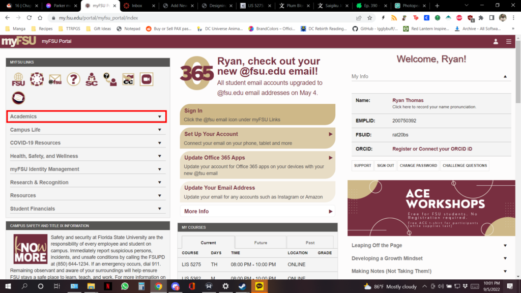
For this website I chose to use the school’s native website pictured below. The URL is https://www.my.fsu.edu/portal/myfsu_portal/index. I challenged a woman in her 50s to accomplish a set of tasks. I asked her to log in and access my CANVAS dashboard and check my grades. I then asked her to send an email to one of my professors. She has never used this website before but is technically savvy and has used similar university websites before.

Observations
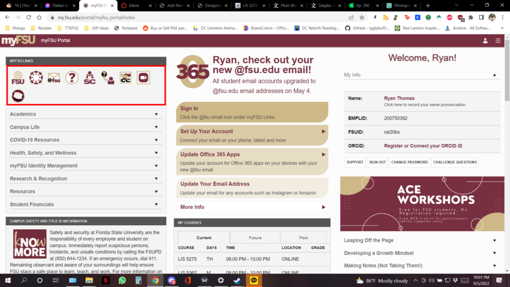
The first thing my tester did was click the sign in button. This was a very obvious and well done call to action button that was clearly labeled and colored in such a way as to stand out on the page. The next thing she did was to immediately check the “Academics” tab. This stood out to me because it was a logical conclusion to draw, that the way to get to class information would be under the academic tab. There is no clear call to action leading you to CANVAS visible on this page. The next thing she did was to mouse over everything on the screen to get the link descriptions. I’ve been using the website for so long that it didn’t occur to me that without someone being told to go to CANVAS specifically they would have no way to know how to access the classroom dashboard. This is something I would not encounter as someone with experience using the website. She decided that the icons under the MyFSU Links header were probably the most important and opened them in order until she found the CANVAS one. From there she was able to quickly identify the classes and click on them. Once at the classroom page, the Grades tab was clearly marked for the users, as was the Inbox tab.
Differences In User Experience Level
In the beginning the interface was able to assist my tester in logging in and reaching the main page from where other tasks could be carried out. However once there, there is a clear lack of direction from the interface. There are plenty of tabs that branch off into different sections of the website and containing different information but CANVAS is not clearly labeled and is in fact only identifiable if the user has a level of familiarity with the website or with the CANVAS logo. This is fine for experienced users of the site, but for new students this can be very debilitating and can hinder their ability to access critical information pertaining to their academics or curriculum. The FSU site is organized into very clear sections, but each section contains a lot of information that may be overwhelming to new users. One of the changes I would implement to solve this issue is adding clear labels to the MyFSU links using clear and concise language to tell the user what they do before they click on them. I think a CANVAS link inside the Academics tab would also make sense just to add an extra avenue of approach.