The Website
The website that I chose was the FSU Office of Admissions main landing page, which requires a user to navigate a series of buttons and menus in order to reach the content that they are looking for. I use this webpage every day, as it is the main reference page that prospective applicants to FSU must navigate to receive important information regarding admissions requirements and deadlines (and we try to reference students to the webpages so that they have easy access to these resources). I know the vast majority of the content on the pages that are housed within the admissions.fsu.edu domain and exactly how to navigate to important information in the most direct way possible. However, I also know (based on my use of the site before my current role, in addition to the plethora of confused emails I get each day) that this site is overwhelming and often unnavigable, especially for the young adults exploring their college options for the first time. (It is currently being worked on though! Many of the subsidiary pages have already been majorly revamped!)
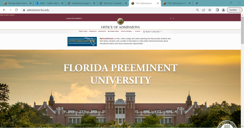
Although the initial landing page seems pretty standard and benign, as seen here:
An attempt to make the process more digestible is made with the use of photo buttons, which (although still a little bit of a lot it) does help chunk it nicely into our most common inquiries, but….
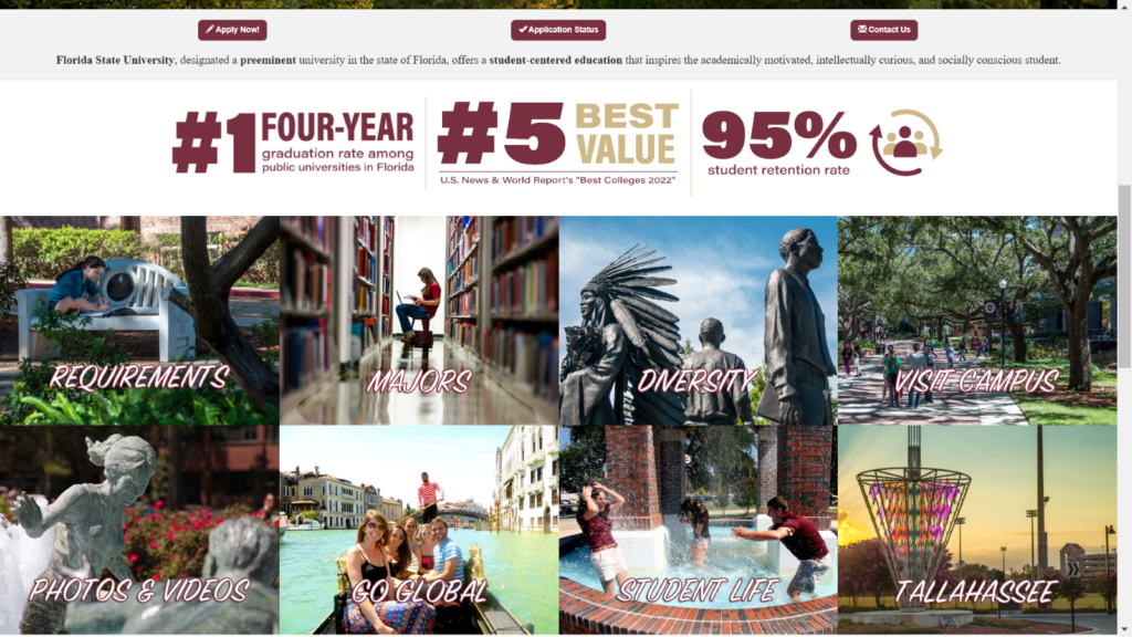
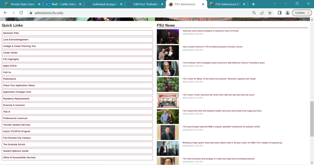
….if you scroll down just a bit more, it quickly becomes a mass of buttons and text with minimal organization.
The User
For this assignment, I wanted to see how a prospective student might engage with the admissions website to find necessary admissions information to begin their application and know relevant materials and deadline info.
I asked someone who may be interested in applying at some time in the near future to run the test for me. Their aims were to find out more about how the application process differs between First-Year and Transfer, and to see which cohort they should apply to, what majors they can apply to and what the requirements may be, and information about scholarships.
The user is a young woman (18-24) who is very technologically savvy; she has taken computer coding courses, is a social media marketing chair for an organization, and has built her own computer. She is likely more technologically competent than many of the users who utilize this site on a regular basis. She also has lots of opinions and is emphatic about design choices, so I had a lot of fun watching and listening as she went through the pages.
User Actions
The user began by navigating to her Google Chrome browser….on her phone. I honestly did not think to specify at first that we should do it on a desktop/laptop. So, we started with that, since I felt like it would be more authentic to most of our user’s experiences anyway. (The main difference between the two layouts is that everything is stacked on top of each other, so slightly less overwhelming than the desktop layout.)
The user ignored the hamburger menu (which concealed the options for “First Year,” “Transfer,” “Graduate,” etc.) and chose instead to open a new tab from the Apply Now button……which loops back to the main Admissions homepage… This brought about from the user a fun expletive and a quizzical head-tilt. She clicked the button to open in a new tab again, and the same thing happened. After a small grrr at the screen, she went back and simply clicked the button and saw that it opens a pop-up menu to the different application types. She chose First-Year (“since it’d be my first year there!”), clicked the “Apply Now” button on the new webpage that opened up and got to a User Log In screen where she had to make an account to continue. Getting annoyed with the relative lack of info on previous screens, and not sure if she was entirely in the right place, she decided to back out to go look at the different application types and their requirements.
Since she noted how annoying it was to have to back out and try to find the pages again (since opening new tabs had so far been futile), I mentioned she could use my laptop to finish going through everything. We moved to the Google Chrome browser on the laptop, booted up the landing page, and as soon as she scrolled down and saw all of the picture buttons and Quick Links, she screamed and flopped back on the couch.
At this point the user looked at me dejectedly, but said they were going to try one more time to find the info. She decided to ignore the Apply Now! button “because [she] hates it” and instead scroll back down to center the page on the photo buttons. She chose requirements, grumbled at the pop-up menu before choosing First-Year, screamed when she saw the wall of buttons (see below) and closed the laptop. Overall, the user test was an adventure for both of us.

(To be fair, I did help her find what she was looking for later that evening, and she said that it honestly wasn’t that bad once I showed her where to find what she was looking for…but she just got so frustrated with the looping and walls of buttons that she just stopped caring at first. Granted, she did say that she eventually would have had to come back and try again, since she was actually interested in potentially applying…but that she got so overwhelmed with it all as a first experience that she would have had to wait a while before diving back in. She also said she would have probably called or emailed for help (both of which she hates having to do) because she did not feel like she could find what she needed without feeling overwhelmed.)
Recommendations
The biggest thing I think this site needs is fewer text buttons. Just that change alone is probably the most important thing. However, I also know that many of these buttons are necessary, and many more must remain on the landing page. To that end, I think what would really help is to organize the buttons into main sections throughout the page, so that the buttons are all grouped together in closer proximity to relevant other buttons. The page could also be delineated in a variety of ways, although delineating by application type seems the most logical to me. I think, also, utilizing the photo buttons more intentionally (fewer of them grouped together, for starters) could be very useful as well. As they are, the photo buttons offer some reprieve, but are still themselves relatively overwhelming since they are arranged as a double-stacked wall.
Additionally, I feel like sectioning out the page to include relevant info by application type (such as a section for First-Year that includes a button for Requirements, Deadlines, Majors, etc.) would solve the looping problem that my user had. The pop up menu is not always intuitive, and the fact that so many of the broad categories include the pop-up menu instead of each of the app types from the pop-up menu having its own section with relevant informational buttons lead to a lot of frustration and confusion. Perhaps it is less of an issue with less tech-savvy users (not everyone is going to try to open something as a new tab instead of just clicking the link), but the sections would also help less tech-savvy users quickly scan and find relevant information.
Overall, the site is not unusable, it is just a lot. And most of the information presented on the site is relevant and required, so it is not as simple as just taking out extraneous information. A lot of work is being done to make this site more navigable, and I am excited to see the changes (and receive fewer confused emails).