by Jennifer Ritter
Context: the app, the “expert”, and the test-user

The Wegmans grocery store app is used to create shopping lists, store customer loyalty cards, digital coupons, and so much more…
The Wegmans app was selected as the test site because it is the only technology that I use which the millennial test-user has never used before.
The “expert” in this test is a 50+ year old who uses technology very pragmatically. When a need arises, the “expert” discovers how to meet this need and then typically explores no further. For these reasons quotation marks are used with the expert label for this individual, and for the remainder of the post “I” will be used instead.
The user-tester is an 18 year old millennial who has used technology extensively for school, entertainment, and communication for the last 5 years or so.
Test-user performance
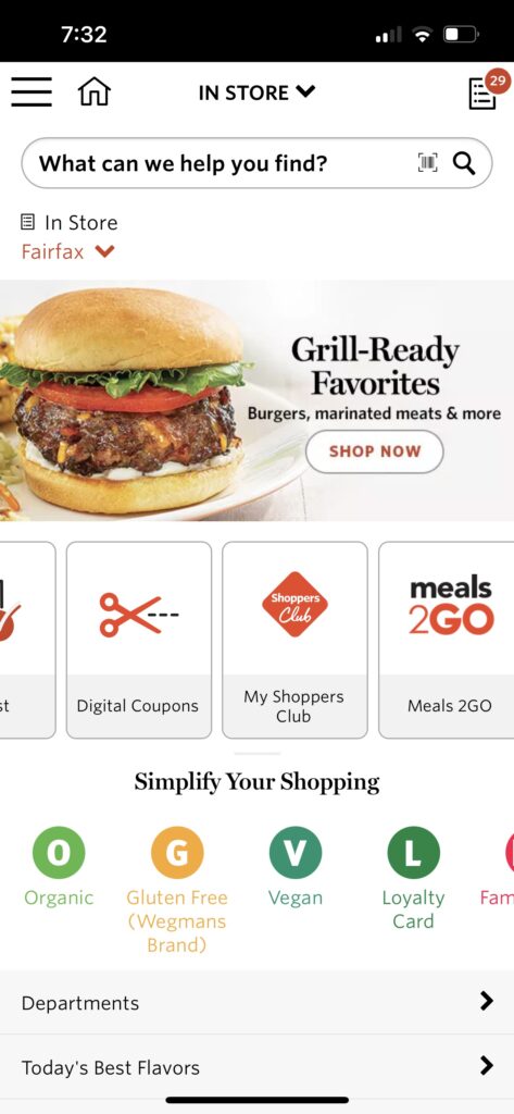
The user-tester was asked to download the app and then determine what it would be used for. He scrolled through the app, both vertically and horizontally, and decided to try the “meals2go” feature. This feature opens a page in the web browser which has the option to download a separate app for meal ordering, or the user can order prepared meals directly from the web page.
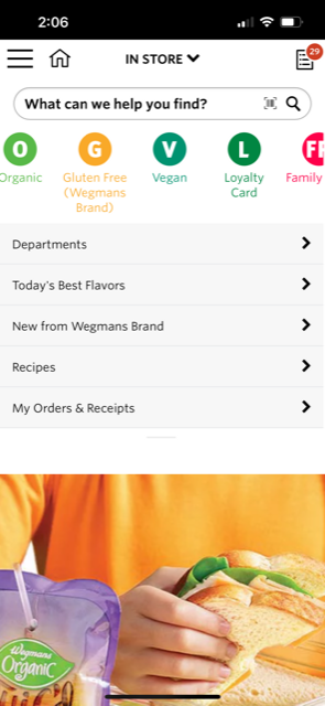
He was then instructed to go back to the app and make his guess about the purpose of the app. He thought it was best used to browse the store’s product selection and he would use it to find out if they sold items he was interested in. The app actually performs poorly for product searches. Items known to be on the store shelves are often not found at all in the database, and even items in the database are not found when exact product names are used, including name-brands. I have learned which words will help me locate the products but often I have to scroll through a number of other items as well.
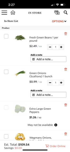
The tester was then informed that I use it make shopping lists and he was asked to compile a specific list of items. He did not encounter any problems doing so.
Usability evaluation
“In trying to make it convenient, they made it overly complicated.” This was the final analysis of the user-tester after using his list to shop.
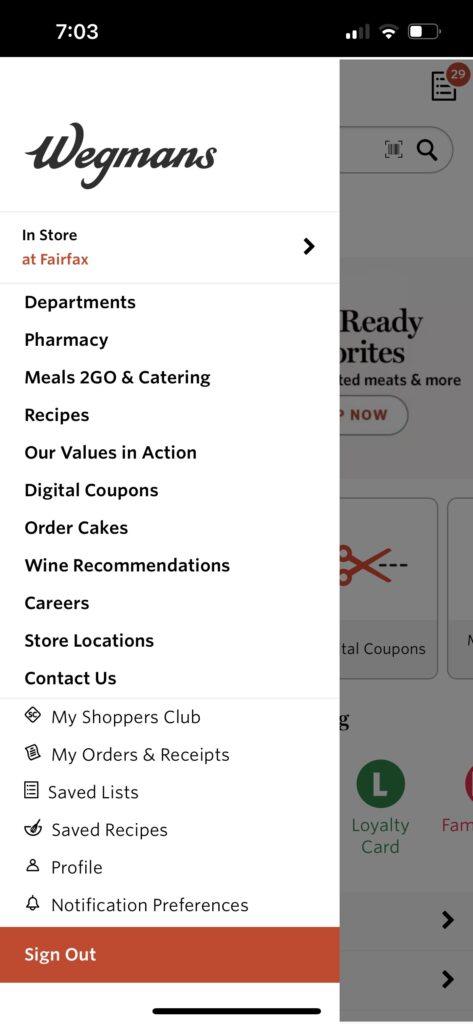
The user-tester also expressed confusion over the main purpose of the app due to its cluttered appearance. We jointly explored the app after his testing and he reiterated his opinion expressed above, that the app is simply trying to do too much. Besides browsing products and making shopping lists, you can clip digital coupons, find and save recipes, look at store locations, see past orders and receipts, link to the catering site, and even apply from a job, amongst other things.
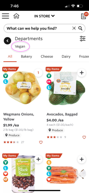


Besides doing too much, the app itself and its database are poorly organized. Ironically “Simplify Your Shopping” is written on the bottom half of the initial view when the app is opened. I think this is describing the icons just below that statement which have very little value. For example, the first page displayed using the “V” vegan icon is the produce department. As a sometimes vegan, I would have expected it to link to vegan alternatives of non-vegan products – but no vegan “cheeses” are found here. Applying the filter for cheese and dairy gives a “No products” message, when in fact, the store has plenty of options.
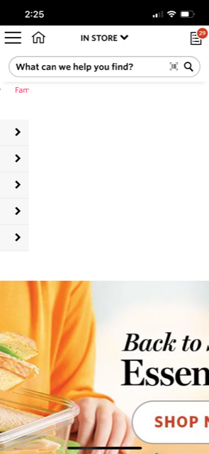
In addition, the app is not formatted for mobile devices. There are multiple horizontal scrolls and two advertisement photos that do not fit on the page. While the entire photo is a link to the product page it is advertising, users have to scroll to the left in order to see any text and the actual button to link to the department.
Wegmans would have more users if they reorganized their database, reformatted their app, and simply removed some options. A simple layout using only a vertical scroll would assist users decide what tasks are available and which actions they want to take.