We incorporated the feedback we received during the in-class review of our redesigned vision of the Sarah Maker website and made the following changes to make navigating even easier for the beginning crocheter (and knitter!):
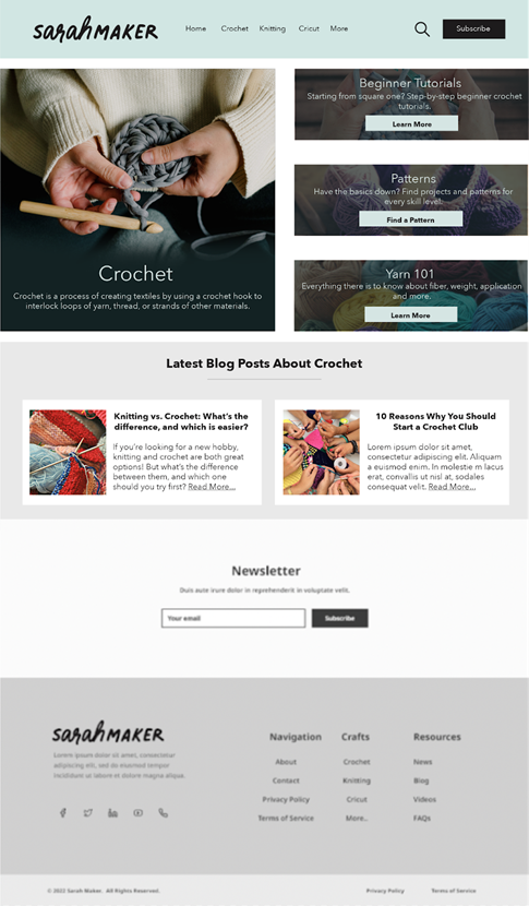
In our first iteration of the redesigned crochet landing page, we had links to both a “get started” page and a “beginner tutorials” page. A beginner might not know where to go first, so the page has been redesigned with a large crochet image (not linked to anything) to establish the page identity and all the beginner information is combined into one link.
Redesigned Crochet Landing Page
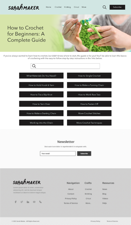
We have included a version of what this new all-in-one beginner crochet page might look like. Instead of a mishmash of hyperlinks hidden among paragraphs of text on one very long page (as is currently found at https://sarahmaker.com/how-to-crochet/, the different instructions have been divided into different pages with highly visible buttons. In addition to the very first lessons about materials and how to hold your hook and yarn, there are links to each of the basic stitches a beginner needs to learn. We have also included a search bar for the crochet section so that a user can find what they are looking for even if they are not familiar with the terminology they see in the buttons.
Crochet Beginner’s Guide Page
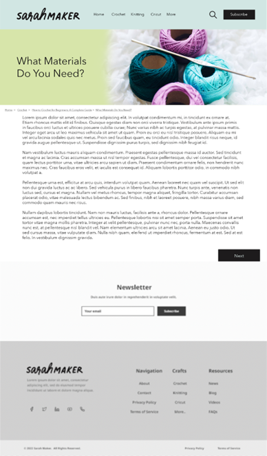
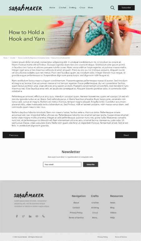
If a user uses the buttons and starts from the beginning, they will be taken to a new page that shows the instructions for each section. These pages also have “previous” and “next” buttons at the bottom (as appropriate) so that the user can easily navigate from one set of instructions to the next, as they are laid out in the order that a complete beginner should go through them. The pages for the first two links (“what materials do you need” and “how to hold a hook and yarn”) are shown below.
Materials Guide Page — First Page of New TutorialsHow to Hold a Hook and Yarn — Second Page of New Tutorials
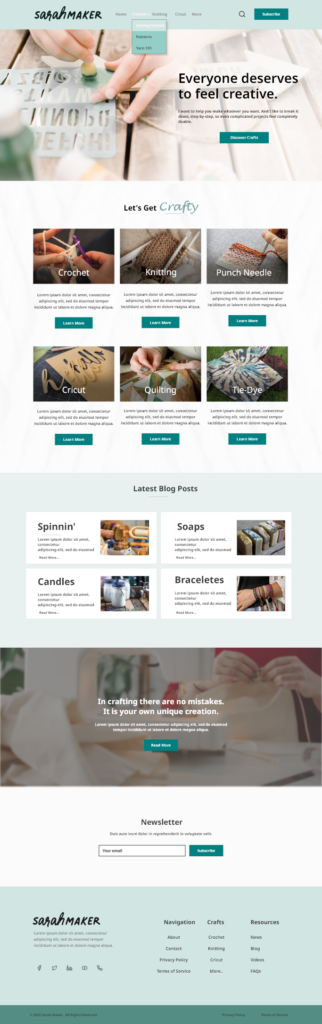
Since Sarah Maker also includes knitting patterns (and her original layout is just as confusing as it is for crochet) we also redesigned the knitting landing page to match the crochet page. This will add a level of consistency for the user as they navigate through the site. The rest of the knitting section would be structured similarly to the redesigned crochet section.
New Knitting Landing Page — Matches Crochet Landing Page
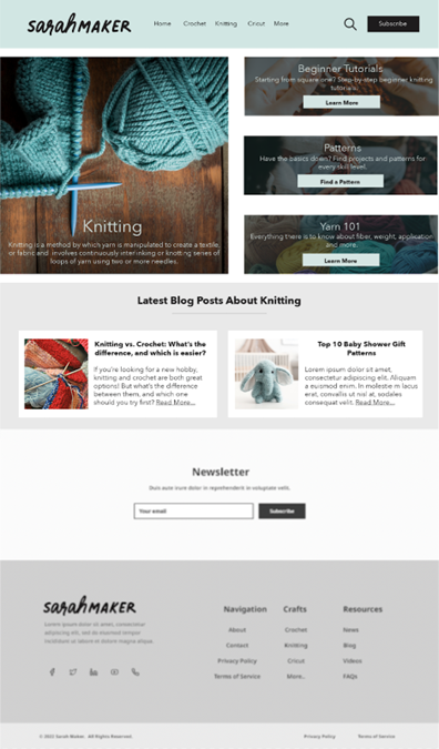
Finally, in our previous post, we had the layout of the redesigned homepage, but we hadn’t had a chance to add pictures and colors to make it mesh with the new craft-specific landing pages. The new iteration includes images of each craft as well as inspiring words to get the user excited to discover new crafty activities.
New Homepage
We hope that our redesigned version of the Sarah Maker website will encourage visitors to spend more time on the site, not because they are frustrated by trying to find the information they want, but because they find it a welcoming and easy-to-navigate resource that they can come back to again and again. The new organization and functionalities should impress both current users and those who are coming to the site for the first time!
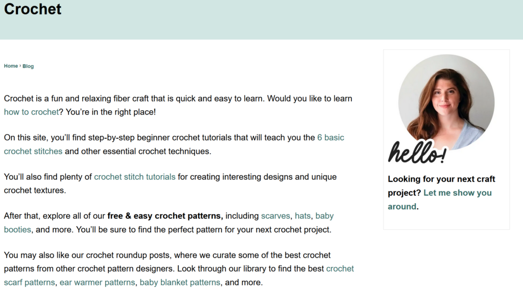
The Arts and Crafts group has chosen to evaluate sarahmaker.com, a website run by a woman named Sarah who describes herself as “collecting hobbies” – that is, she loves crafts and wants to share ideas, patterns, and instruction with the world. The main menu headings at the top of the page are Crochet, Knitting, Cricut, and Crafts (this last one has a drop-down menu leading to several other categories, including friendship bracelets, jewelry making, and tie dye). Since crochet is the first menu heading and the first craft she mentions in her bio, it is the craft our group chose to focus on most heavily for our user testing.
Sarah Maker Home Page
The User
Our persona is that of a social-media savvy young woman who wants to learn to crochet after being inspired on Pinterest. She has been wanting to start crocheting for years, but finally has the free time to begin the hobby. My actual user mirrors our chosen persona surprisingly well – when I described it to her, she said, “that’s practically me.” She is woman in her twenties who wants to explore many different crafts (including crochet!) but hasn’t found the time yet to do it. After going through the user tests on Sarah Maker, she felt even more inspired (but probably still doesn’t have time).
User Testing Method
I used the Think Aloud method to conduct my user test. Since I only had one user tester and no fancy monitoring equipment, I sat next to her while she was on her laptop and asked her to narrate her thoughts as she moved through the tasks and took notes as she did so, asking clarifying questions if she clicked on something without explaining why she did so. She was very good about walking me through her process and required very little prompting.
User Tasks – Overview
Our original tasks were as follows:
Task 1: Find instructions for a complete crochet beginner who has no idea where to even start with the craft.
Task 2: Learn what different types of yarn and thread are good for different types of crafting.
Task 3: Find a beginning crochet project that would make a good holiday gift for friends or family.
I presented the tasks to my user one at a time, using the same wording from the previous assignment. However, I ended up giving them to her in a different order due to how she was exploring the site. As she was completing Task 1, she naturally flowed into Task 3 (with a brief comment that was related to Task 2). I let her continue exploring Task 3 before redirecting her back into Task 2.
User Tasks – Detailed Analysis
Task 1
For Task 1, I asked my user to find instructions for a complete beginner to learn to crochet. She immediately clicked on the Crochet menu at the top of the page. She started reading the descriptive text and missed the “how to crochet” link that was embedded in the first paragraph but noticed the “6 basic crochet stitches” link in the second paragraph and clicked on that (many of the embedded links on the site are difficult to see, as they are not in a highly contrasting color and don’t show an underline until you mouse over them). She scrolled down and noticed the bullet points of the different kinds of stitches (she either didn’t notice or didn’t mention that only four of the six stitches in the list had hyperlinks). However, just after that, she saw the embedded link for How to Crochet: A Complete Guide for Beginners, and clicked on that (she opened it in a new tab so that she would still have access to the stitch page). This took her to the same page that she would have gone to if she had clicked that first hidden “how to crochet” link.
Main Crochet Page on Sarah Maker
My user mentioned that she liked seeing the photos on the page as she continued to scroll down. She commented on each section as she read and clicked on the links that caught her interest, opening them in new tabs. The two she clicked on were the “crochet supplies for beginners,” where she appreciated the division of tools into “need to haves” and “nice to haves,” and the “worsted weight yarn” link because she was curious about what that was. (That was her brief foray into Task 2 before I introduced it to her.) When she got to the bottom of the supply list page, she noticed that she had already read two of the three related articles that were linked (the “how to crochet” guide and the “6 stitches” guide). The third one was a pattern for a beginner crochet scarf, but she didn’t click on that yet because she didn’t want to confuse herself.
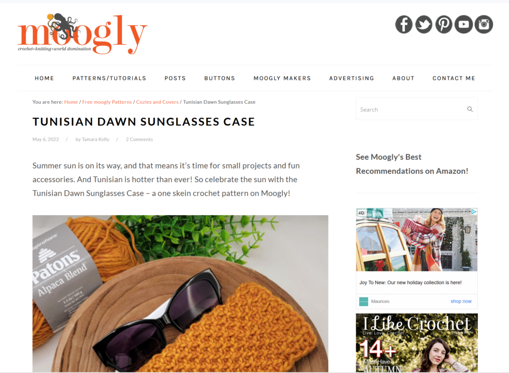
Even while saying that, she went back to the main Crochet page to find more information about basic crocheting and scrolled down, and was immediately drawn to the “27 Free Tunisian Crochet Patterns (Beginner-friendly!)” link. She said she was curious about them because the title drew her attention. She kept scrolling down the Crochet page to see if there was more beginner information, but only saw collections of different types of patterns. She wanted to see if there was any kind of FAQ at the bottom of the page, but there was not. (She didn’t click on the About link to see if that had anything.) She went back and clicked through the different pages of the crochet links, looking to see if anything was tagged as being appropriate for beginners, even before I introduced Task 3, which was to find a beginner project that she could make.
Task 3
Since she on her way toward Task 3 already, I formally introduced it by asking my user to find a beginner-friendly project that she could give as a holiday gift to friends or family. She remembered seeing a link for 25 Crochet Gift Ideas on page two of the crochet patterns, so she navigated there but realized that it didn’t have a beginner tag, so she returned to the Tunisian crochet patterns she had seen earlier. As she scrolled through them, she didn’t necessarily think they looked like beginner patterns, but she clicked on the instructions for the sunglasses case to see if it looked doable. The first thing she noticed was that she was taken to an external site. She scrolled down past the introduction and noticed that it provided a materials list, as well as links for tutorials to the different kinds of stitches and techniques that are required. When she read through the instructions, she knew she would have to refer back to not only these tutorials, but general crochet instructions so that she could follow all the abbreviations in the pattern. She decided she probably could create the project if she followed the instructions carefully.
Sunglasses Pattern on an External Site
Task 2
I then redirected my user back to Task 2, which asked her to learn about different kinds of yarn and thread for different kinds of crafting. Remembering the link about worsted weight yarn that she found in one of the crochet guides, she went back to the main Crochet page one more time and navigated to all the pages in hopes of finding an informational article about yarn. She only found links to collections of patterns, so she used the search function at the top of the page to search for “yarn.” That yielded 22 pages of results, including a general guide to yarn. (Interestingly, when I just searched for it now on my computer to recreate her journey for this blog, that article did not show up in the search results, but it did when I searched on my phone.) The article she found had a lot of good information, including a yarn weight chart and tips for determining yarn weight. It also had links to other yarn crafts at the end.
User Difficulties and Design Recommendations
Overall, my user moved smoothly through the tasks without too many difficulties, but there were a few areas where tweaks to the site could make it easier to navigate. In Task 1, where she had to learn the basics of crochet, she missed the first link to the crochet guide, but saw the next one about crochet stitches – which eventually gave her another way to link to the main crochet guide. It’s good that that guide is linked in so many different articles, but it should be more prominently displayed on the main Crochet page. If the hyperlinks were underlined or at least highlighted in a more contrasting color, they would be much easier to spot. The text could also be rewritten so it’s less like a conversational blog – bullet points would be easier to follow.
Similarly, the very long pages of text involve a lot of scrolling, and it’s easy to miss important information. Shorter pages and/or clearer section differentiation would make information easier to find. For example, when my user was trying to learn about different types of yarn, she wanted to have specific recommendations for each project, because she knew that using the wrong weight of yarn can make your project turn out very strangely. On one of the links she clicked, the 25 Gift Ideas, there is a whole section about choosing yarn for gifts, but because there is so much text, she scrolled right past it. Having a separate page or expandable/collapsible sections could alleviate that problem.
Searching for beginner-friendly projects was possible, but could also be streamlined for ease of use. My user kept referring to posts that were tagged as beginner, but there was no actual tag there, only a parenthetical note after the title of the post. Adding an actual tag, or adding a drop-down menu from the main crochet menu, could make different levels of projects easier to find. The drop-down menu could also include links to the yarn articles, since the only other way to find those appears to be through the search function. And since the search function seems to be inconsistent (an article that showed up on my friend’s computer and my phone did not show up on my computer), it doesn’t give me confidence that it will show me all the resources a user could need. An FAQ at the footer of the site with links to basic instructional and informational posts (which my user looked for at one point) would also be helpful.
My last main recommendation doesn’t strictly address usability, but I always prefer a site to tell me when I’m about to be redirected to an external site. My user was surprised when the pattern she clicked on took her to another site. If you are trying to learn a new craft, consistency in directions and style is important, and being taken to an entirely new set of instructions can be disconcerting. Linking to an external site is fine – it should just be noted in the link to the post so the user is prepared.
Sarah Maker contains an amazing amount of information for beginning crocheters and other crafters. It is functional and navigable, but a few tweaks in format could make it an even better resource for beginners and advanced crafters alike.
When I am not busy making friendship bracelets, I also love doing origami. When I’m folding at home, I like to work on advanced models from my print book collection, but sometimes I find myself searching for an easier model that I can teach to a group of people. There are many instructional origami sites; for this assignment I am focusing on Origami Resource Center.
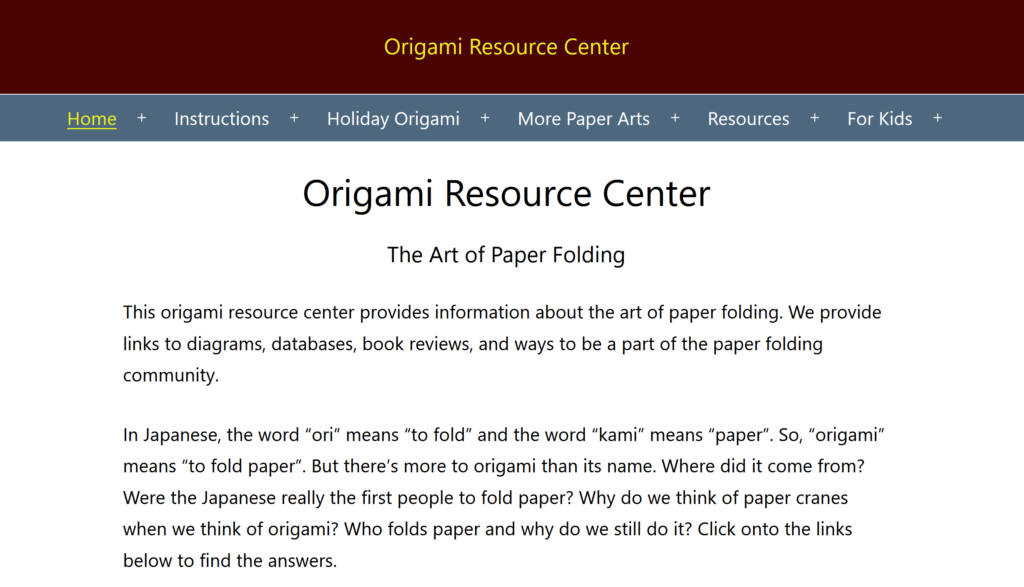
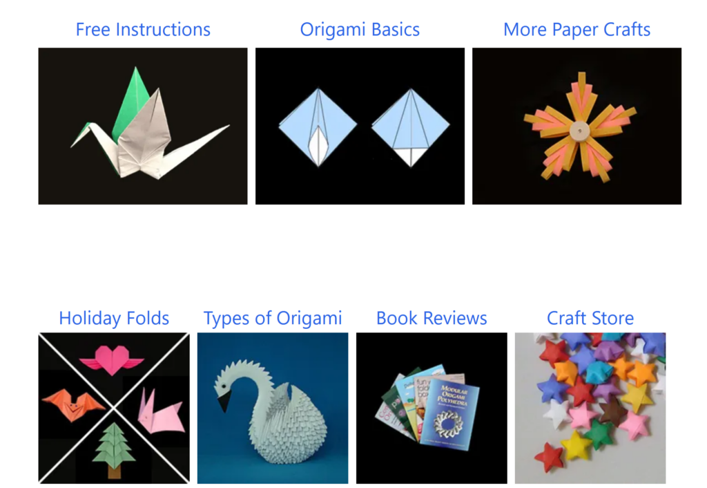
On its home page, Origami Resource Center describes itself as follows: “This origami resource center provides information about the art of paper folding. We provide links to diagrams, databases, book reviews, and ways to be a part of the paper folding community.” The title of the page is in small print at the top, with several categories of drop-down menus underneath: Home, Instructions, Holiday Origami, More Paper Arts, Resources, and For Kids. Scrolling down past the introductory text, there are 15 hyperlinked pictures which partially correspond to the menus at the top, but are not exactly the same.
Top of the Home Page of Origami Resource Center — this is everything that is visible before scrolling.7 of the 15 main categories linked in photos on the home page. They do not always line up with the menus at the top of the page.
Evaluation Scenario
For my scenario, I have decided to look for an easy-to-fold bird model on Origami Resource Center. I am not picky about the type of bird, but I would prefer it to be recognizable as a species or family of bird rather than a generic bird-shaped object.
Working Through the Scenario
I start on the home page, where the first thing I notice is that the “Home” menu is underlined and highlighted in yellow, and that all the drop-down menus have plus signs interspersed between them. Mousing over these menus expands them and turns the plus sign into a minus sign. I’m not sure exactly what the point of the yellow highlighting is (I’m guessing it’s to let you know what main section you are currently in) or why the plus sign is so far away from its related word. This violates the Consistency and Standards heuristic, as the drop-down menus look and act unconventionally. It also violates the Aesthetic and Minimalist Design heuristic – although the top of the page doesn’t have a lot of extraneous information, once you scroll down (and you do have to scroll to see anything besides the introductory text), the 15 categories to choose from seem excessive. Some of them could be grouped together under the same categories you have at the top – for example, the Resource menu at the top contains links to both Health Benefits and Educational Benefits pages, but those two pages each have their own link in the 15-category spread, while Resources does not. This violates the site’s own internal consistency as well as the consistency you expect from visiting other websites.
Finding the Models
Once I get past the oddly organized home page, there are several ways to start looking for specific models. I can click on the Instructions menu at the top and then click on Birds, I can mouse over the Instruction menu and click on the Birds drop-down, I can click on the Instructions photo in the middle of the page, or I can scroll all the way down past the 15 boxes and click on the Birds photo in the category links. This last option seems excessive and violates the Aesthetic and Minimalist Design Heuristic – there are just too many pictures on the page, especially when you consider that not until you scroll past even this last set of categories do you get to the search box. Having the search box so far down also violates the Consistency and Standards heuristic, since most sites have the search box in a top corner where it easy to access.
In the interest of testing more of the site navigation, I go to the main Instructions page before I go to the Birds page. Now, the Instructions menu at the top is yellow and underlined, as the Home menu was before, which seems to confirm my hypothesis about using the highlighting as a signpost – except that now the More Paper Arts menu is highlighted in the same way. This causes confusion and violates the Visibility of System Status heuristic – is the More Paper Arts menu connected to the Instructions menu in some way? When I click on it, it jumps me close to the bottom of the page under the headline Origami Fringe, which has links to only six of the seven categories found under the More Paper Arts menu up top.
After getting distracted by the extra yellow highlighting and following that path (a path I probably would not have taken were it not for the lack of Aesthetic and Minimalist Design), I finally make it to Origami Birds. After a brief text introduction, there are ten hyperlinks to different categories of birds (the first one being the extremely non-specific “birds”), each of which will jump you to the categories on the same page. Alternatively, you can scroll all the way down the page to see the categories as will as the list of the individual models.
Narrowing Down My Options
Since I don’t know exactly what kind of bird I want to make, I decide to scroll down and see what catches my eye. There are photos of completed models on either side of the list of birds, but they appear to be a random selection of models within the category. They seem to be a random selection of photos within the category, and they are not hyperlinked to anything, so there is no way to accurately preview a model. (After writing the rest of this blog and going back to take screen shots, I realized that you can mouse over the photo to see what model it is. They are still not hyperlinked, though.) This violates Visibility of System Status, since you do not have a visual cue of where to go next, as well as Match between System and the Real World, since the pictures do not line up with the appropriate models.
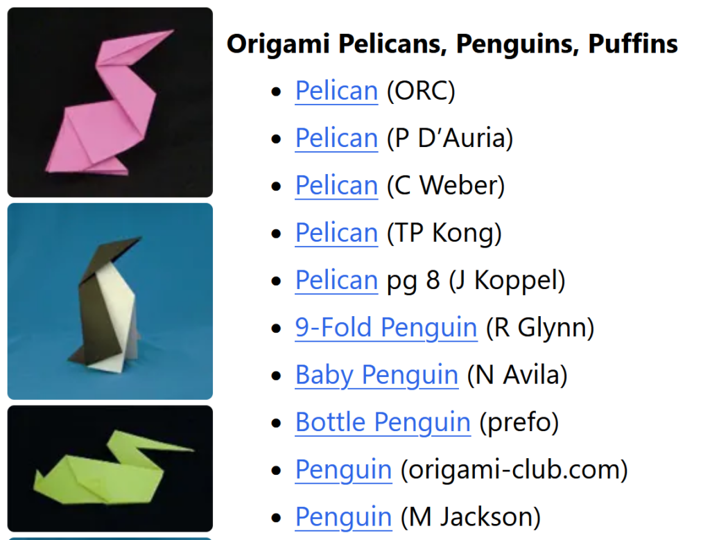
For no particular reason, I decide to explore the Origami Pelicans, Penguins, and Puffins category. There are 6 photos and 24 models to choose from, so I click on the first model (a pelican). It takes me to a page that corresponds to the third picture on the previous page (violation of Match between System and the Real World – the first link should not match up with the third picture).
Some of the photos and models from the Pelicans, Penguins, and Puffins section. The photos on the left do not directly correspond to the links on the right, nor are they hyperlinked to the appropriate instructions.
Evaluating the Instructions/Diagram Page
The description says the pelican is easy and less than 10 steps. It also more or less resembles an abstract pelican, which makes it matches my initial requirements. The text instructions are listed on the left side of the page, and the diagrams are in one image on the right. While it’s possible to follow this, it’s much easier when the instructions are visually linked with their matching diagrams (another problem with Match between System and the Real World). Despite it being an easy model, there are a few technical origami terms that aren’t explained, such as “valley fold” and “reverse fold.” You can find these under the Resources Menu –> Origami Basics at the top of the page, but there should be a more obvious link for it at the top of the instructions (one more issue with Match between System and the Real World, with the possible addition of Recognition Rather than Recall, since users will have to either memorize the meaning of the steps or go back and forth between two pages).
While in this case I have decided the pelican model is a reasonable one to teach to beginners, if I want to go back and explore the other models available, I have a couple more options at the bottom of the page. There is a link to “more origami pelican and birds” (which takes to you back to the top of the birds page, not the pelican/penguin/puffin section — also, every other link has been in title case and this one is all lower case) and then a photo gallery of “More Origami Birds.” This is perhaps the most egregious violation of Match between System and the Real World, and also of Visibility of System Status – when you mouse over one of the photos, it tells you exactly what model and artist it is, but when you click on any one of them, it takes you back to the general bird page again! Once you get there, you have to figure out what subcategory the model you liked was in and remember the name (Recognition Rather than Recall).
Design Recommendations
There are several design fixes that would make navigating Origami Resource Center less frustrating:
On the home page, the drop-down menus at the top should match the photo icons halfway down the page. This would keep the user from feeling like they’re missing important parts of the site because the main categories and the subcategories don’t match (Visibility of System Status, Match between System and the Real World.
Move the search box to the top of the page so it is easily noticeable and accessible (Consistency and Standards).
Line up the photos of the completed models with their matching instructions and link said photos to those instructions (Visibility of System Status, Match between System and the Real World).
Have an easy link to Origami Basics at the top of each instruction page so beginners can follow the diagrams (Recognition Rather than Recall).
For the photo gallery for the related models at the bottom of the instruction page, link those photos directly to the pictured models rather than to the general category page (Visibility of System Status, Match between System and the Real World).
There are so many different directions we could have gone when it comes to arts and crafts on the web – biographical and portfolio sites from fine artists, e-commerce sites for buying arts and crafts, instructions on how to make crafts, and more. While we found all of these sites interesting, we ended up choosing to focus on instructional sites because of their high potential for interactivity.
There is still quite a bit of variety when it comes to instructional arts and crafts sites. Some are aimed at parents or teachers of young children, some focus their attention on teen and adult hobbyists, and some are designed for professionals to share techniques. People coming to use these sites will have differing levels of computer and website navigation skills, so it will be interesting to see how usable, functional, and accessible they are.
It will also be interesting to compare sites that differ in their pricing structures. Some make their instructions and templates freely available to anyone who comes to the site, while some require users to create a free account, and others restrict access to those who pay a fee.
The size of a site (and accordingly, the number of people who run or are admins on a particular site), can also greatly affect usability. A site like Pinterest, which has a central hub but depends on many different individuals to create and organize its content, has a very different feel and level of usability from a site like Easy Peasy and Fun which was originally started by one person and has more of a blog feel.
Lately, I’ve gotten back into making friendship bracelets (they’re a lot more complicated than you might remember from summer camp!). I found a site, www.braceletbook.com, that lets you find friendship bracelet patterns, generate patterns, see photos, watch video tutorials, and participate in a forum. I’ve been spending a fair amount of time on this site recently, and so I asked my friend to take a look and see what she thought.
BraceletBook Homepage
The Tester
My friend describes herself as moderately technically proficient, knowing “just enough to get by on most websites” but also notes that she knows how to look up anything she is unsure of. Her initial impression of BraceletBook is that it seems like a combination of Pinterest and Instagram. She is familiar with both of those sites and uses them relatively frequently.
Initial Exploration
Since my friend had not seen or heard of BraceletBook before, I gave her a brief overview while letting her start to explore on her own. The home page shows previews of a few different sections of the site, including Hottest Patterns, Latest Patterns, Latest Photos, and Latest Videos. The first thing she mentioned was that it reminded her of Instagram because many of the patterns showed “likes” underneath the thumbnails. She clicked on a pattern that interested her and immediately noted all the information that showed up at the top of the page – the dimensions of the pattern, the number of strings required, and the number of colors required. She wondered how to find what colors were needed and then scrolled down and realized that you had to look at the pattern itself to find the colors. I asked her how she would find out if that pattern had a photo attached – she didn’t see the little camera icon at the top of the page that had a “0” next to it but did scroll down to the bottom of the page, where she thought photos might be based on where she would find them on Amazon. While that is where they show up when they are available, this pattern didn’t have any photos attached (hence the “0” at the top).
Colors and knotting instructions for a pattern
After looking at that first pattern, my friend started exploring different aspects of the site, from the photo page to the tutorial page (she liked that the video on the tutorial she picked was embedded) to the video page (which she discovered also had video tutorials). I then asked her to find a specific pattern by its number, and she clicked on the pattern page to search for it, which was the correct path to take. If she had searched directly from the video page, she wouldn’t have been able to find it because there is no video listed for that particular pattern. Because the filter options look the same on each main page except for the title, this isn’t necessarily clear to a novice user. However, she navigated it well.
Filter options on the Patterns page. The filters look the same on all the pages, which makes it confusing to find a specific pattern if you are, for example, on the Tutorials page and the pattern you want doesn’t have a tutorial.
I asked her to do a few more specific tasks on the site to observe her process. I asked her how to tell if specific patterns had photos and/or videos attached to them, and at that point she was able to find the icons at the top, although it wasn’t until she found a pattern with multiple photos that she noticed the numbers next to the camera and recorder icons. I then tried a more abstract question – could she find a description of the difference between “alpha” and “normal” style bracelets? She used the keyword search in the patterns, which was a good thought, but it did not get her to the answer. She ended up opening another tab and googling the answer. (For those who are curious, alpha bracelets are more like pixel art and go straight across row by row, where normal bracelets tend to be more geometric in design and have diagonal rows.)
Alpha bracelet with keyword tags and bracelet info
Normal bracelet with keyword tags and bracelet info
The trickiest task I had her do on the site was to filter only by alpha or normal patterns. She tried the keyword search at first, but while “alpha” is a tag in at least some bracelets, “normal” rarely is. I eventually gave some hints for her to find the option to filter by type at the top of the page – most of the other filter options are pretty straightforward, but you have to be at least semi-familiar with bracelet making and the site in order to know to choose that filter.
Novice vs. Expert
I hesitate to call myself an expert yet on BraceletBook, as I am sure there are features I have still not discovered, but I noticed a difference in ease of navigation between myself and a first-time user (further discussed below under User Interface). One area my friend clicked on that I had never looked at was the social media link section at the top of the page. She clicked on the Facebook link, which opened a pop-up window with an error message. (While typing this up, I just tried it on my own computer and it took me to a link to share the pattern page I was on). She also tried Pinterest, which on her computer just showed a window with the BraceletBook logo and on mine showed the actual pattern. She was using Chrome while I use Firefox (as it turned out, she and I also discovered that the print function worked much better on her browser than on mine).
User Interface
There were several times when the interface hindered my friend’s navigation, most of which I also encountered when I began using the site. For instance, when clicking on videos from the video page rather than the tutorial page, it took her a few tries to exit out of them, as there is no handy “X” at the top of the video. Eventually she managed by clicking far outside of the video screen; I usually exit with the ESC key. Once, she was looking at pictures on the photo page and wanted to navigate to a particular pattern but clicked on the photo thumbnail rather than the pattern number, which just opened the photo. It takes some time to realize that clicking on a pattern thumbnail takes you to a pattern, but clicking on a photo thumbnail only takes you to that particular photo.
Suggestions for Improvements
There are several improvements that could be made to help novice users. Both the About section and the FAQs are extremely tiny links at the bottom of the page – not an unusual place for them to be, but because there is so much information on each page, it takes a lot of scrolling to find them. They should be more prominently featured at the top, which would have made it is easier for my friend to get some of her questions answered. For example, she was wondering what user rankings meant, and the answer is in the first FAQ.
That said, one of the questions I originally asked her, about the difference between alpha and normal patterns, is not specifically answered in the FAQ or the About section – there is only a link to the general tutorial page. That seems like a big omission for beginning bracelet makers. Another major issue we ran across is the keyword search functionality. My friend noticed a pattern with the Disney character Stitch and clicked on it. Since I am also a fan of that character, I had previously done searches for patterns with Stitch and asked her to do the same. It turns out that when you write “Stitch” in the search box you get a lot of irrelevant patterns, since the knots of a bracelet look like stitches for sewing, making it a common tag. Logically, you would think the next step would be to search for both “Disney” and “Stitch.” Unfortunately, when you do, the keywords are additive rather than subtractive, and now you get every pattern that is tagged with both “Disney” and “Stitch,” and using Boolean operators doesn’t change the results. (Again, for those who are interested, it turns out that you can search for “Lilo” and suddenly all the Stitch patterns show up as well.) Adding keywords that filter rather than add extra patterns would be a major improvement to the site. Overall, the site has a lot of great functionality, but a few design tweaks would make it friendlier for both expert and novice users.