Group Assignment 3B

Group Libraries – Jasmine Philips, Caitlin Hattaway, Christopher Gregor, Colin Webb, Erin Seaman

The focus of our redesign iterations have predominantly concentrated on the homepage of the Wilderness Coast Public Library website. During user testing, we found that the design and the layout of the homepage was confusing and not very user friendly. When doing our user testing, our users thought that the design of the website was not cohesive throughout, the majority of pertinent information was written in bulk text, and locating the catalog to search for books was difficult. 

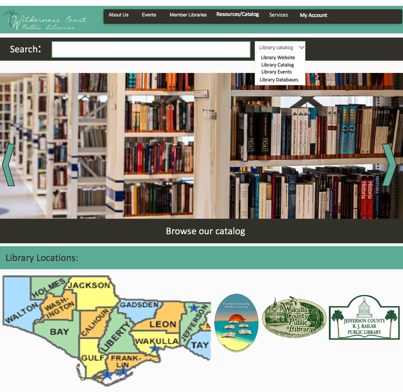
In our first iteration we added a search bar on the main page as well as a drop down box that users could use to specify what part of the website they wanted to search. We also added a few more options onto the main menu, including a tab for services and a tab for users to log in. We also wanted to make the four library locations a major part of the home page and easy to find. We thought that was best so that users could find the link for whichever library website they needed. 

       Feedback on our first assignment gave us ideas on how to further edit the homepage of the website. The main feedback we received was to make the search bar more visible and locatable for users. Edits to the main menu were also suggested, like changing the “login” tab to “my account,” making it clearer to the user what that tab was for. There were also suggestions made to clarify the four library branches and the three county libraries. Since the libraries are located far apart, besides the two Franklin County branches, adding the map makes it easy for users to locate and access which library they needed. 

Our previous user testing also showed that the events page for the Wilderness Coast Library was not cohesive between all the libraries. Combining the events pages for all the libraries in the system would make the websites more unified and easier for patrons and users to find the events they are looking for. Events could also be highlighted on the scrolling banner we have created and added to the homepage of the site. Clicking on the banner would take them to the events page, giving them options for which library, and what dates the events are held on.
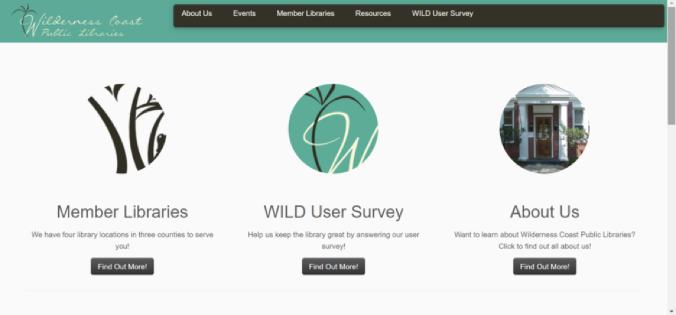
Original Library Website
3A Iteration
Updated Iteration for 3B

Menu/Search Bar Design

Our redesign for the Library system search bar would be an increase in size since it was very small to begin with. This will make the search bar more accessible to different users. Also, we would filter the search results shown to our users depending on the page the user is on. So if the user were on a particular library’s page, it would show results only of that library. The two exceptions to this would be if A) the user was searching from the main catalog or main page of the system, or B) if the user selected an option on the search bar to search a specific filter such as Library Website, Catalog, Events, or Databases which would bypass the page filter to search the specified location.

For the Menu Bar, we decided to increase its size as well for the same reasons as the search bar size increase and adjust its options. Now it would include a link to the Events page which will show all events for the system, the same About Us as before, Member Libraries which would be a drop-down menu to navigate to a specific library or to view the map, which will show where the libraries are, a link to the full catalog on the menu bar so that it is accessible from any page, services for each library to find specific tools for the user’s needs, and a link to the user account for logging in and tracking rented books, services, and other library tools and services.

Rotating Information Banner

For this new iteration we also thought that adding a rotating banner would be a great way for the library to promote their services as well as make it easy for users to locate information. Since the catalog on the original site was hard to locate we thought that adding that as one of the banners would be beneficial. The library can also use this rotating banner to highlight upcoming events so users visiting the site can see what is going on at the library. Another banner they can add is a services banner highlighting e-services that users can access through the library. A “New Releases” banner would also be a good way to show what new materials the library is offering, ranging from books to audiobooks and ebooks.

Additional Rotating Information Banner

Library Locations Map

Since the Wilderness Coast Public Library system has multiple library buildings, people will need to know where each building is located. We decided that the website map should feature the three libraries. If people move their cursor to the library building names, the stars in which the building is located will expand to show the users where the library is. This will give users information they need on where to go. Since the Franklin County Public Library has two buildings, both stars will expand and will give titles of the branches: Carrabelle and Eastpoint.
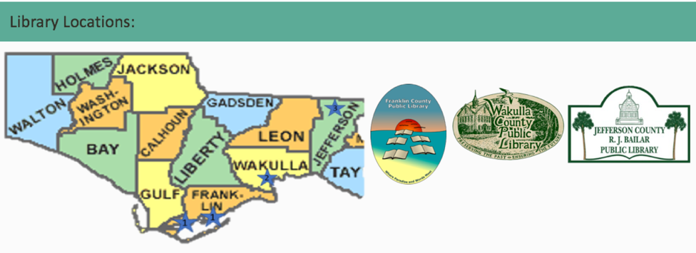
Library Map

Events Page

One idea we had for helping the Wilderness Coast Public Libraries website create a more unified identity, while preserving the functionality of the individual branches for users, is to adjust the Events page to include an events Calendar on the main Events page, and then include the individual library calendars on each of the sub-menus. At present, the events landing page looks like the image below, which is clunky because of all of the extra clicks a user has to make in order to actually find a calendar (presuming the library has a calendar linked….JCPL does not currently have anything listed on their events page).
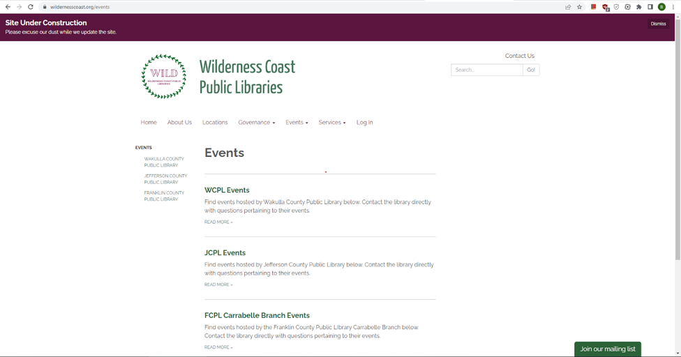
Current Events Page

Initially, we discussed simply embedding a widget that links to each library’s social media page on this webpage so that users could quickly see what the most recent news for each location was regarding events. While we like this idea, and think it would be a helpful addition to each of the individual libraries Events pages (accessible via the sub-menus and on the left-hand side of the main events webpage), we ultimately acknowledged that this would not give users the most control and quickest way to access event information, not least of all because some of the locations don’t have very active social media and others have overly-active socials. To avoid this issue, we determined that an interactive calendar would be the best way to update this particular aspect of the website’s design. 

After reviewing the WCPL events redirect, which is the only branch of the four that has any kind of calendar system, we took inspiration from the categorization system they already have in place. Our proposed change would not only be to have the landing page include a visible calendar showing all upcoming events at all of the different branches, but we feel that the best user experience would be to have the calendar include a drop-down menu to filter either “All Libraries” or each individual branch. It would also include a Filters section that allows the user to filter for specific calendar dates, keywords in the event titles, or to filter by Event Types categories such as Age (Audience) and whether the event will be In Person or Online, as seen in the mock-up below. This update would be possible using a shared Google Calendar where each library maintained their own branches’ calendar, but all branches would need to use the same color-coding system so that a filter for event type could function.
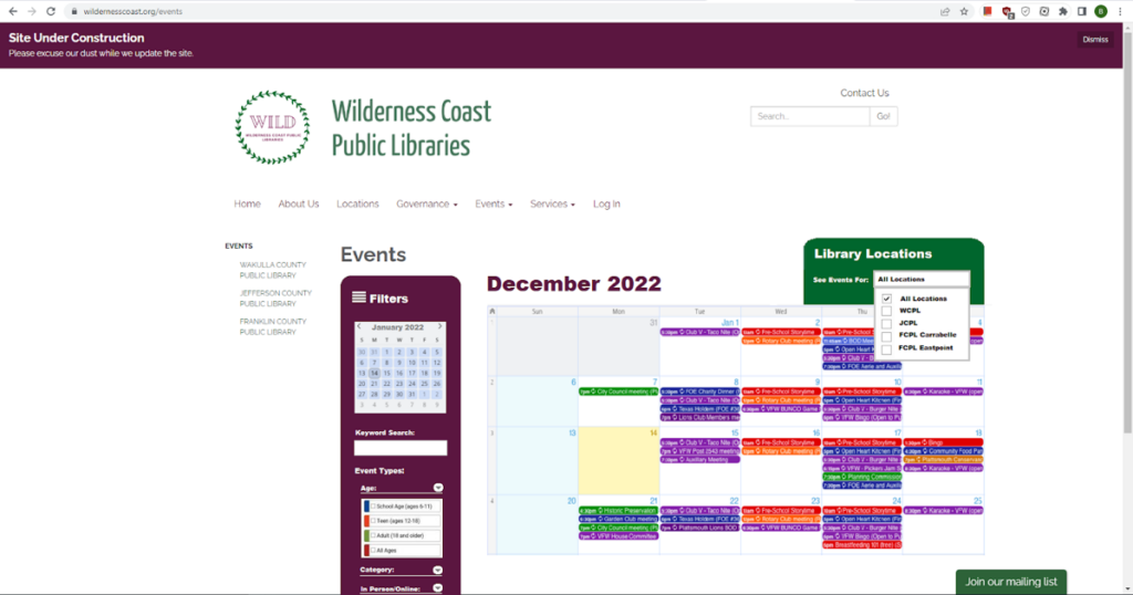
Recommended Updates to Events Page

Individual Assignment 3: User Test

Website

The website for this user test was the Wilderness Coast Library website and secondarily the Jefferson County R.J. Brailer Public Library website. These websites are used by library patrons for the four libraries in the Wilderness Coast Library system. The website holds links to the different websites for the libraries in the system and also houses the combined library catalog, which is features in one of the tasks performed in the user test.

Wilderness Coast Library Website
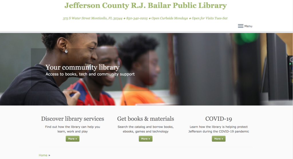
Jefferson County R.J. Bailar Public Library Website

Persona/User

The persona that our group decided on was a high school age student working on a paper about the death of Julius Caesar. Unfortunately, my user did not match that description. My user was a man in his sixties who is tech-savvy in his work environment. I thought he would be a good user to watch as I did not think he has spent a lot of time on library websites like the one we were testing. I thought this user would have a similar approach as a high school student as they tend to be tech-savvy but encountering a website they have not used before could prove to be difficult. I told him that the subject would most likely be a high school student so he took that into account during the test.

User Testing Method

I used the Thinking Aloud method while performing the user test. I thought this would be the best way to understand what the user was doing and why they were doing it. I think the user speaking aloud can also affect their approach when they are trying to accomplish the tasks. My user occasionally told me what he would normally do, which would have been to Google something rather than stick to the website. I thought that was an interesting aspect of the Thinking Aloud method and made for some interesting data while the test was occurring.

Tasks

Task 1: Using the library system, the user must locate a book about the death of Julius Caesar, and figure out which library location the book is located.

Task 2: Now that the user found the book, the user needs to see what library it is as and the hours that the library is open for business.

Task 3: The user now knows what library the book is located so now the user must find the information for computer usage in that library. The user will also find the information on printing since the user would need to print out their paper for school.

Task 1

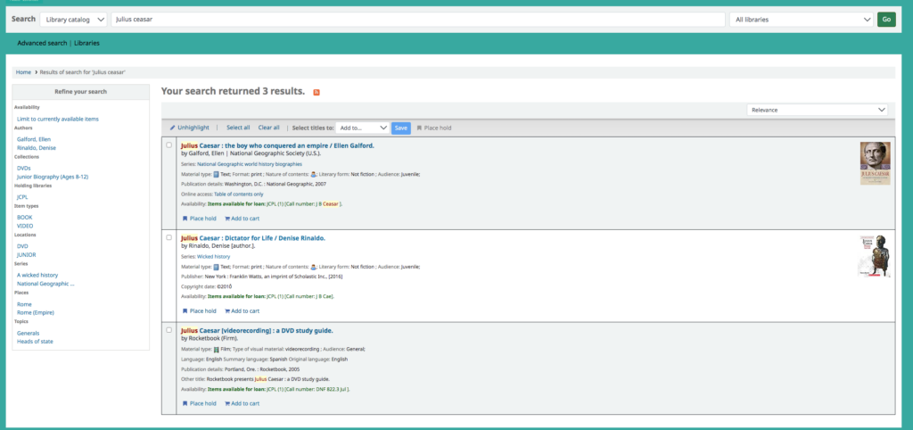
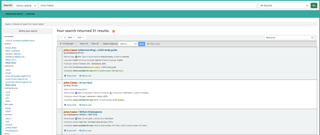
The user pulled up the website easily to start the task. While on the homepage he did scroll down to the bottom but pretty quickly scrolled back up and clicked on the “resources” tab. From the links on the resources tab he immediately clicked on the catalog page which took him to where he needed to be to find the book. I was surprised how easily he managed to find the catalog page. On the catalog page he pretty quickly found the search bar and typed in “Julius Ceaser.” I did not immediately realize that he misspelled Caesar until I looked at the amount of results that came up in the search. Normally, the search yields 31 results, when he spelled the last name wrong it limited the search to only 3 results. The results were two books and a DVD. The user did not realize the name was spelled wrong and was surprised that only three items came up. I had told the user the research paper for our high school persona was about Julius Caesar’s death so he decided to pick the book titled Julius Caesar: Dictator for Life. Since he managed to find the books and catalog pretty easily, I tacked on a secondary task which was to see how to put the book on hold. Again, he pretty quickly found the “place hold” button and clicked it. The link took him to a log in page for the library so he went back to the catalog for the next task.

Search Results with Spelling Error
Results with No Spelling Error

Task 2

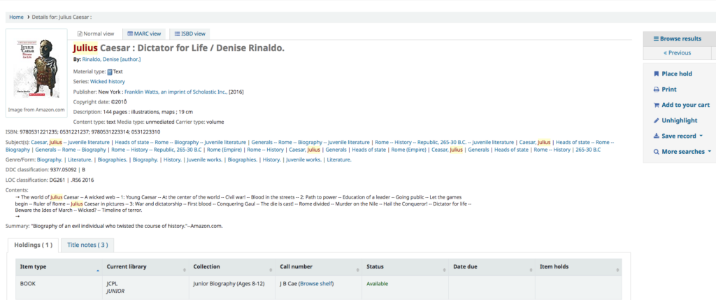
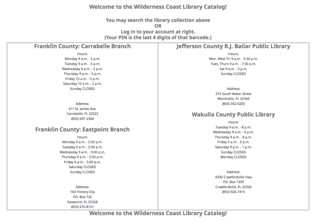
The book that the user decided to locate was the Julius Caesar: Dictator for Life book. The website lists the book at “JCPL Junior.” The user went back to the homepage to find the correct library where the book was located. Because it just used JCPL, the user had a hard time figuring out which library that was. The user was also confused about the “junior” part of the location, but realized it meant that it would be located in the children’s department of the library. The user had to go back to the page a few times to try and remember JCPL. The actual name of the library is Jefferson County R.J. Bailar Public Library so the user assumed that was the correct library. The website shows all of the library names and the hours underneath so the user was able to locate the library hours pretty easily from the homepage of the catalog.

Book Listing with JCPL Junior as Library Location
Catalog Homepage with Library Locations and Hours

Task 3

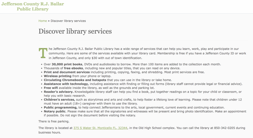
I thought the user would go back to the main library page as one of the big icons on that page is for the “Member Libraries” but he went back to the catalog page. The catalog page shows all the library names and hours like the user saw in task two. Along with that there is a bar on the side that says “Links to Our Libraries,” and the user found that pretty quickly. He clicked on the Jefferson County R.J. Bailar Public Library link and was greeted by their homepage. There are not that many options on the JCPL website but the user was torn between clicking on “Get books & materials” and the “Discover library services” links. The user decided to click on “Discover library services” button. That page just lists bullet points with library information so the user found the information pretty quickly about computer usage and printing easily. The user was confused about the information he located as computer usage is not listed but the library states that they have “circulating Chromebook and hotspots.” The website does not state if they have desktop computers for customer use but the Chromebooks says that they can be checked out or used in the library. There is also a bullet point listed for “print and document services” so the user found that information easily. The user had a question about the printing as the website says that most printing services are free. He wanted to know if his printing would fall into the free category or if it would cost something. I added another task to the user test since he did the tasks pretty quickly. I told him to find the directions to the library. What the user noticed and what I did not notice was that there was a link right at the bottom of the library services page that took the user to Google Maps and he easily found the directions. The user did tell me that he normally would have just googled the directions instead but found that the link to the directions was easy to see and use.

Discover Library Services Page with Computer and Printing Information, Directions at Bottom

Design Recommendations

Watching this user test there were some things on the website that could be adapted for easier user use. In the first task, due to a misspelling, there was only three results when the user searched for books. I also did my own test and typed in “Julius Caesar” and nothing came up. I think misspellings should not limit the search by so much. If the user did not know they spelled something incorrectly, they might think that the library system has no materials on the subject they are looking for. In task two the user had a problem finding the correct library because the catalog used an acronym, JCPL, instead of the actual library name. Using the acronym is probably fine for veteran users of the site but it could, and did, cause problems for users. I also think the JCPL website could use some updates as most of the information on the site is written in bullet points and only shows little information. In task three the user needed to see how much printing would cost, it said most print jobs were free but some were not. For this test, a research paper that is a few pages would probably fit under the free category but they should list what would not.

Individual Assignment 2

Website

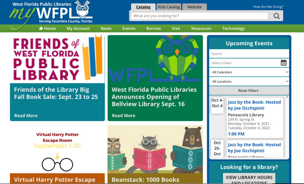
The website I selected for this analysis was the West Florida Public Libraries website, https://mywfpl.com/. This website and library system encompasses the libraries in Escambia County, Florida. The library system has seven libraries and they utilize library e-services like Libby and Hoopla to expand their catalog. The website shows a lot of information for these libraries and services ranging from the library catalog, events, and other activities.

West Florida Public Libraries Website Homepage

Scenario

For my scenario, I wanted to act like I was new in town and wanted to get a library card. However, before I did that I wanted to see if they had a copy of the book I wanted and I wanted to find the locations of the libraries to see which was the best one for me. I also wanted to look at the events and see if there was anything interesting going on or if there was anything I would want to attend. For most new users, I think this line of searching would be a common start for those with a new library card or those thinking about applying for a card.

Analysis

The first thing that I wanted to do on the website was to search and see if they have the book I want. The home page is where the heuristic analysis starts with heuristic #8, aesthetic and minimal design. There is already a lot to click on and look at and it is a bit overwhelming seeing all of the links and tabs on the home page. There are eight different tabs right at the top of the page and they all have multiple drop-down box options to click on. There are also a lot of articles to click on and “read more” as well as an upcoming events section. Even further down the page, there are more items to click on like new book lists and DVD lists.

For the first part of my scenario, I want to search for a book. The search button is clear at the top, and it does feature different search options like; catalog, kids’ catalog, and the entire website. When you search a book, the website loads into a different website that has a different interface with a bigger search bar and advanced search options. During my first attempt to locate Daisy Jones and the Six, I typed “sixth” instead, and I got a message that said “no results found.” I believe that is a heuristic #9: help users recognize, diagnose, and recover from errors, issue. I work in a library and know that a lot of times people don’t know what the book they are looking for is called or one of the words they have is wrong. The catalog website did not show any other options for that book and I feel that could be an issue for patrons, as it did not help the patron find the book and fix the error in the title. I also wanted to see if it would fix a misspelled word, but it gave me the same error message.

WFPL Catalog Search Bar with error

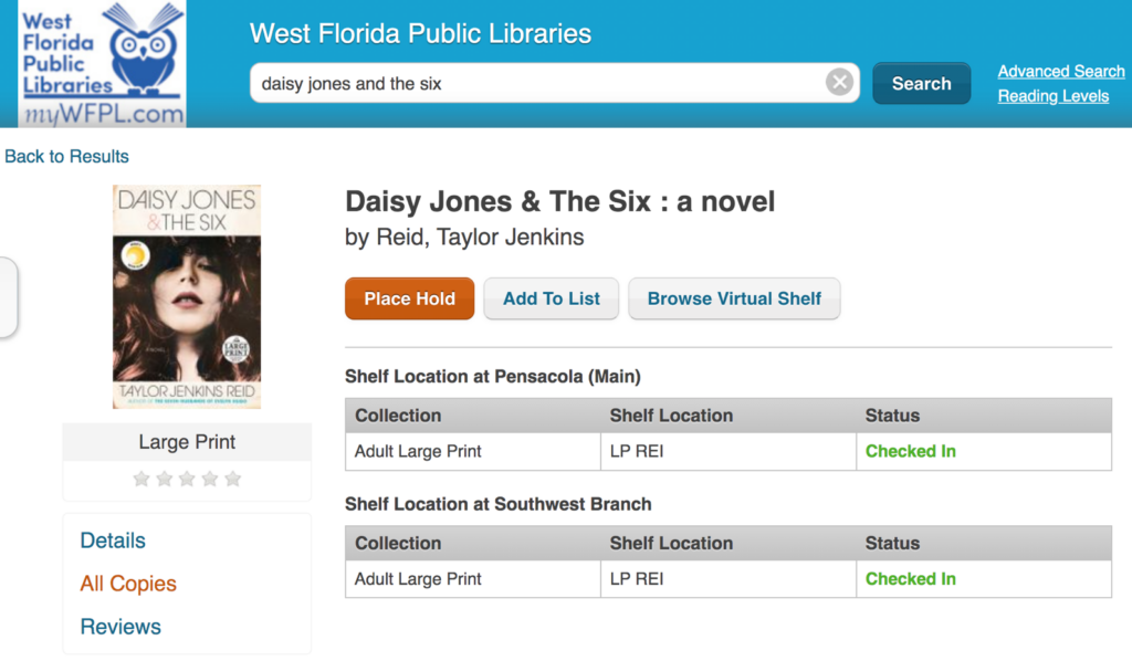
When I typed in the correct title, the book does pop up but the first item in the search is the book on CD, not the actual book. The book is the second in the list and shows not available, but there is an option to place a hold. There is a third option which is the large print option, which will be fine so I will click on that. On my usual library website, if you scroll to the bottom it shows what locations have that book, but this library you have to click on the “all copies” on the side. One of the copies of the book is at the Southwest Branch and I think that is the one I will decide to go to so my next step is to find the location. I also found that there was a heuristic #7: flexibility and efficiency of use error with the catalog. There is not a way to browse the catalog where you do not have to search.

Book Search Item Results, Large Print with Locations

I had to click back to the home page to find the location, and then the locations page was easy to find. There is a section on the home page to find a location and then there is a “visit” tab right at the top of the page. Then the locations page makes it very clear which library you are looking at and has a “get directions” option that takes you to google maps.

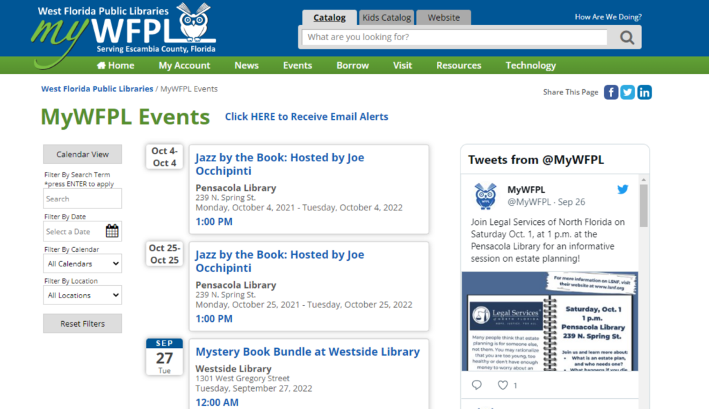
The next thing I wanted to do was check to see if there were any events going on that I would be interested in, specifically at the Southwest branch. The events tab was easy to find at the top of the page and I clicked “full calendar” to see what events were going on. The events page could also fall into the heuristic #8: aesthetic and minimalist design. The page opens and shows two random dates in October and then goes to the current day. This page also has a “tweets from @mywfpl” that does not need to be there.

Events Page

It was really easy to filter the calendar by location and it was interesting to see what events they offer. I think it could be laid out better and maybe should not show random October dates at the start. Or, if they do that make sure it says “special event” or something like that so patrons will know why it is at the top.

Recommendations

I believe that the website overall is nice and mostly easy to use for first time users. I think that taking some of the information off the homepage would be beneficial as there is a lot of information all at once and definitely is a heuristic #8: aesthetic and minimal design issue. That can also be said for the events page with the unnecessary tweets and dates at the top out of order. I also think their catalog should have a better interface so that when you make a typo or do not know exactly what the title is you can still find the book. There catalog could also benefit from some kind of genre browsing, this would help the website with heuristic #7, flexibility and efficiency of use. In their catalog you can only search books there is not a way to browse if you were looking for books in a specific genre. If you search “mystery” in the search box, instead of books in that genre you just get books with the word “mystery” in the title. There catalog also does not show what books they have available in their e-services, until you select “e-resource” in their format filter.

Individual Assignment 1: Designing for Users

Website

The website I asked my user to test was jaxpubliclibrary.org, a website that I use or look at almost every day for work purposes. I work at one of the Jacksonville Public Library branches and am very familiar with this website, and was interested to see how someone would interact with it that was not familiar with it. My user is older than me and most of their technology knowledge comes from the interfaces they use for work.

https://jaxpubliclibrary.org/

User Usage

To start the test, I let me user look around the website as there is immediately a lot to see and look at. The user does have a library card but has never logged on or accessed anything from the library website. The first thing the user clicked on was the “Events & Classes” tabs it immediately takes you too just a really long list of events in date order. After scrolling down this page the user then clicked on one of the options at the top of the page that says “Find Your Next Read.” This took the user to a page with a form to fill out of their interests and then book recommendations would be emailed to you. When on this page, there is not a search bar at the top like there normally is on the other website pages. So when the user then wanted to search for a book there was mild confusion on how to do so. Since having the user look for a book was one of the tasks I wanted the user to do I told the user to click back to the home page of the website which would show the search bar again.

https://jkpl.ent.sirsi.net/client/en_US/default/search/results/?ln=en_US&q=where%20the%20crawdad%27s%20sing&rw=0

For the first task I asked the user to look up Where the Crawdads Sing, as I knew the user has read this book and was familiar with it. I told the user I wanted them to look for the physical book, not an e-book or audiobook, to see how many holds were on it. The user went to the search bar and wanted to change the filter to search by author but the filters do not have options like that. They are set up to change the search to search the catalog, databases, events, or the website. So the user then typed the book title into the search bar and searched. Immediately the results are for e-materials, which I knew would happen but the user was confused by that. They thought that it would make more sense for the physical copy of the book to come up first. The physical book is the third thing on the list. I asked the user to see how many holds were on the book, and it is clearly shown that there are 179 holds on the items by patrons. The next task was to find a certain event back on the events page, the user had already been there so they were pretty quick to find their way back. They then just searched the event that I asked for and it popped up immediately.

www.jaxpubliclibrary.org search box features, home page

Suggestions

For the most part, it seemed like the user had a good interaction with the website and of the tasks I asked them to do, they accomplished them easily. The website is initially overwhelming as there is a lot of information on the home page. I think that once the user had a certain task to accomplish the website made more sense to them. They were able to search items easily and find the event that I asked them to look for. As I normally use the website every day for work or to look for things on the website myself, it is easy to forget that it is not second nature to everyone. I do think the site could make some changes to be a little more user friendly. The search box on the front page of the website only searches through the book catalog unless you change the feature on the side. I think that would hinder people from finding other library information that they needed from the site. I also think that when searching for a book, like my user recommended, there should be a way to select an author search. When you search an author the author’s books do come up but they have other items mixed in as well that fit the search but not the author. There are more filters when the search comes up but the user has already had to make a search. In my everyday use I also question why the e-materials like e-books and audio-books come up first. I think most users would be searching for the physical book to place a hold or to read the summary more than the e-material. Also, most of the e-materials do not have a book summary that would be helpful to the user in deciding whether to read the book or not.

Overall, I think that the Jacksonville Public Library website is user friendly. However, with minor changes and updates believe that it could be even better. The user was able to complete the tasks and was also able to work the website without a prompt.