Individual Assignment 3: Representative User Test

Norman Rockwell Museum, https://www.nrm.org/
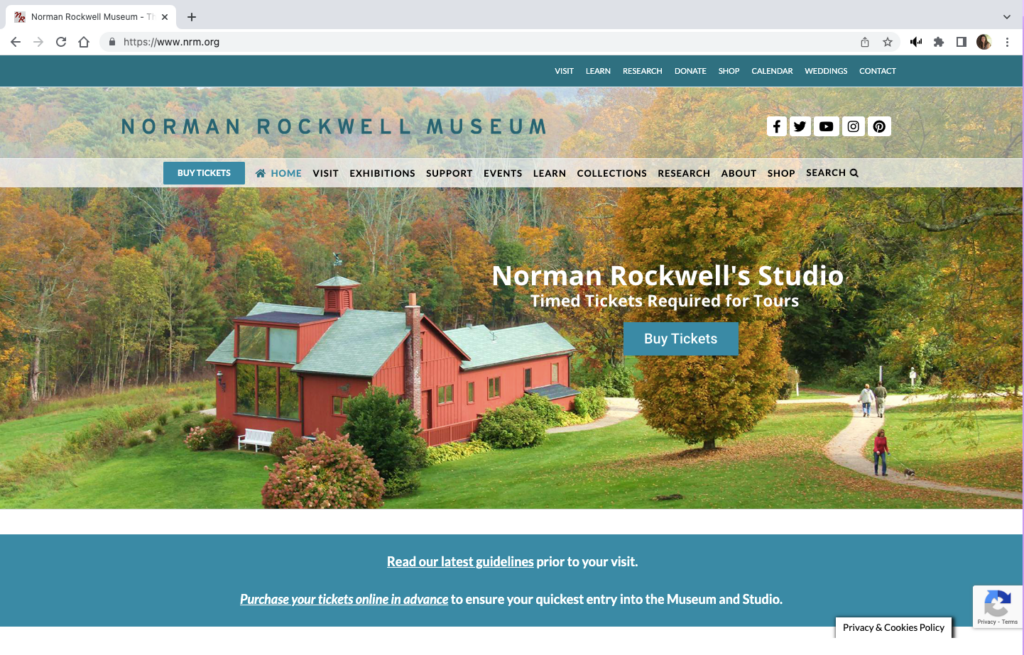
The Norman Rockwell Museum website provides information about the artist, museum exhibits and events, and hosts the museum archive. The homepage has two menu bars, each with some distinct links as well as several overlapping links.  The green-blue menu bar at the very top of the page also has dropdown sub menus. The second menu bar is below the museum name banner and social media links. The remainder of the homepage features photographs on a loop. 

Not all pages within the website have titles or headers, several have menus on the left-hand side where two of the site’s pages have a link to the Rockwell Center for Visual Studies, URL rockwellcenter.org

The website also has embedded YouTube videos and uses a third-party popup window for ticket sales.

Users

Persona

Slightly modified from group assignment so it could be read to the user-testers and to include a starting location for directions: You are an undergraduate art history student at Bay Path University in Longmeadow, Massachusetts. Your are interested in Norman Rockwell’s works since Rockwell was a fellow Massachusetts native. One of your class projects includes Rockwell’s Pointing Hand. You are going to use the NRM website as a source for your project, but you are also interested in visiting the museum over break. Also, you will need an internship before you graduate and you will seek information about opportunities at the museum.

User-testers

The individual user-tester is an 18 year old male high school graduate, June 2022. He is taking a gap year before matriculating at George Mason University, Fall 2023.

The user-tester team consists of a 16 year old female junior high school student and a 23 year old male who recently graduated from the University of Mary Washington with an art history degree and a minor in math.

Testing Methods

Concurrent Think Aloud – This method makes it easy to evaluate the experience of the user: understand participants’ thoughts and elicit real time feedback.

Paired User Testing – an interesting twist on the above that is expected to require less prompting from the moderator.

Test Plan and Tasks

Test Purpose

To determine how quickly and easily an undergraduate student can navigate the website and use it for academic purposes.

Methods

The user characteristic description will be read to user-testers. They will then be asked to describe what information they need from the website in order to confirm their understanding of the scenario. 

The test moderator will provide encouragement if frustration levels become a roadblock. If all attempts of the moderator fail, the participant will be given a hint at the discretion of the moderator. 

Benchmarks & Metrics

Frustration level of participant and post task user review (subjective); error rates, task completion and time will be measured (qualitative)

Tasks

Plan a visit to the museum including getting directions from the university and purchasing a ticket. This represents a high frequency task for website users since many people who visit a museum website are planning to visit the museum itself. Or conversely, many who want to visit a museum will use the website to plan their visit.

Find out if the museum has any internship opportunities for undergraduate students and details about the internship, including how to apply. This is an important community engagement activity for the museum.

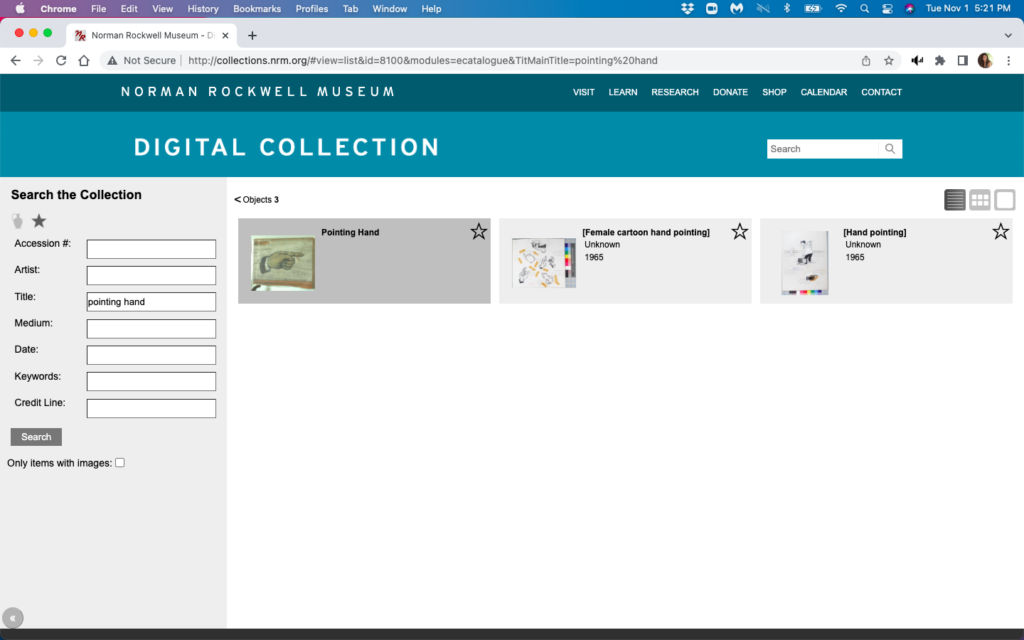
Find a specific work called Pointing Hand in the Norman Rockwell Museum’s digital collections. Finding artwork is a foundational concept for an art museum.

Addendum: Finding Pointing Hand did not present any significant navigational issues for the paired users. So for the individual user-tester, the artwork was changed to New Kids in the Neighborhood and the participant was asked to determine if the website had any narrative information about the work that might be useful in an art history project. 

Test Analysis

Paired User Test (PU) – all three tasks were completed in less than ten minutes with no real navigation difficulties. 

Think Aloud User Test (TA) – All tasks were completed in 11 minutes. There was difficulty in searching for information about the artwork and confusion with navigating between the NRM site and the Rockwell Center.org site (RC).

Benchmarks & MetricsFinding Artwork Planning Visit1 Internships
Task Completionyes2yesyes
Time
minute:second
Paired 2:15
Think Aloud 2:40
Paired 33
Think Aloud 5:49
Paired 4
Think Aloud 2:25
Error RateAll testers tried the main search bar before going to “Collections”→”Search the Collection”Paired – none; used “Visit” link
TA – none
Paired – none; typed “internships” in search bar
Frustration Level noneTA – confusion surrounding the need to choose a date before proceeding to checkoutTA – confusion between nrm.org and rockwellcenter.org
1. Both users declined to get directions from the website saying they would use google maps on their phones; they were able to display the website on their phones during the time of the test. 2. TA tester did not complete the subtask of finding narrative information about the artwork. He did not recognize a blog post which could be used in an art history project. This post was displayed when the tester searched “New Kids in the Neighborhood” in the main search bar, but the link for the post was between a grade K-5 lesson plan and two past museum events. 3. PU testers also briefly looked at the current exhibits advertised on the homepage while planning their visit.

User Review

The collection artworks are displayed in what I will describe as an archival view. None of the user-testers liked this display, nor the interactivity of the page. Works are displayed in shadowed boxes which highlight when the cursor hovers over them.

However, the cursor had to be directly over the image to display an enlarged version of the image, likewise the cursor had to be directly over the title of the work to display metadata for the work. None of the users found the metadata informative. They all expected to find narrative commentary displayed with the artwork image or for links to that information to be provided with the image. 

Users also found it inconvenient that the archive page had no back function. The users expected a left pointing bracket (<) that is above the images to act as a back arrow, but it has no functionality. Both users used browser back arrows from here even though the NRM name at the top acts as a homepage return.

When TA was searching for narrative commentary about New Kids on the Block, he got led to the Rockwell Center for Visual Arts. This has a different URL, it has the RC name in place of the NRM name, and a new menu bar, however there are enough similarities that tester was unaware that he was at a different website. The browser tabs for both sites contain red “NR” and both sites have the same menu bar at the very top of the page, although there is a slight color difference from blue-green to gray-blue.

Neither set of users found the popup window used when purchasing tickets bothersome. The 23 year old in the PU group opined that it might be a more secure site to enter his credit card information. And the PU testers happily noted the Trip Advisor ratings on the popup site. 

Design Recommendations

ViolationImprovement
Heuristic 1 – Use popup message when moving from nrm.org to rockwellcenter.org
Heuristic 2 – Add a breadcrumb trail to the top of each page
– Enlarge the very top blue-green-gray menu bar. 
– Keep the top menu bar pinned throughout both websites. 
– Highlight the “Internships” link by adding a colored field to improve visibility
and recognition that it is a button.
Heuristic 3 – Add a title or header to the top of each page

Discussion

Redesigning how images of artwork are displayed is only realistic if NRM wants to do a major overhaul of their site, however there are some smaller improvements that will improve the navigability of the site. 

Based on Nielsen’s first heuristic, visibility of system status, the user should clearly know when they are moving from nrm.org to rockwellcenter.org. A simple popup message that the user is leaving the original website would work. Additionally, clear instructions should be given within the popup window that the user needs to first choose a visit date before proceeding to checkout.

User control and freedom, heuristic #3, states that links should be easily discoverable, especially back and cancel. NRM website should add a “bread crumb” trail so that users know where they are in the website, improving their ability to make decisions about which link to use next. The website has two menu bars at the top  of the page, a blue-green bar at the very top, and semi-transparent one under the website name. This stays consistent between nrm.org and rockwellcenter.org with the exception of the slight color change in the top bar. Enlarging this top bar and pinning it so that it does not disappear with scrolling will also improve navigation. Also, the search for internship opportunities would be easier if the “internships” link at the top of the webpage included a colored field that changed color so that it is more obviously a link and not merely a heading. 
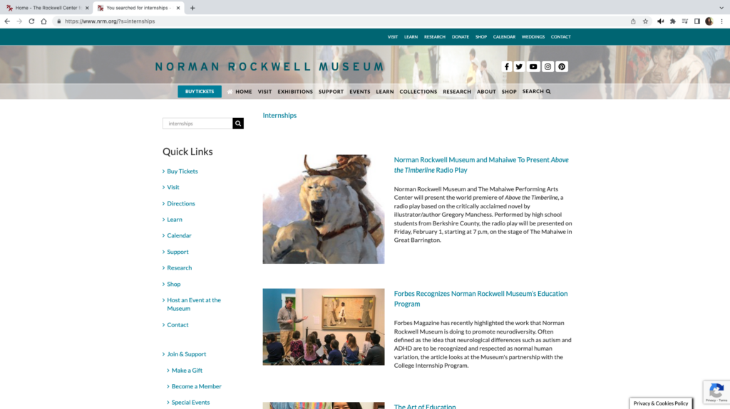
Find the “Internship” link

Finally, in accordance with the fourth heuristic of maintaining consistency with other websites, each page should contain a header so the user understands where they have landed and what content is found on that page. This would help others from feeling like they are looking at “another page with a bunch of random articles” as the think aloud user-tester described one page.   

Heuristic Evaluation | Art Museums

“America’s First Modern Art Collection” https://www.phillipscollection.org/

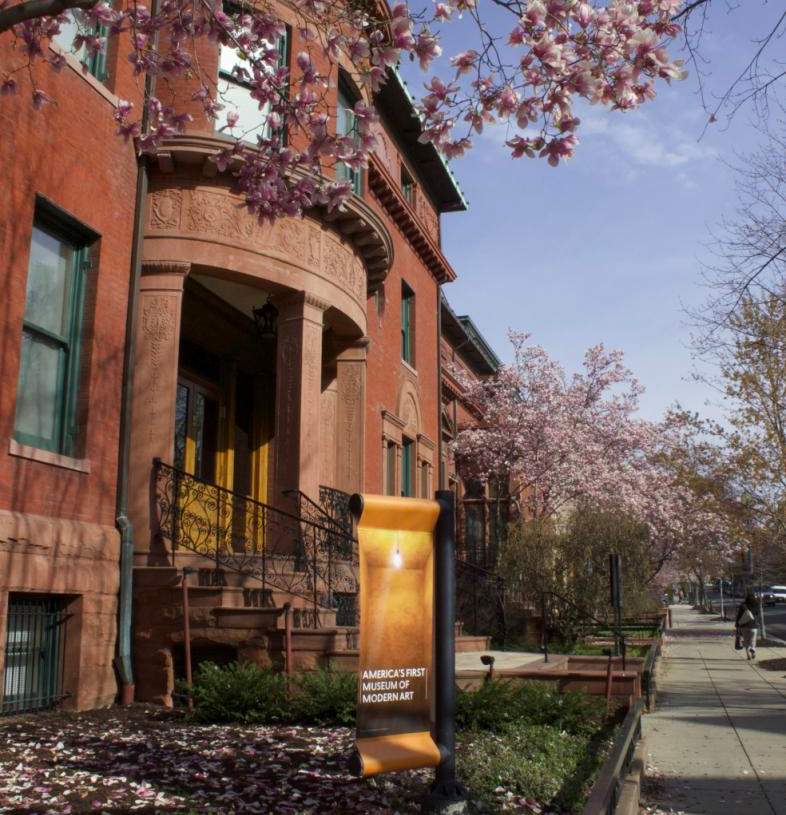
The gallery was originally the home of Duncan Phillips, art collector and philanthropist. Several additions to the original house were required in order to accommodate the ever growing art collection, now consisting of nearly 6,000 modern and contemporary works.  

Evaluation Scenario

I will be using the website to plan art history lessons and a field trip for homeschooled high school students. Generally these lessons consist of studying several works of art by one specific artist, or works created during a specific time period and in a specific place (e.g. several works by Picasso, or works from the Hudson River School). Since it is hoped that through the field trip students will be able to see in person works of arts they have studied in class, I will broaden the parameters for choosing works for this course.

Analysis

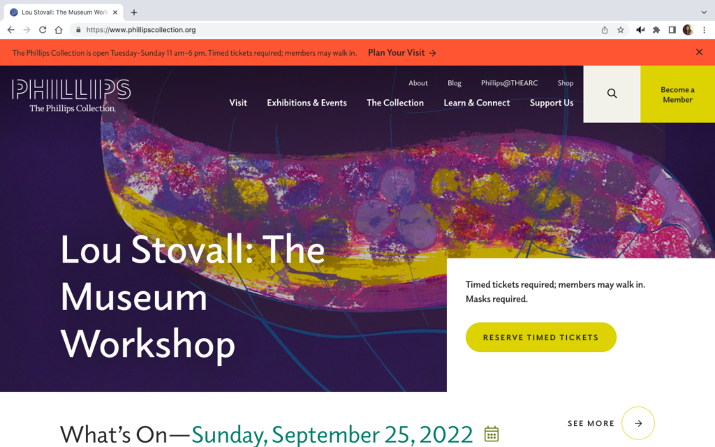
The landing page for The Phillips website has two menu bars, a search bar, a ticket link, membership information, and a promotion of a current exhibition. A red banner at the top of the page gives museum hours, ticket information, and an additional link to “Plan Your Visit.”

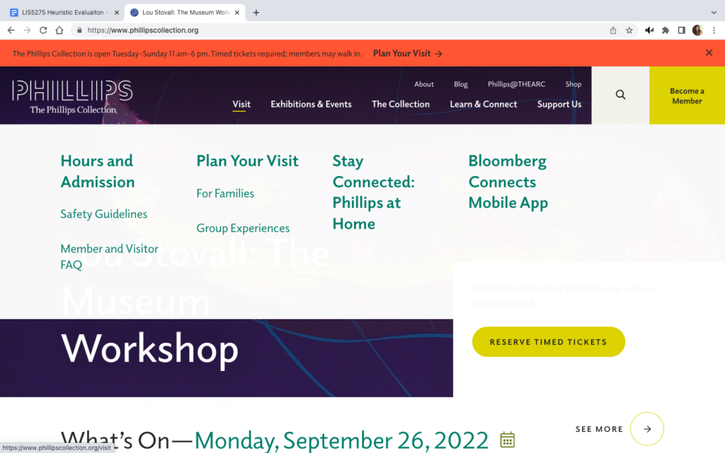
If you hover your cursor over the main menu bar at the top, a dropdown menu appears which obscures most of the window. (See images above)

The original screen is busy and gives the user pause while trying to digest all of the options available. When the dropdown menu appears with even more options, and at the same time significantly changes the view of the screen, it only adds to the potential for “information overload” or cognitive strain and the potential for confusion. By trying to provide too many choices in the initial view, The Phillips website violates Usability Heuristic #8, Aesthetic and minimalist design.

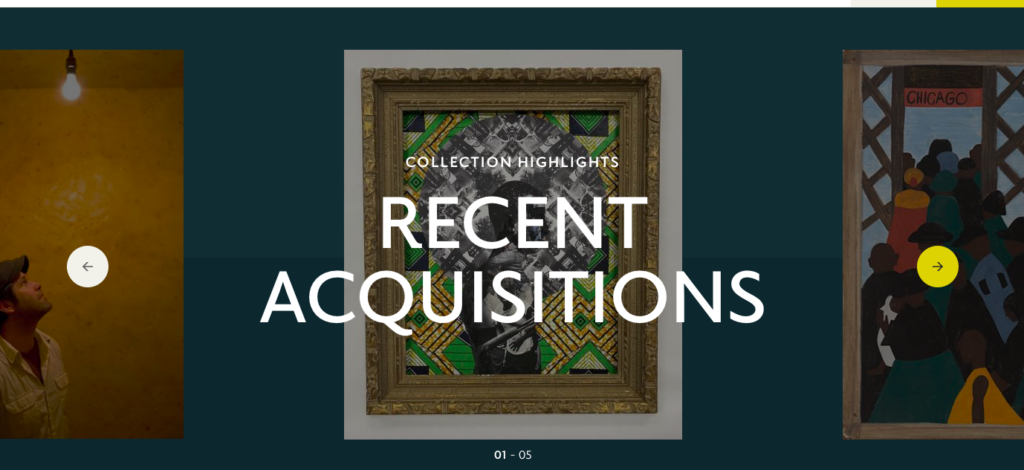
The Recent Acquisitions section found towards the bottom of the homepage is another example of where too much is done in one space, again violating heuristic #8. The work being highlighted is obscured by the text – this is true as you scroll through the entire section.

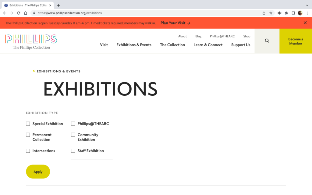
However, it is possible to take minimalism too far. The image to the right shows the landing page when “Current Exhibitions” is selected from the “Exhibitions and Events” dropdown menu on the main page. This landing view feels like the page did not fully load, or is perhaps not formatted correctly for the screen.

Scrolling down does give a view of all current exhibitions, but for a moment the user can feel lost. Also, the breadcrumb trail is barely recognizable since it consists of only the menu category and a small, lightly colored arrow. These difficulties in navigation inhibit the visibility of system status by not making it clear where the user is within the website, violating heuristic #1.

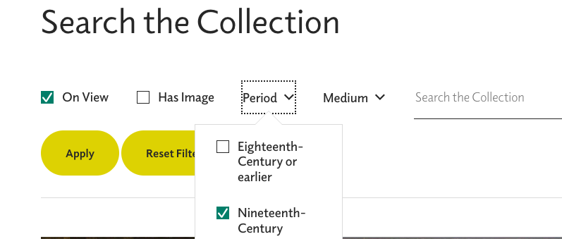
An even more egregious error in keeping users informed about what is going on occurs when trying to search the collection.

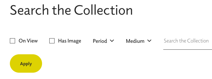
The view above shows the search page prior to any filter applications.

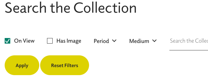
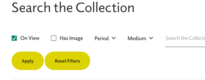
Once a search is selected, the checkbox turns blue with a white checkmark. However, using the “Apply” button only adds a “Reset Filters” button. It does not start a list of applied filters or change the color of the “Apply” button or the selected filter’s checkbox.

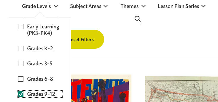
The image above, right, shows selection of the Nineteenth-Century time period and the one on the left shows the view after that filter is added to the “On View” filter. Again, once the “Apply” button is clicked, the user does not have any confirmation of which filters have been applied. (Heuristic #1) This same issue occurs when selecting grades for lesson plans, but there, the dropdown menu for grades obscures the “Apply” button making it even more confusing whether or not the grade filter is applied. (See image below)

“Reset Filters” button is present here before and filters are selected, unlike the “Search the Collection” view. “Grade Levels” obscure the “Apply” button and there no confirmation that the filter has been applied.

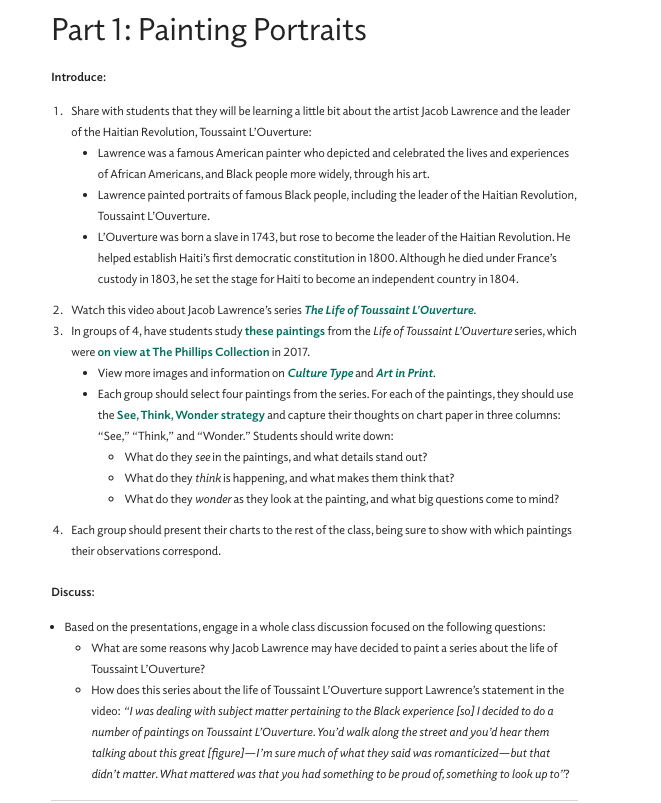
As hoped, the museum did provide robust lesson plans for their collection and special exhibition. Unfortunately, my selection of six works from Nineteenth-Century French artists is not included in the lesson plans, but I will explore the lessons for Jacob Lawrence’s works on Toussaint L’Ouverture since that exhibit’s subject is familiar to the students.

While this is an excellent lesson plan, it is not especially friendly to the user. The text which is blue-green, and may only appear bold to color blind users, are links to other resources. Besides the problem of a color blind user being able to recognize the links, many of the links take the user to outside of the Phillips website. This move is made within the same browser window and without any warning asking the user if they want to proceed to a link outside of the current webpage. At least one of the links, “these paintings” – #3 in the lesson plan, takes the user to a press release issued by another gallery. This press release does not contain any images, which is what I expected to find when I used the link. Jumping to other websites without warning, violates consistency and standards, heuristic #4. Also, since there is no warning that the user will be moved out of the museum website, and therefore away from museum navigation tools, heuristic #1 is again violated. There is not communication or transparency from the website to the user about the consequence of using the links.

Recommendations

As a whole, The Phillips Collection website is attractive, informative, and fairly easy to use. With some minor changes addressing navigation and visibility exploration of the website would be streamlined, making the site more user friendly.

  1. Aesthetic and minimalist design, heuristic #8 improvements
    • Remove the red banner at the top of the homepage. All the information here is found in the “visit” dropdown menu directly below.
    • Change the dropdown menus to vertical view only; eliminate the large white box that takes over the entire homepage.
    • Remove the box insert on the lower right corner of the homepage. Again, tickets are available under the “visit” dropdown.
    • Move heading for “Recent Acquisitions” to the top of the field
  2. Visibility of system status, heuristic #1 improvements
    • Reformat all views for filter options: the “Exhibitions” filters should be reduced so they do not take up the entire window. Display filters that have been selected and applied.
    • Improve the visibility of the breadcrumb trail by putting dark colored arrows, using right to left directions
  3. Consistency and standards, heuristic #4
    • Changing the breadcrumb trail would also create consistency for users based on experience with other websites’ navigation tools
    • In the lesson plans, links should open in a separate browser window, and warn the user if the link leads to another website

Group Topic Selection

Museums

Sonya Jackson, Megan Kosove, Joseph Rhodes, Jennifer Ritter, Kyle Wilson

Chosen Museum Type

We have chosen to narrow down the general topic of “museums” to specifically refer to art history museums.

Examples of these museums include, but are not limited to:

Interest Statement

Museums provide the service of curating important artifacts of the past in order to display them to the public. People are then able to learn about and/or experience pieces of our history and/or our natural world. Art museums specifically allow for people to experience the artistic values, views, and experiences of the past, allowing a visitor to appreciate the art as it is, what the art stands for, and both the art’s and our own places in the world. Art is a universal experience, and an art museum allows people to see the world from a different viewpoint.

Usability Statement

Because museums can have a significant role in individuals’ lives and society as a whole, they must be designed for a wide and varied audience. For example, students of all ages, researchers, the general public, etc. all need to be able to use museum services through intuitive design. Each person has different needs, goals, and abilities. This means museum usability must take into account the several characteristics of users in order to achieve an effective and usable design.

Designing for Users

by Jennifer Ritter

Context: the app, the “expert”, and the test-user

The Wegmans grocery store app is used to create shopping lists, store customer loyalty cards, digital coupons, and so much more…

The Wegmans app was selected as the test site because it is the only technology that I use which the millennial test-user has never used before. 

The “expert” in this test is a 50+ year old who uses technology very pragmatically. When a need arises, the “expert” discovers how to meet this need and then typically explores no further. For these reasons quotation marks are used with the expert label for this individual, and for the remainder of the post “I” will be used instead. 

The user-tester is an 18 year old millennial who has used technology extensively for school, entertainment, and communication for the last 5 years or so.

Test-user performance

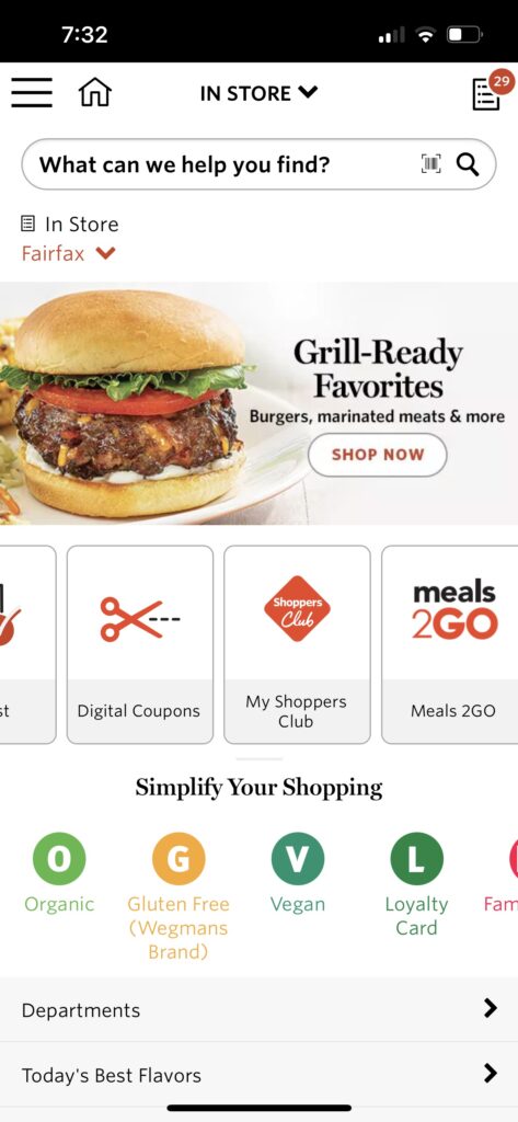
The user-tester was asked to download the app and then determine what it would be used for. He scrolled through the app, both vertically and horizontally, and decided to try the “meals2go” feature. This feature opens a page in the web browser which has the option to download a separate app for meal ordering, or the user can order prepared meals directly from the web page.

He was then instructed to go back to the app and make his guess about the purpose of the app. He thought it was best used to browse the store’s product selection and he would use it to find out if they sold items he was interested in. The app actually performs poorly for product searches. Items known to be on the store shelves are often not found at all in the database, and even items in the database are not found when exact product names are used, including name-brands. I have learned which words will help me locate the products but often I have to scroll through a number of other items as well.

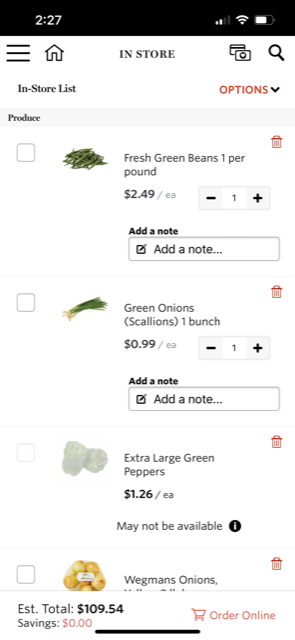
The tester was then informed that I use it make shopping lists and he was asked to compile a specific list of items. He did not encounter any problems doing so. 

Usability evaluation

“In trying to make it convenient, they made it overly complicated.” This was the final analysis of the user-tester after using his list to shop.

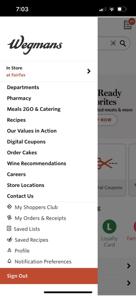
The user-tester also expressed confusion over the main purpose of the app due to its cluttered appearance. We jointly explored the app after his testing and he reiterated his opinion expressed above, that the app is simply trying to do too much. Besides browsing products and making shopping lists, you can clip digital coupons, find and save recipes, look at store locations, see past orders and receipts, link to the catering site, and even apply from a job, amongst other things.

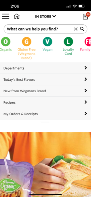
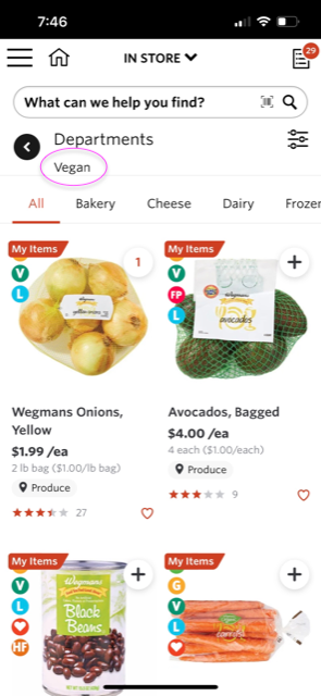
Besides doing too much, the app itself and its database are poorly organized. Ironically “Simplify Your Shopping” is written on the bottom half of the initial view when the app is opened. I think this is describing the icons just below that statement which have very little value. For example, the first page displayed using the “V” vegan icon is the produce department. As a sometimes vegan, I would have expected it to link to vegan alternatives of non-vegan products – but no vegan “cheeses” are found here. Applying the filter for cheese and dairy gives a “No products” message, when in fact, the store has plenty of options.

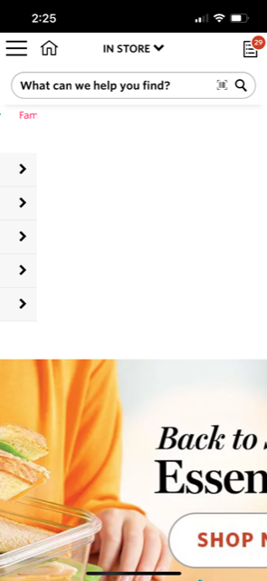
In addition, the app is not formatted for mobile devices. There are multiple horizontal scrolls and two advertisement photos that do not fit on the page. While the entire photo is a link to the product page it is advertising, users have to scroll to the left in order to see any text and the actual button to link to the department. 

Wegmans would have more users if they reorganized their database, reformatted their app, and simply removed some options. A simple layout using only a vertical scroll would assist users decide what tasks are available and which actions they want to take.