Individual Assignment 3: Representative User Test

By Matthew Post

Subject Website: https://www.jeffdavishospital.org/

Jeff Davis Hospital, main landing page. Retrieved from: https://www.jeffdavishospital.org/

Website Description:

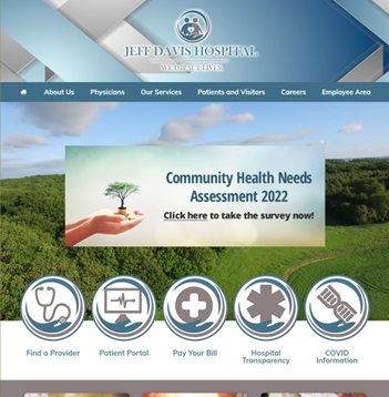
This website represents a small hospital located in Hazlehurst, Georgia, a small town about 100 miles west of Savannah. The website serves as its public-facing virtual hub for those seeking information relating to its services in patient care, employment opportunities, patient portal access, hospital and provider information, and health topic research resources. 

User Description:

The user is a 37-year-old woman with a graduate-level education and a profession in healthcare. She owns and operates a private clinical practice in the field of behavioral health, so she is very familiar with navigating various healthcare-related websites such as health insurance (payer) and government policy sites. She describes herself as “highly analytical, but easily frustrated” by poorly designed websites and portals, and “[doesn’t] understand why they make it so hard to use them”. She was concerned about the pacing of the user test, as she described preferring taking her to her time navigating a website and didn’t want to feel rushed into making mistakes or missing things.

Testing Methodology:

The user testing methods that I employed was Concurrent Think Aloud (CTA) and Retrospective Probing (RP). I chose a synthesis of these moderating techniques to maximize my data capture for testing by collecting in-the-moment thoughts from the tester, while also collecting information from their experience post-test with their complete attention and ability for more focused dialogue and feedback. During the testing, I had to ask the tester repeatedly to provide continuous feedback as they struggled to split their focus on the actions of their task and narrating their thoughts throughout as part of the CTA technique. Post-test RP allowed for a more deliberate description of their thoughts and actions during testing.

User Tasks:

I described the scenario as the following:

The user is an adult-child of an elderly father who has recently suffered a stroke at his home, outside the small town of Hazlehurst, GA. The father was initially seen at his local hospital, Jeff Davis Hospital, but was transferred to a larger, more comprehensive hospital in a city several hundred miles away to undergo surgery. The father has successfully completed the procedure and has asked the user to help him to be transferred back to Jeff Davis Hospital for recovery and rehabilitation, so that he can be closer to home and his elderly wife. The tester is using the Jeff Davis Hospital website for the first time to see if she can have her father transferred back to recover, learn more about stroke, and to see what elderly-specific outpatient care coordination is available after being discharged.

The user realizes that she knows very little about stroke. She listened her father’s care team describe his condition and treatment, but they used a lot of terms that she wasn’t familiar with and was too embarrassed to ask. She wants to learn more about stroke and its treatment, and since she is helping her father transfer back to Jeff Davis Hospital, she wants to know what information resources the website has available to research this topic. The first task is to leverage the website to learn more about stroke.

The user’s father was adamant about being transferred back to Jeff Davis Hospital. The staff at the hospital he is currently in said it was not uncommon for patients to be transferred to other hospitals, but they were not sure about this specific hospital. The next task is to use the website find out if Jeff Davis Hospital accepts patients for inpatient recovery and rehabilitation.

As part of the user’s concern for her father returning to the smaller hospital, she needs to investigate what resources are available to him after he goes home to further recover after his inpatient stay. The user wants to find out what outpatient services are available to him upon discharge to assist in managing his recovery and transition. The final task is for the tester to use the website to discover what elderly-specific care coordination programs are provided by the hospital.  

Testing Analysis:

  • The first task for the user was to use the website to research stroke. The user spent a few minutes orienting themself to the landing page and the available options. The user skimmed the top options by hovering over them one by one, revealing the drop-down menu of sub-option items for each option. The user spent a majority of their time on this page reading and re-reading through the “Our Services” menu options looking for a relevant selection for searching for medical conditions. The user noted the lack of a search bar field available on the landing page, as she indicated the desire to simply search for the keyword “stroke”.

The user eventually found the “Education” option under the “Patients and Visitors” main menu item. The user was initially confused with the addition of the left panel menu options, as it was a duplication to the already available and used top-center main menu sub-options; she scrolled through the list even though they were exactly the same as the options she already browsed to arrive on the “Education” page. She then scanned the limited content of the page and determined that this was not what she was searching for.  

The user then re-examined the options for some time before selecting the “Health Research Center” option. Upon loading the page, she immediately selected the image on the right side of the page representing the “FastHealth” search engine. After several minutes of laughter and questioning the authenticity of the displayed page, the user began to scan the available links presented in described “migraine-inducing color palette selection”. After several time-filling comments about the absurdity of the design of this page while continuing to scan, the user did locate the “stroke” option. The stroke page featured the same user described “terrible design” with “too many” options that provide no description of what they are. The user clicked through many of the available “Top Stroke Sites” options, finding a mixture of highly reputable medical research organizations and other healthcare sites that had “suspiciously generic” names that made the user question its authenticity or reputability. One source was from another country that recommended calling “999” if experiencing an emergency, which would not connect a caller in Hazlehurst, GA to the appropriate emergency response.

The “FastHealth” search engine informational page for stroke made available on the Jeff Davis Hospital website appears “crude, confusing, and frankly, assaulting to the visual senses” according to the user. The strange formatting of the content, too many options, the clashing visuals, and the lack of supplemental information describing the available links lends to an uncomfortable consumer experience, as the user feedback states.

  • The second task was for the user to investigate and determine whether Jeff Davis Hospital allows the transfer and in-patient stay of patients in recovery and rehabilitation after surgery. The user returned to the main landing page for the hospital website and began scanning the “Our Services” options. After spending some time going through the options, the user selected the “Respite Care” link; after reading the brief content on the following page, she determined that this was not the information she was seeking. The user then selected the “Surgical Services” option, read the page content, and asked if she had found the appropriate information; the user was minimally encouraged to continue searching. After another brief scan of the “Our Services” options, the user selected the “Swing Bed Program” option and found the information she was searching for.
  • The final task was to find elderly-specific outpatient care coordination for her father upon discharge from the hospital. The user again scanned the “Our Services” options, almost selected “Respite Care” again but opted for “Hospice Care”. Upon reading the words “terminally ill”, knowing this does not reflect her father’s status, returned to the “Our Services” options, scanned once again, and selected “Harmony Center”. Even upon reading the content of the page, the user was unsure if this was the desired information for the task – it was.

Design Recommendations:

  • Addition of a search bar on all website pages. With the addition of a functional search bar, users can simply search by keywords to find the website content they are searching for.
  • The addition of brief, descriptive, supplementary text to display, or appear after hovering, under each menu option selection. Users should have an idea of what the following page selection content provides without having to visit that page, especially if there are medical or non-standard language terms being used.
  • Remove the redundant display of sub-category options on the left panel; the duplicate display of these options only crowds the screen unnecessarily and confuses the user as they have already used the top center main option selection to reach a page that displays it.
  • Remove the image-link of the “FastHealth” search engine landing page from the “Healthcare Research Center” page. Present the available categories in text, in alphabetical order on the page.
  • Completely re-design the “FastHealth” search engine with a more modern, aesthetically appropriate design. Introduce improved Jeff Davis Hospital branding. Eliminate or better organize as many options as possible (i.e., consolidated options or sub-pages) to present a more streamlined and minimalist design. When presenting links to external resources, provide brief detail text describing the resource and its authority on the subject matter. If this is not possible, remove the “Health Research Center” page completely.

Matthew Post

Individual Assignment #2: : HEURISTIC EVALUATION

Website Selection

South Georgia Medical Center – https://www.sgmc.org/

I have selected the South Georgia Medical Center (SGMC) website for the assignment 2 heuristic evaluation. This website represents a small but surprisingly comprehensive medical center and hospital located in Valdosta, Georgia. The website serves as it’s public-facing virtual destination for those seeking information relating to its services in patient care, employment opportunities, patient portal access, its medical residency program, public health and hospital census data, and community events.

Retrieved from: https://www.sgmc.org/

Scenario Description

The scenario that I chose to center my heuristic evaluation on is that of an individual who is attempting to discover more information about South Georgia Medical Center’s palliative care program and what services the program provides. Palliative care is defined by the U.S. National Institute on Aging as “specialized medical care for people living with a serious illness…meant to enhance a person’s current care by focusing on quality of life for them and their family,” (NIA, 2021). Palliative care is different than hospice care, as hospice care does not contain curative treatment as part of its care planning and is designed for patients that will be terminal in the short term, typically within six months (NIA, 2021). I approached the SGMC site evaluation somewhat unconventionally based on the framework described by in Nielsen, as I was a single individual conducting the evaluation acting as both the evaluator and the observer with no additional participating evaluators to aggregate findings with (Nielsen, 1995). In the scope of these roles, I am evaluating my use of this website as a first-time user for this specific scenario without the possibility of guardrails or hints provided by an observer by requesting guidance – I am on my own as an evaluator.

Usability Flaws

The first usability flaw discovered is that the landing page is not branded with the full name of the organization, South Georgia Medical Center, and instead only displays the organizational acronym, SGMC. This lack of brand awareness connecting the more generally recognizable full name with the acronym violates the usability heuristic #2 match between system and the real world, as the website’s current state assumes that the user is familiar with identifying this organization by its acronym, which they may not. Due to this lack of identification, it is possible that an individual in the evaluation scenario could be confused about whether they have even arrived at the correct website after searching for a “South Georgia hospital” and being presented with two very similarly named organizations “Southeast Georgia Health System (SGHS.org)” and “South Georgia Medical Center (SGMC.org)”, two different health systems that are over 120 miles away from one another. When an individual visits the physical location of a South Georgia Medical Center campus or building, the full name is displayed outside (https://www.sgmc.org/about-south-georgia-medical-center/our-mission-vision-and-values/), and similarly, when an individual calls the main telephone line for SGMC, it identifies itself through its full name not an acronym. The website failing to follow real-world conventions by clearly identifying itself on its landing page violates usability heuristic #2 match between system and the real world.  

The second usability flaw that was encountered during the evaluation was in the medical service listing page while attempting to locate information on palliative care. The list of services contains “palliative care” in two different locations and the information that each links to is different, with no mechanism on the service list page or the following linked pages to explain the difference and route to the other. This flaw represents a violation of usability heuristic #4 consistency and standards and #7 flexibility and efficiency of use. The first link displays “Hospice/Palliative Care” and links to an external website for an organization called “Hospice of South Georgia” with no explanation of its affiliation to SGMC. The second “Palliative Care” listing in the services links to a SGMC page that very briefly describes the program, defines the difference between hospice and palliative care, and requests personal contact information to receive more detail about the program. The service list having two listings for palliative care violates usability heuristic #4 consistency and standards because it requires the user to click on both links to ascertain what the difference between the two are and even then, it is not readily apparent. This violation causes unnecessary confusion for the user and negatively impacts the user experience in a context that is likely serious and emotional. Furthermore, this design also does not allow the user to be routed from the palliative care page to the hospice care site, despite the effort made to make the user understand the difference. By not providing a link from the palliative care page to the hospice care site and vice versa, the design violates usability heuristic # 7 flexibility and efficiency as it requires the user to navigate between both links from the service list inefficiently despite acknowledging a confusing semantic difference.

Retrieved from: https://www.sgmc.org/our-services/  

Recommendations

The first design recommendation that I propose is to include a prominent display of “South Georgia Medical Center” on its landing page front and center. Additionally, I recommend including the full name under the website home icon located on the top left of the website throughout. Through the inclusion of these recommendation design optimizations, users can enjoy a higher level of brand awareness and thus less confusion regarding the website they are viewing while seeking information from this specific healthcare system.

The second proposed design recommendation is to remove the “Palliative Care” from the “Hospice/Palliative Care” link on the service list; the inclusion of it creates unnecessary confusion in the user experience. I also recommend creating a section on the remaining “Palliative Care” linked page that describes this available service through the affiliation with Hospice of South Georgia with a link to that website’s palliative care page in addition to the palliative care service option that SGMC provides independently. Additionally, on the SGMC palliative care page I recommend including a link to Hospice of South Georgia’s website in the section defining the difference between palliative care and hospice for navigational convenience.  

Retrieved from: https://www.sgmc.org/our-services/palliative-care/

References:

Nielsen, J. (1995). How to Conduct a Heuristic Evaluation. http://www.nngroup.com/articles/how-to-conduct-a-heuristic-evaluation/

U.S. Department of Health and Human Services, National Institutes of Health, National Institute on Aging. (2021). What are palliative and hospice care? Retrieved September 23, 2021, from https://www.nia.nih.gov/health/what-are-palliative-care-and-hospice-care#palliative

Group Healthcare – Assignment 1

  1. Our group name is “Healthcare,” and our team members include Marjani Alceus, Peter Lis, James Murray, Matthew Post, and Robert Stewart.  
  1. We determined healthcare system websites as the type of sites to observe user interface and interaction. The following are major healthcare system sites: 
  1. Group Interest: 

Our interest in this type of site is simple: we are all consumers of healthcare and with it the many ways the industry leverages technology to deliver information and functionalities related to its consumption. Our experiences differ, but collectively we can relate in the frustrations of our own healthcare journeys whether that has been anxiously navigating the insurance marketplace on complicated or even non-functional government websites, booking an urgent care visit through a temperamental online scheduling system for what we were pretty sure – but also not so sure – was strep throat, or trying to find an in-network specialist for migraines through a confusing payer website directory.  

The healthcare industry in the United States accounts for nearly 20% of its GDP, or $4.1 trillion per year (CMS, 2021). Despite this shockingly high price tag, many healthcare consumers, like the members of this group, find the technology interfaces with our healthcare providers or payers to be in many cases disappointing or aggravating. As the healthcare industry transforms to meet the emerging needs of its consumers in a future where the demand will exceed providers’ capacity to treat, innovations in integrated digital strategies will be increasingly deployed to create efficiencies and to promote better health outcomes (Haddad et al., 2022). Health systems will continue to support their digital front door initiatives through the engagement they receive through their websites. Therefore, it is our group’s assertion that it is vitally useful to explore the usability of this type of site, as its usability has life-changing potential (Gidron, 2022).

Word Count: 318 

References 

A leader in whole-person health care. AdventHealth. (2022). Retrieved September 10, 2022, from https://www.adventhealth.com/ 

Access anytime anywhere. Cleveland Clinic. (2022). Retrieved September 10, 2022, from https://my.clevelandclinic.org/  

Gidron, Ziv. (2022). What is the digital front door in healthcare? Hyro.ai. https://www.hyro.ai/post/what-is-the-digital-front-door-in-healthcare  

Giving people a healthier Tomorrow. HCA Healthcare. (2022). Retrieved September 10, 2022, from https://hcahealthcare.com/  

Haddad, L.M., Annamaraju, P., & Toney-Butler, T.J. (2022). Nursing Shortage. StatPearls Publishing. https://www.ncbi.nlm.nih.gov/books/NBK493175/  

Home: Intermountain healthcare. intermountainhealthcare.org. (2022). Retrieved September 10, 2022. from https://intermountainhealthcare.org/  

Mayo Foundation for Medical Education and Research. (2022). Mayo Clinic. Retrieved September 10, 2022, from https://www.mayoclinic.org/  

U.S. Centers for Medicare and Medicaid Services. (2021, December 15). The National Health Expenditure Accounts historical. https://www.cms.gov/Research-Statistics-Data-and-Systems/Statistics-Trends-and-Reports/NationalHealthExpendData/NationalHealthAccountsHistorical 

Yale New Haven Hospital – A Connecticut Hospital. (2022). Retrieved September 10, 2022, from https://www.ynhh.org/ 

Individual Assignment 1: Designing for Users

A Usability Analysis by Matthew Post

  1. Target Website:

URL: https://www.beckershospitalreview.com/

Website Description: Becker’s Hospital Review is one of the leading healthcare industry-specific news and information sources in North America.

Screenshot:

Main landing page of Becker’s Hospital Review website (https://www.beckershospitalreview.com/).

Tester: The tester is a mid-30’s aged Licensed Mental Health Counselor in private practice. This individual has a high level of digital literacy as someone who is very comfortable using an Electronic Medical Record (EMR) system, navigating government and payer websites, leverages an internet-based marketing strategy, and uses the internet to follow news and trends relating to their practice/industry. This user is familiar with some other healthcare-related publications like Psychology Today and ADDitude but has not used Becker’s Hospital Review before.

  • User Action:

I asked the user the perform the following task: use the website to find and download the whitepaper on “integrated virtual care”. The user immediately described being overwhelmed by the UI and the amount of options, text, and banners on the screen. The user hovered over the main Whitepaper directory option in the upper-center area of the landing page and selected “Current Whitepapers”. I have never selected that option in my years of using this website, nor do I believe I have ever noticed it. I expected the user to click the upper-right banner that displayed “Health IT Whitepapers – Download”, use the search bar to enter a query, or to select directory option listed “Health IT Whitepapers” under the “Featured Learning Opportunities” list on the middle-right of the page.  

On the following whitepapers page, the user quickly located the “Health IT” category line item and hovered over its “click here” option, hesitated, appeared confused, and decided not to use this option because it had text “to download all” after “click here”. The user then typed “integrated virtual care” into the search bar.

On the following page with the search results listed, the user browsed the list of results by scrolling down, did not notice the “Featured Learning Opportunities” menu with the direct link to “Health IT Whitepapers” on the right side of the page, and instead selected a search result that had “Virtual Care” in its title. On the following page with the article content, the user selected the option to print to PDF the page.

I redirected the user back to the whitepapers page and asked the user to select the “click here” option for “Health IT”, despite their reluctance. On the following page (https://go.beckershospitalreview.com/becker-s-healthcare-choose-your-hit-topics), the user scrolled through the check box list of Health IT whitepapers, checked the box for the “integrated virtual care” item, and scrolled further down the page. The user unchecked the box for receiving the “E-Weekly” emails and selected “Download Now”. The page displayed red text informing the user to enter the required fields for “First Name”, “Last Name”, “Email”, “Job Title”, “Company”, “State”, and “What type of institution are you employed by?”. The user exasperatedly entered placeholder text into these fields and again selected “Download Now”. Red text displayed again, asking the user to complete the required fields, which after some scanning of the options turned out to be the acknowledgement checkbox for the site’s privacy policy; the user checked this box and selected “Download Now” to begin downloading the document.

  • Expert-Novice Differential:

The Becker’s Hospital Review website user interface has several issues that likely make it difficult to navigate and use by those unfamiliar with it. The first issue is that the site has some scaling problems on desktop; depending on how much the screen is being used by the browser (i.e., half the screen versus full screen), the site prioritizes and displays its modules and menu options differently. This produces a user experience that is highly dependent on how many windows are open and sharing the device screen simultaneously. Additionally, the test user and I found that the default 100% zoom of the page in the browser to be sub-optimal for navigation, with agreement that 25% zoom was far more usable.

Main landing page viewed at 100% zoom (https://www.beckershospitalreview.com/).
Main landing page viewed at 25% zoom (https://www.beckershospitalreview.com/).

Another issue that effected usability for the novice user was the formatting of information on the main page. The main page has three tiers of menu options, two are separated by an advertisement banner, and the second row of options present more option drop downs when hovered over that overlay the third row of options; the test user found this design choice to be confusing to navigate. Additionally, the main page has information organized into five different lists that feel cramped in their spacing and seems to reduce their intended accessibility by inundating the user with information.

Screenshot of the many listed menu options at the top of the page (https://www.beckershospitalreview.com/).

When selecting most of the content from these areas, the website requests registration information which, based on the test user feedback, comes off as pushy and makes the user question the legitimacy of the site or how the information would be used. The webpage would benefit novice users by reducing the amount of information presented on the screen, applying a more consolidated menu organization, and presenting less required registration information fields when accessing content.

The most impactful usability issue from the user test was the design choice of displaying the following text to navigate to the Health IT Whitepapers page: “Health IT – click here to download all” (https://www.beckershospitalreview.com/whitepapers/current-whitepapers.html ). The inclusion of the text “to download all” pushed the user to seek another method of reaching the page (despite their not being another method), as they were concerned that the selection of that “click here” would instantly begin downloading an unknown quantity of documents in an unknown format. Feedback from testing suggests that the navigational design of this list of whitepaper categories would be greatly improved by simply eliminating the text “to download all” as the following page allows the user to select which documents they actually want to download.

Whitepaper category list with confusing “download all” text (https://www.beckershospitalreview.com/whitepapers/current-whitepapers.html).