Individual Assignment 2: Heuristic Evaluation

Website Being Evaluated
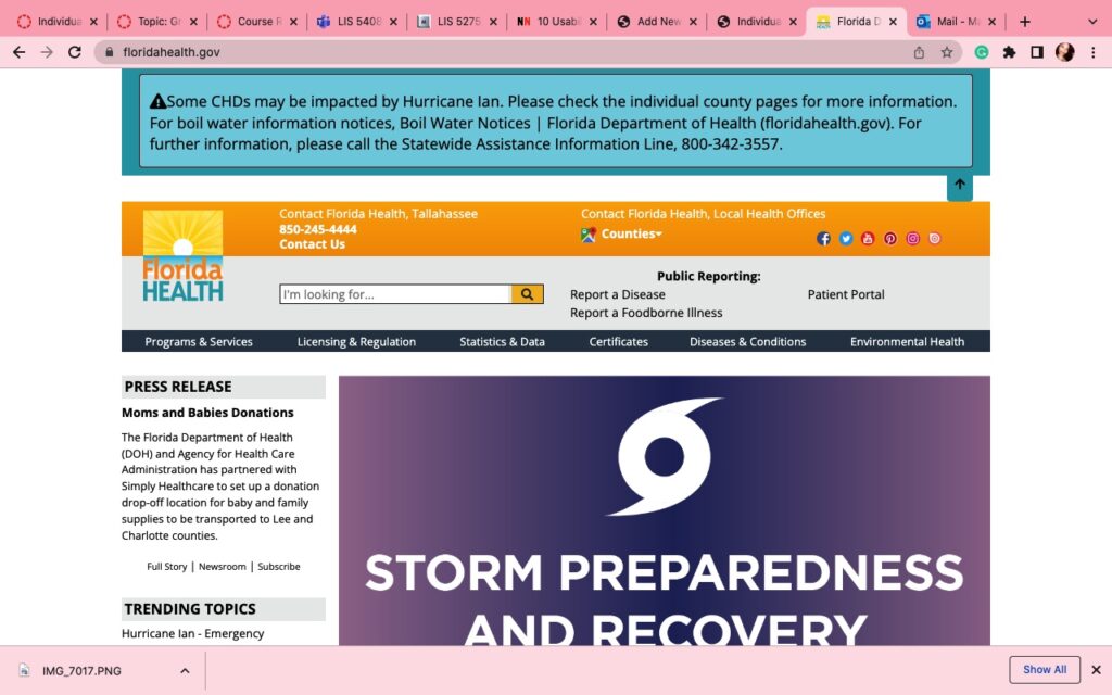
This image has an empty alt attribute; its file name is 1135C61E-4FCC-4161-B0C7-738C8FC5DB0C-1024x640.jpeg


Site Background

The site that I chose to complete my heuristic analysis assignment on is the health site used and operated by the state of Florida for up-to-date health information, floridahealth.gov. This site provides health information to Floridians that reside within the state and out of state so that they may obtain health information, statistics, and updates of the state of Florida to make informed health decisions.

Heuristic Analysis Simulation situation

The simulation chosen for the floridahealth.gov was one of a user seeking the most up to date information on the COVID-19 to make an informed decision on whether to get the COVID-19 vaccine for protection against the virus. This simulation was based off a user that mostly seeks after information using social media mostly without verifying the information received from social media during every encounter of the posts that comes across to the user. This simulation was used in a manner of the user not being very advanced in information seeking, usability analysis, or information seeking practices; we can identify the user in this simulation as a beginner as they navigate the Florida Health site.

Heuristic Analysis 10 step checklist

Heuristic Analysis Steps |Not Met Achieved| Comments
#1. Visibility of system status: The design should always keep users informed about what is going on, through appropriate feedback within a reasonable amount of time.


XThe site does not give users much information what they are doing, there is a search both atop the site that indicates “I’m looking for” which can be frustrating to use since the text indicator of “I” does not show in the search box as the search box only shows the texts that are typed once typing begins but there is no indication to show that text input can be started. 
#2. Match between system and the real world: The design should speak the users’ language. Use words, phrases, and concepts familiar to the user, rather than internal jargon. Follow real-world conventions, making information appear in a natural and logical order.XThe site uses the user’s language clearly but the updates are not in real time as shown on the yielded search results, the last updated article “The State of Florida Issues COVID-19 Updates” after being clicked shows as August 7, 2020 which is over two years ago. 
#3. User control and freedom: Users often perform actions by mistake. They need a clearly marked “emergency exit” to leave the unwanted action without having to go through an extended process.


XThe user control is limited to return to the previous page the back arrow in inactive so to allow going back the user must select the previous tab they were on shown to the left of the new tab that was opened. It is a very limited system. 
#4. Consistency and standards: Users should not have to wonder whether different words, situations, or actions mean the same thing. Follow platform and industry conventions.XThe articles presented upon search submission are not well organized at all. 
#5. Error prevention: Good error messages are important, but the best designs carefully prevent problems from occurring in the first place. Either eliminate error-prone conditions, or check for them and present users with a confirmation option before they commit to the action.

XThe opening of the new tab causing the back arrow to be disabled allows limit of error and error prevention because multiple tabs can be opened and navigated through which is helpful for information comparison by an expert of information seeking but not an information seeking beginner. 
#6. Recognition rather than call: Minimize the user’s memory load by making elements, actions, and options visible. The user should not have to remember information from one part of the interface to another. Information required to use the design (e.g. field labels or menu items) should be visible or easily retrievable when needed.

XThe opening of the new tab causing the back arrow to be disabled allows limit of error and error prevention, and recognition rather than recall because multiple tabs can be opened and navigated through which is helpful for information comparison by an expert of information seeking but not an information seeking beginner. 
#7. Flexibility and efficiency of use: Shortcuts — hidden from novice users — may speed up the interaction for the expert user such that the design can cater to both inexperienced and experienced users. Allow users to tailor frequent actions.XThe site is friendly for beginners with the search bar being easily found on the first page and topic widgets sectioning information can also be clearly seen. The sectioning of information is not easily found however by a beginner.
#8. Aesthetic and minimalist design: Interfaces should not contain information that is irrelevant or rarely needed. Every extra unit of information in an interface competes with the relevant units of information and diminishes their relative visibility.

XThe design of the site is very simple and does meet the design metrics for older adults through navigation being easily accessible by means of all of the information being on one page that only requires scrolling down to see. 
#9. Help users recognize, diagnose, and recover from errors: Error messages should be expressed in plain language (no error codes), precisely indicate the problem, and constructively suggest a solution.XThis step is met because there is not an easily made method to invoke error during a search on this site. 
#10. Help and documentation: It’s best if the system doesn’t need any additional explanation. However, it may be necessary to provide documentation to help users understand how to complete their tasks.XThe site does not provide documentation to help users complete their tasks it simply provides a question and answer from multiple article method. 


LIS5765_MarsAlceus_HeuristicAnalysis1-1

Design Recommendations

The site has many features that could be improved however two recommendation that I could immediately consider for user experience are that the search results be yielded in a more organized manner to filter the topics prior to receiving the search results. The second recommendation is that the information yielded in the search results be filtered by most recent to later in date while providing a brief synopsis of what the article includes instead of just showing the article title.
Individual Assignment 2: Heuristic Evaluation

Website Being Evaluated

This image has an empty alt attribute; its file name is 1135C61E-4FCC-4161-B0C7-738C8FC5DB0C-1024x640.jpeg


Site Background

The site that I chose to complete my heuristic analysis assignment on is the health site used and operated by the state of Florida for up-to-date health information, floridahealth.gov. This site provides health information to Floridians that reside within the state and out of state so that they may obtain health information, statistics, and updates of the state of Florida to make informed health decisions.

Heuristic Analysis Simulation situation

The simulation chosen for the floridahealth.gov was one of a user seeking the most up to date information on the COVID-19 to make an informed decision on whether to get the COVID-19 vaccine for protection against the virus. This simulation was based off a user that mostly seeks after information using social media mostly without verifying the information received from social media during every encounter of the posts that comes across to the user. This simulation was used in a manner of the user not being very advanced in information seeking, usability analysis, or information seeking practices; we can identify the user in this simulation as a beginner as they navigate the Florida Health site.

Heuristic Analysis 10 step checklist

Heuristic Analysis Steps |Not Met Achieved| Comments
#1. Visibility of system status: The design should always keep users informed about what is going on, through appropriate feedback within a reasonable amount of time.


XThe site does not give users much information what they are doing, there is a search both atop the site that indicates “I’m looking for” which can be frustrating to use since the text indicator of “I” does not show in the search box as the search box only shows the texts that are typed once typing begins but there is no indication to show that text input can be started. 
#2. Match between system and the real world: The design should speak the users’ language. Use words, phrases, and concepts familiar to the user, rather than internal jargon. Follow real-world conventions, making information appear in a natural and logical order.XThe site uses the user’s language clearly but the updates are not in real time as shown on the yielded search results, the last updated article “The State of Florida Issues COVID-19 Updates” after being clicked shows as August 7, 2020 which is over two years ago. 
#3. User control and freedom: Users often perform actions by mistake. They need a clearly marked “emergency exit” to leave the unwanted action without having to go through an extended process.


XThe user control is limited to return to the previous page the back arrow in inactive so to allow going back the user must select the previous tab they were on shown to the left of the new tab that was opened. It is a very limited system. 
#4. Consistency and standards: Users should not have to wonder whether different words, situations, or actions mean the same thing. Follow platform and industry conventions.XThe articles presented upon search submission are not well organized at all. 
#5. Error prevention: Good error messages are important, but the best designs carefully prevent problems from occurring in the first place. Either eliminate error-prone conditions, or check for them and present users with a confirmation option before they commit to the action.

XThe opening of the new tab causing the back arrow to be disabled allows limit of error and error prevention because multiple tabs can be opened and navigated through which is helpful for information comparison by an expert of information seeking but not an information seeking beginner. 
#6. Recognition rather than call: Minimize the user’s memory load by making elements, actions, and options visible. The user should not have to remember information from one part of the interface to another. Information required to use the design (e.g. field labels or menu items) should be visible or easily retrievable when needed.

XThe opening of the new tab causing the back arrow to be disabled allows limit of error and error prevention, and recognition rather than recall because multiple tabs can be opened and navigated through which is helpful for information comparison by an expert of information seeking but not an information seeking beginner. 
#7. Flexibility and efficiency of use: Shortcuts — hidden from novice users — may speed up the interaction for the expert user such that the design can cater to both inexperienced and experienced users. Allow users to tailor frequent actions.XThe site is friendly for beginners with the search bar being easily found on the first page and topic widgets sectioning information can also be clearly seen. The sectioning of information is not easily found however by a beginner.
#8. Aesthetic and minimalist design: Interfaces should not contain information that is irrelevant or rarely needed. Every extra unit of information in an interface competes with the relevant units of information and diminishes their relative visibility.

XThe design of the site is very simple and does meet the design metrics for older adults through navigation being easily accessible by means of all of the information being on one page that only requires scrolling down to see. 
#9. Help users recognize, diagnose, and recover from errors: Error messages should be expressed in plain language (no error codes), precisely indicate the problem, and constructively suggest a solution.XThis step is met because there is not an easily made method to invoke error during a search on this site. 
#10. Help and documentation: It’s best if the system doesn’t need any additional explanation. However, it may be necessary to provide documentation to help users understand how to complete their tasks.XThe site does not provide documentation to help users complete their tasks it simply provides a question and answer from multiple article method. 


LIS5765_MarsAlceus_HeuristicAnalysis1-1

Download

Design Recommendations

The site has many features that could be improved however two recommendation that I could immediately consider for user experience are that the search results be yielded in a more organized manner to filter the topics prior to receiving the search results. The second recommendation is that the information yielded in the search results be filtered by most recent to later in date while providing a brief synopsis of what the article includes instead of just showing the article title.
Individual Assignment 2: Heuristic Evaluation

Website Being Evaluated

https://www.floridahealth.gov/

Site Background

The site that I chose to complete my heuristic analysis assignment on is the health site used and operated by the state of Florida for up-to-date health information, floridahealth.gov. This site provides health information to Floridians that reside within the state and out of state so that they may obtain health information, statistics, and updates of the state of Florida to make informed health decisions.

Heuristic Analysis Simulation situation

The simulation chosen for the floridahealth.gov was one of a user seeking the most up to date information on the COVID-19 to make an informed decision on whether to get the COVID-19 vaccine for protection against the virus. This simulation was based off a user that mostly seeks after information using social media mostly without verifying the information received from social media during every encounter of the posts that comes across to the user. This simulation was used in a manner of the user not being very advanced in information seeking, usability analysis, or information seeking practices; we can identify the user in this simulation as a beginner as they navigate the Florida Health site.

Heuristic Analysis 10 step checklist

Heuristic Analysis Steps |Not Met Achieved| Comments
#1. Visibility of system status: The design should always keep users informed about what is going on, through appropriate feedback within a reasonable amount of time.

XThe site does not give users much information what they are doing, there is a search both atop the site that indicates “I’m looking for” which can be frustrating to use since the text indicator of “I” does not show in the search box as the search box only shows the texts that are typed once typing begins but there is no indication to show that text input can be started. 
#2. Match between system and the real world: The design should speak the users’ language. Use words, phrases, and concepts familiar to the user, rather than internal jargon. Follow real-world conventions, making information appear in a natural and logical order.XThe site uses the user’s language clearly but the updates are not in real time as shown on the yielded search results, the last updated article “The State of Florida Issues COVID-19 Updates” after being clicked shows as August 7, 2020 which is over two years ago. 
#3. User control and freedom: Users often perform actions by mistake. They need a clearly marked “emergency exit” to leave the unwanted action without having to go through an extended process.

XThe user control is limited to return to the previous page the back arrow in inactive so to allow going back the user must select the previous tab they were on shown to the left of the new tab that was opened. It is a very limited system. 
#4. Consistency and standards: Users should not have to wonder whether different words, situations, or actions mean the same thing. Follow platform and industry conventions.XThe articles presented upon search submission are not well organized at all. 
#5. Error prevention: Good error messages are important, but the best designs carefully prevent problems from occurring in the first place. Either eliminate error-prone conditions, or check for them and present users with a confirmation option before they commit to the action.
XThe opening of the new tab causing the back arrow to be disabled allows limit of error and error prevention because multiple tabs can be opened and navigated through which is helpful for information comparison by an expert of information seeking but not an information seeking beginner. 
#6. Recognition rather than call: Minimize the user’s memory load by making elements, actions, and options visible. The user should not have to remember information from one part of the interface to another. Information required to use the design (e.g. field labels or menu items) should be visible or easily retrievable when needed.
XThe opening of the new tab causing the back arrow to be disabled allows limit of error and error prevention, and recognition rather than recall because multiple tabs can be opened and navigated through which is helpful for information comparison by an expert of information seeking but not an information seeking beginner. 
#7. Flexibility and efficiency of use: Shortcuts — hidden from novice users — may speed up the interaction for the expert user such that the design can cater to both inexperienced and experienced users. Allow users to tailor frequent actions.XThe site is friendly for beginners with the search bar being easily found on the first page and topic widgets sectioning information can also be clearly seen. The sectioning of information is not easily found however by a beginner.
#8. Aesthetic and minimalist design: Interfaces should not contain information that is irrelevant or rarely needed. Every extra unit of information in an interface competes with the relevant units of information and diminishes their relative visibility.
XThe design of the site is very simple and does meet the design metrics for older adults through navigation being easily accessible by means of all of the information being on one page that only requires scrolling down to see. 
#9. Help users recognize, diagnose, and recover from errors: Error messages should be expressed in plain language (no error codes), precisely indicate the problem, and constructively suggest a solution.XThis step is met because there is not an easily made method to invoke error during a search on this site. 
#10. Help and documentation: It’s best if the system doesn’t need any additional explanation. However, it may be necessary to provide documentation to help users understand how to complete their tasks.XThe site does not provide documentation to help users complete their tasks it simply provides a question and answer from multiple article method. 

Design Recommendations

The site has many features that could be improved however two recommendation that I could immediately consider for user experience are that the search results be yielded in a more organized manner to filter the topics prior to receiving the search results. The second recommendation is that the information yielded in the search results be filtered by most recent to later in date while providing a brief synopsis of what the article includes instead of just showing the article title.
What Are Index Futures? Definition, Types, and How to Profit

what is index trading

Some brokers also allow you to purchase fractional shares, which means you can buy a portion of a share if you can’t afford the full share price. Pick one with the terms and tools that best align with your investing style and experience. A priority for active traders will be low commissions and fast order execution for time-sensitive trades.

With smaller indexes like the S&P 500, the fund manager will typically hold the same stocks in the same proportions as the underlying index. For instance, if the S&P 500 is 7% Apple stock, an S&P 500 index fund will hold roughly 7% Apple stock. – tracking the performance of a group of stocks may be more volatile than individual stocks. This means there is potential for more significant losses and more enormous profits. New traders should look for a broker who can teach them the tools of the trade. Some offer educational articles, online tutorials and in-person seminars.

Regardless of strategy, trading on an index reduces the risk and expenses incurred by trading individual stocks, and it also results in a more diversified portfolio with less volatile price changes. Since many of the major stock indices are reliable predictors of both domestic and global economies, traders can use effective index trading tactics to gain a competitive edge. Trading index futures and options can be more suitable than cash products for a longer-term position, as they have wider spreads, but they still include the overnight fees. Index futures are derivative products based on the value traders expect the index to reach in the future. At expiry, you can settle the futures contract for cash, or roll it forward into the next period and continue to hold. The share prices of all the constituents were totalled and divided by the number of companies.

  • This method gives greater weighting to larger cap companies, which means their performance will affect an index’s value more than lower cap companies.
  • An unweighted or equal-weighted index will give the same weight to each and every constituent company.
  • You can take a position on index futures with CFDs, and they will be traded at the futures price – meaning that you won’t incur overnight funding charges.
  • The S&P 500 is one of the most widely traded indices in the world and is considered a benchmark for the US economy, as well as the global economy.

If an investor wanted to do that, it would have meant buying every stock in equal weighting. It wasn’t until the first financial derivatives in the 1970s and the advent of stock index futures that trading an index became possible. Index funds and ETFs are baskets of stocks that offer other securities that you can invest in all at once. These funds will track the entirety of the S&P 500, and they’ll likely perform similar to how the index itself performs. And rather than buying individual stocks to mimic the S&P 500, you can invest in a fund that just does the entire thing for you all in one investment.

Please ensure you understand how this product works and whether you can afford to take the high risk of losing money. That’s because their prices https://bigbostrade.com/ depend on the prices of the underlying index. The risk comes from speculative positions taken by investors who use leverage to make their trades.

It covers 30 prominent companies listed on stock exchanges in the United States, and unlike many of its other peers, it does not use a weighted average. The use of price-weighted measurements ignores volume and focuses solely on price, adding more weight to those companies that are more expensive than others. The most important thing to pay attention to is that they have volatility and liquidity. Some indices tend to favor one sector of the economy over another, so understanding the differences will be crucial. Here are some of the leading indices, all of which you can trade at PrimeXBT.

Trade with a trusted Forex broker

For example, the E-mini S&P 500 futures contract, which trades on the Chicago Mercantile Exchange (CME), has a value of $50 times the value of the index. So if the index trades at 3,400 points, the market value of the contract would be 3,400 x $50 or $170,000. Some of the most popular index futures are based on equities, which means investors hedge their bets on the individual index named in the contract. A market index measures the value of a portfolio of holdings with specific market characteristics. Each index has its own methodology which is calculated and maintained by the index provider.

what is index trading

Stock trading is the trading of shares of specific companies at individual prices. Once you buy a stock, it is transferred to you from the seller, and you assume ownership. You should also consider that different indices are traded at separate times, depending on the individual exchange.

Wherever you fall on the investor-trader spectrum, taking things slowly, ignoring ‘hot tips’ and keeping good records can help you do it safely. While most global economies are in a similar period of post-Covid, the macroeconomic and industrial responses are divergent cross-country, and complicate the argument of investing in stock vs indices. Adding complexity to the stock trading vs index trading debate, Andrew Sheets of Morgan Stanley, thinks the index could contract by 5%. In light of expectant deceleration, many analysts believe the question is becoming one less focused on what to invest, but where. In turn, banks and forecasters are still projecting positive returns in the stock market.

IG International Limited receives services from other members of the IG Group including IG Markets Limited. Find out more about a range of markets and test yourself with IG Academy’s online courses. The Dow Jones Industrial Average is the oldest U.S. stock index, as well as the most frequently cited one; however, the S&P 500 represents a larger cross-section of the economy. This will also potentially help you identify the best index to trade at any given time. This will reduce the volatility while also dampening the effect of the sharp rally in each and every stock. This will limit the influence that one stock can have on the overall performance of the index.

In most cases, the relative change of an index is more important than the actual numeric value representing the index. For example, if the FTSE 100 Index is at 6,670.40, that number tells investors the index is nearly seven times its base level of 1,000. However, to assess how the index has changed from the previous day, investors must look at the amount the index has fallen, often expressed as a percentage. Indexes are also created to measure other financial or economic data such as interest rates, inflation, or manufacturing output. Indexes often serve as benchmarks against which to evaluate the performance of a portfolio’s returns. One popular investment strategy, known as indexing, is to try to replicate such an index in a passive manner rather than trying to outperform it.

How does index trading compare to stock trading?

Portfolio managers often buy equity index futures as a hedge against potential losses. If the manager has positions in a large number of stocks, index futures can help hedge the risk of declining stock prices by selling equity index futures. Index futures, which are also called stock or equity market index futures, function just like any other futures contract. They give investors the power and obligation to deliver the cash value of the contract based on an underlying index at a specified future date at an agreed-upon price.

The best time to trade an index will depend on the assets it covers, where it is based and the trading hours for the stock exchange if it’s a stock index. It will also depend on market drivers such as company announcements, economic news and political events, which can all trigger market volatility. Stock indices are calculated in different ways based on cfd trading platform the types of companies they track and the goals of the index. Some index calculations give more weight to stocks with higher prices, while others base the weighting on market capitalisation, and others weigh all constituent stocks equally. The two major formulas used to calculate the value of a weighted index are price weighted and market cap weighted.

Price-weighted indices are less common than those based on market cap. The Dow Jones Industrial Average (US30) in the US and Nikkei 225 are both price-weighted indices. Now that you have set your stops and possibly limit orders, it is time to execute the trade. However, you should monitor your trade from time to time, recognizing whether or not you may wish to add or subtract from the position or adjust your stop-loss or limit orders. Trading a specific share involves a lot more research, as you need to be aware of balance sheet issues, earnings reports, and of course the industry that the company operates in.

Here, they will trade an index-tracking fund or simply a basket of shares instead of simply buying and selling individual company stocks. They are traded on margin, meaning that for a small refundable deposit you can actually control a much larger trading position. You can also profit from both rising (going long) and falling (going short) markets. The S&P 500’s value is calculated based on the market cap of each company, adjusted to consider only the number of shares that are traded publicly. However, each company in the S&P 500 is given a specific weighting obtained by dividing the company’s individual market cap by the S&P 500’s total market cap.

In reference to mortgages, it refers to a benchmark interest rate created by a third party. One of the key reasons why investors use put options for hedging purposes is because of the unpredictable nature of the market. Since index options are tied to their stock indices, there is a huge level of risk in the market.

Open your account. Apply in minutes.

So, if you choose to use an actively managed index fund, make sure the added benefit is worth the higher cost. “The low expense ratio helps to ensure that investors obtain returns very close to that of the underlying index which the fund tracks,” Crowell says. Index funds work by holding all or many of the securities within the benchmark index.

Indices move on a list of different factors, with the most basic one being the earnings of the companies listed. The earnings-per-share, cash flow per share, dividends per share, and a whole litany of other metrics come into the picture. The Dow Jones Industrial Average traces its start back to 1896 and is the second oldest index in the United States. (Second only to the Dowell Jones Transportation Average.) It was created by legendary investor Charles Dowell, editor of the Wall Street Journal.

Indices are a measurement of the price performance of a group of shares from an exchange. For example, the FTSE 100 tracks the 100 largest companies on the London Stock Exchange (LSE). Trading indices enables you to get exposure to an entire economy or sector at once, while only having to open a single position. We want to clarify that IG International does not have an official Line account at this time. We have not established any official presence on Line messaging platform. Therefore, any accounts claiming to represent IG International on Line are unauthorized and should be considered as fake.

How can risk be hedged with stock index futures?

For nearly the last century, the average annual total return of the S&P 500, which includes dividends, has been about 10%, not adjusting for inflation. But this doesn’t mean that you can expect to get a 10% return on your investment in the S&P 500 every single year. Our partners cannot pay us to guarantee favorable reviews of their products or services.

What are the indices in trading?

For instance, traders can invest in the S&P 500 index by purchasing E-mini S&P 500 futures contracts. Investors can also trade futures for the Dow Jones and Nasdaq 100 Index. There are the E-mini Dow and E-mini Nasdaq-100 futures contracts, or their smaller variants the Micro E-mini Dow and Micro E-mini Nasdaq-100. Institutional fund managers use benchmarks as a proxy for a fund’s individual performance.

What affects the price of indices

We also offer nine indices on our options – meaning that you’re more likely to find a market that fits your individual trading style. Alternatively, you can also opt to trade or invest in an index-tracking ETF or shares of companies that are included in your chosen stock index. Before trading, you should always consider whether you understand how leveraged instruments work and whether you can afford to take the high risk of losing your money.

Individual Assignment #2 – Heuristic Evaluation

The Website

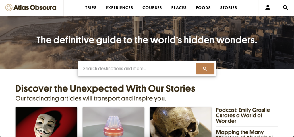
The website I selected for this assignment was atlasobscura.com. The website’s tagline is “The definitive guide to the world’s hidden wonders.” and users can search for destinations, experiences, food to try, and read stories about different places. The website features destinations that are popular as well as some out-of-the-box destinations/experiences.

Home page of atlasobscura.com

The Scenario

The scenario I chose to evaluate for this website is that I am visiting New Orleans and I want to plan out what attractions to go to. For the scenario, I do not have any food restrictions/allergies and everyone is over 21 years old. Nielsen’s 10 heuristics will be used in the evaluation of this website.

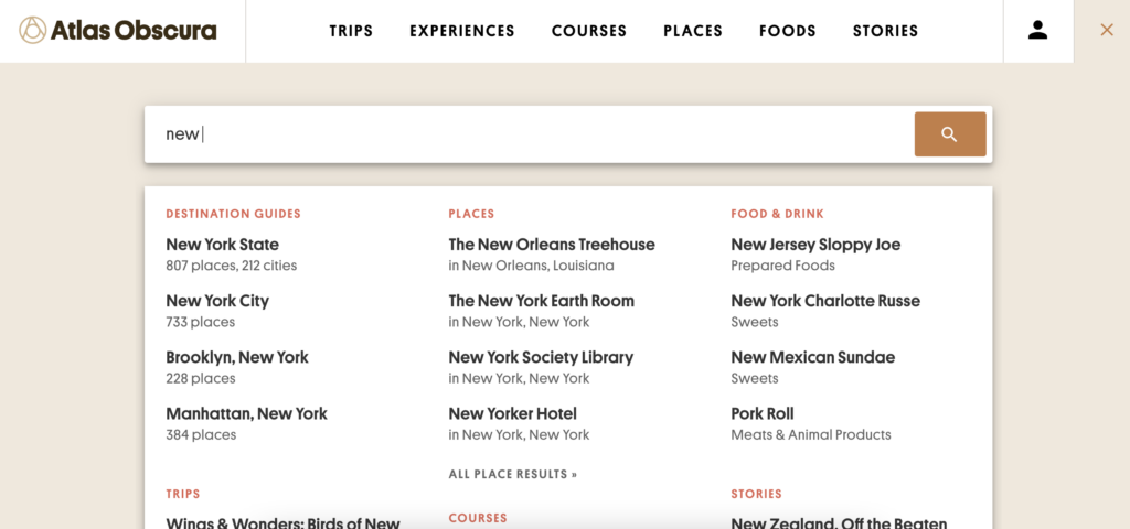
To begin the scenario I decided to search New Orleans in the search bar located on the home page. As I was typing, the search was continuously updated as I typed. For instance, when I had typed out “new” before “Orleans” it recommended destination guides for New York State, New York City, etc., it recommended places such as The New Orleans Treehouse and the New Yorker Hotel, and even a story about New Zealand.

A partial search of “new”

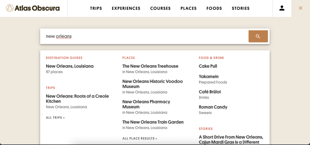
As I finished typing out “new orleans” the search results pulled together the results for information related to New Orleans. The results were broken down into different categories including “Destination Guides”, “Trips”, “Places”, “Food & Drink”, and “Stories”.

A search of “New Orleans”

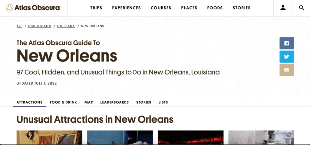
Instead of clicking any result listed in the search I just hit the enter button which led to “The Atlas Obscura Guide to New Orleans” which I believe is the same page as the “New Orleans, Louisiana” result that showed up under “Destination Guides”. This page had been recently updated in July of 2022 and featured quick links (“Attractions”, “Food & Drink”, “Map”, “Leaderboards”, “Stories”, and “Lists”) that would take you to that part of the page when clicked.

The Atlas Obscura Guide to New Orleans front page

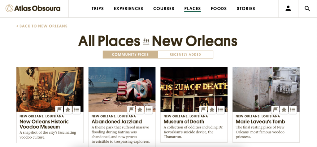
The first task was to pick out 2-3 attractions to visit while in the city. I was able to click a button under the “Unusual Attractions in New Orleans” section that led to another webpage which listed all the places in New Orleans that were added to the website. From that webpage I browsed the different options and settled on three different places to visit (Marie Laveau’s House of Voodoo, Lafitte’s Blacksmith Shop, and New Orleans Pharmacy Museum).

All places in New Orleans webpage

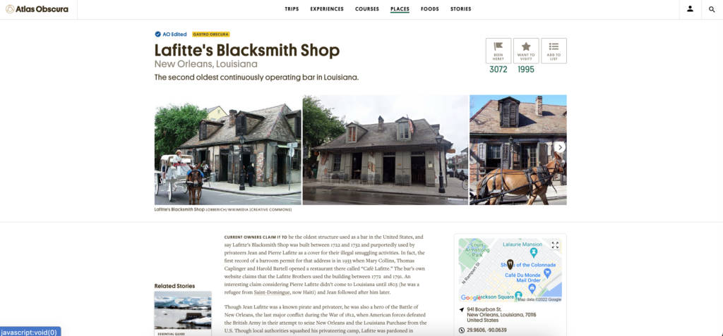
I clicked on one of the attractions I wanted to visit and it took me to a webpage dedicated to that attraction. On this webpage it gave a quick description of what the attraction was, a map of the location and the address, as well as a link to the website and nearby attractions.

Lafitte’s Blacksmith Shop webpage

Usability Flaws

While working through this scenario the overall process was relatively easy but some issues were present. When searching for “New Orleans” in the search bar it was constantly updating to try to find the best match based off each individual key stroke. This led to an overload of information that was constantly changing which is a violation of Nielsen’s 8th heuristic. Another violation occured when I clicked on “Lafitte’s Blacksmith Shop”. This led me to a new webpage dedicated to this attraction but did not provide a back button (which can be seen in the “All places in New Orleans” screenshot). This violates Nielsen’s 3rd heuristic.

Recommendations

Overall, this website was easy to use and was formatted and designed in a way that made sense as a user. I also acknowledge that I am not a novice when it comes to using computers, the internet, and searching webpages. One of the first recommendations I have is to not have the search automatically update results with every keystroke. I know that this is what is used in most search engines but I think for this specific site it makes sense to wait until the user is done typing their search term so they do not get overwhelmed with unrelated results. Another recommendation I have is to create a back link that would take you from an attractions webpage back to the webpage with all of the attractions. This could be a link just like the one seen on the “All places in New Orelans” webpage that is in the left hand corner of the screen (“BACK TO NEW ORLEANS”) but with the wording “BACK TO ALL PLACES IN NEW ORLEANS”. This would provide the user with an easier way to get back to the previous page.

MVP What does MVP stand for? The Free Dictionary

Test your Minimum Viable Product (MVP) A Minimum Viable Product is essentially a first iteration of your social network that you can put out to market and measure people’s reactions. What does mvp mean in a relationship, But, what does MVP actually mean? We first need to look at players in the “Relationship Game” and identify what makes for the perfect athlete.

mvp meaning in relationship

The Presenter is also decoupled directly from the View and talks to it through an interface. One common attribute of MVP is that there has to be a lot of two-way dispatching. For example, when someone clicks the “Save” button, the event handler delegates to the Presenter’s “OnSave” method. Once the save is completed, the Presenter will then call back the View through its interface so that the View can display that the save has completed. Now that you’ve weighed the strategic elements above and settled on the limited functionality you want for your MVP, it’s time to translate this into an action plan for development. A team effectively uses MVP as the core piece of a strategy of experimentation.

Start identifying specific problems you want to solve or improvements you want to enable for your user persona.

Playing the lottery can destroy your business, and it’s nearly impossible to play the game. We recommend that each product be kept up to date by creating an MVP. Scale the concept down to the bare minimum after you have tested it on a larger scale. Wayne Gretzky is well-known as the “Great One.” The award was given to him nine times from 1980 to 1989, during his illustrious career with the Edmonton Oilers and Los Angeles Kings. Despite his age, he is revered by hockey fans all over the world as a true icon of the National Hockey League. As a basketball player, he is also known as one of the greatest players of all time.

mvp meaning in relationship

Since the inception of the NBA All-Star Game, four different players have received the Co-MVP award. The NBA’s third and final labor dispute occurred in 1998 and was the third time in league history that a work agreement had been reached. A learning-based project management process (MVP) is used in Lean Startup to emphasize how learning can have an impact on new product development. An epic’s analysis begins with its definition of a Minimum Viable Product (MVP). A person is honored with the Most Valuable Player Award for his or her outstanding performance on the field, in the league, or in competition.

How Do You Define Your Minimum Viable Product?

In some cases, the MVP may also be a team captain or leader who has demonstrated exceptional leadership or teamwork throughout the season. MVPs are usually the face of their team and the league, and often become icons for their sport. If you are using the term MVP concerning market research, it likely refers to a minimum viable product. However, if you use this term in another context, it might stand for something different.

They created a minimalist website, published photos and other details about their property, and found several paying guests almost immediately. IMO, MVP is an improved version of MVC where you basically separate the concern of what you’re gonna show (the data) from how you’re gonna show (the view). The presenter includes kinda the business logic of your UI, implicitly imposes what data should mvp meaning in relationship be presented and gives you a list of dumb view models. Its main benefit is you can test your UI business logic against many/various views like showing items in a horizontal list or vertical list. Proper use of an MVP means that a team may dramatically change a product that they deliver to their customers or abandon the product together based on feedback they receive from their customers.

Does Mvp Mean Best Player?

He is also an online editor and writer based out of Los Angeles, CA. He studied at Georgetown University, worked at Google and became infatuated with English Grammar and for years has been diving into the language, demystifying the do’s and don’ts for all who share the same passion! Your relationship with your Most Valuable Person (MVP) is unquestionably unique. Thus, when your partner calls you an MVP, it means that you are the only person he/she would want to face life with. In modern software development, cybersecurity cannot be an afterthought. The software development landscape is constantly evolving, driven by the need for efficient, secure, and…

  • With its templates, Notion comes as close to highly aesthetic and multi-purposed journals as it is possible without a cutesy notebook and a set of color pens.
  • Shortly after, the market will boom because similar products are coming up.
  • They make you feel loved, supported, and appreciated.They’re your best friend, your confidante, and your biggest cheerleader.
  • A focus on releasing an MVP means that developers potentially avoid lengthy and (possibly) unnecessary work.
  • Nowadays, User Action also known as the Referral programs is a perfect distribution channel for many SaaS products.

MVP is an abbreviation for “most valuable person.” This title is frequently bestowed upon the kind and supportive partner in a relationship. When times are difficult and you need someone to lean on, you can depend on your MVP. This someone could be your partner, best friend, or even therapist. An example of an MVP is ad campaigns to products that do not exist yet. The campaigns simply directs potential customers to landing pages with info about the product. Metrics track interest of potential customers in the product and which features are receiving the most attention.

Testing

Definition of MVPThe Lean Startup methodology has its roots in lean manufacturing and lean software development and focuses on the same concepts of reducing waste and efficiency. To be perfectly frank, I think the underlying concerns of MVC hold true for any MVP implementation and the differences are almost entirely semantic. If you are achieving the benefits then who really cares whether your pattern is MVC, MVP or Supervising Controller? The only real pattern remains as MVC, the rest are just differing flavours of it. The location-based social network Foursquare started as just a one-feature MVP, offering only check-ins and gamification rewards. The Foursquare development team began adding recommendations, city guides, and other features until they had validated the idea with an eager and growing user base.

mvp meaning in relationship

Customers can understand the value of a product or service in a more tangible way without the need for a full-featured product or service. Landing pages are a great way to test customer interest and engagement levels. They enable businesses to capture leads and gather data in order to make product recommendations. A Most Valuable Player (MVP) is the individual or group of players who make the most contributions to a team’s success during a given season or championship.

Meaning of MVP in English

For example, will it attract new users in a market adjacent to the market for your existing products? If that is one of your current business objectives, then this MVP plan might be strategically viable. Whether it’s relationships, education, or sports, the most valuable person is referred to as an MVP. When someone refers to you as a MVP, they are saying that they consider you to be the most important or useful person in their situation.

mvp meaning in relationship

You have your customer object which your UI widgets is data bound to, but you also have additional UI-spesific fields like “IsButtonEnabled”, or “IsReadOnly”, etc. In that case your View might have a property called Customer, which then again is databound to the UI widgets. You don’t have to think about synchronizing and micro-manage the view, and the Supervising Controller can step in and help when needed, for instance with compled interaction logic. Your Presenter class will talk to the model and “map” it to the view. The benefit is that the view is easy to test, and it is easier to move between UI platforms (Web, Windows/XAML, etc.).

Potential Costs

In the context of sports, MVP has stood for “Most Valuable Player” since at least the 1930s. It’s an annual accolade given to a single player in a sports league at the end of a season, as voted by other players, sports writers, and sometimes fans. MVP stands for “Most Valuable Player.” The term is most commonly used in professional sports, but can be applied to any competitive situation where there is a clear winner. An MVP is typically someone who has made the biggest contribution to their team’s success.In games, this could mean anything from scoring the most points to having the best win-loss record. It’s as difficult as actually becoming the Most Valuable Player of any team.

INDIVIDUAL ASSIGNMENT #2: Heuristic Evaluation

INDIVIDUAL ASSIGNMENT #2: Heuristic Evaluation (Fredrick Douglass National Historic Site) By Sonya Jackson

The Website

Cedar Hill is a National Historic Site where Fredrick Douglass lived from 1877 until his death in 1895. The home is on eight acres on top of a 50-foot hill. Cedar Hill has been restored to its 1895 appearance, furnished with original objects that belonged to Frederick Douglass and other members of the home. As of March 1, 2022, the Fredrick Douglass National Historic Site is closed for renovations until 2023.

The Scenario

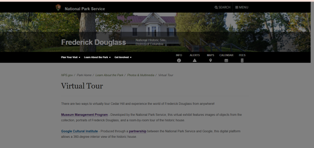
I initially wanted to visit the museum, but it’s closed for renovation. However, there are 2 options to visit the museum virtually:

  1. The National Park Service developed a virtual exhibit. It’s a room-by-room tour of the historic home with portraits of Frederick Douglass and objects from his collection.
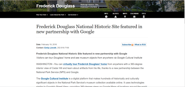
  2. Google Cultural Institute has partnered with the National Park Service and allows a 360-degree interior view of the home.

I wanted to have a 360-degree view of the home. So, I decided to view Cedar Hill via the Google Cultural Institute.

The Analysis

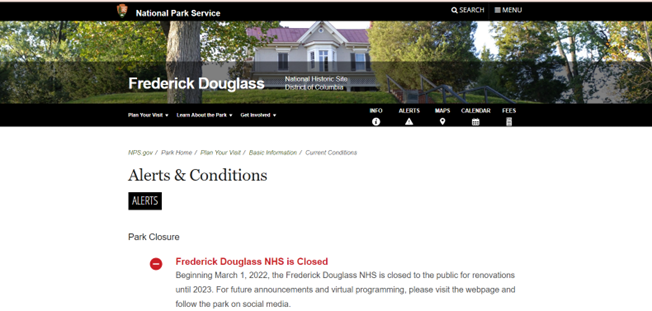
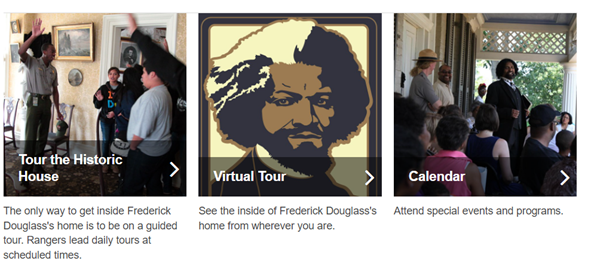
Usability heuristic #1 Visibility of system status- The system should always keep users informed about what is going on. When you initially hit the site the “Alerts & Conditions” tab shows there is a notification available in red. Naturally, I selected the tab. Under “Alerts & Conditions” the website informs visitors the house is closed for renovation and will not be open until 2023. A novice user may not select the “Alert & Conditions” tab. The notification should be posted under every tab since there is no “home page” as a starting point.

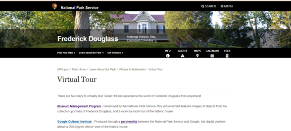
Usability heuristic #7 Flexibility and efficiency of use- Shortcuts are hidden from novice users- and speed up the interaction for expert users. The design is flexible and can be carried out in different ways so that people can pick what method works for them. Once you select the “Virtual Tour” tile it takes you to this page:

Now, once I select the “Google Cultural Institute” hyperlink the site turns grey, and nothing happens:

I waited 2 minutes because maybe there was a delay. Nothing happened so I selected the “Partnership” hyperlink and that also resulted in the following:

I was anxious to begin my 360-degree tour, but each hyperlink on the above page was not working. Each hyperlink resulted in a grey non-working page. A website should have working links on its page.

Usability heuristic #8 Aesthetic and minimalist design- Content should be visual and support the user’s primary goal. There are two sections on the website to initiate the virtual tour.  The “Info” tab and “guided tour” is a hyperlink that takes you to the virtual tour option. Because the museum is closed but a virtual tour is an option, the virtual tour link should be available under each tab.

Recommendations

The Fredrick Douglass National Historic Site contains a lot of information. The site is thorough however, the information on the site could be better organized, and navigation not so cumbersome. A novice user or a child would have some difficulty navigating the site. There is no “home page” for a point of reference. A “home page” is a great place to start over when you have become misdirected while seeking information. Since the museum is closed, the virtual tour option should be widely publicized. The virtual tour link is always placed at the bottom of the page, it should be moved to the top. Once you select the virtual tour option it plainly shows the two options to visit virtually however only one of the links is working. Broken hyperlinks are frustrating even for an advanced user. I have visited this site many times before and both links worked. The Google Cultural Institute site option is exceptionally aggravating because there are so many hyperlinks to select and all of them are broken. Overall, this site needs to be updated aesthetically and allow for maximum flexibility and efficiency of use.

Pretty Ways to Check with Someone to Be Your Girlfriend

When you have been dating a lady for a scottish women while and know that you intend to take what you should the next level, requesting her to be your girlfriend can seem like a difficult task. You’ll probably https://www.farmersonly.com/blog feel a lot of pressure to ask her in the ideal way mainly because, after all, you don’t desire to risk it not on track and losing her forever.

http://zhill.org/wp-content/uploads/2013/09/takeittothelord3.jpg

Luckily, there are lots of sweet ways to inquire someone to become your lover that will help you mop her off her feet and make the instant truly memorable. Keep reading to find out about some of the best and a lot creative strategies to pop the question!

A great way to ask a lady to be your sweetheart is to system ,which is a special day for the 2 main of you. Select a spot which means something to you personally both, like the place where you first satisfied or her most loved restaurant, and create a affectionate backdrop with regards to the occasion. Then, prepare a date that’s sure to make her laugh and let her know exactly how much you love her.

In case you aren’t comfortable speaking your feelings aloud, writing down your pitch can be a great way to express yourself. Write a notice or a poem which includes all of the factors you love her, and then finish this with a straightforward question: “Will you always be my sweetheart? ”

Another option is to get something expressive to give with her to show how much you care. A personalized gift is excellent, and you can also find ones with her initials or other symbols built in! For a seriously thoughtful touch, sing her a song regarding simply how much you love her. Even if you aren’t the best musician, she will prefer the thought that went into creating a music just for her.

A more modern way is to use technology to your advantage. In the event that she works on the calendar app, you can build an event with the question in the name so that it looks on her display when the woman opens that. This is a fantastic way to use technology in a creative way and can surely win over her!

You can also make an effort to be more traditional and ask her on her birthday. This is certainly a great way showing how much you care about her and will absolutely make the day special for her. Only be aware that you do not ask her in front of many folks, as this could make her feel uncomfortable.

In case you have some tech savvy close friends, they may be able to help you create a website that will allow you to ask her to be your girlfriend. This really is a fun and unique way to do it, and she will always be impressed by the ingenuity and effort that went into this!

Individual Assignment 2

Logan Davis – Arts and Crafts

Introduction

The website I have chosen for my heuristic evaluation is a Pinterest article. The specific article can be found under a collection entitled “Art and Crafts for Kids,” which contains a vast number of similar articles that offer arts and crafts activities that are supposedly meant for kids. The specific article I have chosen is titled “Tulip in a Heart Card Mothers Day Craft,” and includes a short video giving instructions on how to make the card specified in the title. Along with this video is a very brief description and a comments section.

Scenario

The scenario that I am imagining for the evaluation of this website is that of a younger child looking for something to make for their mom for Mother’s Day. With that being said, I am viewing the provided instructions in the video as they would be from the point of view of a child. I am assuming this child does not have any help from any adults and are attempting to complete this craft entirely on their own.

Analysis

The first flaw that shows itself is the use of materials that are not obviously available. In the instructional video, the demonstrator has multiple templates that are used to trace out various aspects of the craft. Despite these being such an important part of the process, there is no mention of how to attain these templates, or even how to make them yourself. There are no links provided outside of the video that would lead someone to finding these templates either. On top of this there are multiple comments asking about these templates as well, all with no answers. Secondly, there is no provided list of the necessary materials for completing this craft. Throughout the instructional video, the demonstrator uses scissors, glue, multiple sheets of construction paper, and the aforementioned templates. At no point in the video is it stated that the user will need to use all of these materials, and the only way they would find this information is by watching the full video and making a note of each material being used. While this normally would not be an issue for someone even slightly older, a younger child might find themselves beginning the craft without having the necessary materials gathered. This could prove to be a problem, especially if said child is attempting to complete this without the help of a parent. The final issue that I have found relates to the landing page of the website, rather than the specific article itself. The main page consists of what is essentially a wall of thumbnails that could easily become overwhelming for anyone, let alone a child. Along with this mess of thumbnails, the images are much larger than the titles of the articles, which are in a small font underneath the images, which could prove to be confusing or even easy to miss, leading to navigational issues.

  • The first flaw I mentioned, the use of templates without any explanation as to how to attain them, falls under heuristic rule number 2 “match between system and the real world.” The second flaw I mentioned, the lack of an explanation of materials, falls under heuristic rule number 6 “recognition rather than recall.” The final flaw I mentioned, the overwhelming main page, falls under heuristic rule number 8 “aesthetic and minimalist design.”
  • The first flaw I mentioned violates the second rule because information does not “appear in a natural and logical order.” The demonstrator uses the aforementioned templates which are not entirely obvious to the user. It may have been clear to the creator where or how to obtain these templates, but to the user it is not obvious at all. The second flaw I mentioned violates the sixth rule because it falls upon the user to be able to recall what materials they need while in the middle of the instructional process, rather than recognizing the necessary materials from a prior materials list. It would be much easier for the user to recognize the materials they need if that information had been explained prior to the instructions. The final flaw I mentioned violates the eighth rule because the main page is not aesthetically pleasing at all and could serve to be much more minimalistic. The images are way too big, the text is way too small, and each article’s link takes up far too much space.

Design Recommendations

In order to improve this site, I would add a link to the templates that are used in the video as well as a list of necessary materials. Adding a method to obtain the shown templates would cut out a lot of confusion for users, and provide them with a much simpler way to complete the craft instructions. A materials list at the beginning of the video or even as a text entry outside of the video would allow for users an easy to way to gather what they need before completing the instructions, rather than during the process. Along with these, I would fix the main page by making the thumbnails for each article smaller and their respective titles slightly larger. The main page would also benefit from being reorganized in a much more appealing fashion. These changes to the main page would provide users with a much simpler way to navigate through the available articles and decrease frustration.

Heuristic Evaluation | Art Museums

“America’s First Modern Art Collection” https://www.phillipscollection.org/

The gallery was originally the home of Duncan Phillips, art collector and philanthropist. Several additions to the original house were required in order to accommodate the ever growing art collection, now consisting of nearly 6,000 modern and contemporary works.  

Evaluation Scenario

I will be using the website to plan art history lessons and a field trip for homeschooled high school students. Generally these lessons consist of studying several works of art by one specific artist, or works created during a specific time period and in a specific place (e.g. several works by Picasso, or works from the Hudson River School). Since it is hoped that through the field trip students will be able to see in person works of arts they have studied in class, I will broaden the parameters for choosing works for this course.

Analysis

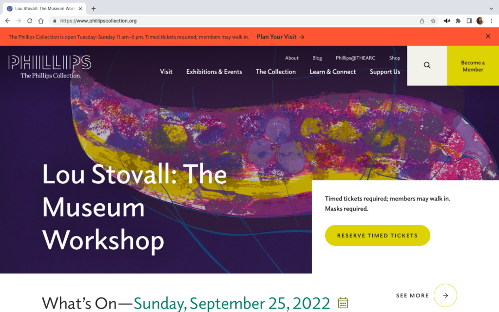
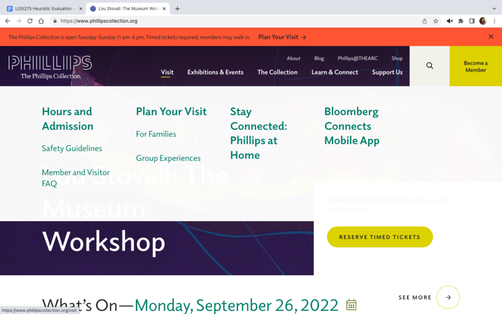
The landing page for The Phillips website has two menu bars, a search bar, a ticket link, membership information, and a promotion of a current exhibition. A red banner at the top of the page gives museum hours, ticket information, and an additional link to “Plan Your Visit.”

If you hover your cursor over the main menu bar at the top, a dropdown menu appears which obscures most of the window. (See images above)

The original screen is busy and gives the user pause while trying to digest all of the options available. When the dropdown menu appears with even more options, and at the same time significantly changes the view of the screen, it only adds to the potential for “information overload” or cognitive strain and the potential for confusion. By trying to provide too many choices in the initial view, The Phillips website violates Usability Heuristic #8, Aesthetic and minimalist design.

The Recent Acquisitions section found towards the bottom of the homepage is another example of where too much is done in one space, again violating heuristic #8. The work being highlighted is obscured by the text – this is true as you scroll through the entire section.

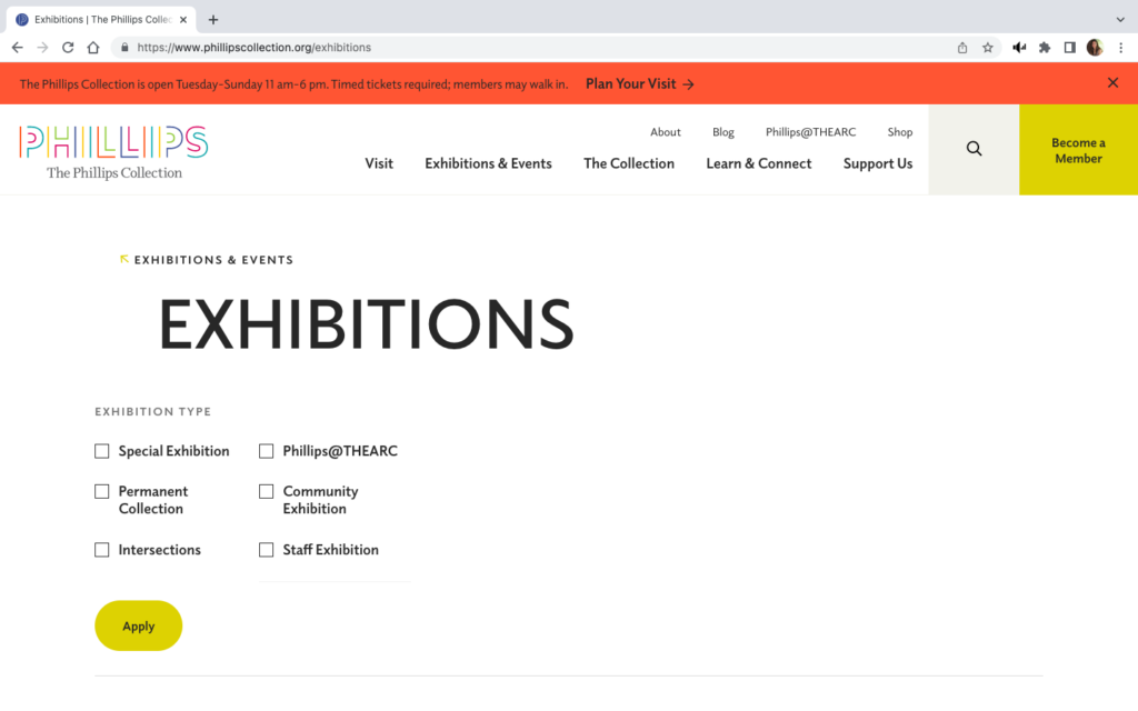
However, it is possible to take minimalism too far. The image to the right shows the landing page when “Current Exhibitions” is selected from the “Exhibitions and Events” dropdown menu on the main page. This landing view feels like the page did not fully load, or is perhaps not formatted correctly for the screen.

Scrolling down does give a view of all current exhibitions, but for a moment the user can feel lost. Also, the breadcrumb trail is barely recognizable since it consists of only the menu category and a small, lightly colored arrow. These difficulties in navigation inhibit the visibility of system status by not making it clear where the user is within the website, violating heuristic #1.

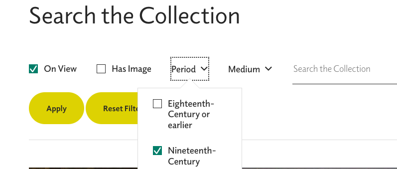
An even more egregious error in keeping users informed about what is going on occurs when trying to search the collection.

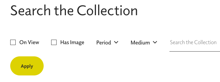
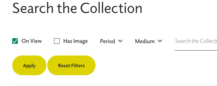
The view above shows the search page prior to any filter applications.

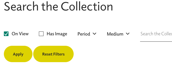
Once a search is selected, the checkbox turns blue with a white checkmark. However, using the “Apply” button only adds a “Reset Filters” button. It does not start a list of applied filters or change the color of the “Apply” button or the selected filter’s checkbox.

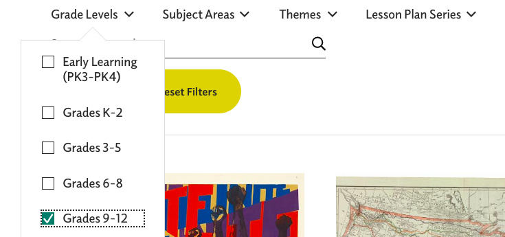
The image above, right, shows selection of the Nineteenth-Century time period and the one on the left shows the view after that filter is added to the “On View” filter. Again, once the “Apply” button is clicked, the user does not have any confirmation of which filters have been applied. (Heuristic #1) This same issue occurs when selecting grades for lesson plans, but there, the dropdown menu for grades obscures the “Apply” button making it even more confusing whether or not the grade filter is applied. (See image below)

“Reset Filters” button is present here before and filters are selected, unlike the “Search the Collection” view. “Grade Levels” obscure the “Apply” button and there no confirmation that the filter has been applied.

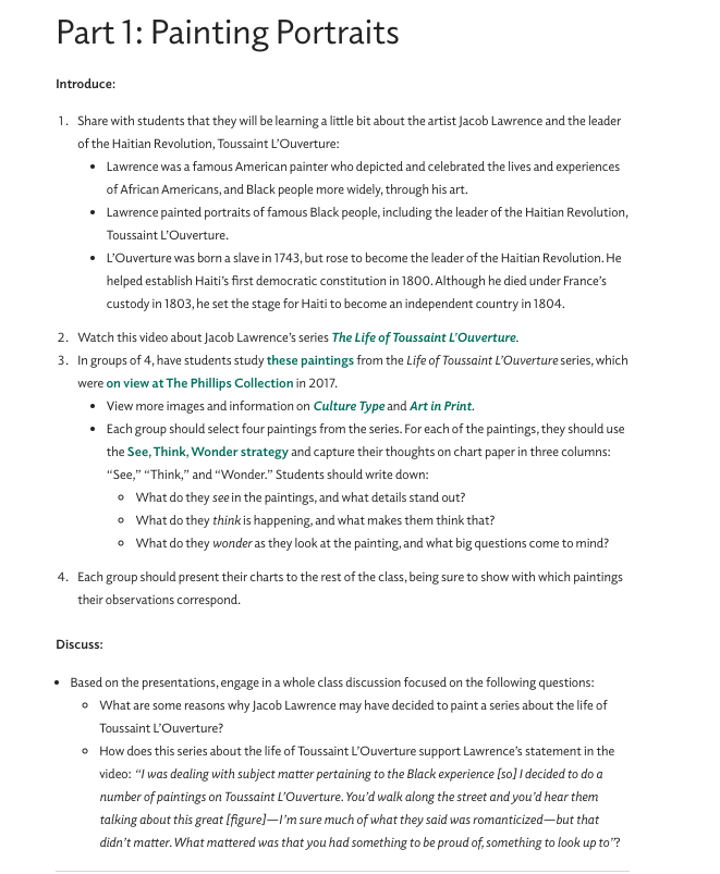
As hoped, the museum did provide robust lesson plans for their collection and special exhibition. Unfortunately, my selection of six works from Nineteenth-Century French artists is not included in the lesson plans, but I will explore the lessons for Jacob Lawrence’s works on Toussaint L’Ouverture since that exhibit’s subject is familiar to the students.

While this is an excellent lesson plan, it is not especially friendly to the user. The text which is blue-green, and may only appear bold to color blind users, are links to other resources. Besides the problem of a color blind user being able to recognize the links, many of the links take the user to outside of the Phillips website. This move is made within the same browser window and without any warning asking the user if they want to proceed to a link outside of the current webpage. At least one of the links, “these paintings” – #3 in the lesson plan, takes the user to a press release issued by another gallery. This press release does not contain any images, which is what I expected to find when I used the link. Jumping to other websites without warning, violates consistency and standards, heuristic #4. Also, since there is no warning that the user will be moved out of the museum website, and therefore away from museum navigation tools, heuristic #1 is again violated. There is not communication or transparency from the website to the user about the consequence of using the links.

Recommendations

As a whole, The Phillips Collection website is attractive, informative, and fairly easy to use. With some minor changes addressing navigation and visibility exploration of the website would be streamlined, making the site more user friendly.

  1. Aesthetic and minimalist design, heuristic #8 improvements
    • Remove the red banner at the top of the homepage. All the information here is found in the “visit” dropdown menu directly below.
    • Change the dropdown menus to vertical view only; eliminate the large white box that takes over the entire homepage.
    • Remove the box insert on the lower right corner of the homepage. Again, tickets are available under the “visit” dropdown.
    • Move heading for “Recent Acquisitions” to the top of the field
  2. Visibility of system status, heuristic #1 improvements
    • Reformat all views for filter options: the “Exhibitions” filters should be reduced so they do not take up the entire window. Display filters that have been selected and applied.
    • Improve the visibility of the breadcrumb trail by putting dark colored arrows, using right to left directions
  3. Consistency and standards, heuristic #4
    • Changing the breadcrumb trail would also create consistency for users based on experience with other websites’ navigation tools
    • In the lesson plans, links should open in a separate browser window, and warn the user if the link leads to another website