INDIVIDUAL ASSIGNMENT #2: Heuristic Evaluation (Fredrick Douglass National Historic Site) By Sonya Jackson
The Website

Cedar Hill is a National Historic Site where Fredrick Douglass lived from 1877 until his death in 1895. The home is on eight acres on top of a 50-foot hill. Cedar Hill has been restored to its 1895 appearance, furnished with original objects that belonged to Frederick Douglass and other members of the home. As of March 1, 2022, the Fredrick Douglass National Historic Site is closed for renovations until 2023.
The Scenario
I initially wanted to visit the museum, but it’s closed for renovation. However, there are 2 options to visit the museum virtually:
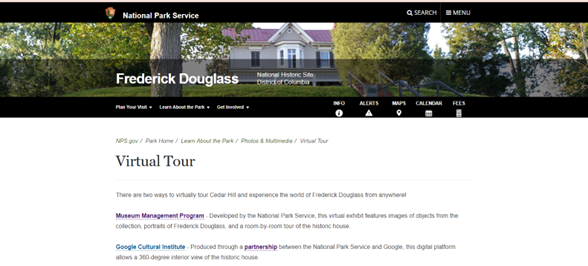
- The National Park Service developed a virtual exhibit. It’s a room-by-room tour of the historic home with portraits of Frederick Douglass and objects from his collection.
- Google Cultural Institute has partnered with the National Park Service and allows a 360-degree interior view of the home.
I wanted to have a 360-degree view of the home. So, I decided to view Cedar Hill via the Google Cultural Institute.
The Analysis
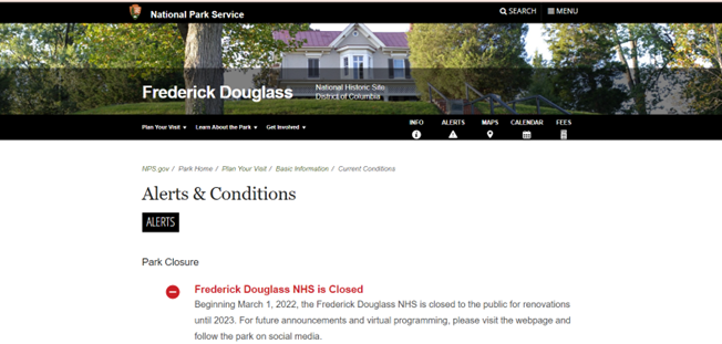
Usability heuristic #1 Visibility of system status- The system should always keep users informed about what is going on. When you initially hit the site the “Alerts & Conditions” tab shows there is a notification available in red. Naturally, I selected the tab. Under “Alerts & Conditions” the website informs visitors the house is closed for renovation and will not be open until 2023. A novice user may not select the “Alert & Conditions” tab. The notification should be posted under every tab since there is no “home page” as a starting point.
Usability heuristic #7 Flexibility and efficiency of use- Shortcuts are hidden from novice users- and speed up the interaction for expert users. The design is flexible and can be carried out in different ways so that people can pick what method works for them. Once you select the “Virtual Tour” tile it takes you to this page:
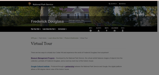
Now, once I select the “Google Cultural Institute” hyperlink the site turns grey, and nothing happens:
I waited 2 minutes because maybe there was a delay. Nothing happened so I selected the “Partnership” hyperlink and that also resulted in the following:
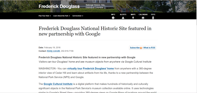
I was anxious to begin my 360-degree tour, but each hyperlink on the above page was not working. Each hyperlink resulted in a grey non-working page. A website should have working links on its page.
Usability heuristic #8 Aesthetic and minimalist design- Content should be visual and support the user’s primary goal. There are two sections on the website to initiate the virtual tour. The “Info” tab and “guided tour” is a hyperlink that takes you to the virtual tour option. Because the museum is closed but a virtual tour is an option, the virtual tour link should be available under each tab.
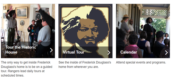
Recommendations
The Fredrick Douglass National Historic Site contains a lot of information. The site is thorough however, the information on the site could be better organized, and navigation not so cumbersome. A novice user or a child would have some difficulty navigating the site. There is no “home page” for a point of reference. A “home page” is a great place to start over when you have become misdirected while seeking information. Since the museum is closed, the virtual tour option should be widely publicized. The virtual tour link is always placed at the bottom of the page, it should be moved to the top. Once you select the virtual tour option it plainly shows the two options to visit virtually however only one of the links is working. Broken hyperlinks are frustrating even for an advanced user. I have visited this site many times before and both links worked. The Google Cultural Institute site option is exceptionally aggravating because there are so many hyperlinks to select and all of them are broken. Overall, this site needs to be updated aesthetically and allow for maximum flexibility and efficiency of use.