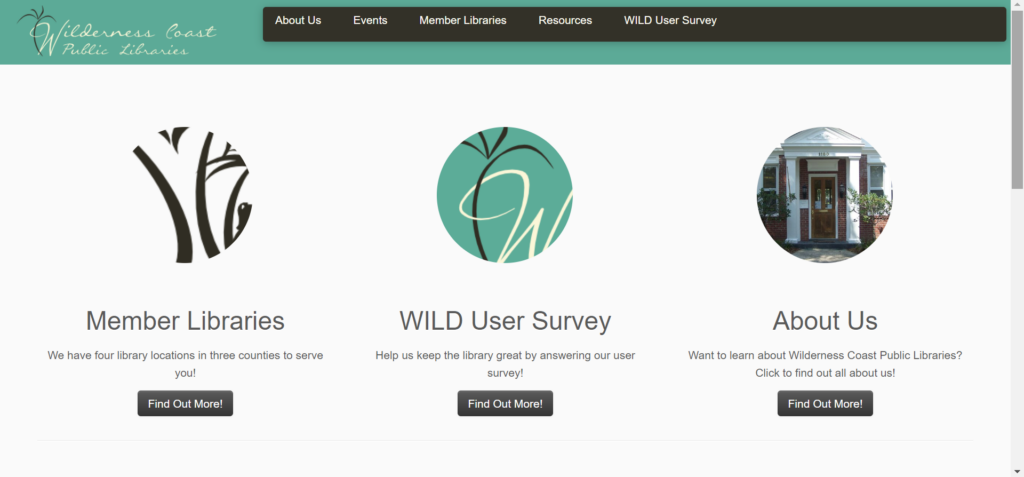
Individual Assignment 3: User Test

Website

We chose the Wilderness Coast Library system’s website, and chose to follow up our analysis with an emphasis on one of the 3 different library websites that are affiliated with the Wilderness Coast system, the Jefferson County Public Library website. This website is particularly interesting because it not only includes the main webpage detailing all of the info regarding the different member libraries and links to each one’s individual website (which provides a user, but it also includes a link to the main Catalog that all 4 member libraries utilize.

Persona/User

Our persona was intended to be a high school aged student who had to write an essay about Julius Caesar. Although I could not find a high school student to perform our user test, I was able to ask a college freshman to go through the website and think aloud while they navigated the page. My user had already taken college-level English and research courses, so that is a significant deviation from not only our developed user persona, but also likely from the average user of these websites in general. However, because a college-level research education is based on using a system that is (theoretically) well-made for research at a variety of levels, these sites present enough unique challenges that their intuition would not necessarily work out well for them anyway. My user claims that they are pretty comfortable looking things up on difficult to use websites, since they do that often for their job, but that they aren’t super comfortable with technology in general.

Testing Method

I chose to utilize the Think Aloud protocol, because I knew that my particular user would be comfortable giving immediate feedback as they went through, and that they would happily verbalize them. I think that it is helpful to see what they are doing in the moment and why they think they are doing it/what they think the interface wants them to do. I find it particularly interesting the way that, whilst doing a Think Aloud, people tend to anthropomorphize the interface and ascribe sentience to it (i.e. “it wants me to do XYZ”), which they then verbally react to. I have noticed that this does not happen as much with other types such as Retrospective Probing, and I think this helps us to better understand not just what a user does and why, but also how it makes them feel and why.

User Tasks

I wanted to utilize the tasks as we wrote them, since I felt like it would provide the best flow for a potential user. However, we did also have a short conversation before the test about their experiences with libraries, and spoke about the Library of Things and Seed Libraries that they’ve utilized at their own library, which influenced their user test toward the end. I did not comment on that, since I thought it was a fun addition that a student may likely need to try to find when completing a research paper.

Our tasks were as follows:

              Task 1: Using the Library system, the student will locate a relevant book for their research on the death of Julius Caesar, and which library that book is located at.

              Task 2 Now knowing what book to look for and what library it is at, the student will look for the available hours of that library that does not overlap with their high school schedule.

              Task 3: Find information on the use of computers at the local library to complete their research paper on Julius Caesar’s death. The student will also find out how to print from the library.

User Navigation

I gave my user a list of the three tasks to complete the project, and then set them up with the main Wilderness Coast Library System website, since that is the first result that comes up on Google. She immediately hovered over each of the three options and could not decide between the Member Libraries option or the About Us option (but immediately said that the Survey seemed pointless). She decided to start with About Us, but as soon as she opened that page she said that it did not seem to be what she was looking for, so switched to the Member Libraries option from the Nav bar. She found the JCPL option and clicked on that tab, and found the carousel image header both unhelpful and nauseating. However, after she was done being annoyed about the carousel, she noted that she was excited to have found the address for the actual library she was looking for.

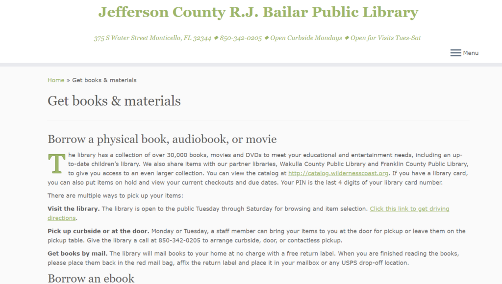
However, even though she knew where to physically go to find books, at this point she knew she needed to find the catalogue so she could actually look for books. Yet again, she was not sure which button to choose between Get Books & Materials and Discover Library Services, but “Get Books” seemed more promising so she went with that. When that page opened, she was looking for a search bar and was confused when she did not see it after scrolling up and down the page. Assuming she had landed on an “About our Services”-style page (since it was so text heavy), so went back to the Home page to get to the Services page. Realizing that it was essentially the same style of info, she clicked the “Get Books & Materials” button on the bottom right of the Services page. She skimmed the bolded headings of this page, seeing the different ways to get a book and noting that there is a way to borrow tech, which she wanted to explore (since she knew that was the third task) but decided not to because she hadn’t found the actual materials she needed to write the paper in the first place. Tucking that info away for later, she continued to search for the search bar that would allow her to find books.

After much clicking around this limited website and growing frustration, she decided to return to the Wilderness Coast landing page to see if she could find a Catalog there. She decided that the Resources item on the Nav Bar felt promising, and selected that. The first two items, WILD Catalog and WILD E-Books, called to her, and she could not decide between the two so she opened them up at new tabs. She immediately got excited by the search bar on the Catalog page, but wanted to check on the E-Books just in case; however, when she saw that they page was basically just a link to a different resource, she closed it out and continued forward with the search bar.

She searched for “Julius Ceasar” and was shocked to only see three results displayed. She decided to expand her search to “Rome” and decided that the 21383 results was too much. She switched to “Roman leaders” and felt that between the three Julius Ceasar books and the 550 Roman leaders resources, she could probably begin crafting a decent essay. She then went back to her search for “Julius Cesaer” and noticed that there were now 31 results instead of 3. She Googled how to spell “Caesar” and came back to the search bar and entered the name in properly, which interestingly enough still yields the 31 results.

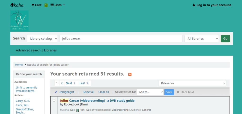
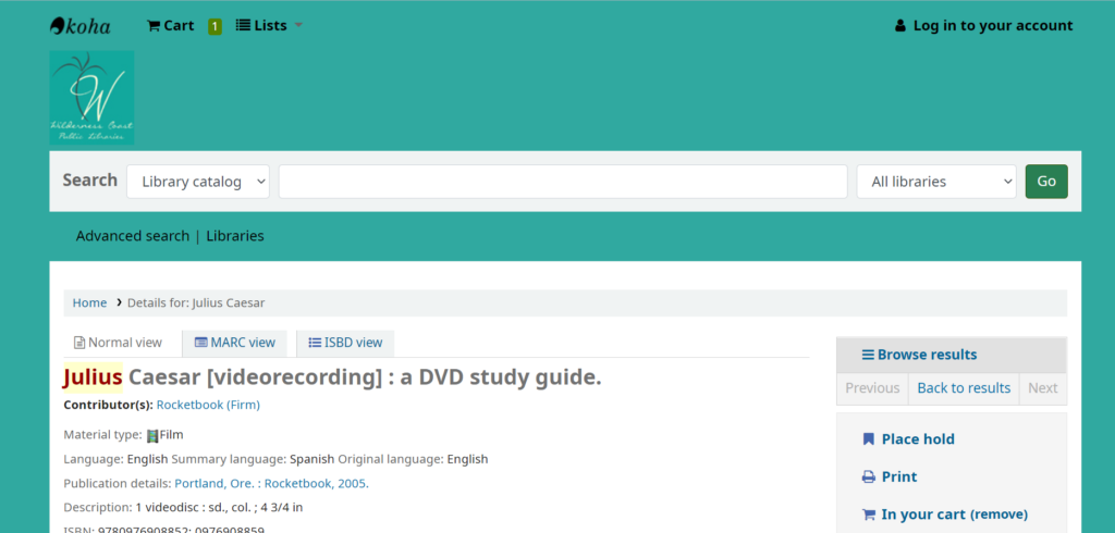
Now that she was able to locate that they had books/videos related to the topic, she checked to see where they were offered. She just went to the first result at the top of her current search page, which was for the Videorecording/DVD study guide. She noted that it showed green at the bottom of the listed that it was available at the JCPL branch, which she was excited about. When she clicked the title to look more into the resource, she saw the menu on the right side of the page and chose Add to Cart…and was confused when nothing appeared to happen. She scrolled up to find the Cart and saw the Log In option, but never located the cart. She clicked the Log In and promptly backed out since she did not have a library card and could not log in. She tried to choose the Place Hold option and also realized that she could not since she did not have a library card.

At this point, the user noted that she needed to find out when the library was open so she could go get the resource (and sign up for a library card). She had thankfully already found the address on the JCPL site, but did not remember seeing anything about the time. She started backing out of the catalog page and ended up backing up until she was stuck on the home page and could not back up anymore. She quickly perused the site and was thankfully able to quickly find the hours for the branch closest to her, but noted that she would not have guessed to look there if she hadn’t been dumped there during her frantic backing out.

She finally decided to go back to the JCPL webpage, and thankfully noticed the hyperlink to the left of the library hours to find the JCPL link. From there she navigated back to where she remembered seeing the Borrow Technology heading, and ended up back on the Catalog by following the Tech2Go link. She realized that she would probably need a library card for that, as well, and figured that was where she should stop.

Design Recommendations

There were a number of issues that my user ran into when navigating this site, which in many ways echoed my own navigation woes and the frustration my group has identified as we’ve worked with this website. These are the biggest stand out issues to me, though, that I think would help navigability immensely.

Main Home Page

For the Wilderness Coast main page, they should forgo the About Us/Survey/Member Libraries buttons and instead have the Member Library websites (with their addresses and hours) as the main landing page. Additionally, either above or below the different member libraries, they should have the Catalog search bar. From there, the Nav Bar can help users find more About Us and Survey info on separate pages (or honestly it could all be one continuous scroll page with clearly defined sections of descending import). Doing this would save so many clicks and so much unnecessary searching.
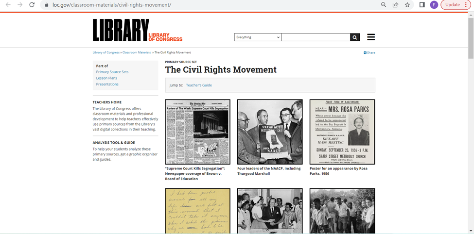
JCPL Webpage

The JCPL website is simultaneously too much and not enough. The information it does have is overbearing and redundant, with big blocks of text with minimal contrast to help a reader skim through and quickly find what they need. At the same time, the page is incredibly sparse and does not do a good job of guiding the user to the resources they undoubtedly want to access. Again, I think making this one continuous page could be beneficial, but mostly I think the home page should have a clearly labeled link that takes the user straight to the catalog website. Additionally, it would make sense for the home page to include things like their hours and contact information. Finally, since users cannot utilize resources without a library card, the home page should have a clear space defining the procedure of signing up for a library card.

Individual Assignment 2: Heuristic Evaluation

Website

For this assignment, I chose to evaluate the website for the Library of Congress (https://www.loc.gov/) website, which according to its website is “the largest library in the world” and has a collection of more than 173 million items, and it “receives some 15,000 items and adds more than 10,000 items to its collections” each working day. The library not only contains a variety of special collections, with everything from rare books and manuscripts to international collections to photographs and comics.

The Library is not just a place to preserve history (and, indeed, history itself: “it is the oldest federal cultural institution in the nation”), but an active repository that anyone can access for any purpose. With so much to access and so many types of users (from expert researchers and historians to students at every level to a casual reader looking to learn something new), the Library of Congress necessarily must serve as a model for all other libraries to learn from in terms of usability and navigation.

Scenario

The user that I am imagining for this evaluation is an AP US History teacher who wants to assign an essay for students to investigate the Civil Rights Movement, and specifically first-person accounts of the Civil Rights Movement and what it was like to be alive during that time. The teacher plans to require that students use the LoC website to find at least one primary and one secondary source. In order to confidently create this assignment, the teacher wants to create a few sample topics with specific sources for each one, so that during class she can go through the website and take the students through the research process. Tangentially, the teacher is hoping to find resources for teachers and how to use the site in the classroom and/or lesson plans.

Analysis

For the first part of my analysis, I started with trying to find resources for teaching the subject in the classroom. Since the teacher wants the essay to be about the topic they are covering, the Civil Rights Movement, they start with searching “civil rights movement” in the search box at the top of the page. This is very easy, and is located in the same place most websites would show a search box, and it quickly returned results. I think the results, however, violate heuristic #8, Aesthetic and minimalist design, because while the page is thankfully sparse in terms of the colors chosen…but the amount of text for each result is overwhelming, especially with the text to the left showing ways to refine the results. I think if this included some kind of corresponding image with each result, so that it is easier to see the delineation between each result, and making the “Refine your results” pane collapsible. It’s not a major faux pas, as far as database search results go, but especially as the largest library in the world, one might expect innovative design for helping increase navigability of their resources.

The violation of minimalist design is particularly problematic for this user, since they know that they will have to figure out how to keep 150+ students from immediately giving up due to being overwhelmed. The teacher wants to find ways to minimize the student’s panic, and notices off to the side that they can refine down to only seeing Photos from a specific time period, so the user decides to make the assignment such that the students will choose a relevant photograph to include with their essay, since the results found in this refined search is less visually overwhelming:

Satisfied with that decision, the teacher decides to try the search bar again to find primary sources. The search is a little better this time around, since it lists specific types of collections at the top of the page of results. The top result is exactly what the teacher is looking for, “Classroom Materials” for the Civil Rights Movement. The teacher hopes this will be a repository of lesson plans, and immediately decides to open it.

However, while the initial impression seems positive, it quickly becomes clear that this part violates two other heuristics. The first is #7, Flexibility and efficiency of use. The resource is just a collection of images, which while helpful, provide no context for the teacher and requires each one to be opened up individually to review what each resources shows. Additionally, for the background information and Teacher Suggestions are at the bottom, and there is no real indication that you can expect that information beneath all of the photos.

The second issue is a violation of #6, Recognition rather than recall. This is because the user has to open up each resource page to access it, so they have to remember how to return to the landing page in order to continue going through the resources that are collected together. This ends up either being an untenable number of tabs, or a need to make sure not to fall too far down the rabbit hole of hyperlinks and searching, so that you can back out to the landing page after reviewing each source.

While the teacher likes this resource, they want to find an actual lesson plan, because this seemed like a promising resource that did not deliver. So after backing out to try to return to the search page that originally prompted them to find the above resource page. They scroll down and are fortunate to immediately find a Learning Activity Secondary Level – Historical Narrative: The Civil Rights Movement, which is thankfully an easy to use PDF that the teacher decides to print out and peruse later.

Since they were able to find an actual lesson plan, the user decides to go back to the home page to see if they have dedicated Teacher’s Resources. On the main page’s navigation pane, there is a Teacher tab, although I would argue that this moderately violates the heuristic #4, Consistency and standards, in that the header bar is underneath the carousel image header, which hides it away when most navigation panes would be seen up in the header of the page, and remain consistent throughout the website. The hamburger menu remains static, but does not match up with the header from the main landing page, so finding what you want once you’re within the site is difficult and basically requires backtracking (which violates #7 again).

The user is excited to find the resources page, and begins looking at the “Getting Started with Primary Sources” page, and then hopes to partake in the Professional Development options, but struggles to find how to sign up (violating #10: Help and documentation) and decides to try again another time.

Recommendations

Overall, for the world’s largest library website, it does a good job of trying to bracket the information in logical ways. However, for a layperson with a very specific goal (especially one who has to consider a variety of various other users and how they may interact with the site to meet a specific goal), this site is note overly navigable. The biggest issue is how overwhelming it becomes. The violations of minimalist design and efficiency of use are the biggest violations, as users are almost immediately overwhelmed by too much text and having to click to new pages all the time. I think one of the best things they could do is make the search feature more image/collections focused. The Refine Results pane is very helpful, but I think making it collapsible would help a lot in reducing visual clutter and creating more space for better explanations for each material.

Individual Assignment 1: Designing for Users

The Website

The website that I chose was the FSU Office of Admissions main landing page, which requires a user to navigate a series of buttons and menus in order to reach the content that they are looking for. I use this webpage every day, as it is the main reference page that prospective applicants to FSU must navigate to receive important information regarding admissions requirements and deadlines (and we try to reference students to the webpages so that they have easy access to these resources). I know the vast majority of the content on the pages that are housed within the admissions.fsu.edu domain and exactly how to navigate to important information in the most direct way possible. However, I also know (based on my use of the site before my current role, in addition to the plethora of confused emails I get each day) that this site is overwhelming and often unnavigable, especially for the young adults exploring their college options for the first time. (It is currently being worked on though! Many of the subsidiary pages have already been majorly revamped!) 
 
Although the initial landing page seems pretty standard and benign, as seen here: 

An attempt to make the process more digestible is made with the use of photo buttons, which (although still a little bit of a lot it) does help chunk it nicely into our most common inquiries, but….  

….if you scroll down just a bit more, it quickly becomes a mass of buttons and text with minimal organization.  

The User 

For this assignment, I wanted to see how a prospective student might engage with the admissions website to find necessary admissions information to begin their application and know relevant materials and deadline info.  
 
I asked someone who may be interested in applying at some time in the near future to run the test for me. Their aims were to find out more about how the application process differs between First-Year and Transfer, and to see which cohort they should apply to, what majors they can apply to and what the requirements may be, and information about scholarships.  

The user is a young woman (18-24) who is very technologically savvy; she has taken computer coding courses, is a social media marketing chair for an organization, and has built her own computer. She is likely more technologically competent than many of the users who utilize this site on a regular basis. She also has lots of opinions and is emphatic about design choices, so I had a lot of fun watching and listening as she went through the pages. 

User Actions 

The user began by navigating to her Google Chrome browser….on her phone. I honestly did not think to specify at first that we should do it on a desktop/laptop. So, we started with that, since I felt like it would be more authentic to most of our user’s experiences anyway. (The main difference between the two layouts is that everything is stacked on top of each other, so slightly less overwhelming than the desktop layout.) 

The user ignored the hamburger menu (which concealed the options for “First Year,” “Transfer,” “Graduate,” etc.) and chose instead to open a new tab from the Apply Now button……which loops back to the main Admissions homepage… This brought about from the user a fun expletive and a quizzical head-tilt. She clicked the button to open in a new tab again, and the same thing happened. After a small grrr at the screen, she went back and simply clicked the button and saw that it opens a pop-up menu to the different application types. She chose First-Year (“since it’d be my first year there!”), clicked the “Apply Now” button on the new webpage that opened up and got to a User Log In screen where she had to make an account to continue. Getting annoyed with the relative lack of info on previous screens, and not sure if she was entirely in the right place, she decided to back out to go look at the different application types and their requirements. 

Since she noted how annoying it was to have to back out and try to find the pages again (since opening new tabs had so far been futile), I mentioned she could use my laptop to finish going through everything. We moved to the Google Chrome browser on the laptop, booted up the landing page, and as soon as she scrolled down and saw all of the picture buttons and Quick Links, she screamed and flopped back on the couch.  

At this point the user looked at me dejectedly, but said they were going to try one more time to find the info. She decided to ignore the Apply Now! button “because [she] hates it” and instead scroll back down to center the page on the photo buttons. She chose requirements, grumbled at the pop-up menu before choosing First-Year, screamed when she saw the wall of buttons (see below) and closed the laptop. Overall, the user test was an adventure for both of us. 

(To be fair, I did help her find what she was looking for later that evening, and she said that it honestly wasn’t that bad once I showed her where to find what she was looking for…but she just got so frustrated with the looping and walls of buttons that she just stopped caring at first. Granted, she did say that she eventually would have had to come back and try again, since she was actually interested in potentially applying…but that she got so overwhelmed with it all as a first experience that she would have had to wait a while before diving back in. She also said she would have probably called or emailed for help (both of which she hates having to do) because she did not feel like she could find what she needed without feeling overwhelmed.) 

Recommendations 

The biggest thing I think this site needs is fewer text buttons. Just that change alone is probably the most important thing. However, I also know that many of these buttons are necessary, and many more must remain on the landing page. To that end, I think what would really help is to organize the buttons into main sections throughout the page, so that the buttons are all grouped together in closer proximity to relevant other buttons. The page could also be delineated in a variety of ways, although delineating by application type seems the most logical to me. I think, also, utilizing the photo buttons more intentionally (fewer of them grouped together, for starters) could be very useful as well. As they are, the photo buttons offer some reprieve, but are still themselves relatively overwhelming since they are arranged as a double-stacked wall.  

Additionally, I feel like sectioning out the page to include relevant info by application type (such as a section for First-Year that includes a button for Requirements, Deadlines, Majors, etc.) would solve the looping problem that my user had. The pop up menu is not always intuitive, and the fact that so many of the broad categories include the pop-up menu instead of each of the app types from the pop-up menu having its own section with relevant informational buttons lead to a lot of frustration and confusion. Perhaps it is less of an issue with less tech-savvy users (not everyone is going to try to open something as a new tab instead of just clicking the link), but the sections would also help less tech-savvy users quickly scan and find relevant information.  

Overall, the site is not unusable, it is just a lot. And most of the information presented on the site is relevant and required, so it is not as simple as just taking out extraneous information. A lot of work is being done to make this site more navigable, and I am excited to see the changes (and receive fewer confused emails).