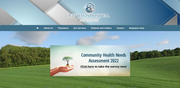
Individual Assignment 3: Representative User Test

Target Website

https://www.jeffdavishospital.org/

The Jeff Davis Hospital (JDH) website serves communities located within Hazlehurst, GA. Our primary concern is to observe the website’s usability through representative user testing.

Representative User

The target user responsible for carrying out the subsequent usability tasks for certain sections of the JDH website is a 22-year-old pre-medical student attending Florida State University (FSU). They are familiar with various information systems, particularly regarding healthcare websites considering their academic background. Their objective will be to simulate the role of a family member seeking healthcare services concerning the welfare of their grandparent, namely having a stroke.

Testing Method

Empirical research consisting of forty participants conducted by Alhadreti demonstrated that the Think Aloud (TA) method is highly suitable for usability testing (Alhadreti, 2020). They show that TA requires the involvement of one user, which reduces cost constraints and other project complexities, while effectively yielding major usability problems concerning the website.

However, the TA method is not without certain limitations. Computer science and information researchers Fan et al. argue that TA tests require a heavy time commitment to analyzing users’ voicings (Fan et al, 2020). Interestingly, their research seeks to automate TA sessions through machine learning models. Therefore, while cost-effective, TA tests should be limited to as few participants as possible to benefit from such testing without heavy time commitments. In this representative user test, one individual for evaluating the usability of JDH’s website will suffice.

Representative User Tasks

Assigned user tasks in this representative user test of the JDH website include:

Representative TaskDescription
Locate General Information About Strokes  Reviews information to make better decisions for the welfare of those impacted by such health issues. Tests website information scent, relevance, and reliability.
Locate Patient Transfer Services  When the patient is transitioning from post-surgery to physical rehabilitation. Such services are imperative to the safety and well-being of the patient, which aids in their recovery. Tests matching real-world vocabulary to the system.
Find Information About Elderly Care CoordinationFinding elderly care services offered by the JDH outpatient clinic. Tests website consistency and standards regarding its naming conventions and brevity.

Usability Analysis of Tasks

Locate General Information About Strokes

Using the TA method, the user accessed JDH’s website using their laptop on a Windows 10 OS. They made multiple remarks about the cleanliness and aesthetics of the homepage. When assigned the first task of locating general stroke-related information, they started with the section “Our Services” in the navigation panel. They reasoned that of the healthcare services that JDH provided, managing strokes should be one. With each link selected, the user would quickly scan the webpages using ‘CTRL+F’ with “Stroke” as the search criteria. However, they could not locate the information. Of those links, they selected “Emergency” after considering that a person experiencing a stroke would most likely look at this section. But the emergency services provided were not granular.

They then reasoned that their vocabulary regarding strokes needed to match a more formal, medical term. But a quick Google search did not yield relevant information about navigating JDH’s website. This search behavior continued over to the “Patients and Visitors” section which yielded similar dead ends that the user provided their reasoning for initially clicking. Of particular interest, the subsection “Education” did not provide the user with any information related to learning about strokes. They mentioned expecting to see such information on this webpage but were disappointed.

After a few more minutes of continuing navigation through trial and error, the user selected the subsection “Health Research Center” to finally locate stroke-related information. They expressed frustration that such information would exist in on this webpage but not in the “Education” section. They also thought the FastHealth graphic was “ugly” and intentionally did not click on the picture for that reason. They added that the graphic did not fit the rest of the web page’s aesthetic presentation.

Selecting the “Stroke” link directed the user to another section of the JDH website called FastHealth. The user mentioned that if they had accessed this website outside of JDH, they would have been highly skeptical of FastHealth because of its antiquated interface. They pointed out that the orientation of the links was arranged in alphabetical order. This frustrated the user because they could not tell which information was most important based on how they navigate webpages in general. They explained that they will typically click on the first link directly under a section on the navigation panel thinking that the first link is the most relevant to that section. FastHealth’s approach to the mere organization of links based on lettering did not sufficiently consider their users’ needs. This threw the user off to good information scent (since it was lacking) because they ended up clicking on all the links to discover that most of them don’t adequately define what a stroke is but explain procedures for managing a stroke. Additionally, the user needed stroke-related links that were relevant and reliable and presented in chronological order rather than alphabetical.

Locate Patient Transfer Services

For the second representative user task, the user’s behavior with navigating the JDH website became more apparent. For this task, they selected the section “Patients and Visitors” stating that such services would most likely reside here. The user continued by selecting the “Patient Portal” subsection expecting to find information related to the task simply because it was the first link immediately under the section header. The webpage did not provide them with relevant information. They then reverted to the main section, scanning the remaining links to no avail.

At some point, the user realized that patient transfer services could also be found under the “Our Services” section and hovered over the subsection links. They mentioned various links that could house such information but directed their attention to the ‘Swing Bed Program”. This wasn’t too surprising considering their background with healthcare websites. However, they couldn’t make sense of the selected webpage. It took them a few minutes in attempting to discover if JDH did offer such services. There were no clear indicators on the webpage that catered to patient transfers. The reason for the user’s confused behavior most likely stems from JDH’s vocabulary not matching real-world situations. The user was looking for transfer services, which the webpage offered, but was inundated with additional services concerning the exhaustiveness of their ‘Swing Bed’ program.

Find Information About Elderly Care Coordination

The final representative task involved the user locating a JDH outpatient clinic related to elderly care. The user began this task with said consistent behaviors in navigating the JDH website links. They selected the “Our Services” section, also stating that the first link, “Behavioral Health Unit” would be the “most relevant”. This reasoning led them across several various links as they kept running into irrelevant information. They voiced their confusion about how difficult it was to find the JDH outpatient clinic related to elderly care.

This confusion was further corroborated by their thinking that the JDH outpatient clinic was the Family Medical Group (FMG). This confusion is understandable considering the FMG offered “quality care for a broad range of illnesses” that included DOT physicals. This was an easy mistake to make since FMG was using ambiguous language in defining their “quality care”. The user voiced this concern by asking questions, “What are wellness visits?” or “Patient education?” However, the user determined that the JDH outpatient clinic for elderly care was not to be found at FMG.

After realizing that FMG wasn’t suitable for accomplishing this task, they simply selected the link below FMG, “Harmony Center”. It took them about a minute to accomplish this task since the vocabulary on this webpage matched the task requirements for receiving elderly care from a JDH outpatient clinic. They voiced several terms that corroborated their reasoning that the Harmony Center was the right webpage for such services. Such terms included, “loved one”, “seniors”, and “declining physical ability”. However, the time it took for the user to accomplish this task was unacceptable due to the JDH’s website’s naming conventions from the “Our Services” section. The Harmony Center doesn’t provide any context as to what that webpage will provide. Additionally, for Family Medical Group to offer DOT physicals is also misleading for services whose clinic name concerns family care. The user’s expressed frustration is noted.

Design Recommendations

Chronologically oriented stroke-related links

Currently, FastHealth alphabetically organizes its educational links for all its healthcare topics. While this satisfies some form of organization it is not considering the audience that would utilize this information. Based on the findings of the TA session, the user was frustrated with not knowing which stroke-related link was most relevant to the scenario described to them. Their understanding of how to research strokes was chronologically oriented to the task requirement. That is, they wanted information about the different stages of a stroke with the respective medical care administered at each stage. By considering the audience, that is, users most likely to navigate this website, chronologically orienting healthcare links will increase website information scent, relevancy, and reliability thereby improving its usability.

Re-design the FastHealth user interface

The user noted their dislike of FastHealth’s antiquated interface. While it didn’t prevent them from navigating the website, it did invoke feelings of distrust for satisfying their information needs. The user reasoned that if it weren’t for accessing FastHealth from the JDH website, they would not have taken it seriously. Based on these findings, re-designing the FastHealth user interface to match the JDH website interface will promote a better experience for users and enhance its usability.

Match real-world vocabulary to the system

The user experienced frustration when seeking patient transfer services because of the terminologies utilized by JDH’s website. Namely, the “Swing Bed Program” webpage. While that term might have made sense to some, it was clear that the term was not universally understood. Thus, when matching real-world vocabulary to JDH’s “Swing Bed Program” webpage, its audience must be considered. The TA session proved this reality when the user struggled with understanding what “Swing Bed” meant even with their pre-medical background. Therefore, one solution is to consider what their audience would most likely understand and search for. That is, instead of “swing bed”, use plain vocabulary like, “patient transfer services”. This solution demonstrates empathy for its users that speaks their natural language since these words are familiar to them (Nielsen, 2020).

Re-design contextual navigation system using card-sorting

For all tasks, the user found it difficult to track down task requirements through JDH’s website navigation system. This hurt the website’s usability since the user could not reconcile their understanding of patient transfer services or seeking outpatient elderly care with system terminology like “Swing Bed” or “Harmony House”. The user voiced several times about clicking on links that seemed “right” but were not at all relevant to their representative tasks. One solution is to conduct a card-sorting exercise where users organize topics into categories that make sense to them, which can help improve the JDH website contextual navigation system’s logical ordering to better reflect website usability.

Citations

Alhadreti, O. (2020). Comparing Two Methods Of Usability Testing In Saudi Arabia: Concurrent Think-Aloud Vs. Co-Discovery. International Journal Of Human-Computer InteractionAhead-Of-Print(Ahead-Of-Print), 1–13. Https://Doi.Org/10.1080/10447318.2020.1809152

Fan, Li, Y., & Truong, K. (2020). Automatic Detection Of Usability Problem Encounters In Think-Aloud Sessions. ACM Transactions On Interactive Intelligent Systems10(2), 1–24. Https://Doi.Org/10.1145/3385732

Nielsen, J. (2020, November 15). 10 usability heuristics for user interface design. Nielsen Norman Group. https://www.nngroup.com/articles/ten-usability-heuristics/

WORD COUNT: 1905

Individual Assignment 3

LIS 5275 – Usability Analysis

Christopher Gregor

The Wilderness Coast Library System

Main Page

The Wilderness Coast Library System website is the central access site to the Wilderness coast multiple library sites. It is used by the Franklin County, Jefferson County, and Wakulla County libraries to access their own main sites and the larger Wilderness Coast library catalog of books and assets. This site is designed to aid users in searching for information and tools related to the entire library system or to direct users to the appropriate site of the correct library.

User

The user selected for this round of testing was a 17-year-old high school student preparing to end their junior year with their final history project. They are determined to keep a high grade in their courses since next year they are applying to colleges and want to in with a high GPA. They live in a two-parent household with one younger sibling within walking distance of the school. To prepare for the history project, they are planning to do their project work with their fellow group members at one of the nearby libraries so they can be near resources and guarantee everyone has internet access and can do their part, along with communicating in person.

User Testing Method

For studying this website, I will be using the ThinkAloud method of user testing in order to be able to observe the user’s interactions and thoughts on the websites as they explore it and complete their tasks. This method will allow me a good understanding of my user’s interactions with the site, especially since the observation of the tasks will be done remotely using discord to allow me to watch my user move through the site live. This method will also allow me to record insight into the user’s plans and thinking on how to find their goals and walk through their confusion when they get stuck.

Tasks

The following three tasks were planned by the group to test the Wilderness Coast Library System’s usability and focus. For the purposes of my user, it is assumed that they are able to get to any of the libraries in the system for their tasks because their group members can drive them. The library my user will focus on will be discovered by their completion of the first task. Should they be unable to complete the task or not find a specific library, they will be instructed to select the Jefferson County Public Library.

Task 1

Using the Library system, the student will locate a relevant book for their research on the death of Julius Caesar and which library that book is located at.

Task 2

Now knowing what book to look for and what library it is at, the student will look for the available hours of that library that do not overlap with their high school schedule.

Task 3

Find information on the use of computers at the local library to complete their research paper on Julius Caesar’s death. The student will also find out how to print from the library.

User Testing

Task 1

For task 1, the user was sent the URL for the homepage and began streaming their screen to me as they read the instructions. Their first choice was to click on the Member Libraries link and select the Wakulla County Public library, seemingly at random. From there, they used the catalog link to go to the Wilderness Coast catalog and type in the upper search bar “death of Julius Caesar.” They chose the first book of “Julius Caesar/Struan Reid” and started to get confused by their options. First, they clicked the link “Place Hold” and hit a dead end when prompted to log into a library account they didn’t have. After backing up a page, they began scrolling through all the options on the left side of the page before clicking save record, which did not present them with where it was saved. The user then seemed to hesitate on “adding it to cart” but instead clicked print to try and download it, but the site didn’t provide which library it was at still. They backtracked again, and this time clicked “Add to cart,” which still didn’t provide them with the location of the book. From here, the user’s frustration began to show, and asked me to repeat the task prompt; they then returned to the catalog search page to look for more options. When they found none, they returned to the book’s link and began viewing the MARC and ISBD view links with no success. Following this, the user became very lost and frustrated before abandoning the task, declaring the library wasn’t listed on the page.

After completing all tasks, I showed the user the location of the library information, which was spelled under the book’s description as an acronym which clearly confused the user, who was unfamiliar with the libraries already to recognize an acronym. I imagine that while the catalog is designed well for library staff who know the information and acronym meanings, it is too jarring to the new user who needs some more explanation on what each link does.

Task 2

                To begin task 2, since the user was unable to find the location of the book in the previous task, the user was instructed to assume the book was located at the Jefferson County Public Library. They were also told to restart from the main page with the provided URL. They began by once again clicking on the member library and now clicking on the Jefferson County public library. From there, they navigated to the menu button on the right side of the page and read through the options before leaving the menu. They then clicked home, which took them to the same page they were already on. They then selected Discover Library Services and read through its contents before going to Get books and materials. They once again read through its contents and then moved on to the COVID-19 section, which mentioned adjusted hours but did not list the actual hours of the library. At the point the user remarks on how confusing it is that the pages have texted highlighted like links but no actual links to more pages, it once again appeared to be frustrating the user. The user then found the tiny Facebook link at the bottom of the page and clicked on it to go to the library’s Facebook page. They clicked on the About link and found the hours of the library, completing the task.

                It was very clear that for this task, the user became as confused as my group was with the difficulty of simply finding the hours on the site. However, they also became frustrated with how often the page mentioned the “standard hours” without mentioning what they were, and I can see how this could be very problematic as a design for users searching for very basic information.

Task 3

                After exploring virtually, the entire Jefferson Public Library website for task 2, task 3 was completed very quickly by the user. They began by returning to the Discover Library Services page and scrolling through the bullet points on the list to locate the printing services policy for the library. On the same page, they were able to find information on the use of the Library’s Chromebooks for research and internet uses.

                While this task was completed in the shortest number of steps, it still took my user a bit of time to review all the bullet points of the site, which they remarked felt very tedious and unhelpful for an informative website.

Design Recommendations

                After completing the tasks, I asked my user to list some problems they had with the website as if they were reviewing it. Combining their opinions along with my own gathered observations, I believe that multiple small improvements to the general look and layout of the site are needed. Across all the website’s pages, it is clear that the site was improved from a previous WordPress design to look more appealing with pictures and color, but the information itself is still presented poorly. Relying on bullet point lists to close together, images with no links or explanation, lack of basic information like hours of operation, and the jarring change of designs between each section of the public library system website. Overall, these smaller issues add up to a larger appearance that leaves the user either dreading lots of condensed information or confused about where to search.

Some of the pages should be broken up into separate subsections and incorporate either more graphical designs like pictures of the library or simply a more appealing and larger font. A quote from my user on this matter was, “Aerial is the most basic of fonts, and everything is so closely spaced.” The links used in the site should be placed in order of most use. Currently, they place the link to the individual library pages on the home screen off to the left and the survey on the library system at the center of the page even though they should prioritize its user’s needs, not the survey.

The larger recommendation would be to combine all of the sections of the library system: the main page, each of the individual libraries, and the catalog into a single site with a uniform design. It would allow users to navigate the site more consistently as the same navigation tools and patterns would be used across the site, along with specific standards being uniform to ensure all the correct information for each library and book can be found and recognized easily by each user. While this may take some time, it would allow for a smoother experience overall instead of a bunch of extra tabs being opened by links throughout the site to navigate across the Wilderness Coast Public Library System.

Individual Assignment 3: Representative User Test

The Site

The website that my group selected is TripAdvisor. It is a travel website that helps people plan and book their vacations. It guides you to find the best places to eat, stay, fly, what to do, rent vehicles, and find a cruise based on the reviews of those who have been there before.

My User

My user is a 42-year-old mom with 3 kids. She has been on a lot of cruises but never used TripAdvisor to search for a cruise. I could say she is an expert at navigating websites that involve shopping and vacations.

Test Method

I used the “think aloud” method. I gave her one task at a time, had her verbalize her thoughts, and had her start from the TripAdvisor home page for each task, which is a total of three tasks. I recorded the whole screen, including mouse clicks and her verbalization. I chose this method because it is easy to follow what she is trying to do.

Description of Tasks

The first task that I gave her was to find a cruise for her family of five that was priced at around $400 per person. The cruise needs to originate in the Miami or Port Canaveral area. It must be when the kids have no school and not hurricane season. I used some of the questions that the group chose for the second task because I think those options can make the first task easier to attain. On my experience, those options are usually in the filter on the search result page.

The second task was to find a cruise that has multiple stops. Multiple stops mean it will be a longer cruise, so, she had to make sure that the price was within her budget (the more stops, the more expensive the cruise gets). After finding a cruise with several port stops, the third task was to figure out what activities are offered at the different places where the ships will port. For this task, I asked her to use a different approach rather than using the search bar.

First Task: Find a Cruise

The user was asked to go to TripAdvisor and complete the first task that she was given. The first thing she did when she landed on the site was go to the search bar and search for “cruises”. The search bar is very visible, and it looks like it is the highlight of the page. This took her to the “Cruise” tab of the website. From there, she directly goes to the search tab and clicks on the “Where to” drop-down. Using her experience, she picked the cruise location that looked appropriate for the price limit. She was debating between “Caribbean” and “Bahamas” and picked the latter. Then she went to the drop-down menu of the “Departure Month” and picked December since she knows that the hurricane season is between June and November and the kids have no school in that month. Then she was presented with the results. She narrowed down the results by clicking on the filter on the left-side of the screen. She first limited her search to cruises departing from Miami, and then she selected the cruise that fit her budget. Then she was taken to a new page (still on TripAdvisor) where she could change the date, see pictures of the ship, and see the cruise deals. She clicked on the pictures first, then went back to the previous page and clicked on one of the deals. She was sent to the partner page (the site was showing a very good indication of where she was taken) where she had the option to book the cruise.

She did not encounter any problems with this task. She went through it flawlessly. She knew what she was doing and where to go. She even predicted that she would be taken to a partner website because TripAdvisor doesn’t book cruises.

Second Task: Multiple Port Stops

From where she was at, I had her go back to the TripAdvisor home page and do the second task. She was lost for a little bit because the current tab was the partner site and not TripAdvisor. She had to close Firefox and reopen it to get her way back to the TripAdvisor home page. When she opened the webpage, she did the same search. When she arrived at the result page, she filtered it with the price range of $79-$450. Then she started browsing each cruise that has two port stops. By clicking on “Ports,” she was able to view the cruise schedule, which includes the port stops. This is tricky because there weren’t a lot of cruise results for the price filter that she added. Most of the cruises were unavailable. At the top of the right-side of the first hit result was a “sort by” drop-down menu. She changed it from “Best Value” to “Price”. That is when she was able to browse the results seamlessly.

The problem she encountered on this task was that there were a lot of unavailable cruises that were showing after the price filter was applied. She had that problem because the sorting was automatically set to the best deal, which, unfortunately, the deals were not available. This is a violation of Neilsen’s aesthetic and minimalistic design principle because, after the filter was applied, the site showed very few available cruises and a lot of unavailable and irrelevant ones. It also violates Neilsen’s visibility of system status principle because the “sort by” was not very visible, and who would have thought that the reason why there were not many good results after filtering was because of the sorting?

Third Task: Port Activities

After finding a cruise with multiple ports, I had her go back to the TripAdvisor home page and do the third task without using the search bar. She started to look at the buttons at the top of the search. She scrolled all the way to the bottom of the page, then scrolled back up and clicked on the button with “….”, which reveals more buttons. She found the “Cruise” button and it took her to the cruise page. She scrolled down the page and looked for a link for an excursion. When she couldn’t find an excursion page, she scrolled back to the top of the page and filled in the drop-down menus with the same information used in tasks one and two. When she arrived on the result page, she picked the appropriate cruise and clicked on the “View Deal,” which took her to the partner website. On that webpage, there was an “Itinerary” page for that specific cruise. That is where she was able to find the excursions for each port that the ship stopped at.

She was having a problem looking for an excursion page because she did not see the “To Do” section of the home page of the site. Instead, she looked for it on the partner’s site. This is a violation of Neilsen’s consistency and standards because if the button link for the “To Do” on the “cruise” page was the same as the home page, it would have been easy to spot. They also changed it to “things to do” and it is hardly visible when you are in the “cruise” page. It also took her awhile to find the “Cruise” link button because it was not visible but under the “….” button. This is a violation of Neilsen’s visibility of system status principle because the link to get to the cruise page is hidden.

Recommendations

For the usability problems when performing the second task, my first recommendation is to remove the unavailable cruises from the search results (especially for the filtered results). By doing so, this would have made her search simple, easy, and more effective by spending more time on relevant information.

After filtering a search result, users directly scan the results without thinking about sorting them first. My second recommendation is that the “sort by” should be more visible and easier to spot so that users will know that there are more relevant cruises at the bottom of the page or somewhere on the other tabs if you change the sorting. Also, since the filter applied was on prices, the sorting should have been on prices too, not best value all the time. This would have saved the user time and made her more efficient in her search by looking at the relevant results.

For the usability problems of the third task, my first recommendation is to have a button for “cruise” on the home page instead of hiding it in “….”. This could have saved the user time from looking for the cruise link and more time to do a cruise search.

My second recommendation is to have the “To Do” button on all pages and don’t change the way it is presented. The user would have used this button when she was on the “Cruise” page because she would see it as related to her search. This would have saved her time from going to the partners’ webpage and searching for it there.

Individual Assignment 3 – Colin Webb

Jefferson County, located in Florida’s panhandle, is known as Florida’s Keystone County. It borders Georgia on the North and extends to the Gulf of Mexico on the South. It’s library system, the Wilderness Coast Library System, serves three different counties in North Florida and is comprised of four libraries. The libraries are: the Franklin County – Carrabelle Branch, the Franklin County – Eastpoint Branch, the Wakulla County Public Library, and the Jefferson County R.J. Bailar Public Library.

My user is a female high school senior interested in fashion design and is familiar with using websites. She is someone who does not give up easily and is persistent in finding the information she desires. A student at Pembroke Pines Charter High School, she frequently visits a large branch of the Broward County library system that is adjacent to her high school. The Broward County Library system is the largest and most expansive library system in Florida.

I chose to observe the probing test method. I decided on this method of testing because I believe it would be best for the user to explore the website by herself.  I believe by observing without any interaction or disturbance is the best way to gather information accurately from her experience.

The changes to my group’s original tasks are:

  • Task 1 – A change in researching the Ides of March to any subject in Ancient Rome. I wanted to give the user the freedom to search for something she would be interested in.
  • Task 2 – No change was made. The user will find the library’s operating hours.
  • Task 3 – In addition to my group’s request that she find the library’s computer and printing availability, I asked her to see if the book she found could be sent to a library in a different location for pick up.

My test involves the user finding a book on any subject of their choice related to Ancient Rome. Once my user chooses a book, she needs to determine which of the four locations in the Wilderness Coast Library System the book is located. She will also need to gather the library hours to see if it will coordinate with a high school student’s schedule. If she was a patron of the Wilderness Coast Library System, the library where the book is located may not be convenient. The largest distance between 2 libraries in this system, the R.J. Bailar Public Library to the Franklin County Public Library: Eastpoint Branch, is approximately 180 miles away, approximately a 3.5 hour drive. The final task will be to search for services the library may provide, including being able to have the book sent to another Wilderness Coast Library.

For Task 1, my user chose to look for information about clothing worn in Ancient Rome. When she started on the Wilderness Coast Public Library’s homepage, there were three main areas to choose from: Member Libraries, WILD User Survey, and About Us. She noticed the home page did not have a clear library catalog search bar. Looking at the tabs available on the top of the home page, she chose the Resources tab. The Resource page had certain links and the first was the “WILD Catalog”. This led her to a page with a search bar. She began her search for “Ancient Roman Clothing”, but all the book results were unrelated to Ancient Rome and/or clothing. In an effort to try again, she changed her search to “Ancient Rome” which resulted in 30 pages of book titles. However, less than 2 of the result pages contained books having “Ancient Rome” in their titles and none of them appeared to reference clothing. In addition, the results of the catalog search had no information of what is contained in each book. Clicking on a book title led her to the standard information such as the author, the publication date, ISBN, etc. and a tab labeled “Title Notes”. This tab contains additional information about the book’s subject. She found the contents of the “Title Notes” tab inconsistent since some of the books had this section missing or empty. My user had to explore each book’s “Title Notes” until she found a book called “Ancient Rome” by Richard Dargie. The title notes stated it “compares the lifestyles of the rich and poor in Ancient Rome, including, dwellings, clothing, and food”. She was also able to determine the book’s location, WCPL Junior, in the “Holding” tab on this page. However, this abbreviation was confusing to her as she did not understand what it meant. Her only choice was to return to the homepage and see what WCPL Junior referred to. At the homepage she clicked on Member Libraries and noticed one of the libraries is named the Wakulla County Public Library and realized it matched the abbreviation.

Once my test user found the book she wanted, the next task to complete was checking for the Wakulla County Public Library’s operating hours and if they coordinated with a normal high-school student’s schedule. She checked the hours and learned they were open after school and was glad to know the library is also open on Saturdays from 9:00 a.m. to 1:00 p.m.

With the hours found, her last task was to search the availability of computers and printers, and to find out whether the book could be sent to a different library in the Wilderness Coast Library System. She started back at the Wilderness County Public Library home page, followed by the WPCL library homepage and clicked on the “Services” tab at the top. This gave information, such as computer availability and printing cost. Computers at the WCPL Branch are available to residents with a library and non-residents with guest passes. Printing is available from their computer or by flash drive. It states that double-sided printing is available as well as the cost for black-and-white or colored prints. Finishing Task 3 was researching if the book could be sent to a different library within the Wilderness County Library system. She returned to the book tab, but all she could do is place it on hold. There is no information on the website regarding transporting books.

The Wilderness Coast Public Library website is confusing and disorganized, which is a disadvantage for all user levels. A major change that should be made is placing the individual library links on the main page to make it easier for users to know which library they wish to visit. Even if that were done, the current Member Libraries page states that the “Wilderness Coast has four library locations in three counties”. However, right below that statement there are only three links, instead of four, which is confusing. It seems the Franklin County Public Library has two branches and those individual library links are shown only after choosing the primary Franklin County Public Library link. The search results for books are disorganized as they show titles not related to the search. It would be clearer if the search responded with “No Results Found” instead of a list of unrelated material. Another major improvement to the book search results would be to include a brief description of the book’s subject and/or the information it contains. This way users will not have to spend time looking into each individual title. Also, the library’s homepage should be highlighting upcoming events to attract community participation. Instead, there is an “Events” tab that leads to a page with several listed events, some of which have already occurred. These are just a few improvements I would suggest for this website, I could identify many more.

The Wilderness Coast Library System may be able to assist those who walk into the library, but it needs to be able to assist all the patrons they serve electronically since this library system covers 180 miles. Its website needs major improvements in order to be beneficial to all patrons.

Representative User Test of the Norman Rockwell Museum’s Website

The site that will evaluated is the one for the Norman Rockwell Museum (https://www.nrm.org/). This website hosts information about the Norman Rockwell Museum located in Stockbridge, Massachusetts. This includes information about its hours, collection, location, events, careers, etc. Also, through this website, a person is able to do many things such as buy a ticket and view their digital collections. The evaluation that will follow will be completed through the observation of an example user participant as they complete a set of tasks within this website.

Figure 1. Screenshot of the Norman Rockwell Museum’s homepage located at https://www.nrm.org/

Participant Description

The participant that had been chosen for this evaluation is a middle-aged adult man with high education level. He does not have a background in information architecture/usability analysis, and he also does not have a background in museum studies or studies pertaining to art; however, he has a high proficiency in technology which may have proven to be a confounding variable due to his ability to easily navigate many websites and use various technologies.

User Testing Method

The method that was employed for this evaluation was the Think Aloud method. The participant was instructed to narrate his thoughts at each step while completing the tasks given for website evaluation. Notes were taken during observation to capture the results observed and to write down any notable statements that the participant said during the evaluation as quotes. This method was chosen for its insight into what a user might think while going through a website with the goal of using this information to understand what effect a flaw might have on a user’s thought process and why this thought process may have occurred, potentially causing difficulties in using this website.

Tasks Assigned

The tasks assigned to the participant were to find out how to buy a ticket for the Norman Rockwell Museum and to find directions to the museum itself, find out if there were any internship opportunities and find the description for all potential internship opportunities, and find the work, “Pointing Hand,” in the Norman Rockwell Museum’s digital collection archive. Overall, these tasks remained the same from their previous proposal conceived in a group setting. However, there were minor changes in the second part of the second task; instead of finding the description for a single internship opportunity, the task then became to find the description for all internship opportunities instead of an open one offered at the Norman Rockwell Museum. This is because there were no internships open at the time of the website evaluation.

Observations and Analysis

Task one: Find out how to buy a ticket and find directions to the museum

The participant started the first part of task one, finding out how to buy a ticket, by immediately going to the blue “Buy Tickets” button on the lower menu banner on the homepage of this website with a statement about how it was easy to find and eye-catching. This is most likely because it seems to stand out among the other buttons along that banner as the only button in a blue box.

Figure 2. Screenshot of the pop-up box when clicking on the “Buy Tickets” link in the bottom menu

After the pop-up box opened, he made a statement about wanting to know the difference in prices between a membership to the museum and a single ticket. After clicking on the “Museum Visit + Studio Tour” option, he looked through the information before finding his way back to the main page without any issue through the button shaped like a house on the top left of the pop-up. This symbol is fairly ubiquitous as the button to go to the main page of an application, so he had assumed correctly that clicking on that button would lead him back the way he came as he said. After this series of events, he made a statement about how the website is very easy to use and that he appreciated the fact that it was “actually a pretty comprehensive website” due to the ease at which he was able to go through the website and the amount of information he could find on it. He compared prices for two minutes before selecting the “Museum Visit + Studio Tour” button, scrolling down, and selecting the ticket option for 1:00PM. There was no hesitation during these last few actions, and he did not make any indication that the interface had caused him any confusion because the website was not difficult at all for him to navigate. After this part, he made a statement that the website was “user friendly” and that each option was “easy to find and stands out” with useful lists of options and pertinent information.

Figure 3. Screenshot of the “Museum Visit + Studio Tour” page within the pop-up that allows a user to buy tickets to the museum

For the second part, finding directions to the museum, he went directly to the directly to the top menu, hovered over the “Visit” option and selected “Directions” without any issue to get directly to this section (https://www.nrm.org/visit/#directions). Because the bottom menu did not have dropdowns and the top menu did, he found it easier to figure out the fastest way to get where he needed through the more specific options in the dropdowns in the top menu versus the single links in the bottom menu. Therefore, the dropdowns provided in the homepage were able to lend themselves to the participant’s ease of use regarding the website. From there, the page stated all directional information, and the task was completed. He made statements about how he was impressed with how comprehensive the website was and how user-friendly it seemed because of how easily he was able to complete this first task. Overall, this task took the participant less than four minutes to complete from start to finish due to how the participant was able to locate and understand what he was looking for quickly through a usable interface.

Figure 4. Screenshot of the “Directions” section of the “Visit” page on the Norman Rockwell Museum’s website (https://www.nrm.org/visit/#directions)

Task two: Find out if there were any internship opportunities and find the description of all internship opportunities

For task two, the participant, now back to the homepage, also went directly to the top menu to look through each drop-down list. Because he had already observed what was within that menu, it did not take long for him to figure out where to go. From the “Contact” drop-down menu, he went to the “Careers, Internships and Volunteering” page (https://www.nrm.org/about/employment/).

Figure 5. Screenshot of the “Careers, Internships and Volunteering” page of the Norman Rockwell Museum’s website (https://www.nrm.org/about/employment/)

Due to the length of the page, he got confused for a moment regarding where to go next before realizing he needed to scroll down. He did not find it difficult to understand that he needed to scroll down instead of clicking on a link as he instinctively knew that he should scroll down first. Then he encountered the internships and their description, figuring out how to apply to them as well within a minute. The statements that he made were regarding a wish that there was a link on the left-hand menu that jumped down to where he needed to go, remarking that it was an “awful long way to scroll.” However, again he remarked about how the website was “very easy [to use] and user friendly.”

Figure 6. Beginning of the “Internships” section of the “Careers, Internships and Volunteering” page of the Norman Rockwell Museum’s website (https://www.nrm.org/about/employment/)

Task three: Find the work, “Pointing Hand,” in the digital collection

After going back to the homepage again, he used the search feature to locate this work. However, he only found an article from this page because the search feature on the homepage did not include the digital collection of the Norman Rockwell Museum within the pool of information that it includes in its search.

Figure 7. Results of searching for “pointing hand” in the main search box found in the bottom menu

After looking through the article for a moment because he thought that there might be a link in there, he was able to locate a link labelled “Collections” that took him to the digital collections page (http://collections.nrm.org/#browse=enarratives.1). His eyes immediately caught the search feature and was able to use it without issue. However, because the search feature did not turn up the requested work when searching for the phrase “pointing hand” in the title search field, the participant was confused for a minute, wondering whether he got the name wrong, but once he searched for the word “pointing” he was able to find it immediately. He made a statement regarding how it was odd that the search function did not turn up the work when searching for its full title, but it turned it up when searching for a portion of it.

Figure 8. Results for only searching for “pointing” in the title part of the search function within the digital collection for the Norman Rockwell Museum

Possible Design Recommendations

Overall, all of the tasks together took the participant less than ten minutes to complete in full. The participant felt that the website was a “pretty good website, easy to navigate [and] easy to figure out.” Because the website seems to be a fairly usable website, there are not many design recommendations to fix the flaws the website has, but there are still some things that can be proposed to fix aspects of its design. Firstly, making each page either less long and difficult to scroll through or adding obvious links to parts of long pages might increase the usability of the website by making it easier for a user to locate the information they are looking for. Also, it is important to consider the search function. It does not state that the general search function does not also search the digital collection, so it is recommended that a link be provided within this feature that takes the user to the digital collection instead to prevent the confusion that stems from the results not being of the nature the user may have expected. Furthermore, the search function may need to be fixed on an internal level. Because it does not always turn up what it needs to, this may be a coding issue that creates a bug in the system. Fixing this may allow for greater ease in searching by making it so that the terms the user searches for are accurately used. In all, this website is a fairly good, usable website without too many glaring issues in its construction.

INDIVIDUAL ASSIGNMENT 3: REPRESENTATIVE USER TEST

Identified Website for Testing: TripAdvisor 

The identified site for testing is TripAdvisor, which is a travel information and booking site. It provides travel information on hotels, restaurants and attractions that is user generated content based on their own personal experiences. The site also allows individuals to research and book lodging, transportation and make reservations at restaurants. However, most TripAdvisor users rely on the site to provide information on things to do while on their trip more so than booking travel accommodations, given the popularity of competitors in that space, such being Orbitz, Book.com, Priceline, etc.

Tester Profile / Characteristics   

                Unfortunately, I could not find someone who fit the user profile for Group Assignment 2, which was a 42-year-old female from the Miami area that is married and has three children.

            The tester in this case is a single 34-year-old female from the Pheonix, Arizona area. She has a Doctor of Pharmacy (Pharm. D.) and works as a pharmacist for a large hospital network in Arizona. She is trying to plan to weekend vacation to New York City for her and her partner to attend a wedding for a college friend. She is looking for flights from Pheonix to NYC airports, including Newark, NJ, if the price and itinerary is a better option. The wedding is being held on Saturday, November 19th and they would like to get to NYC on Friday evening. In addition, they both need to return to Pheonix on Sunday evening, as they need to return to work on Monday morning. She would also prefer a hotel near Central Park, as this is relativity close to the venue and has a lot to offer in terms of tourist attractions and a safer part of New York City. They are both vegans, as such, they also would need to find food options that accommodate them. The tester has experience with other travel sites and is comfortable using technology in her daily life and has traveled to NYC in the past.

User Testing Method and Approach    

            The testing method used was the Think Aloud approach, as this made the most sense given that the testing was done remotely via Microsoft Teams. Screensharing, screenshots and overall observation was used to document testing results and feedback from the respective tester. 

                Other testing methods such as the Empirical, Probing, Ethnographic Observations would also require the tester and moderator to be physically in the same location to be overall effective. This was a challenge given the physical distance and the costs of administrating these tests are exponentially more than of using Think Aloud via Microsoft Teams. The Paired Users was not used due to scheduling challenges and also the fact that performing the Paired Users testing would be far more effective when both testers are together and engaging in the actions as a team.

Modification to Specific Tasks for Tester  

            Given the challenges in finding a tester that matched the original user profile described in the Group Assignment 2, modifications were required to the User Tasks to fit the new scenario for this respective tester. These modifications were necessary, given the vast difference in the demographics and needs of the two users, such being their marital status, children, and that in this case it was a weekend trip for a wedding, rather than a cruise.

  • TASK 1: Book a weekend trip to New York from Pheonix returning Sunday evening.
  • This testing task was developed to assess the logical path they would take by the tester to address the ask. I am curious to see how the tester would start their search, if it is by date, pricing, or both to see what they prioritize first.
  • TASK 2: Find a hotel in Manhattan for the respective weekend near Central Park.
  • The testing task was developed to assess the approach taken by the tester to navigate the site to find a hotel room that meets the requirements, given they have never used this site.
  • TASK 3: Find a vegan bakery near the hotel.
  • The testing task was developed to assess the level of difficulty to find vegan options within a geographic area on the TripAdvisor site.

Specific Tasks Testing Results and Insights  

TASK 1: Book a weekend trip to New York from Pheonix returning Sunday evening.

The tester input Tripadvisor.com in the Google Chrome browser to get to the TripAdvisor home page. Once they arrived, they took about 20 seconds to examine the page to figure out where they can search for flights. The then clicked on the ‘More’ icon and was provided with a dropdown with many options, including ‘Flights.’ The tester then proceeded to click on ‘Flights’ option and was sent to a different page where they had to input the required information, such as the origin ‘From’ and the destination ‘To,’ which in this case was Pheonix and New York City. Then the tester was not sure about the ‘Compare Prices (in new window)’ section and just selected CheapFlights to test it out. Once they populated all the required fields, they hit the ‘Find Flight’ icon. This then opened a new window in the browser directing them to CheapFlights and also sent the user to a TripAdvisor results page. This took over 1 minute to load, which seemed a lot longer than most sites, such as Priceline, Orbtiz etc. Once the results were loaded, the tester noticed filters on the side and starting utilizing them. They selected ‘Non-Stop’ and used the filters for ‘Take-off’ and ‘Landing’ for Pheonix and found only 2 options that fit these criteria out of Newark, NJ for $778 each from American Airlines and JetBlue. They selected the American Airlines flight and then were redirected to the American Airlines site to complete the purchase of the tickets. The overall experience was rated as a 7/10, but they said they would prefer a different travel site or go directly to American Airlines to book the flight, as it appeared that TripAdvisor did not add much value.

TASK 2: Find a hotel in Manhattan for the respective weekend near Central Park.

The tester went back to the Tripadvisor.com homepage in the Google Chrome browser. Once there they clicked on the ‘Hotels’ icon and then asked where they wanted to find a hotel, which they typed in New York City. The tester then proceeded to click on ‘Search’ button. The results page took about 30 seconds to load with many options. The tester then utilized the filter on the side to select ‘Neighborhoods – Manhattan’ and ‘Distance From – 5 miles – Central Park’ and found some options that were within 2 miles of Central Park. The tester then decided to click on the Fairfield Inn Suites and then the page went blank and was trying to load and for about 5 minutes before giving an “Unresponsive Page” error with the options to “Wait or Leave the Page”. The tester was very frustrated at this point and we decided to end the test and mark this as a failure. It was not very clear what was the root cause of this issue, as the tester only clicked on one hotel, therefore, not exactly sure if it is isolated or systemic. However, it is recommended that TripAdvisor IT support investigate the matter to see why the page is being stuck.

TASK 3: Find a vegan bakery near the hotel.

            The tester went back to the Tripadvisor.com homepage in the Google Chrome browser. Once there they clicked on the ‘Restaurants’ icon and then asked where they wanted to find a restaurant, which they typed in New York City. The tester then proceeded to click on ‘Search’ button. Then they were taken to a results page with a lot of options. They used the same approach as the other 2 tasks and utilized the filtering to select ‘Bakery’ and then ‘Dietary Restrictions – Vegan’ and ‘Neighborhood – Central Park’, which yielded 0 results. The tester, having been to NYC before, therefore, she decided to modify the ‘Neighborhood’ filter and added ‘Midtown,’ which provided 4 results. The tester found an option that worked well ‘Tisseria’ and selected this as their option. The overall experience was a 4.5/10 per feedback from the tester. The main disappointment was receiving 0 results for Central Park, however, when Midtown was selected, an option appeared that was within walking distance of Central Park. The root cause is not obvious, but it does not appear to be related to user error. TripAdvisor IT support should investigate this matter as well, since it seems to provide inaccurate results.

Design Recommendations for TripAdvisor

            In regards to Task 1, the tester was confused with respects to the ‘Compare Prices (in new window)’ section, which provided a bunch of competitor sites and just opened new windows in the browser to their homepages. This did not add any value to the tester, since if they wanted to see multiple results from different sites, they can do that on their own. Additionally, this does not make much sense from a business sense, as it might impact revenue by sending traffic to competitors. As such, I would recommend removing this from the site.

            With regards to Task 2, this was extremely frustrating for the tester and did not give a very good impression. I could not determine the root cause; however, I recommend that IT Support troubleshoot to confirm if it is isolated in nature or if the SQL query or other enhancements are required to produce timely results.

            For Task 3, this was very unexpected, as the filtering seemed to be working well for other tasks, however, in this case, it yielded 0 results. I recommend that IT Support troubleshoot this issue to see if there is a bug in the coding. In addition, I recommend that they add a filter for ‘Zip Code’ or ‘Distance From’ instead of the neighborhoods, as many tourists might not know that Central Park is part of Midtown and would not get any results.

Word Count: 1631