The Site
The website that my group selected is TripAdvisor. It is a travel website that helps people plan and book their vacations. It guides you to find the best places to eat, stay, fly, what to do, rent vehicles, and find a cruise based on the reviews of those who have been there before.
My User
My user is a 42-year-old mom with 3 kids. She has been on a lot of cruises but never used TripAdvisor to search for a cruise. I could say she is an expert at navigating websites that involve shopping and vacations.
Test Method
I used the “think aloud” method. I gave her one task at a time, had her verbalize her thoughts, and had her start from the TripAdvisor home page for each task, which is a total of three tasks. I recorded the whole screen, including mouse clicks and her verbalization. I chose this method because it is easy to follow what she is trying to do.
Description of Tasks
The first task that I gave her was to find a cruise for her family of five that was priced at around $400 per person. The cruise needs to originate in the Miami or Port Canaveral area. It must be when the kids have no school and not hurricane season. I used some of the questions that the group chose for the second task because I think those options can make the first task easier to attain. On my experience, those options are usually in the filter on the search result page.
The second task was to find a cruise that has multiple stops. Multiple stops mean it will be a longer cruise, so, she had to make sure that the price was within her budget (the more stops, the more expensive the cruise gets). After finding a cruise with several port stops, the third task was to figure out what activities are offered at the different places where the ships will port. For this task, I asked her to use a different approach rather than using the search bar.
First Task: Find a Cruise
The user was asked to go to TripAdvisor and complete the first task that she was given. The first thing she did when she landed on the site was go to the search bar and search for “cruises”. The search bar is very visible, and it looks like it is the highlight of the page. This took her to the “Cruise” tab of the website. From there, she directly goes to the search tab and clicks on the “Where to” drop-down. Using her experience, she picked the cruise location that looked appropriate for the price limit. She was debating between “Caribbean” and “Bahamas” and picked the latter. Then she went to the drop-down menu of the “Departure Month” and picked December since she knows that the hurricane season is between June and November and the kids have no school in that month. Then she was presented with the results. She narrowed down the results by clicking on the filter on the left-side of the screen. She first limited her search to cruises departing from Miami, and then she selected the cruise that fit her budget. Then she was taken to a new page (still on TripAdvisor) where she could change the date, see pictures of the ship, and see the cruise deals. She clicked on the pictures first, then went back to the previous page and clicked on one of the deals. She was sent to the partner page (the site was showing a very good indication of where she was taken) where she had the option to book the cruise.
She did not encounter any problems with this task. She went through it flawlessly. She knew what she was doing and where to go. She even predicted that she would be taken to a partner website because TripAdvisor doesn’t book cruises.
Second Task: Multiple Port Stops
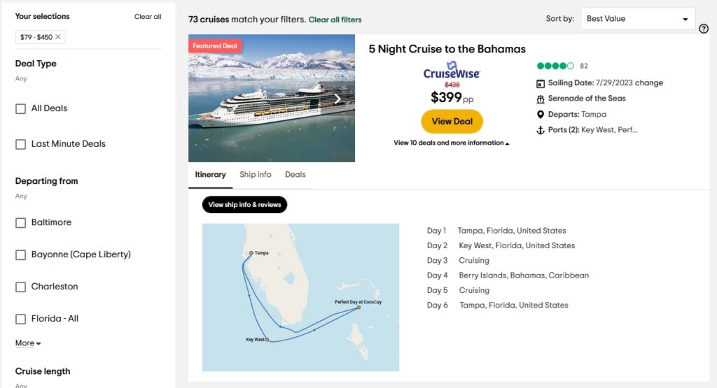
From where she was at, I had her go back to the TripAdvisor home page and do the second task. She was lost for a little bit because the current tab was the partner site and not TripAdvisor. She had to close Firefox and reopen it to get her way back to the TripAdvisor home page. When she opened the webpage, she did the same search. When she arrived at the result page, she filtered it with the price range of $79-$450. Then she started browsing each cruise that has two port stops. By clicking on “Ports,” she was able to view the cruise schedule, which includes the port stops. This is tricky because there weren’t a lot of cruise results for the price filter that she added. Most of the cruises were unavailable. At the top of the right-side of the first hit result was a “sort by” drop-down menu. She changed it from “Best Value” to “Price”. That is when she was able to browse the results seamlessly.
The problem she encountered on this task was that there were a lot of unavailable cruises that were showing after the price filter was applied. She had that problem because the sorting was automatically set to the best deal, which, unfortunately, the deals were not available. This is a violation of Neilsen’s aesthetic and minimalistic design principle because, after the filter was applied, the site showed very few available cruises and a lot of unavailable and irrelevant ones. It also violates Neilsen’s visibility of system status principle because the “sort by” was not very visible, and who would have thought that the reason why there were not many good results after filtering was because of the sorting?
Third Task: Port Activities
After finding a cruise with multiple ports, I had her go back to the TripAdvisor home page and do the third task without using the search bar. She started to look at the buttons at the top of the search. She scrolled all the way to the bottom of the page, then scrolled back up and clicked on the button with “….”, which reveals more buttons. She found the “Cruise” button and it took her to the cruise page. She scrolled down the page and looked for a link for an excursion. When she couldn’t find an excursion page, she scrolled back to the top of the page and filled in the drop-down menus with the same information used in tasks one and two. When she arrived on the result page, she picked the appropriate cruise and clicked on the “View Deal,” which took her to the partner website. On that webpage, there was an “Itinerary” page for that specific cruise. That is where she was able to find the excursions for each port that the ship stopped at.
She was having a problem looking for an excursion page because she did not see the “To Do” section of the home page of the site. Instead, she looked for it on the partner’s site. This is a violation of Neilsen’s consistency and standards because if the button link for the “To Do” on the “cruise” page was the same as the home page, it would have been easy to spot. They also changed it to “things to do” and it is hardly visible when you are in the “cruise” page. It also took her awhile to find the “Cruise” link button because it was not visible but under the “….” button. This is a violation of Neilsen’s visibility of system status principle because the link to get to the cruise page is hidden.
Recommendations
For the usability problems when performing the second task, my first recommendation is to remove the unavailable cruises from the search results (especially for the filtered results). By doing so, this would have made her search simple, easy, and more effective by spending more time on relevant information.
After filtering a search result, users directly scan the results without thinking about sorting them first. My second recommendation is that the “sort by” should be more visible and easier to spot so that users will know that there are more relevant cruises at the bottom of the page or somewhere on the other tabs if you change the sorting. Also, since the filter applied was on prices, the sorting should have been on prices too, not best value all the time. This would have saved the user time and made her more efficient in her search by looking at the relevant results.
For the usability problems of the third task, my first recommendation is to have a button for “cruise” on the home page instead of hiding it in “….”. This could have saved the user time from looking for the cruise link and more time to do a cruise search.
My second recommendation is to have the “To Do” button on all pages and don’t change the way it is presented. The user would have used this button when she was on the “Cruise” page because she would see it as related to her search. This would have saved her time from going to the partners’ webpage and searching for it there.