For the past two iterations of our redesign, our group has selected the ticket purchasing system. We agreed that this is one of the most important features of the site, and one that has ample room for improvement. Many users found the ticket buying process arduous and were disoriented by the pop-up window with multiple widgets that are incongruous with the rest of the website, confusing a few participants during user tests. It was not obvious to all users what they needed to do to complete their goal of buying a ticket. Each step had barriers to the participants’ understandings of what they needed to do next. Overall, this adds to the cognitive load a user may experience at a time while decisions are being made. As soon as they completed one step, the next step caused them to reorient themselves all over again.
Instead of a pop-up window, we propose that the Norman Rockwell Museum (NRM) implements a proprietary purchasing feature within its own website to maintain uniformity, control, and consistent aesthetics. By standardizing the checkout page with the rest of the website, there is a hope that the user will feel more comfortable using it. Through this, our redesign aims to decrease confusion and cognitive load on the user during the ticket buying process, making the experience more user-friendly.
After already creating one iteration of a redesign of this page, we have made changes based on user feedback. This feedback includes statements such as:
[The first iteration is] much more clear what the ticketing options are now in advance, which means less back and forth paging through the ticketing system for the users.
Explore different ways to integrate the Museum’s calendar events into the ticketing process too, perhaps building off the studio tour idea?
It needs to be clear that you can visit the museum any time that day.
The tours are for specific times only… I’d love to see your thoughts on that.
[I] liked the idea of re-shaping the Donations option to make that more positive.
[Add an option regarding] how to approach group pricing.
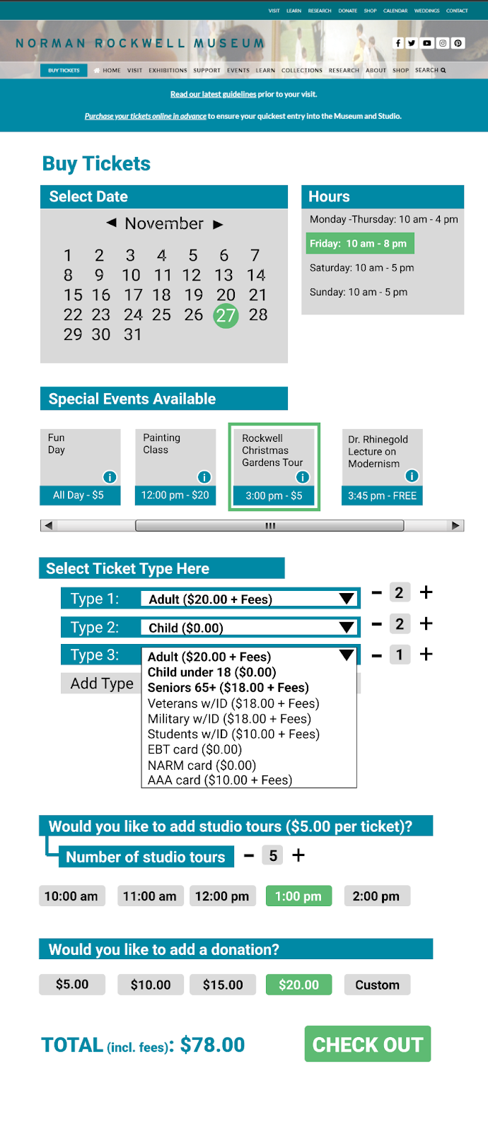
In order to redesign based on these statements, firstly, we added a section that shows the user the events that are occurring on the chosen date. The museum hours were also displayed next to the calendar section with the selected date highlighting the hours for that day to the left. This way, the user is able to see at a glance what they have available should they choose a specific date, allowing for greater ease of planning. A small button that the user can click on to see the information about an event was also added as well as a scroll bar underneath to demonstrate to the user how they can see more events if they scroll to the side. Selected events become surrounded by a green box to show which ones a user has chosen. Also, we have added the ability to buy multiple tickets of one kind through the input of a number on the left so that, instead of having to individually add tickets, there is a way to buy tickets in bulk. The donation/studio tours options have also been streamlined where, instead of first selecting a yes/no option then selecting a number/time, a user has only one line to look at and choose from. Below, we have included an image that shows our second iteration visually.
Our group selected the ticket purchasing system to redesign. We agreed that this is one of the most important features of the site, and one that has ample room for improvement. Many users found the ticket buying process arduous and were disoriented by the Trip Advisor widget, the initial pop-up ticket window that seemed to confuse a few participants during some user tests. This pop-up window takes the user to a smaller window with a lot of initial information. It was not obvious to all users what they needed to do to complete their goal of buying a ticket. Each step had barriers to the participants’ understandings of what they needed to do next. Overall, this adds to the cognitive load a user may experience at a time while decisions are being made. As soon as they completed one step, the next step caused them to reorient themselves all over again.
Instead of a pop-up window, we propose that the Norman Rockwell Museum (NRM) implements a proprietary purchasing feature within its own website to maintain uniformity, control, and consistent aesthetics. By standardizing the checkout page with the rest of the website, there is a hope that the user will feel more comfortable using it. Through this, our redesign aims to decrease confusion and cognitive load on the user during the ticket buying process, making the experience more user-friendly. Our proposed redesign will simplify the process of buying tickets through reducing the ticket selection to a single page with all discount options placed into a single drop down per ticket. We’ve also combined the general museum visit and the “visit + studio tour” options by adding a section on the ticket buying page where a user can opt in to the tour and select their desired tour time underneath this option. Below, we have included a prototype for our proposed redesign of the NRM’s ticket purchasing page. Individual elements have annotations that provide further details beneath the prototype. While creating this prototype, the following ideas guided us:
The pop-up ticket interface should be removed and replaced. This interface caused a host of problems for users. By replacing this with a set of pages that are standard across most ecommerce websites, users will be more familiar and comfortable with navigating the ticketing process.
Simplify the ticket types. The current ticketing system has multiple locations to select ticket types, whether that is just a museum visit or a “visit + studio tour”, an adult or child ticket, and then a drop down for additional ticket discounts. Streamlining how a user can purchase their desired ticket means that potential confusion regarding the next step(s) can be greatly reduced.
A standardized checkout page. The pop-up box that is currently on the NRM’s website is unique in its formatting and interface compared with the rest of the website. By replacing it with more commonly found formats, forms, layouts, and interfaces the user will feel more comfortable utilizing them.
Inclusive design. Our redesign considers that many users will need a design that enables users of all backgrounds and various ability levels. Exclusive designs create usability issues when a user does not fit a specific circumstance, but an interface is able to reduce these usability issues through inclusive designs that include a flexible display that is able to be accessed by as many users as possible.
Our ticketing page brings all variables for your ticket onto a single page, where previously they existed over two or more pages. The calendar is now prominently displayed on the ticket selection page, this leads the user through a very clear process, starting with selecting the day they want to to come, the number of tickets they need, what types of tickets, and finally whether they’d like a studio tour.
This dropdown displays a list of all ticket types available and replaces the two separate sections for ticket type and ticket discount. All prices are clearly displayed next to each type so the user can quickly browse all categories and select the most affordable type that applies to them. The most common ticket types are bolded and placed on top of the list to expedite selection for the user. Additionally, these dropdowns populate as additional tickets are added in a 1:1 ratio, making it explicit to the user what discounts are being applied to which tickets.
This section makes adding a studio tour for the group of tickets very simple for the user, with two clicks to opt-in and select a time. Previously this was achieved on a different page and prompted an entirely different set of ticket prices. On top of simplifying the process, the call-to-action and clear pricing information will hopefully increase the purchase of studio tours.
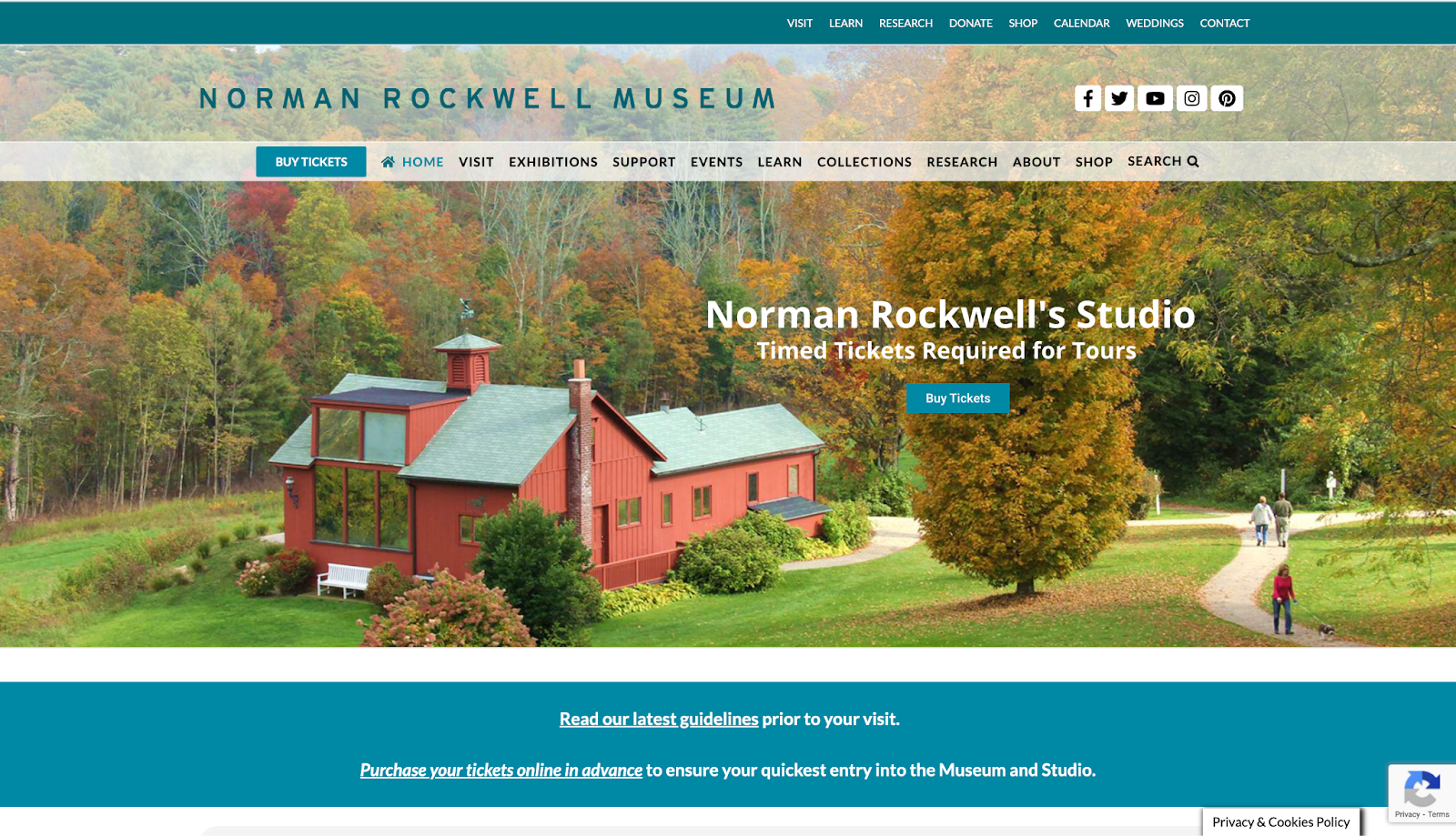
The site that will evaluated is the one for the Norman Rockwell Museum (https://www.nrm.org/). This website hosts information about the Norman Rockwell Museum located in Stockbridge, Massachusetts. This includes information about its hours, collection, location, events, careers, etc. Also, through this website, a person is able to do many things such as buy a ticket and view their digital collections. The evaluation that will follow will be completed through the observation of an example user participant as they complete a set of tasks within this website.
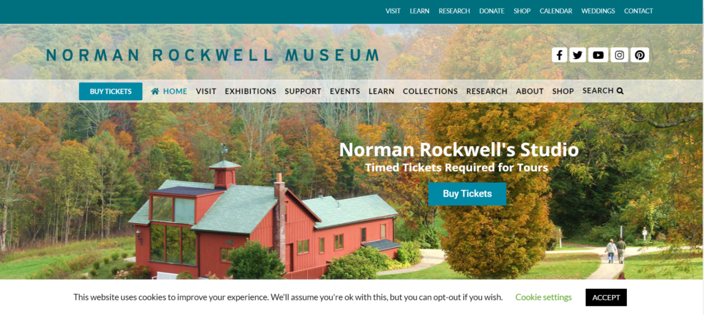
Figure 1. Screenshot of the Norman Rockwell Museum’s homepage located at https://www.nrm.org/
Participant Description
The participant that had been chosen for this evaluation is a middle-aged adult man with high education level. He does not have a background in information architecture/usability analysis, and he also does not have a background in museum studies or studies pertaining to art; however, he has a high proficiency in technology which may have proven to be a confounding variable due to his ability to easily navigate many websites and use various technologies.
User Testing Method
The method that was employed for this evaluation was the Think Aloud method. The participant was instructed to narrate his thoughts at each step while completing the tasks given for website evaluation. Notes were taken during observation to capture the results observed and to write down any notable statements that the participant said during the evaluation as quotes. This method was chosen for its insight into what a user might think while going through a website with the goal of using this information to understand what effect a flaw might have on a user’s thought process and why this thought process may have occurred, potentially causing difficulties in using this website.
Tasks Assigned
The tasks assigned to the participant were to find out how to buy a ticket for the Norman Rockwell Museum and to find directions to the museum itself, find out if there were any internship opportunities and find the description for all potential internship opportunities, and find the work, “Pointing Hand,” in the Norman Rockwell Museum’s digital collection archive. Overall, these tasks remained the same from their previous proposal conceived in a group setting. However, there were minor changes in the second part of the second task; instead of finding the description for a single internship opportunity, the task then became to find the description for all internship opportunities instead of an open one offered at the Norman Rockwell Museum. This is because there were no internships open at the time of the website evaluation.
Observations and Analysis
Task one: Find out how to buy a ticket and find directions to the museum
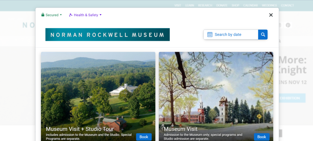
The participant started the first part of task one, finding out how to buy a ticket, by immediately going to the blue “Buy Tickets” button on the lower menu banner on the homepage of this website with a statement about how it was easy to find and eye-catching. This is most likely because it seems to stand out among the other buttons along that banner as the only button in a blue box.
Figure 2. Screenshot of the pop-up box when clicking on the “Buy Tickets” link in the bottom menu
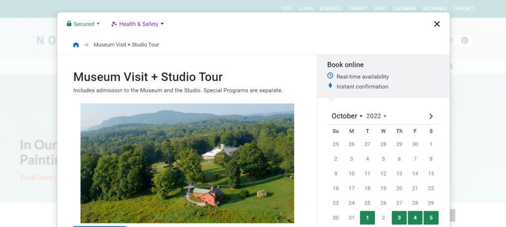
After the pop-up box opened, he made a statement about wanting to know the difference in prices between a membership to the museum and a single ticket. After clicking on the “Museum Visit + Studio Tour” option, he looked through the information before finding his way back to the main page without any issue through the button shaped like a house on the top left of the pop-up. This symbol is fairly ubiquitous as the button to go to the main page of an application, so he had assumed correctly that clicking on that button would lead him back the way he came as he said. After this series of events, he made a statement about how the website is very easy to use and that he appreciated the fact that it was “actually a pretty comprehensive website” due to the ease at which he was able to go through the website and the amount of information he could find on it. He compared prices for two minutes before selecting the “Museum Visit + Studio Tour” button, scrolling down, and selecting the ticket option for 1:00PM. There was no hesitation during these last few actions, and he did not make any indication that the interface had caused him any confusion because the website was not difficult at all for him to navigate. After this part, he made a statement that the website was “user friendly” and that each option was “easy to find and stands out” with useful lists of options and pertinent information.
Figure 3. Screenshot of the “Museum Visit + Studio Tour” page within the pop-up that allows a user to buy tickets to the museum
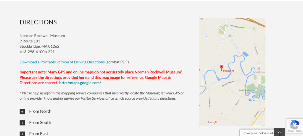
For the second part, finding directions to the museum, he went directly to the directly to the top menu, hovered over the “Visit” option and selected “Directions” without any issue to get directly to this section (https://www.nrm.org/visit/#directions). Because the bottom menu did not have dropdowns and the top menu did, he found it easier to figure out the fastest way to get where he needed through the more specific options in the dropdowns in the top menu versus the single links in the bottom menu. Therefore, the dropdowns provided in the homepage were able to lend themselves to the participant’s ease of use regarding the website. From there, the page stated all directional information, and the task was completed. He made statements about how he was impressed with how comprehensive the website was and how user-friendly it seemed because of how easily he was able to complete this first task. Overall, this task took the participant less than four minutes to complete from start to finish due to how the participant was able to locate and understand what he was looking for quickly through a usable interface.
Figure 4. Screenshot of the “Directions” section of the “Visit” page on the Norman Rockwell Museum’s website (https://www.nrm.org/visit/#directions)
Task two: Find out if there were any internship opportunities and find the description of all internship opportunities
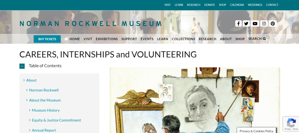
For task two, the participant, now back to the homepage, also went directly to the top menu to look through each drop-down list. Because he had already observed what was within that menu, it did not take long for him to figure out where to go. From the “Contact” drop-down menu, he went to the “Careers, Internships and Volunteering” page (https://www.nrm.org/about/employment/).
Figure 5. Screenshot of the “Careers, Internships and Volunteering” page of the Norman Rockwell Museum’s website (https://www.nrm.org/about/employment/)
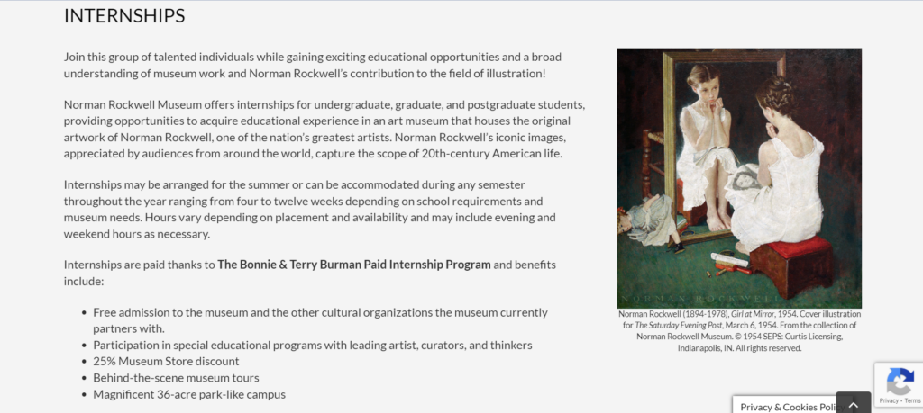
Due to the length of the page, he got confused for a moment regarding where to go next before realizing he needed to scroll down. He did not find it difficult to understand that he needed to scroll down instead of clicking on a link as he instinctively knew that he should scroll down first. Then he encountered the internships and their description, figuring out how to apply to them as well within a minute. The statements that he made were regarding a wish that there was a link on the left-hand menu that jumped down to where he needed to go, remarking that it was an “awful long way to scroll.” However, again he remarked about how the website was “very easy [to use] and user friendly.”
Figure 6. Beginning of the “Internships” section of the “Careers, Internships and Volunteering” page of the Norman Rockwell Museum’s website (https://www.nrm.org/about/employment/)
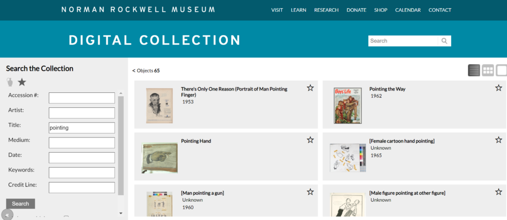
Task three: Find the work, “Pointing Hand,” in the digital collection
After going back to the homepage again, he used the search feature to locate this work. However, he only found an article from this page because the search feature on the homepage did not include the digital collection of the Norman Rockwell Museum within the pool of information that it includes in its search.
Figure 7. Results of searching for “pointing hand” in the main search box found in the bottom menu
After looking through the article for a moment because he thought that there might be a link in there, he was able to locate a link labelled “Collections” that took him to the digital collections page (http://collections.nrm.org/#browse=enarratives.1). His eyes immediately caught the search feature and was able to use it without issue. However, because the search feature did not turn up the requested work when searching for the phrase “pointing hand” in the title search field, the participant was confused for a minute, wondering whether he got the name wrong, but once he searched for the word “pointing” he was able to find it immediately. He made a statement regarding how it was odd that the search function did not turn up the work when searching for its full title, but it turned it up when searching for a portion of it.
Figure 8. Results for only searching for “pointing” in the title part of the search function within the digital collection for the Norman Rockwell Museum
Possible Design Recommendations
Overall, all of the tasks together took the participant less than ten minutes to complete in full. The participant felt that the website was a “pretty good website, easy to navigate [and] easy to figure out.” Because the website seems to be a fairly usable website, there are not many design recommendations to fix the flaws the website has, but there are still some things that can be proposed to fix aspects of its design. Firstly, making each page either less long and difficult to scroll through or adding obvious links to parts of long pages might increase the usability of the website by making it easier for a user to locate the information they are looking for. Also, it is important to consider the search function. It does not state that the general search function does not also search the digital collection, so it is recommended that a link be provided within this feature that takes the user to the digital collection instead to prevent the confusion that stems from the results not being of the nature the user may have expected. Furthermore, the search function may need to be fixed on an internal level. Because it does not always turn up what it needs to, this may be a coding issue that creates a bug in the system. Fixing this may allow for greater ease in searching by making it so that the terms the user searches for are accurately used. In all, this website is a fairly good, usable website without too many glaring issues in its construction.
We have chosen the Norman Rockwell Museum to analyze for the rest of the course (https://www.nrm.org/). We chose this site because of the many issues we noticed, hoping to figure out possible suggestions as to how to fix it. After looking at the website as a group, we decided to focus on the sections that include its collection/research resources, open careers, and exhibits. All of these sections have issues and usability violations of varying degrees, and we believe that it would be helpful to look at sections with clear usability issues to deepen our understanding about the class material as well as help us understand how to apply what we’ve learned to real life.
User Profile/Persona
The type of people who would potentially use this website are those who are interested in the museum’s collections, interested in going to visit the museum, interested in going to the museum’s events, and/or interested in donating/giving back to the museum. In order to analyze this website through the lens of someone who fits these criteria, we have developed a persona. After deliberation, we created a persona that is an art history student potentially interested in getting an internship at this museum.
Scenario
We developed a scenario to help guide us in figuring out how our persona might interact with this website. Based on both the general persona we created and the overall type of people who visit this website, the scenario we created for our persona is:
Cameron is an undergraduate art history student at a local university. They became interested in Normal Rockwell’s works after attending a class that included these works. Cameron looked online to try and find more of these works, and ended up stumbling upon the Norman Rockwell Museum’s website. After looking around, they are interested in visiting the museum and, as they need an internship before they graduate from their program, would love to also intern at this museum as well. However, they are having some trouble navigating this museum’s website.
Through the use of this scenario, we are then able to develop tasks that a person like our persona, Cameron, would complete on this website. We expect Cameron to initially make use of the common search function on the main page of the site to find out more information on a certain collection. We also expect Cameron to navigate the third-party purchasing widget in hopes of purchasing their ticket. In performing these tasks, Cameron will have to explore alternative methods of accomplishing their tasks.
Developed Tasks
For the future user tests that we will be completing individually, we have developed three tasks for our test users. The first task is to plan a visit to the museum by finding out how to buy a ticket and how to get to the museum. This is the most likely task a person going to this website might complete as many people who visit a website for a museum are looking to visit the museum itself as well. The second task is to find out if any internship opportunities are open and the details about the internship as well as someone like Cameron would look for career opportunities in this way. The third task is for the user to find a specific work called “Pointing Hand” in the Norman Rockwell Museum’s digital collections. A student like Cameron might hope to learn more about the museum, how an internship at the NRM can benefit their career, and if “Pointing Hand” would be a good candidate to do an assignment on. Therefore, using these types of tasks in our user tests might show us how someone might actually use the website.
The website that has been selected for a heuristic evaluation is the one for the Ringling Art Museum, https://www.ringling.org/. This website holds information about the art museum and its location, hours, and content. It also provides a database with its online collection and archives. Through this website, a person can plan a visit and find out how to get there, view the Ringling Art Museum’s collection(s), learn a bit about the museum, etc.
Figure 1. Screenshot of the homepage of the Ringling Art Museum’s website found at https://www.ringling.org/
Scenario
In order to conduct this heuristic evaluation, I took the role of a person wanting to visit this art museum. During this scenario, I acted as a person who wished to buy tickets and plan their visit to this museum. The heuristic list that was used to evaluate the usability of this website was taken from Jakob Nielsen’s ten heuristics (https://www.nngroup.com/articles/ten-usability-heuristics/) (2020). I approached this website with an open mind and tried to use it in the same way a potential visitor might in hopes that this might have made it easier to see what kinds of usability flaws would come up for someone who is using this site for its intended purpose. I feared that, in only looking for flaws, I might have seen heuristic violations where there were none.
Analysis
Beginning on the homepage (https://www.ringling.org/), the first flaw I recognized was how much was included on that page. There was a lot of movement, and I was overwhelmed at first with how colorful and busy it was. Without knowledge about the Ringling Art Museum prior to this evaluation, the fact that there were so many links elsewhere without explanation caused me confusion at first. This flaw violates Nielsen’s eighth heuristic, aesthetic and minimalist design, as the UI was overly busy and there was too much information before I had even started (2020).
Figure 2. Screenshot of the homepage of the Ringling Art Museum’s website found at https://www.ringling.org/ Note. Page is zoomed out to 25%
I was able to find the next page I needed in this scenario fairly easily. Because I was acting as someone intending to visit, the next page I visited was one that contained the hours and admission information, titled “Hours and Information” (https://www.ringling.org/hours-and-admission).
Figure 3. Screenshot of the “Hours and Admission” page of the Ringling Art Museum’s website found at https://www.ringling.org/hours-and-admission Note. Page is zoomed out to 33%
The switch between such a busy homepage and a relatively still, monochromatic information page violated Nielsen’s fourth heuristic, consistency and standards (2020). Because the homepage had so much on it, the fact that this page had relatively few graphics felt jarring at first. Another heuristic this page violated is Nielsen’s sixth heuristic, recognition rather than recall, as all of the options given for ticket purchases were placed one after another in a long page where the user had to scroll down to find which option they wanted (2020). By the time I got to the bottom of the page, I had already lost track of what was on the top.
The next page I visited was the one titled “Plan Your Visit” (https://www.ringling.org/plan-your-visit). This page violated Nielsen’s second heuristic, match between system and the real world, as I had expected this page to have information about the contents/exhibitions within the museum instead of its actual contents which were regarding food and drink as well as safety protocols and guidelines (2020). The actual information I wanted was actually in a whole different tab titled “What’s On.”
Figure 4. Screenshot of the “Plan Your Visit” page of the Ringling Art Museum’s website found at https://www.ringling.org/plan-your-visit Note. Page is zoomed out to 50%
Figure 5. Screenshot of the “What’s On” page of the Ringling Art Museum’s website found at https://www.ringling.org/events/type/all Note. Page is zoomed out to 50%
Discussion
Overall, this website was designed in a fairly usable way. The heuristic violations were few and far between, and I had no issue in completing the tasks I gave myself. However, because each page on the website was so spread out, I did have consistent issues in remembering everything that was on each individual page. A recommended fix for this would be something like finding a way to fit information next to each other instead of in one long column that a user needs to scroll down. This would help fix the website’s violation of Nielsen’s sixth heuristic of recognition and recall as it would be made easier to remember the choices presented on a page (2020). Another recommended fix would be to the homepage: reduce the amount of what is on this page to reduce the overwhelming nature of its current state. This would help this page not violate Nielsen’s eighth heuristic, aesthetic and minimalist design, as a reduction in the design would help a user not get overwhelmed immediately when they navigate to the homepage (2020). For example, reducing the number of graphics and movement and replacing them with a little negative space and/or text to match the other text-heavy and graphic-minimal pages on the website. This would also fix the website’s violation of Nielsen’s fourth heuristic, consistency and standards, as it would allow the homepage to better blend into the rest of the website (2020). After this evaluation, I can see that there are more positives regarding this website’s design than flaws. While there are violations in usability, it is an overall usable website that allows its users to efficiently go where they want and find the information they need.
The selected website is called Novel Updates (https://www.novelupdates.com/). Novel Updates is a database of online literature that a person is able to use in order to find novels to read online. It provides a forum, a filtration system, and a search function to help its users. In order to test its usability, a participant has been chosen. The user tester selected is an adult woman with no experience with the site in question. Because she also has no experience with the content of the site, she has been chosen as a way to see whether someone with no user experience and/or general knowledge of the subject matter would be able to navigate this site.
The user was given three tasks throughout the test, two of which she had no issue with but one of which she was unable to complete. The first two tasks, to find out how to register and to find a specific forum regarding users’ original fictions, were completed in under five minutes. The user was able to find the register button immediately after being asked and had no problems filling out the form before being told she did not have to actually register (https://www.novelupdates.com/register/).
The second task to find a specific forum was similarly easy save for the last part; she was able to locate the general forums page under a minute but found trouble in figuring out which forum suited the task as a few pages could have potentially applied (https://forum.novelupdates.com/). However, the correct forum was chosen after around two minutes of deliberation.
Figure 3. Screenshot of the forum homepage on Novel Updates Note. Link: https://forum.novelupdates.com/Figure 4. Screenshot of the section holding the correct forum (“Community Fictions”) for the second task Note. Link: https://forum.novelupdates.com/
The results of the first two tasks were not surprising as the links were fairly obvious and in conspicuous places. Furthermore, as the language was clear, it is not surprising that the correct links were chosen. Although, for the second task, I did not expect that the forum labels would be vague to an inexperienced user. As someone with extensive experience, I am able to understand the nuances of the different terms, so I did not realize that someone else might not be able to.
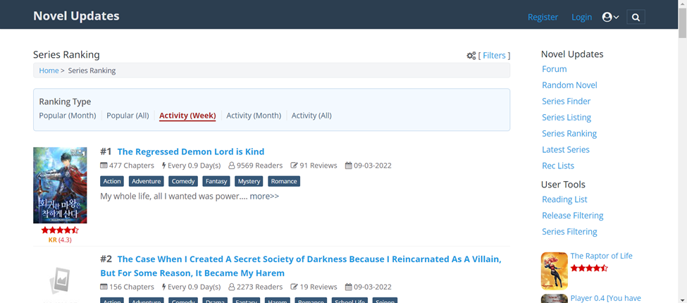
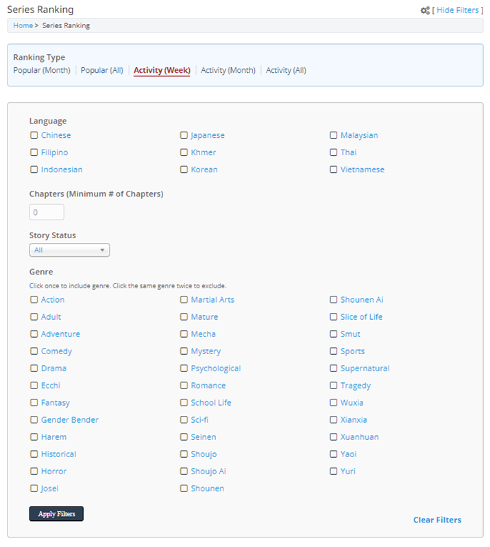
The third task was to find the least popular action series of all time. She was able to locate the link to the “Series Ranking” page without issue and knew to click on the filter button immediately, but the actual filtration system gave her difficulty (https://www.novelupdates.com/series-ranking/).
Finding the genre section took a few moments, and when applying filters, she accidentally chose an option that took her to the general search page instead of the ranking page. Because she was unable to figure out how to get back, she went all the way back to the homepage to start again. However, even when only filtering for the genre, she did not realize that the tab labelled “popularity,” actually meant “highest reviews” instead of the general meaning of the term, and she did not realize that she needed to select the tab that would provide an all-time selection.
Figure 6. Screenshot of the filtration system on the “Series Ranking” page on Novel Updates Note. Page zoomed out to 50% in screenshot. Link: https://www.novelupdates.com/series-ranking/
The third task was given as to be of higher difficulty than the first two, so it makes sense that this one would be a bit harder to complete. I was rather surprised that she was able to click an option that took her to a whole different search page as I had no idea that a user could even do that beforehand. Even after watching her screen throughout the test, I am unable to replicate what she had done on my own. This is probably due to random clicking brought on by confusion as I do not understand how she managed to get there. The setup for advanced filtration can be difficult to figure out even for an expert user, so I expected a lot of trial and error here. However, I did not realize until she was unable to find the answer that the website uses the wrong term for its popularity filtration system. Furthermore, as someone who has a lot of experience using filtration systems, I was surprised that she did not notice the extra tabs she needed to click in order to change what kind of ranking she wanted to use.
Discussion
Overall, the site’s most glaring issue in regard to usability is its vague, sometimes inaccurate, word choice. During this test, I was able to learn that, to someone unfamiliar with the general terms, a lot of the wording is difficult to understand. Nuances can go over the head of someone reading text without a deeper understanding of its individual words. Clearer labelling would allow for greater accessibility on this front, and this website would definitely benefit from editing that would get rid of inaccurate labels like the “Popularity” versus “Activity” tabs on the “Series Ranking” page (https://www.novelupdates.com/series-ranking/). Furthermore, this website would benefit from a more straightforward filtration system where the user can use one section to search for what they are looking for rather than having to set up filtration settings then change to a specific tab on a whole different menu. In all, Novel Updates is generally accessible so long as specific tasks given regarding finding a particular novel through the filtration system is not given. An inexperienced user may be generally able to get to the correct page that they may need without issue, but the usage of its database system has an experience requirement in order to use properly. Previous knowledge/experience is required for more nuanced/specific tasks which brings this website’s overall usability down, but as a starting point, this website is functional for even an inexperienced user.