INDIVIDUAL ASSIGNMENT 3: REPRESENTATIVE USER TEST

• The Website

The website for this test is IGN (https://www.ign.com). The site hosts a wide variety of content related to video games and entertainment. The layout of the site is designed around a sidebar style menu setup that can be condensed to the far left of the screen to have more room for main page content.

The User

The user for this test is a mid-30’s black male that enjoys gaming on his days off. Raised by an Army father, and with a bachelor’s degree, he is very well spoken, well-mannered, and respected by his peers and his customers. He almost exclusively games on a PlayStation 4. He is in the IT field, with over 15 years of experience, so there should be no issues with “normal” website navigation.

The Testing Method

In the test, the “think aloud” method was used, simply due to it’s cost effectiveness. In a conference room setting, the user was provided a printed list of the three tasks to accomplish and a laptop that was open to the IGN website. The user was read the following script to help set the “motivations” behind the provide tasking:

You are just out of high school and have your first job. You enjoy gaming and are looking to purchase a game with your hard-earned money, but you want to get a good game that you can use to pass the time. The idea of spending $60 on a game that you will complete in a few hours seems like a waste of money. With this in mind, you will visit the IGN website on the laptop and perform the three tasks listed on the provided list.

The Tasks

Task #1:
Since you are looking for a good game to buy, start by finding the site’s “best games” from 2021.


Task #2:
You are looking for a game that will take some time to play through, so tale a look at Zelda: Breath of the Wild and see how long it would take to complete.


Task # 3:
Look through the 2021 best games list and check out the reviews to pick out a game that you would want to play.

How the test went

Task #1


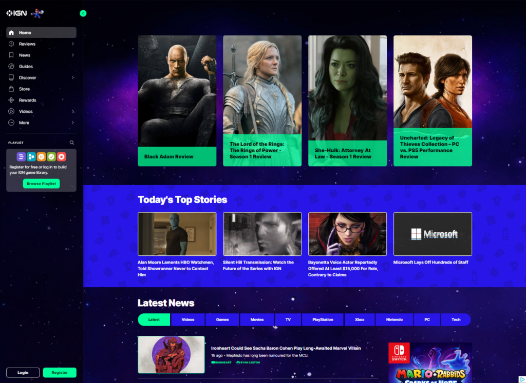
The testing was in line with what was found during the original group discussion about the website. The first words out of his mouth were “I’m looking for a search bar.”


Some of the following conversation:


I see a magnifying glass, so I am clicking that to see if I can use that to search the site.”


This points to the real-world expectation of using the magnifying glass icon for searching.


“When I click on it, it shows games and playlists, and since I’m not trying to find a specific game, I’m checking the only other option which is Playlists. Since it shows stuff other that games, I’ll search for 2021 and see what comes up.”


This leans more to a lack of other options instead of having a choice that makes sense to the user.


“There’s a lot of stuff just called 2021, so I’ll keep scrolling. I see different ‘Favorites of 2021’ and various writers’ best of 2021, but no “IGN best of” list. Nothing shows up for ‘2021 Game of the Year’. I’m going back to the home page now.”


Already some frustration from the user, as the closest thing to a search doesn’t give him anything usable for this task.


“I’m looking under Reviews, Game Reviews…. Why does it have Movies, TV, and other stuff under Game reviews?”


Looking at what he was talking about shows that there are issues with the Reviews section. Selecting Game Reviews in the left navigation pane highlights the words ‘Game Review’ which shows an attempt to keep the user informed of where they are, but in reality, all reviews are on the same page. They filter by type by using the side navigation buttons, or the bar in the middle of the page that shows the same subjects. Oddly enough the Comics reviews option is not shown in the left-hand navigation.

Task #2


“The Playlist let me search for games, so I’ll try that. Zelda shows up on the list and I click there and go to the page and there’s the How Long to Beat on the page.”


Lessons learned from the first task were applied but may have been a more natural flow with a simple search option as well.

Task #3


“Since I couldn’t find a IGN 2021 Games of the year list, I’ll just try to find a game I might like.”


He clicks Discover and finds a IGN Best Picks section and starts there. For the sake of time, he picks Call of Duty: Modern Warfare 2. As he looks through all the reviews, he comments on the lack of pictures by each.

The Recommendations

The absolute first change that the website needs is a well-defined search function that the user cannot miss. In the testing, an uncomfortable amount of time passed as the test user scrolled and clicked through various menu options, until he finally gave up and clicked on the only thing with a magnifying glass by it. This shows that the symbol of a magnifying glass is universally understood to be associated with some form of search functionality. Having a search bar with the magnifying glass icon by it would create the match between system and real-world expectations.


A second change would be in the best Games list. It should have had a small picture by each review, just for consistency. Some reviews did, but they were in the minority. That may just have been the author’s poor layout, not indicative of the entire site.


Another note is the Login/Register buttons at the bottom left of the page. There should be some addition call to action for these, such as “Click here to subscribe to our weekly email with the latest reviews and special content”. If this is connected to some website metric, it would generate additional interest form site visitors.

Individual Assignment 3: Representative User Test

The Site

The website that my group selected is TripAdvisor. It is a travel website that helps people plan and book their vacations. It guides you to find the best places to eat, stay, fly, what to do, rent vehicles, and find a cruise based on the reviews of those who have been there before.

My User

My user is a 42-year-old mom with 3 kids. She has been on a lot of cruises but never used TripAdvisor to search for a cruise. I could say she is an expert at navigating websites that involve shopping and vacations.

Test Method

I used the “think aloud” method. I gave her one task at a time, had her verbalize her thoughts, and had her start from the TripAdvisor home page for each task, which is a total of three tasks. I recorded the whole screen, including mouse clicks and her verbalization. I chose this method because it is easy to follow what she is trying to do.

Description of Tasks

The first task that I gave her was to find a cruise for her family of five that was priced at around $400 per person. The cruise needs to originate in the Miami or Port Canaveral area. It must be when the kids have no school and not hurricane season. I used some of the questions that the group chose for the second task because I think those options can make the first task easier to attain. On my experience, those options are usually in the filter on the search result page.

The second task was to find a cruise that has multiple stops. Multiple stops mean it will be a longer cruise, so, she had to make sure that the price was within her budget (the more stops, the more expensive the cruise gets). After finding a cruise with several port stops, the third task was to figure out what activities are offered at the different places where the ships will port. For this task, I asked her to use a different approach rather than using the search bar.

First Task: Find a Cruise

The user was asked to go to TripAdvisor and complete the first task that she was given. The first thing she did when she landed on the site was go to the search bar and search for “cruises”. The search bar is very visible, and it looks like it is the highlight of the page. This took her to the “Cruise” tab of the website. From there, she directly goes to the search tab and clicks on the “Where to” drop-down. Using her experience, she picked the cruise location that looked appropriate for the price limit. She was debating between “Caribbean” and “Bahamas” and picked the latter. Then she went to the drop-down menu of the “Departure Month” and picked December since she knows that the hurricane season is between June and November and the kids have no school in that month. Then she was presented with the results. She narrowed down the results by clicking on the filter on the left-side of the screen. She first limited her search to cruises departing from Miami, and then she selected the cruise that fit her budget. Then she was taken to a new page (still on TripAdvisor) where she could change the date, see pictures of the ship, and see the cruise deals. She clicked on the pictures first, then went back to the previous page and clicked on one of the deals. She was sent to the partner page (the site was showing a very good indication of where she was taken) where she had the option to book the cruise.

She did not encounter any problems with this task. She went through it flawlessly. She knew what she was doing and where to go. She even predicted that she would be taken to a partner website because TripAdvisor doesn’t book cruises.

Second Task: Multiple Port Stops

From where she was at, I had her go back to the TripAdvisor home page and do the second task. She was lost for a little bit because the current tab was the partner site and not TripAdvisor. She had to close Firefox and reopen it to get her way back to the TripAdvisor home page. When she opened the webpage, she did the same search. When she arrived at the result page, she filtered it with the price range of $79-$450. Then she started browsing each cruise that has two port stops. By clicking on “Ports,” she was able to view the cruise schedule, which includes the port stops. This is tricky because there weren’t a lot of cruise results for the price filter that she added. Most of the cruises were unavailable. At the top of the right-side of the first hit result was a “sort by” drop-down menu. She changed it from “Best Value” to “Price”. That is when she was able to browse the results seamlessly.

The problem she encountered on this task was that there were a lot of unavailable cruises that were showing after the price filter was applied. She had that problem because the sorting was automatically set to the best deal, which, unfortunately, the deals were not available. This is a violation of Neilsen’s aesthetic and minimalistic design principle because, after the filter was applied, the site showed very few available cruises and a lot of unavailable and irrelevant ones. It also violates Neilsen’s visibility of system status principle because the “sort by” was not very visible, and who would have thought that the reason why there were not many good results after filtering was because of the sorting?

Third Task: Port Activities

After finding a cruise with multiple ports, I had her go back to the TripAdvisor home page and do the third task without using the search bar. She started to look at the buttons at the top of the search. She scrolled all the way to the bottom of the page, then scrolled back up and clicked on the button with “….”, which reveals more buttons. She found the “Cruise” button and it took her to the cruise page. She scrolled down the page and looked for a link for an excursion. When she couldn’t find an excursion page, she scrolled back to the top of the page and filled in the drop-down menus with the same information used in tasks one and two. When she arrived on the result page, she picked the appropriate cruise and clicked on the “View Deal,” which took her to the partner website. On that webpage, there was an “Itinerary” page for that specific cruise. That is where she was able to find the excursions for each port that the ship stopped at.

She was having a problem looking for an excursion page because she did not see the “To Do” section of the home page of the site. Instead, she looked for it on the partner’s site. This is a violation of Neilsen’s consistency and standards because if the button link for the “To Do” on the “cruise” page was the same as the home page, it would have been easy to spot. They also changed it to “things to do” and it is hardly visible when you are in the “cruise” page. It also took her awhile to find the “Cruise” link button because it was not visible but under the “….” button. This is a violation of Neilsen’s visibility of system status principle because the link to get to the cruise page is hidden.

Recommendations

For the usability problems when performing the second task, my first recommendation is to remove the unavailable cruises from the search results (especially for the filtered results). By doing so, this would have made her search simple, easy, and more effective by spending more time on relevant information.

After filtering a search result, users directly scan the results without thinking about sorting them first. My second recommendation is that the “sort by” should be more visible and easier to spot so that users will know that there are more relevant cruises at the bottom of the page or somewhere on the other tabs if you change the sorting. Also, since the filter applied was on prices, the sorting should have been on prices too, not best value all the time. This would have saved the user time and made her more efficient in her search by looking at the relevant results.

For the usability problems of the third task, my first recommendation is to have a button for “cruise” on the home page instead of hiding it in “….”. This could have saved the user time from looking for the cruise link and more time to do a cruise search.

My second recommendation is to have the “To Do” button on all pages and don’t change the way it is presented. The user would have used this button when she was on the “Cruise” page because she would see it as related to her search. This would have saved her time from going to the partners’ webpage and searching for it there.