Individual Assignment 3

Sonya Jackson

Description of site:

Dedicated to the art of Norman Rockwell. It’s home to the world’s largest collection of original Rockwell art. 

Characteristics of the user:

My user is a 53-year-old radiology nurse. She performs CT scans and evaluates them for doctors to sign off on. Even though she uses this technology every day and trains new technicians she is not comfortable with the technology we use every day. For example, she can check email, text, take photos, make phone calls, browse eCommerce sites and explore social media sites on a cell phone. However, she cannot attach a photo to a text, or an email. She also has never posted on her social media sites and has never made an internet purchase. She does not trust entering her credit card information on any eCommerce site for purchases. She has never paid a bill via the internet.

User test method

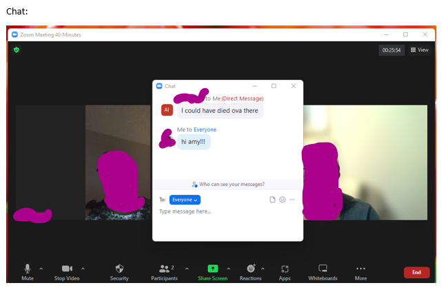
I decided to use the concurrent think-aloud method. CTA is one of the most widely used methods of evaluating the usability of websites. My user is a radiology nurse at Columbia Presbyterian Hospital in New York. I reside in Tallahassee. My user is also my best friend since second grade. The user test method of choice allowed us to catch up on current events (personal events also) and I could analyze her verbalizations while testing. By being familiar with the user I knew she would be unfamiliar and against the task I wanted her to perform.

Assigned task

I requested my user to google search the site, find the directions to the museum, purchase tickets to an exhibit and donate to the museum. Requesting her to make a purchase immediately sparked a debate and friendly argument. I knew this assignment would cause stress and she would need assistance. I assured her she would not have to enter her credit card information. But navigate to the pages.

Analysis of tasks

Amy was able to google the website. We reminisced about seeing the paintings as children at the dentist and doctor’s offices. She was asked then to find directions to the museum. Amy missed this navigation bar at the top of the website.

Now, buying tickets to an event really tested our friendship! She relayed to me she would not select “buy” or enter her credit card information. With great hesitancy, she selected “buy tickets”.  I wanted Amy to purchase the museum and guided tour in January, but she did not want to do that. She selected the museum visit. This is where we ran into problems. January visits were not available yet. I then suggested checking December dates. I am not sure what Amy did, but she ended up on a Covid-19 information page. My user at this point is flustered and no longer interested. We had to stop for the day and pick up at another time.

Finally, we met again and made it to the checkout page. It was very confusing for her, the site appeared to have gone to a third-party site  (Trip Advisor)and that made her suspicious. I also thought it was odd.

Design Recommendations

All the pages on the website look the same. If you accidentally select the incorrect hyperlink, you can easily become disorientated because each page is not clearly labeled. If someone is not  comfortable moving around on this website it’s difficult for them to know how they arrived on a particular page, My recommendation is to clearly mark pages and headings,

INDIVIDUAL ASSIGNMENT #2: Heuristic Evaluation

INDIVIDUAL ASSIGNMENT #2: Heuristic Evaluation (Fredrick Douglass National Historic Site) By Sonya Jackson

The Website

Cedar Hill is a National Historic Site where Fredrick Douglass lived from 1877 until his death in 1895. The home is on eight acres on top of a 50-foot hill. Cedar Hill has been restored to its 1895 appearance, furnished with original objects that belonged to Frederick Douglass and other members of the home. As of March 1, 2022, the Fredrick Douglass National Historic Site is closed for renovations until 2023.

The Scenario

I initially wanted to visit the museum, but it’s closed for renovation. However, there are 2 options to visit the museum virtually:

  1. The National Park Service developed a virtual exhibit. It’s a room-by-room tour of the historic home with portraits of Frederick Douglass and objects from his collection.
  2. Google Cultural Institute has partnered with the National Park Service and allows a 360-degree interior view of the home.

I wanted to have a 360-degree view of the home. So, I decided to view Cedar Hill via the Google Cultural Institute.

The Analysis

Usability heuristic #1 Visibility of system status- The system should always keep users informed about what is going on. When you initially hit the site the “Alerts & Conditions” tab shows there is a notification available in red. Naturally, I selected the tab. Under “Alerts & Conditions” the website informs visitors the house is closed for renovation and will not be open until 2023. A novice user may not select the “Alert & Conditions” tab. The notification should be posted under every tab since there is no “home page” as a starting point.

Usability heuristic #7 Flexibility and efficiency of use- Shortcuts are hidden from novice users- and speed up the interaction for expert users. The design is flexible and can be carried out in different ways so that people can pick what method works for them. Once you select the “Virtual Tour” tile it takes you to this page:

Now, once I select the “Google Cultural Institute” hyperlink the site turns grey, and nothing happens:

I waited 2 minutes because maybe there was a delay. Nothing happened so I selected the “Partnership” hyperlink and that also resulted in the following:

I was anxious to begin my 360-degree tour, but each hyperlink on the above page was not working. Each hyperlink resulted in a grey non-working page. A website should have working links on its page.

Usability heuristic #8 Aesthetic and minimalist design- Content should be visual and support the user’s primary goal. There are two sections on the website to initiate the virtual tour.  The “Info” tab and “guided tour” is a hyperlink that takes you to the virtual tour option. Because the museum is closed but a virtual tour is an option, the virtual tour link should be available under each tab.

Recommendations

The Fredrick Douglass National Historic Site contains a lot of information. The site is thorough however, the information on the site could be better organized, and navigation not so cumbersome. A novice user or a child would have some difficulty navigating the site. There is no “home page” for a point of reference. A “home page” is a great place to start over when you have become misdirected while seeking information. Since the museum is closed, the virtual tour option should be widely publicized. The virtual tour link is always placed at the bottom of the page, it should be moved to the top. Once you select the virtual tour option it plainly shows the two options to visit virtually however only one of the links is working. Broken hyperlinks are frustrating even for an advanced user. I have visited this site many times before and both links worked. The Google Cultural Institute site option is exceptionally aggravating because there are so many hyperlinks to select and all of them are broken. Overall, this site needs to be updated aesthetically and allow for maximum flexibility and efficiency of use.

Individual Assignment 1: Designing for Users

Website: https://zoom.us/

The website I selected is a video telephony software released in 2012. During the spread of Covid-19 Zoom became a popular platform to stay social virtually. My user is a 54-year-old radiology nurse. She is uncomfortable with technology and accesses the internet to pay bills, shop, and search for miscellaneous topics. My user has used the video telephony software Webex once and has never used Zoom.

During our user testing, I asked my user to join a Zoom call sent to her via text. I would like to add that my user was using an iPad and I was using a Windows-based laptop.

Once the user joined the call I had to coach her through using audio with wifi and sharing her screen. My user became frustrated when I attempted to instruct her to blur her background or select a virtual background. She managed to find a sad face emoji, raised her hand, and told me to slow down

I asked her to locate the chat feature and send a chat to keep her encouraged. The user stated she did not see the “Virtual Background” option and she never was able to blur her background or select a virtual background.

When focusing on the differences between an expert and novice user, as a frequent user of Zoom my software is updated often. My user hadn’t updated her software and admitted to ignoring all updates on her iPad. I used this opportunity to teach her how important it is to keep software updated. My user was not familiar with dropdown menus. The virtual background feature is hidden in a dropdown menu under “Start Video”. However, because her software was not updated, I believe she was missing the virtual background feature under “Start Video”

A novice user would not naturally look under “Start Video” for background features. As an expert user, I was comfortable clicking around the application until I found what I was looking for. In order to better support novice users, Zoom could have a separate “Virtual Background” icon.