Individual Assignment #3: Representative User Test

The Website

The website that we chose for our usual tasks was IGN.com. as you hang.com is a website where users can go online to find various pieces of information and even ratings on different types of video games and entertainment media.

The website even allows users to create an account so that they can earn rewards. There are guides on how to complete your favorite games and tips and tricks for gameplay. This website is considered one of the more recognizble of its kind and has been around for decades.

User Characteristics and Tasks

The user persona we had developed was for an 18-23 year old gamer that enjoys various genres of games but does not have a “make or break” genre. They are a student, ideally working part-time to afford video games. The user is looking for a new game to play and is familiar with IGN having a rating system for games and hosting their own awards to recognize high-ranking games.

Our user would be assigned with three tasks:

  • Accessing the Game of the Year awards for 2021. The user doesn’t actually know which video they are interested in purchasing yet. They know that they are looking to see what’s trending in the gaming community before making a purchase.
  • Find a walkthrough for Legend of Zelda: Breath of the Wild. The user wants to be sure that gameplay is actually engaging. They have familiarity with the Legend of Zelda brand but wants to know what to expect.
  • View the reviews for the other games that were being considered for Game of the Year. The user isn’t completely insistent on having Legend of Zelda: Breath of the Wild. They are open to seeing what other games have been trending to see if there is something else to pique their interest.

The actual user that I used to carry out these tasks is a 24-year old who doesn’t regularly play video games. This user has described themselves as a “social” gamer, a person who plays when they are in environment where there is a game. They are very familiar with the internet and are familiar with websites that serve this same purpose just not tailored to video games. During this test I asked the user to speak aloud. This user is a very vocal person and I knew that while the speak aloud method may be intimidating for others, it’d be prefect for me to find out what they were thinking.

The Test

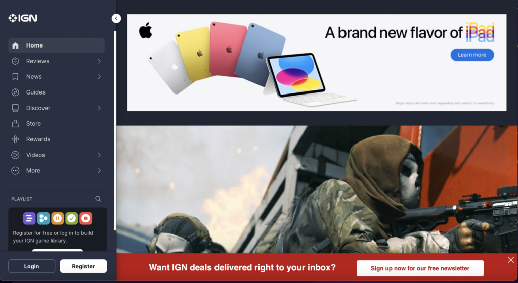
The first task I asked the user to complete was to access the Game of the Year awards for 2021. As soon as I assigned the task, the user encountered their first challenge, website navigation. The website had it main content showing as it was in the first screenshot but then the sidebar had collapsed.

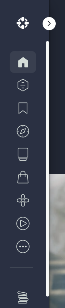
The user expressed confusion over the structure of the navigation bar and then decided to resize the page. Luckily, this made the menu bar expand. At this point, the user expressed that they were looking for a search bar. The user scrolled all the way to the bottom of the website and then scroll all the way back to the top and stated that there isn’t a search bar present. While they were scrolling, they indicated they were also looking for an article or a hyperlink that would take them directly to the Game of the Year awards and they couldn’t find one. The user then decided to expand the menu bar one more time to see if they have missed a search bar. They saw a search icon, but when they clicked it, it only allowed them to search through playlists that have been created on the website. At this point the user turned around and looked at me because they thought that I was playing a joke on them. I didn’t do anything except remind the user of the task to accomplish. They decided to expand the menu bar one more time and click on the Reviews tab, which only separated the reviews by what they were reviewing (e.g., video games, television, etc.). After reviewing all the options present in the navigation by the other determined that there wasn’t a way to get to the game of the year awards from the IGN homepage. The user resorted to conducting a search on a search engine. From the users initial search on the homepage they had concluded that they were unable to execute a search on the website so they decided to continue using their knowledge of Google to help them search the IGN website. There they located the Game of the Year article and was then able to find reviews on the other games listed in the article. The article featured videos it appeared to be trailers for each of the Game of the Year contenders but didn’t necessarily take you to any extra reviews for the games. The user had already accomplished two of the three tasks that I had assigned to them, and the only thing left was to find the walkthrough of Legend of Zelda: Breath of the Wild. The user decided to head back to the IGN homepage and give it one more try to help him complete the last task. The user headed to the menu tab, clicked on the reviews tab and selected video game reviews. The user scrolled down a while and without a search bar, they decided to Ctrl+F the webpage and turned up nothing. After a deep sigh, the user then went back to Google and searched for this information just as they had searched for everything else.

Design Recommendations

Throughout the user test, one thing I noticed is that my user was extremely frustrated at the lack of navigational aids to guide them through the website. I know that the Internet largely functions on ads now, but I think that IGN could benefit from reducing the size of their advertisements. When they reduce the size of advertisements, it will allow them to incorporate certain elements into their webpages such as search bars and other hints to let the user know where they are in the website. The overall structure and layout of the homepage also could use work. Similar to how we format our blog posts, IGN could utilize headings to make certain parts of the website stand out and define structure. The website does have well functioning responsive design which is hard to find sometimes with content heavy websites. Because most of my user problems centered around finding information on the website I feel that would be the space that the most changes should take place.

Individual Assignment 2: Heuristic Evaluation

The Website

The website that I chose was True Achievements.

Screenshot of the True Achievements homepage

True Achievements is a website that markets itself as presenting Xbox related gaming updates and reviews. It also features a community forum where users can participate in discussions and find themselves on leaderboards.

The Scenario

Recently, over 90 videos of what was then considered “suspected” user gameplay of the newest installment of the Grand Theft Auto game series was leaked to the internet. Rockstar Games then came out and confirmed that these videos were real and reassured users that it would not affect the development timeline of the game. In this case, I wanted the user to be heading to True Achievements to see what information they could find on the leak. This task would ideally be accomplished by the user searching the website using the search bar; even though there is an article featured on the home screen.

Usability Flaws

Upon searching the website for anything related to the GTA leak, I was met with the following screen.

A screen capture of a search for “GTA leak” returning the error message stating there aren’t any matching search results

I knew this information was incorrect because I had just seen an article featured on the Home Screen. Another thing I noticed while on the home screen was that each image has a small descriptor box that seemed to put the listing into a category. Naturally, I looked at the search parameters to see if I could change them to match the descriptors. I couldn’t. They were two completely different sets of information. This violated the Consistency and standards design heuristic. Since the categories do not match the descriptors the user is left wondering how to search the correct parameters and how, if at all possible, to search and retrieve a relevant article.

I ended up going back to the home screen and clicking on the article I saw that was related to the leak. I went into the article and read it. I saw that it did contain some of the information that I was looking for but I wanted to know more than a teenager from the United Kingdom was arrested for it. I went through a rabbit hole of related articles until I was well informed about the leak and then wasted to go back to the home screen to see what other featured articles are there. Because I am an avid internet user, I know that the quickest way to get back to a website’s home page is to click on their logo in the header, however this is not always the case. This has to be coded into a website and it is not common knowledge which violates the design heuristic of Visibility of System Status. My current location was not clear nor was I able to navigate back to the Home Screen but I had accomplished what I initially visited the website to do.

Design Recommendations

In conclusion, TrueAcheivements could use an entire revamp. I’d suggest they start with the overall layout o the site. From the screenshot of the homepage, you can see tat headers and other information tend to blend into other elements on the page. This will help the website better appeal to the Aesthetic and minimal design design heuristic. Revisiting the tagging that the website uses to identify their content. They also should revisit the coding of the website because in this case it is interfering with the usability of the website. When I used the provided search bar to look for information on GTA, the returned screen indicated that there was no information on the website that related to GTA. A quick scroll of the Home Screen led me to determine that that was not the case. Also when I clicked on the article that initially grabbed my attention, there were many more articles linked under the article that were also about the game. Lastly, I’d suggest adding some sort of navigational aids to the website. The current header’s navigation options do not support all the different paths you can take on the website. This also leads to the user not being able to return to a page they may have visited previously because it isn’t recognized or listed I the current menu options. A home button would be a great starting point.

Individual Assignment 1: Designing for Users

Website and User Background

The website that I invited my user to test was TechCrunch.com. The user regularly interacts with news sites and forums but not with TechCrunch specifically. The user is someone I consider technically savvy, regularly interacting with technology and websites. The user and I are both a part of the same age group and have had similar experiences with technology and its evolution.

A screen capture of the Home Screen of TechCrunch's website.
TechCrunch home screen

User Interaction

The user was initially confused with the format of TechCrunch. There was no prominent title for the homepage so because my user is not familiar with TechCrunch they immediately asked for the name of the site. They scrolled through the main page of the site and noticed that the pictures were stock photos mostly but still managed to be relevant to the articles. One major thing that the user pointed out was the monotony of the website. Items that were sponsored content and even ads were hard to decipher from regular content. The same was said about the navigation menu; the Search bar and even the More tab seamlessly blends in with the other navigation options. The user scrolled down and noticed an article discussing Instagram recently being fined by the EU for violating children’s data privacy rights. A nice feature of TechCrunch is that as you’re scrolling through the website’s desktop version, there’s a circular meter tracking your progress through the article. Initially, the user clicked the circular meter because it contained an X within a circle and they added that “normally buttons with X’s close items.” That was an interesting point and something that I hadn’t considered before.

Site Suggestions

TechCrunch has one of the more straightforward UIs than a large portion of news sites and forums that exist today. Using what I know about websites I know that that can be both a good and bad thing. In today’s climate, ads are virtually omnipresent. Every app has the ability to track your activity to show ads they think you’d want to see along with decades-old methods or magazine and billboard advertising. A website without too many loud and distracting ads is hard to find. At the same time, the search bar, an extremely helpful tool, is lost in the interface because of the minimalist approach that the website takes. Once you actually use the search bar, the website almost becomes unidentifiable again with only the green TC (TechCrunch logo) in the upper right corner to let you know where you are. I don’t think the user experience level justifies any of these particular challenges. They are simply poor design choices. TechCrunch’s TC logo doesn’t stand out on the web pages, not even on the homepage. If the designers want to use the abbreviated logo throughout the site, I think it’d be best that they introduce the logo a little larger on the home page and include the full name of the website somewhere accompanying the abbreviation, it’d be more recognizable. The website owners can make certain features pop out to the eye without sacrificing their minimalist theme by using their accent color, lime green, to show separation.