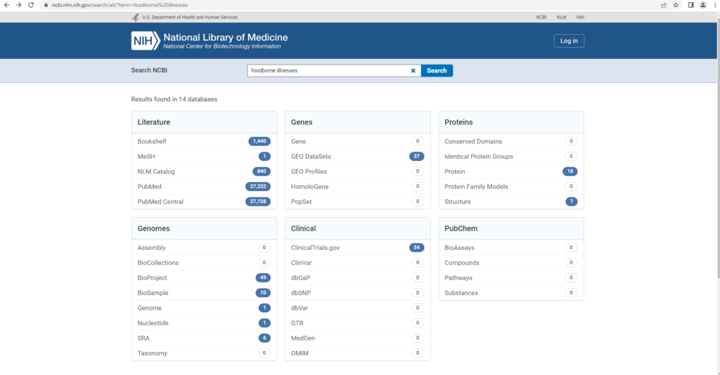
Target Website: https://www.jeffdavishospital.org/
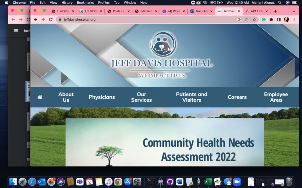
Figure 1. Original Homepage (Jeff Davis Hospital, 2022)
The Healthcare Group user tested the Jeff Davis Hospital (JDH) website, shown in Figure 1, through a comprehensive scenario of an individual seeking healthcare services for their family member. Violating major heuristics issues around consistency, standards, error prevention, efficiency, and minimalist design, this site needed a major redesign in the content organization to merge its disjointed brand or legacy sites (Nielsen, 2020). In our group’s first redesign, we approached the site’s navigation by restructuring the site map, reimplementing search, and visualizing a native implementation of their Health Research Center. In our second redesign, we focused on redefining the categories for services, departments, and Health Research Center (HRC), and revisiting the homepage based on user feedback. Wireframes were assembled in Figma Design and FIGJAM using Estefanía Montaña’s (n.d.) Easy-Peasy Wireframe Kit and colors matching JDH’s theme.
Unchanged Design Components
In the second redesign effort, we decided to maintain the sitemap, blue tones, grey tones, white tones, and patient portal buttons of the original Jeff Davis Hospital site. The reasoning behind the maintenance of these features was rooted in our goal to make the site more compliant with the ten usability heuristic evaluation criteria without drastically changing the original visual idea of the JDH site.
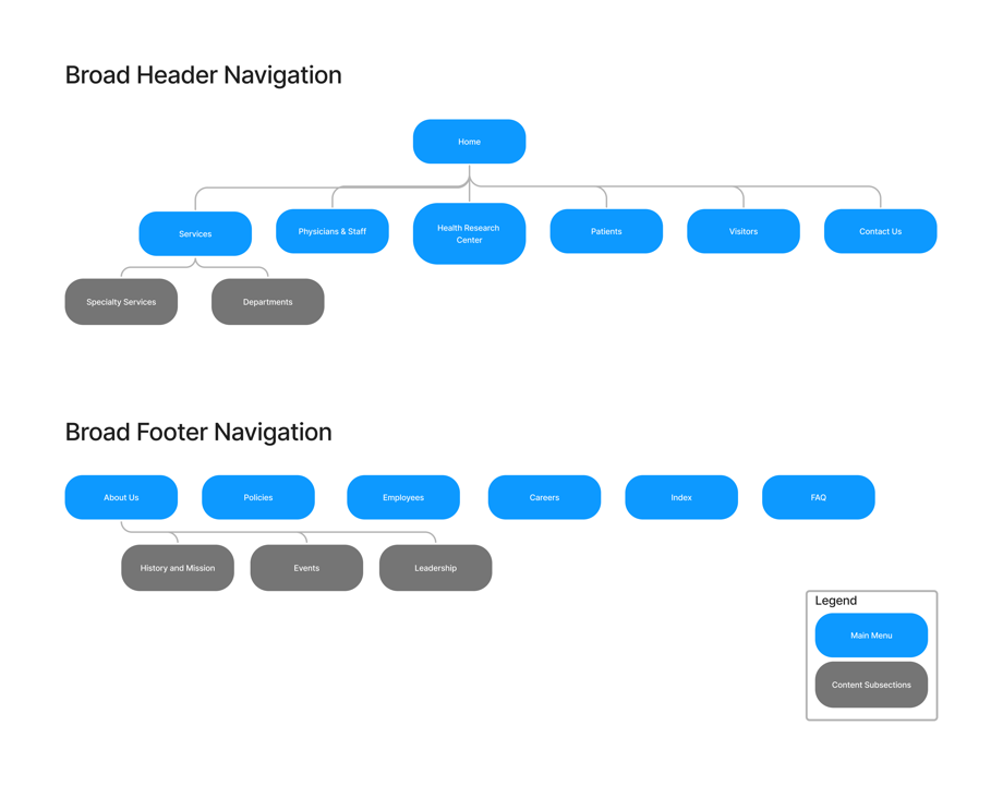
Figure 2. Sitemap
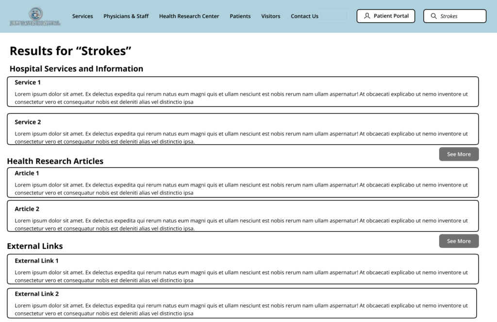
Figure 3. Search Results
Proposed Re-Design #1 – Homepage
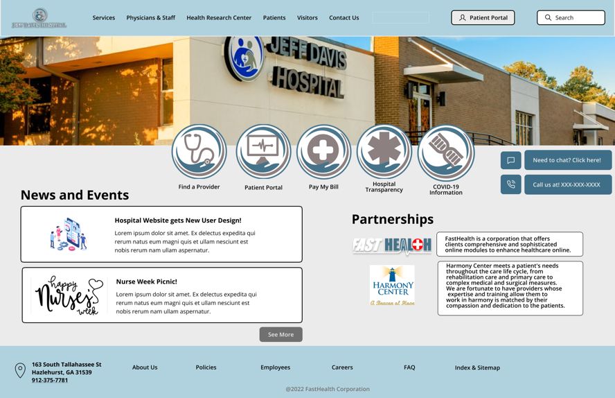
Figure 4. Homepage
Our second iteration made substantive changes to JDH’s Homepage from its first one. Through user feedback and a second brief heuristics evaluation, we determined that there was too much “white space” on the homepage that was not being utilized well. Additionally, significant elements were missing on the homepage that would enhance its usability through having a stronger information scent. Given our selected scenario with our representative user, we propose additional changes including the re-design of the “News and Events” and “Partnerships” sections with the addition of action commands and a footer. By re-designing the two sections, user tasks that require searching for stroke-related information and elderly care services will improve users’ information-seeking behavior by having clearly defined sections with descriptions and graphics of each (higher fidelity).
The second iteration of the JDH Homepage includes the addition of call and chat functions to better reflect the match between the system and the real-world expectations of our representative users (Nielsen’s second heuristic). These changes help users to feel more at ease with navigating through the JDH Homepage since such action commands allow relevant information to appear in an intuitive, actionable way. Graphics adjacent to the call and chat functions were included to clearly mark what the Call-to-Action buttons accomplish.
Adding a footer to the JDH Homepage directly addresses Nielsen’s third heuristic concerning user control and freedom. A footer will provide additional direction and control for our representative users to navigate the JDH website to better satisfy their information needs. Standard procedure for website design requires using a header, body, and footer as well. Additionally, we changed the background color of the JDH Homepage to a darker grey since it better accentuated the existing colors on the page for improved readability. Such re-designs address Nielsen’s eighth heuristic for aesthetic and minimalist design. Through these changes, the JDH Homepage will have an improved aesthetic interface over its first iterative design.
Proposed Re-Design #2 – Services Page
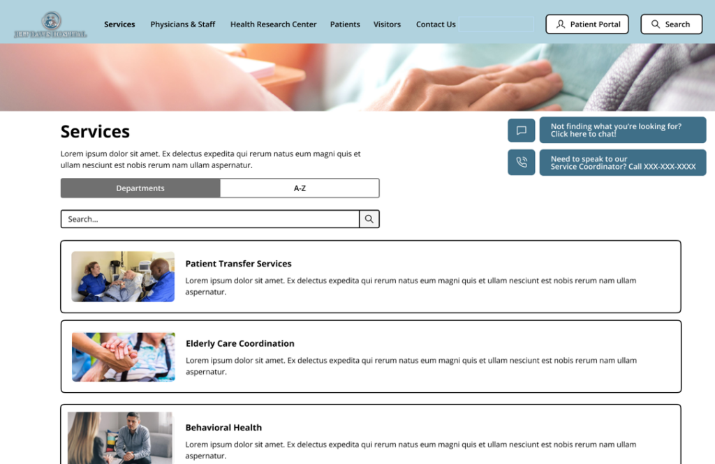
Figure 5. Services Page
The second iteration of the redesign for the JDH Services page includes several changes, or improvements, from the first design. Aesthetically, some minor changes were made to the page to include a re-alignment of the header, page description subtext, the sorting options, and the search bar from a center position to a left-side position on the page. This shifting allowed for the inclusion of two floating/frozen information messages to present an option for a collapsible chatbot feature with a scripted directory and to display the telephone number where a JDH services coordinator can answer questions, human to human, about the services offered at the hospital. Additionally, an aesthetic change was made by widening the service information cards further into the margins to take full advantage of the screen space. As a higher fidelity iteration, the design also displays images in the page header and in the service cards that serve as supplemental visual descriptors.
Another change featured in this design iteration is the removal of a confusing and unnecessary filter option “Special Services” from the first iteration. This filter option could contribute to a negative user experience by expecting the user to know the non-standard language and understand what the “Special” designation filter would and would not include in its service list. This second iteration only includes the “A-Z” sorting filter and the default “Departments” filter which lists the most used services based on user selections on the page. The search bar is still present from the first iteration, allowing users to search for services based on keywords.
Proposed Re-Design # 3 – Sorting Health Topics
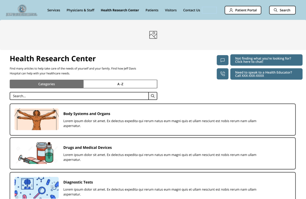
Figure 6. Health Research Center
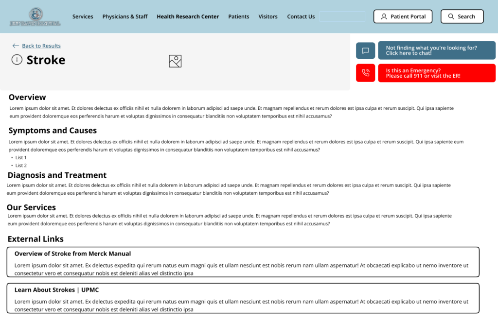
Figure 7. Stroke Article
In the second iterative design for the JDH Health Research Center page the aesthetic changes implemented follow in uniformity with the changes made on the Services page; the left-side shift of the header, page description subtext, the content list filter options, and search bar, as well as the wider content cards that have been expanded closer to margins. Also, following the consistency of the layout of the Services page, floating/frozen information messages are present in the top right of the page, displaying the available chatbot option and a telephone number to reach a Health Educator who can assist in research questions.
On the health topic subpage design, only two changes were made. The first change was to include JDH-curated titles for external links with subtext descriptive text to inform the user of the legitimacy and authority of the linked external resource. The second change was to include a call to action for the user to seek medical attention if they believe they are experiencing a medical emergency. This call to action takes the form of a floating/frozen message displayed in an eye-catching red color, replacing the telephone number display message on previous pages. If JDH chooses to implement a virtual triage or urgent care platform in the future, a link to this could be easily added in a future iterative design.
Word count: 858
References
Health Library. Cleveland Clinic. (n.d.). Retrieved November 15, 2022, from https://my.clevelandclinic.org/health
Jeff Davis Hospital. (2022). Jeff Davis Hospital. https://www.jeffdavishospital.org/
Jeff Davis Hospital/fasthealth corporation (Hazlehurst, Georgia – jeff davis county). (2022). Jeff
Davis Hospital/FastHealth Corporation. http://www.jeffdavisfasthealth.com/
Montaña, E. (n.d.). Easy-Peasy Wireframe Kit. Figma. https://www.figma.com/community/file/989274600796773962
Nielsen, J. (2020, November 15). 10 usability heuristics for user interface design. Nielsen Norman Group. https://www.nngroup.com/articles/ten-usability-heuristics/
Whitenton, K. (2015, November 29). Menu design: Checklist of 15 UX Guidelines to Help Users. Nielsen Norman Group. https://www.nngroup.com/articles/menu-design/
External Links
Group Assignment 3A – First Iterative Design
Group Assignment 2 – User Scenarios and Representative Tasks