Individual Assignment #2 (Hopper)

For my travel site I chose to review the app “Hopper,” due to its wide popularity and claims to provide the best possible deals. Hopper is a travel application designed simply to find users the best deals on flights and hotels. I recently came back from a trip to Aruba and booked my stay via AMEX travel for the hotel (Expedia) and directly through Delta.com for the flight. For this heuristic scenario, I have decided to book the same exact trip from beginning to end through Hopper and compare experiences and review hopper.com utilizing Jakob Nielsen’s 10 guiding principles.
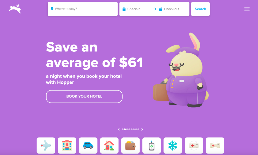
First things first, I can’t use my laptop or desktop to book my trip?! Forcing a traveler to use their cell phone to book the entirety of their trip violates rules #4: Consistency and Standards and #7: flexibility and efficiency of use. The rule of consistency and standards states that an application should follow industry best practices, which in this situation would be to offer both mobile app booking as well as the ability to book on a website. Older users are much less likely to book a trip on their mobile devices than they are their desktop computers. The mobile application shrinks everything, which creates sensory overload for an app that depends on advertisements and a mass amount of options. The rule of flexibility and efficiency of use states that a user can personalize and customize their application. The fact that a user can only use their mobile application violates the principle of flexibility. Additionally, at no point was I able to customize or personalize my experience. In fact, I was only asked to create my account at the end of the experience right at the payment method step.

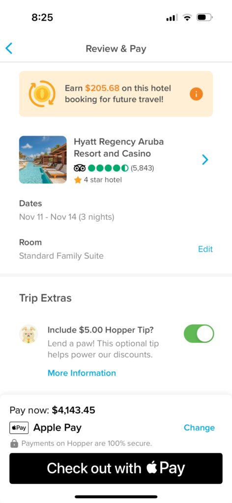
Moving on to booking my flight along with my hotel for the duration of my trip. This process was overwhelming. Again, an abundance of information all on a small screen was overwhelming and made for a stressful booking experience. I didn’t feel as though I was getting the best deal and didn’t find a way to combine booking my hotel and flight in the same process as I am accustomed to while using Expedia or similar sites. At the end of my booking experience I took to the airline and hotel websites directly and found cheaper rates! For a first time user this wasn’t a reassuring experience. Frankly, this is the point where I would delete the mobile app if this wasn’t for a graded assignment. These errors clearly violate the principles of aesthetic and minimalist design. More is less and in this case the UX designers need to reevaluate their mobile application layout. The designers need to be sure to make strong recommendations for the best possible flight/ hotel combination as well as the ability to book the both during the same process.

The final step that never happened were the recommendations. I was under the impression the Hopper app was the best at telling a user they weren’t booking the best deal, at the best price, at the best time. I was looking forward to the, “hey guy! don’t book this now! you can do better!” moment. This step violated the final principle, which is help. I was going to book a trip for way more than I should’ve and the app never helped me stop or even slow down. The app needs to have an automated help feature to assist the user with booking the best deal.
The Hopper concept is great and definitely one that had me thinking about using their product in the future. In order to more closely follow Nielsen’s heuristics principles, the developers can make a few significant changes. First, the developers need to bring the booking to desktop applications. By doing so, they’ll spread out their crowded interface and make the booking process easier for users accustomed to only booking trips using their preferred search engine. Second, if they’re stuck on solely using a mobile application they’ll need to reduce the amount of content each page has to display. Make it so a user can add to options as opposed to having them all laid out right from the beginning. I want to be able to do everything I can on this application as I can using a specific hotel or airline vendor. Points is life for frequent travelers and in order to stay relevant, Hopper should align their organization with other travel companies in order to provide the additional option of rewards points. Lastly, the application needs to constantly tell a user when they’re choosing the best deal at the best value. People use the Hopper app for helpful recommendations, they need to make sure a user is well-informed when making a poor decision, which is the helpful feature to ensure a user is making the best use of the product.

Individual Assignment 2: Heuristic Evaluation

The Website

The website that I want to perform a heuristic evaluation on is Zomato. The platform of this website is for searching and discovering restaurants; reading and writing reviews; ordering food delivery; booking a table; and making payments while dining-out at restaurants (I think the last three services are for an app feature – the site was not specific about it).

Method

The evaluation method was browsing the website while keeping tabs on the usability flaws. After getting familiar with Jakob Nielsen’s 10 general principles for interaction design, I went back to where I found the usability flaws and connected each one that I found.

Usability Flaws

Visibility of the System Status

The flaw that I found with this heuristic is the search bar. The first thing that welcomes you when you get to the site is the search bar. But the problem is, it is already showing the last place that I did a search. It can’t be deleted or cleared, and can’t be removed by clearing the browser’s history. Another problem with it is that when you type your location and hit enter, it just looks like nothing happened. A few tabs at the bottom show up, but not what I am looking for (the list of restaurants). The third is the right-side of the search bar. When I first browsed the site, I thought I could search for any keyword on the search bar. But after careful inspection, you must enter a location and then do a search that pertains to a restaurant, cuisine, or a dish. I call this a flaw because people go to a site and do a search on a search bar, not enter a location, and follow the next direction, which, by the way, there is no direction.

This is a violation of the “visibility of the system status” because the site is supposed to always keep users informed about what is going on, through appropriate feedback within a reasonable time, and clearly this site doesn’t.

Match Between System and Real World

After entering the site, once you scroll down from the search button, you will see “Popular localities in and around Venice, Florida” (remember the previous searched location is automatically inputted). The word “localities” caught my attention because I am not looking for a particular place, but a place to dine.

This violated the usability heuristic “match between system and the real world” because it did not ensure that the user’s understanding of the word match the understanding of the programmers.

User Control and Freedom

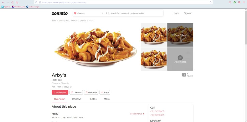
So, I was finally able to search for restaurants. When I click on a specific one, it takes me to the restaurant’s profile. But there is no way of going back to the previous page, which is the results. To go back, I must press the back arrow button, or at the top of the image of the loaded curly fries, there is a directory type of addressing. You can click on any part of the directory and hope that you will land back where you want to go back. The problem with that is that not a lot of users can understand that.

The “no return button” is a violation of the usability heuristic “user control and freedom” because there is no clear way of exiting the current interaction.

Flexibility and Efficiency of Use

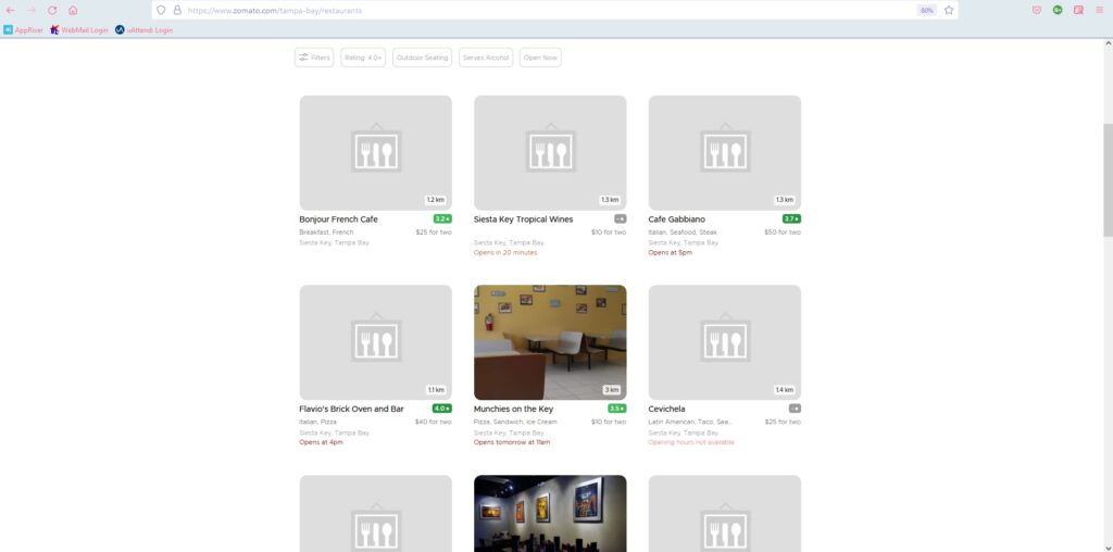
I noticed that in the search results there is no way to pick different restaurants and compare them, nor is there any way to personalize the view. The design is stuck on three columns and endless scrolling (if there are a lot of results – like searching a rural area). So, if you want to get to the bottom of the page, you scroll to what you think is the bottom of the page, but when you hit the bottom, it will load more results. When I searched for restaurants in Cebu City, Philippines, it kept doing that for at least five times. The design is not very convenient and it is annoying to get to the bottom of the page.

These violated the heuristic “flexibility and efficiency of use” because they don’t provide a way to personalize the functionality and they don’t allow customization on how the user wants the product to work.

Help and Documentation

There isn’t a help button, or I can’t find it.

This violated the last usability heuristic because a site needs to have documentation in context right at the moment the user requires it.

Recommendations

Visibility of the System Status

Since the site is already known for restaurant reviews, I recommend that the search bar be set to search full sentences, like “the best place to eat in Sarasota”. People already visit the site because they are looking for a good place to eat, so by doing so, they should get a list of restaurants. Or they can at least have a talking bubble to direct you to the process of getting search results (instructions).

Match Between System and Real World

I recommend changing the label to “restaurants and bars in the neighboring area”. This way, people will know that the section is still relevant to their search.

User Control and Freedom

For this usability flaw, I recommend a clear exit path. It must be correctly labelled and easy to find.

Flexibility and Efficiency of Use

For these flaws, I recommend adding an option/button for the users to change the view of the results, and adding a list view will solve the never-ending scrolling.

Help and Documentation

Add a “help button” to help users when they require it.