Individual Assignment 2 – Heuristic Analysis

Gaming group

The Site:

Gamesradar+ (https://gamesradar.com)

   Gamesradar+ is a gaming site that covers games from all platforms, from PC to all the various video game consoles on the market. The plus is the additional coverage of topics many gamers also enjoy, such as movies and the world of comic books.

The Scenario:

   The review of this site is done through the eyes of the fellow gamer that needs to find a gift for a friend’s child. As video gaming has been around for decades, this group covers a large range of potential ages. In this evaluation, we will be looking at finding a gift for a pre-teen boy that his parents will not object to. In this case, that means nothing with foul language, shooting games, or other conduct they may consider inappropriate for his age. This task will be considered a success if it results in a game recommendation, and if it points to a good deal on the game, that would be a bonus.

The Analysis:

   In the search for information about games, I selected the Reviews tab:

Since I am looking for a game, the Latest Game Reviews tab makes sense. At this point, the site navigation makes sense. What did not make sense was the word Tech under the BROWSE BY PLATFORM section. Curiosity drives you to look at that one, which takes you off to reviews of televisions, personal tech, and streaming hardware. This fails as a Match Between System and Real World.

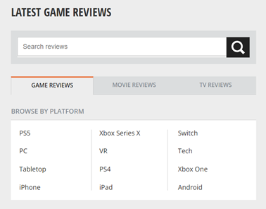
   In navigating the site, I notice that the Reviews tab does not stay colored in black, which would keep the Visibility of the System Status if implemented. Since the friend’s kid only has a Nintendo Switch, an Android tablet, and an Android phone, I select Android looking for game reviews and again get let down as that section takes me to a page full of phones and Android game controllers. There isn’t a review of an Android game until you get to the second page. As I look further, I realize that the newest review on an actual Android game is from March 1st, 2019.  This once again fails at the Match Between System and Real World and the idea of Consistency and Standards. A game review section should only have reviews of games, and reviews of physical devices should be kept separately, and a website about gaming should be kept current. The idea of not having a review of games during the entire pandemic (when people were stuck at home with little else to do) is just unheard of.

   In a pleasant surprise, returning to the Reviews section and going to the Switch section showed reviews as recently as 12 days ago. There were plenty of options to choose from for games, but it also had hardware reviews for platforms not related to the Switch such as the Steam Deck. Once again, another Consistency letdown.

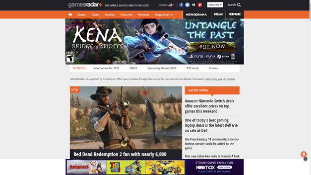
   A user can understand the need for a website to be supported by advertising dollars, but this site crosses into the ‘annoying’ category with the excessive screen real estate devoted to unrelated ads. The following screenshot is what happens when you full screen the site on a widescreen monitor:

In this violation of Aesthetic and Minimalist design, the idea of a gaming site is lost in a flurry of advertisements about London. Less than a third of the page is the actual site content.

The Recommendations:

The adjustments to the site would be straightforward:

  • Adjust the header at the top of the site to keep the current location highlighted to keep the user informed of their location in the site (Visibility of System Status). The header is a good method to show this, but it needs to be fixed. The header also had some other flaws, such as the “About Us” section being hidden under the “Magazines” section:

  • Game reviews should be nothing but game reviews. Either put reviews of hardware in their own section or combine the hardware and games into sections by platform and label them as such. This would give the user the Consistency and Standards as well as a Match Between System and Real World.
  • There is this one little icon that floats on the page, and when you hover over it, it reveals itself to be a “Subscribe to Notifications” option. This needs to be moved into the header with a label. While it could be a highlight for Flexibility and Efficiency of Use, as a shortcut that more experienced users would rely on, I fell that not knowing what it was shows a fault in Visibility of System Status.  
  • Advertising must be limited to less than a third of the site, and ideally should be something remotely linked to gaming. The current layout is pulling from the focus of the site, which is to promote and discuss gaming. Limiting the percentages of screen real estate to advertising will allow users to stay focused on the task at hand.

Individual Assignment 2: Heuristic Evaluation

Website: https://ign.com

Scenario

Navigate to the IGN website and search for a specific game. Locate information about the game such as game statistics and the game walkthrough guide.

I started by opening the web browser on my computer and navigated to the IGN website. When the website loaded, the first thing I noticed was the home page was very busy. There were videos and links to articles about video games. There was also a top navigation menu. When I scrolled down the page, I noticed the page loaded more content. The top navigation menu contained a search function, which I used to search for a specific game: in this case Watch Dogs: Legion. The search function popped up a box in the middle of the screen and grayed out the content of the website. When I started typing the name of the game, the site presented me with options, trying to guess what game for which I was looking. I selected the correct game and was taken to the game profile page.

The game profile page contained information about the game at the top of the page including an image of the cover art for the game, release date, developer, rating, score, platforms, a highlighted button entitled ‘change status’, a wish list button, and a button with three dots. The button with the three dots contained two menu items: ‘go to guide’ and ‘share game’. Similar to the search function, this menu is also displayed in the middle of the screen and grayed out the rest of the website. Below this was a game rating (thumbs up or thumbs down), information on how long it takes to beat the game, community ratings, links to the walkthrough and tips, screenshots, reviews, summary, then news. The news section continues to load when scrolling down the page and doesn’t seem to end.

I located the game walkthrough, which I have used for other games, and I found it to be very organized. The left-hand side of the screen contains a menu with hyperlinks to specific chapters/missions, and each link contains a detailed walkthrough including videos and text. I found this part of the website very easy to navigate and use.

Analysis

Aesthetic and Minimalist Design Violations

  • Home page: The home page is very busy with videos, top stories, and news articles, and it never ended. I couldn’t reach the bottom of the home page. More content kept loading as I scrolled. I glimpsed the footer a couple of times, but the content loaded, and I couldn’t read what the footer said. I also think there are too many menu options in the top navigation menu.
  • Game Profile Page: the game profile page has a lot of wasted space, dedicating part of the first viewable area to thumbs up and thumbs down game rating options. Other space is wasted dedicating room to statistics and data on how long it takes to beat the game. Near the top of the game profile page is a button containing three dots. When clicked, the page is grayed out and two additional menu items are displayed: go to guide and share game.

Help and Documentation Violations

  • In the top navigation menu, there is an option labeled more. The more menu contains a lot of information and I feel the help or support options are missing or buried. The more menu has choices for the website theme, region, accessibility, ad choices, contact support, terms of use, standards, site map, privacy policy, and personal information opt-outs. Since this is listed under ‘more’, I feel many people will miss the information.

Design Recommendations

Aesthetics and Minimalist Design Recommendations

On the home page, I recommend using menu drop down/hover over to consolidate some of the menu options. A menu option called Media can contain news, videos, and playlist. Also, the login and register buttons can be combined to allow the person to register for an account if they do not have a login for the site. I also recommend having a set amount of content for the page instead of continuously loading content as you scroll. Website footers can be used to contain valuable information, and I cannot locate one on the home page.

On the game profile page, a lot of room is taken up unnecessarily, causing other information to be consolidated. My suggestion is to consolidate the ‘rate this game’, ‘how long to beat’ data, and ‘community ratings’ into the panel at the top. I also recommend creating a button for the guide link to be displayed along with ‘change status’ and wish list and using the universal share icon. This prevents a separate menu that grays out the rest of the page from popping up for two menu items. These minor changes will shift some more relevant content to the top of the page under the pertinent game information.

On both pages, and wherever else it is applicable, I recommend implementing a blog post type format for news articles and videos. The newest videos and articles should be viewable with the option to view older posts. This helps implement the other recommendation of including a viewable footer.

Help and Documentation Design Recommendations

On the home page, I again recommend including a viewable ‘footer’ that contains the support information, privacy policy link, terms of use, and accessibility information. I also recommend clearly labeling a support menu, possibly under a contact us page.

Group Assignment 1 – Topic Selection

Group Name: Gaming 

Members:  

  • Ginny Morris 
  • Ryan Thomas 
  • Emanuel Strachan 
  • Jasmyn Collier 
  • Steven Howard 

Type of Site: Video Game Reviews, Walkthroughs, and Collaboration 

Examples:  

Why this type of site?  

We chose this type of site because it is a form of entertainment that we all enjoy, and it was more interesting to us than the other topics presented, such as health care or museums. It covers a wide spectrum, going from online card games and e-sports to long quests that you can take by yourself, or with a group of friends. 

Many gamers rely on video game reviews to choose the games they purchase and play. There are a vast number of websites that provide this type of information, and each gamer has a personal favorite. The articles and videos on these sites have multiple authors, and many of these sites allow for gamers to submit their own walkthroughs, reviews, and comments about games. Users of these sites are looking to gather information about video games that interest them.  

Many times, users of these sites find there is a lack of quality control due to the vast amount of content being shared on the site each day. Other sites can make it difficult to find information about a specific game. Useful information may be lost within a cluttered or disjointed website design. Users may become irritated at large distracting advertisements and unwanted pop ups asking for permission to push notifications or to create accounts. 

Exploring the usability of these types of sites can begin to shine light on what problems exist within these websites themselves but also can give insight to what is happening in the video game from a user’s perspective.  

Ensuring that the site is effective and user friendly is an important start for games and gamers alike. These types of sites not only can determine the success of many gaming titles but also play a factor in how different video games are perceived in the gaming community. Games such as The Quarry and Cyberpunk sometimes don’t reach the mainstream public, so they rely on reviews and word of mouth to spread. These gaming sites give users a place to look at new releases, play demos, look at previews and much more which they might normally be exposed to. From there, news starts to spread, and streamers start taking an interest and ultimately others start taking notice and the games eventually take off. It all starts with a great layout that’s easy to understand and use while also keeping the end user engaged.