Individual Assignment 2: Heuristic Evaluation

Website selection and description

For this heuristic evaluation, I chose the Brooks County Public Library website. The Brooks County Public Library website is what patrons in Brooks County, Georgia, can use to interact with and learn more about their library if they are physically unable to visit the building for whatever reason.

Brooks County Public Library homepage (with a removal of phone number by me)

Scenario and heuristic approach

I have volunteered at my own local public library for numerous programs and events, so I decided to make the scenario one where a representative user looking to fulfill required volunteer hours is checking the library’s website to see if the library offers any volunteer opportunities and, if they do, finding out how to sign up for a shift.

I have no knowledge of Brooks County or its public library website, mainly having chosen it because of its lacking homepage, so my approach is one of a new user looking for desired information, then taking my navigation of the site and of how easy it was to find what I was looking for and judging it against Nielsen’s heuristics.

Analysis

The first thing I do when looking for information specific to a location is read the About page, as general information is typically listed there. I did not have to go far here, as the homepage is title About Us, so I read through the page, which contains a lot of text and an image that does not load, but found nothing about volunteering.

Next, I decided to use the search bar located at the top right below the navigation panel. It says I can “Find Books & More,” and because it says “search” and not “search catalog,” I thought that it would search the whole site and I might get some results for volunteering. Upon pressing search, I received a page notifying me that the search option is not secure.

The page I get after pressing search (which is in compliance with the error prevention heuristic)

I pressed “Send anyway” instead of “Go back” because I wanted to see what my results were and was taken to this page:

The page I get after pressing “Send anyway”

Because I realized that I could not use the search option to look for volunteer opportunities, I went back to the main page and tried the Events tab, as that seemed like a place volunteering might be mentioned. Curiously, on this page there is a note about how the Brooks County Public Library is in the process of updating its website. I would expect this to be on the homepage, as that seems to be more logical—people are more likely to land on the homepage when accessing a website.

The Events page with a note about the site being updated

This page is also mainly text, but there is a picture at the bottom that does load. Still, there is no information about volunteer opportunities. I decided to try the Youth Services tab next, but I continued to have no luck in my search. Finally, I tried the Links & More tab, though wary of what they consider “& More” at this point, and saw nothing to aid my search. Having been through all the parts of the site that seem as though would house volunteer opportunities, I am resigned to the fact that if I really did live in this county and were looking to volunteer at the library, I would have to place a phone call (which, now that I think about it, would probably be more effective than what I just went through).

Heuristic violations

Match between system and the real world

This may be the case of a bad label, but the search bar saying I can use it to find “Books & More” seemed to be a violation of this heuristic. The “& More” implies that I would be able to use the search bar to find out information about things not related to books, especially since there was no mention of this only searching the catalog. In a way, I thought it was speaking my language, but it was actually vague and led me to errors.

Another violation of this heuristic would be the website update information being on the Events page rather than the homepage. This heuristic states that information should be placed logically, which I did not find this note to be. I immediately judged this library site based on the main page, as that was how I first accessed it. If this information about the website being under construction had been on the homepage, it would make more sense, giving users information from the start, and I probably would not have been so harsh about its design (or maybe I would have been, but at least I would have known they were doing something about it).

Consistency and standards

When I received the unsecure form notification and “Not Found” errors after using the search bar, I considered how they violated this heuristic. These error messages did not fit the tone from the library website, which is startling and leads to confusion, detracting from the experience users have on the website.

The Events tab may be a violation of this heuristic, specifically external consistency. When you visit the event pages on other library websites, you find a calendar with events listed, or, if not a calendar, a digital flyer or slideshow of new or recurring events. Brooks County Public Library has neither, just written text about their few events.

Aesthetic and minimalist design

The Brooks County Public Library website does not have many images and is mainly composed of text, making it visually unappealing and giving it a bad first impression. While this heuristic states that the visual design should not be overwhelming for users, containing the necessary information, this site is rather bare and boring to look at and use. While it is minimalistic, it is not aesthetic, so I believe it violates this heuristic.

Recognize, diagnose, and recover from errors

The “Not Found” error page also violates this heuristic. While it did tell me that an error occurred, it did not tell me what went wrong. Here I was, thinking that I was searching the website, and suddenly I am on a different page with seemingly no connection to the library. The error message was not in a plain language for the typical user to understand: I have no idea what any of the words, besides gapines.org, on the last line of the message means. Furthermore, there was no solution offered by this page to help me correct whatever had gone wrong.

Initially, I figured the search option was just for books rather than the library site because it was not completely specific about its intended use, and this error page proved that for me. Gapines.org, which is mentioned on the last line of the error message, is the OPAC system a number of Georgia libraries use so their patrons can request materials from other libraries in the state. I knew this as a user of PINES, but if one did not know about it prior to doing a search, they may be confused about why they were taken to a separate page where the Brooks County Public Library is no longer featured, in addition to being confused about the actual error.

Design recommendations

Search bar

For the search bar, I would make sure the label clearly identifies in universal terms that it only searches the catalog, so users would not be able to use it to search the library website itself for information about the library. This would prevent those users, like me, who try to use it as a shortcut to find out general information about the library. I have seen on some other library sites where there is an option to toggle between searching the catalog or searching the library website, which could also be a redesign alternative for this.

Visual design

There is a balance when it comes to the design of websites, but a lot of the pages of the Brooks County Public Library website are plain and filled with text, so one recommendation I have is adding relevant images and a color scheme. I also suggest they make headers noticeable so users can easily see what information is grouped together, making it easier to scan since most people probably would not read through all of the text they come across.

Adding digital flyers to their events page, if not a calendar, could help elevate the bare design of the site, but I understand the decision of just having text, seeing as they do not have many events. Still, this makes a case for adding flyers, just to help users immediately notice what is going on and locate events instead of reading plain text.

Error messages

To prevent users from receiving the unsecure form notification and “Not Found” error message pages from PINES, as I do not believe they come from the library website, I would suggest the library staff checks and updates their search bar function so that it works properly, if not get rid of it completely. The “Find a Book” button on the navigation panel leads to the PINES catalog with no issues, showing there is something wrong with the search bar function itself. This would save users a lot of trouble, because I believe more are likely to type in a book they are looking for if they see a search bar rather than clicking the “Find a Book” button.

Heuristic Evaluation of the Ringling Art Museum’s Website (Individual Assignment 2)

The website that has been selected for a heuristic evaluation is the one for the Ringling Art Museum, https://www.ringling.org/. This website holds information about the art museum and its location, hours, and content. It also provides a database with its online collection and archives. Through this website, a person can plan a visit and find out how to get there, view the Ringling Art Museum’s collection(s), learn a bit about the museum, etc.

Figure 1. Screenshot of the homepage of the Ringling Art Museum’s website found at https://www.ringling.org/

Scenario

In order to conduct this heuristic evaluation, I took the role of a person wanting to visit this art museum. During this scenario, I acted as a person who wished to buy tickets and plan their visit to this museum. The heuristic list that was used to evaluate the usability of this website was taken from Jakob Nielsen’s ten heuristics (https://www.nngroup.com/articles/ten-usability-heuristics/) (2020). I approached this website with an open mind and tried to use it in the same way a potential visitor might in hopes that this might have made it easier to see what kinds of usability flaws would come up for someone who is using this site for its intended purpose. I feared that, in only looking for flaws, I might have seen heuristic violations where there were none.

Analysis

Beginning on the homepage (https://www.ringling.org/), the first flaw I recognized was how much was included on that page. There was a lot of movement, and I was overwhelmed at first with how colorful and busy it was. Without knowledge about the Ringling Art Museum prior to this evaluation, the fact that there were so many links elsewhere without explanation caused me confusion at first. This flaw violates Nielsen’s eighth heuristic, aesthetic and minimalist design, as the UI was overly busy and there was too much information before I had even started (2020).

Figure 2. Screenshot of the homepage of the Ringling Art Museum’s website found at https://www.ringling.org/
Note. Page is zoomed out to 25%

I was able to find the next page I needed in this scenario fairly easily. Because I was acting as someone intending to visit, the next page I visited was one that contained the hours and admission information, titled “Hours and Information” (https://www.ringling.org/hours-and-admission).

Figure 3. Screenshot of the “Hours and Admission” page of the Ringling Art Museum’s website found at https://www.ringling.org/hours-and-admission
Note. Page is zoomed out to 33%

The switch between such a busy homepage and a relatively still, monochromatic information page violated Nielsen’s fourth heuristic, consistency and standards (2020). Because the homepage had so much on it, the fact that this page had relatively few graphics felt jarring at first. Another heuristic this page violated is Nielsen’s sixth heuristic, recognition rather than recall, as all of the options given for ticket purchases were placed one after another in a long page where the user had to scroll down to find which option they wanted (2020). By the time I got to the bottom of the page, I had already lost track of what was on the top.

The next page I visited was the one titled “Plan Your Visit” (https://www.ringling.org/plan-your-visit). This page violated Nielsen’s second heuristic, match between system and the real world, as I had expected this page to have information about the contents/exhibitions within the museum instead of its actual contents which were regarding food and drink as well as safety protocols and guidelines (2020). The actual information I wanted was actually in a whole different tab titled “What’s On.”  

Figure 4. Screenshot of the “Plan Your Visit” page of the Ringling Art Museum’s website found at https://www.ringling.org/plan-your-visit
Note. Page is zoomed out to 50%
Figure 5. Screenshot of the “What’s On” page of the Ringling Art Museum’s website found at https://www.ringling.org/events/type/all
Note. Page is zoomed out to 50%

Discussion

Overall, this website was designed in a fairly usable way. The heuristic violations were few and far between, and I had no issue in completing the tasks I gave myself. However, because each page on the website was so spread out, I did have consistent issues in remembering everything that was on each individual page. A recommended fix for this would be something like finding a way to fit information next to each other instead of in one long column that a user needs to scroll down. This would help fix the website’s violation of Nielsen’s sixth heuristic of recognition and recall as it would be made easier to remember the choices presented on a page (2020). Another recommended fix would be to the homepage: reduce the amount of what is on this page to reduce the overwhelming nature of its current state. This would help this page not violate Nielsen’s eighth heuristic, aesthetic and minimalist design, as a reduction in the design would help a user not get overwhelmed immediately when they navigate to the homepage (2020). For example, reducing the number of graphics and movement and replacing them with a little negative space and/or text to match the other text-heavy and graphic-minimal pages on the website. This would also fix the website’s violation of Nielsen’s fourth heuristic, consistency and standards, as it would allow the homepage to better blend into the rest of the website (2020). After this evaluation, I can see that there are more positives regarding this website’s design than flaws. While there are violations in usability, it is an overall usable website that allows its users to efficiently go where they want and find the information they need.

INDIVIDUAL ASSIGNMENT 2: HEURISTIC EVALUATION

The Website: Metacritic.com

The website I chose for this heuristic evaluation usability assignment is Metacritic.com. Metacritic is a website that aggregates reviews from movies, tv shows, video games, music, etc. Reviews can be searched by category as seen at the top bar on the homepage. I chose this because my group is focusing on gaming websites and their usability.

Method

My evaluation method was to go on about my specified task while keeping a tab open with the heuristic methods and nothing if one popped up while attempting to complete my task successfully. This ensured the heuristic methods stayed fresh in my mind so that I wouldn’t miss any violations of them.

My Task

The task I am attempting to complete is searching for the most recent addition to the Borderlands video game franchise: Tiny Tina’s Wonderlands and attempting to leave a review of the game. I have never used Metacritic in this fashion so I am exploring this from a novice user’s perspective. This is valuable as I will not be thinking of this like a designer but as someone new to the site.

Usability

The first thing I did was make a search for the game I was looking for. Immediately I want into a violation of Match Between System And The Real World, and Error Prevention. Typing out the game’s entire name did not give me the result I wanted. Instead it gave me a long list of results, several of which were all identical. I had to scroll down in order to find the specific information I wanted. The way I expected this to work is by showing me a much smaller list including the game, and any related content. The site is listing these in this manner to differentiate between the different consoles the game is played on but the fact that they are in identical sets of three with the only difference being small text denoting which console they are on, it is very easy to make a mistake and click on the wrong version for yourself. Especially on smaller screens or with users who may have vision problems such as myself. This does not prevent errors, but in fact makes them far more likely to occur.

The next thing I did was to click on the version for PC as that is what I play the game on. This brought me to the game’s page where I found another heuristic violation: Aesthetic & Minimalist Design. There is a lot of information on this page and some of it is redundant. Critic and User Reviews are each listed twice on this page, both within the users line of sight. These headings are also hyperlinked which means they do the exact same thing and there is no need to have both right in front of the user. This creates an excess of information and can be overwhelming to new users.

Solutions

For the Match Between System And The Real World issue, I would first incorporate the game’s DLC page into the game page itself. This would reduce the number of immediate results and allow you to narrow your choice down much more efficiently. The next thing I would do is have just one entry for the game instead of separating by console. This ensures that users that are just there to get general information about the game do not have to worry about selecting the right one. This would help to alleviate the Error Prevention violation as well because there would be fewer options with more clarity.
On the following page, I would remove the top User/Critic Review tabs and replace those with a DLC tab which players can use to get information on the game’s DLC if applicable. This solves the problem of having redundant information and instead presents the user with more usable and relevant information.

Conclusion

These were the two heuristic violations I found within the scope of my attempted scenario (Attempting to leave a review). I had no issue after the appearance of the final error explained above. I was able to sign in and post a review with no problem whatsoever.

Individual Assignment 2

Introduction to Game Informer

Introduction to Game Informer

The website I’ve decided to evaluate is Game Informer and my goal is to explain my experience browsing the site and how well if functions when trying to complete different task. Game Informer, like its’ name implies, is a gaming website designed to give gamers a place to get information on all things’ games and gaming related. Whether it’s an insider review on the biggest game soon to be released, a podcast on the current state of the gaming industry, or even a demo of the newest God of War installment, this website is made with a specific user group in mind and tries to cater to their needs.

Task Scenarios

My analysis consisted of about 3 different scenarios to see how user friendly this website is and if finding specific topics or reviews prompted any issues. The first scenario had to do with finding news on the highly anticipated Call of Duty (COD). My task was to see if I could either find out any Beta information or any PlayStation exclusive insights. The next scenario involved locating what games were due to be released this year, their platform and launch day. The goal here is to see if a user wants to know when a new game will be released, can they find that game and its information. Lastly, as a final task I wanted to see if a specific game had any new gameplay, demos, or features similar to the new Madden Sense feature that was recently announced.

Website Analysis

At first glance the website has a straightforward layout with a simple design that most users could get behind. Scrolling through the website, there are several news panels that randomly show you upcoming titles and events involving gaming. But taking a closer look, I noticed specific titles didn’t have which platforms the news was referring to. This can cause confusion as unsuspecting users might look at a post and expect it to apply to all systems. This violates rules 1 and 10 of Nielsen’s 10 heuristics which are “Visibility of system status” and “Help and documentation”. Because these articles don’t contain any information on the specific platform, this violates rule 10 due to the need for more context and explanation of the relevant game. This also walks on the toes of rule 1 because while these news clippings are informative, they are only giving the end users a partial picture of what’s supported. Going further into the site I tried looking for COD news under the “News” section but surprisingly it was nowhere to be seen. It wasn’t until I clicked on “Previews” that I finally found what I was looking for which also brought up another problem. Unless you look at the URL, assuming the end user knows how to read it, there’s no way to track what page you’re actually on. This violates rule 6, “Recognition rather than recall”, due to the user required to remember where they are on the site and increasing their memory load. My next task came in the form of locating what games were to be released this year and the game details such as the launch date and supported platforms. Fortunately for me, Game Informer has a really solid navigation system, so I was able to use the Menu bar to locate the 2022 release list for this task. Now taking into account that this is a list for all of the 1st and 3rd party games, this list is really massive and luckily for the end user, they’ve ordered it by month. Unfortunately, since the list is really large it is really a hassle when you want to find a specific game. There is no navigation to find specific titles and the end user could potentially get put off from scrolling continuously without finding anything that interests him/her.

This is a direct violation of rule 7 “Flexibility and efficiency of use” because if I wasn’t already familiar with a title’s specific release date or the Ctrl + F command, I’d have no idea how to look up specific games. My last task involved searching for the actual meat and potatoes of a specific title. Due to my previous experience on the Release List, I’ve decided to use the search feature and look up my game. This task actually required more digging than expected for what I thought was a easy assignment. By typing in a title’s name, the site only brings up news articles of that game and makes the user click through random articles before you run into the main game page.

 From here, everything else is a smooth experience and it’s simple to find the core components of the given game. This violates rule 10 and rule 8 “Aesthetic and minimalist design” because when an end users tries to look for a game, irrelevant information shouldn’t be returned which causes them to go down the rabbit hole.

Final Recommendations

My first recommendation with this site would be a way to separate specific news or games by platform. In the gaming world there are multiple platforms in which users can play videogames and for some games, they’re often console specific. This would bring more relevance to the website for users looking for specific titles and news. This would also lower the chances of misinformation spreading and give the site a more reliable reputation. Whether they go to the Release List, reviews, or previews this little aspect can cause a major impact. My next recommendation would be fine tuning the search function to bring out more relevant results. If a user searches for the God of War title, there should be a result that brings them to that titles page and not just irrelevant news articles. Also, including a search option on specific pages would be really convenient when navigating core pages. I mentioned earlier that if I went to the Release page and wanted to know the release of Call of Duty, I had to already know the month and also, enter Ctrl + f to find that title.  Giving the user an option to look up a title on that page and automatically returning that game would really save the end user time when browsing the page and lessens the chances of them using another gaming site or search engine. Finally, a title section for each page would help the user know where they are at all times. It doesn’t even have to be a huge header; it could be one of the navigation bars highlighted a darker shade to give the end user an idea of where they left off.

Individual Assignment 2: Heuristic Evaluation

The Website

The website that I want to perform a heuristic evaluation on is Zomato. The platform of this website is for searching and discovering restaurants; reading and writing reviews; ordering food delivery; booking a table; and making payments while dining-out at restaurants (I think the last three services are for an app feature – the site was not specific about it).

Method

The evaluation method was browsing the website while keeping tabs on the usability flaws. After getting familiar with Jakob Nielsen’s 10 general principles for interaction design, I went back to where I found the usability flaws and connected each one that I found.

Usability Flaws

Visibility of the System Status

The flaw that I found with this heuristic is the search bar. The first thing that welcomes you when you get to the site is the search bar. But the problem is, it is already showing the last place that I did a search. It can’t be deleted or cleared, and can’t be removed by clearing the browser’s history. Another problem with it is that when you type your location and hit enter, it just looks like nothing happened. A few tabs at the bottom show up, but not what I am looking for (the list of restaurants). The third is the right-side of the search bar. When I first browsed the site, I thought I could search for any keyword on the search bar. But after careful inspection, you must enter a location and then do a search that pertains to a restaurant, cuisine, or a dish. I call this a flaw because people go to a site and do a search on a search bar, not enter a location, and follow the next direction, which, by the way, there is no direction.

This is a violation of the “visibility of the system status” because the site is supposed to always keep users informed about what is going on, through appropriate feedback within a reasonable time, and clearly this site doesn’t.

Match Between System and Real World

After entering the site, once you scroll down from the search button, you will see “Popular localities in and around Venice, Florida” (remember the previous searched location is automatically inputted). The word “localities” caught my attention because I am not looking for a particular place, but a place to dine.

This violated the usability heuristic “match between system and the real world” because it did not ensure that the user’s understanding of the word match the understanding of the programmers.

User Control and Freedom

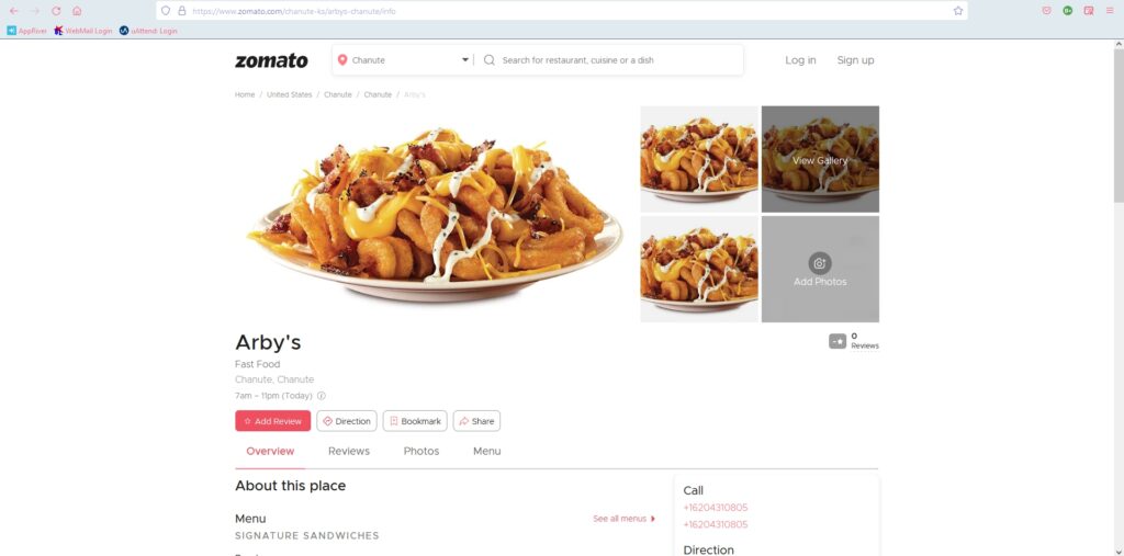
So, I was finally able to search for restaurants. When I click on a specific one, it takes me to the restaurant’s profile. But there is no way of going back to the previous page, which is the results. To go back, I must press the back arrow button, or at the top of the image of the loaded curly fries, there is a directory type of addressing. You can click on any part of the directory and hope that you will land back where you want to go back. The problem with that is that not a lot of users can understand that.

The “no return button” is a violation of the usability heuristic “user control and freedom” because there is no clear way of exiting the current interaction.

Flexibility and Efficiency of Use

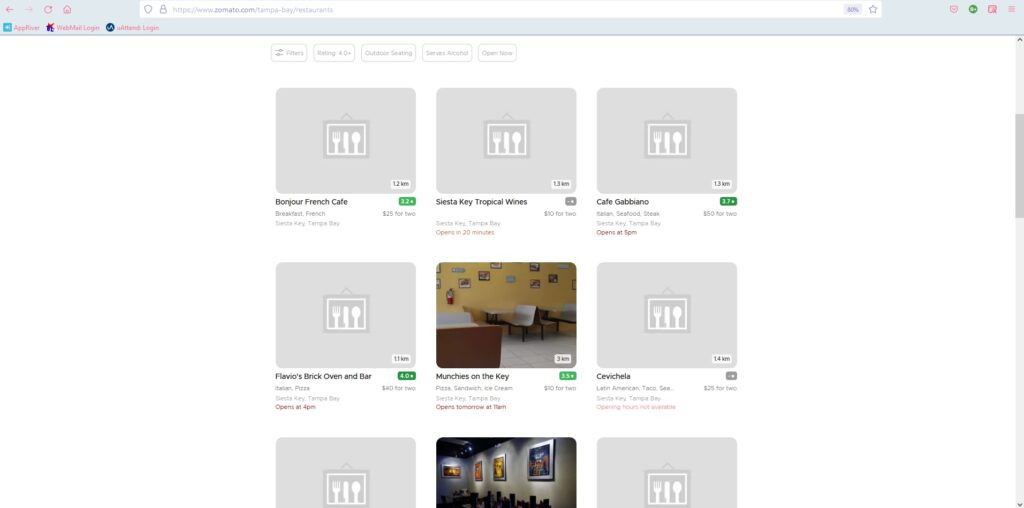
I noticed that in the search results there is no way to pick different restaurants and compare them, nor is there any way to personalize the view. The design is stuck on three columns and endless scrolling (if there are a lot of results – like searching a rural area). So, if you want to get to the bottom of the page, you scroll to what you think is the bottom of the page, but when you hit the bottom, it will load more results. When I searched for restaurants in Cebu City, Philippines, it kept doing that for at least five times. The design is not very convenient and it is annoying to get to the bottom of the page.

These violated the heuristic “flexibility and efficiency of use” because they don’t provide a way to personalize the functionality and they don’t allow customization on how the user wants the product to work.

Help and Documentation

There isn’t a help button, or I can’t find it.

This violated the last usability heuristic because a site needs to have documentation in context right at the moment the user requires it.

Recommendations

Visibility of the System Status

Since the site is already known for restaurant reviews, I recommend that the search bar be set to search full sentences, like “the best place to eat in Sarasota”. People already visit the site because they are looking for a good place to eat, so by doing so, they should get a list of restaurants. Or they can at least have a talking bubble to direct you to the process of getting search results (instructions).

Match Between System and Real World

I recommend changing the label to “restaurants and bars in the neighboring area”. This way, people will know that the section is still relevant to their search.

User Control and Freedom

For this usability flaw, I recommend a clear exit path. It must be correctly labelled and easy to find.

Flexibility and Efficiency of Use

For these flaws, I recommend adding an option/button for the users to change the view of the results, and adding a list view will solve the never-ending scrolling.

Help and Documentation

Add a “help button” to help users when they require it.