Individual Assignment #1

Andrew Martin

User Profile

My chosen user is a 29 year old female with a doctorate in Pharmacy. She loves to travel to different locations throughout the world, however typically goes straight to specific vendors when booking flights and vehicles. When searching looking for events or hotels she uses google and the first application that usually pops up is Trip Advisor. With a trip planned to Sedona, AZ coming up, I put her to the test to plan and book the entire vacation via Expedia and at the end we would compare prices and experiences.

Novice Actions

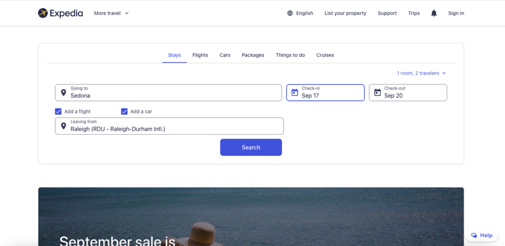
The user went to expedia.com with the task of booking a trip to Sedona, AZ for four nights at the end of September. She needed to book a flight, hotel, car, and find 3x local activities while on the vacation. She began with entering the destination location, amount of people, dates, services desired, and then began the search.

Right away I could tell she was confused. The hotel prices were astronomical when compared to looking at prices via Google. This immediately seemed like the biggest ripoff and almost enough to click X on the tab and give up on this search. What she didn’t know and what wasn’t explicitly clear for a novice user was that the hotel price was the package deal. The flights and rental car are semi included in that huge price. I encouraged her to continue on and pick a hotel she would genuinely enjoy staying in. Right away she clicked on the 4/5 star rating filters and chose a $950 basic hotel room (something she would never do). She moved on to the flights, which is where she found out the hotel price included the base flight rates as well as the rental car. By the end of the booking process she was extremely satisfied with the end result and ease of use even with the initial confusion.

Next came time to book the activities for the trip. She lined up 3x great touring events and was excited to book, except when it came time to click they were all reserved for our selected dates. We went to sites to book directly through the venue and there was still plenty of spots available. We definitely appreciated Expedia providing free recommendations, but we had no luck booking our tickets through the website.

Recommendations

Overall, my user had an easy time navigating through Expedia and making selections for everything we needed to have for our trip. A few things she would’ve like to have been able to do. 1. Points are king when it comes to travel. While there are Expedia points, users want to be able to use their specific sky miles or hotel rewards points. A suggestion would be for the site to partner with hotel chain or airlines to make that possible when booking through their third party application. 2. While I haven’t had any confusion booking through Expedia, the site needs to make it very very clear to new users that they are booking a package deal price right from the beginning in order to avoid users clicking X right after seeing the initial sticker price.

Just like myself, my novice user enjoyed using all the various filters provided by Expedia. Right from the beginning she was able to eliminate dozens of hotel choices by selecting the 4/5 star ratings and reviews. From there was she was to deep dive various amenities and narrow down the location of the resort.

Individual Assignment 1: Designing for Users

Kansas Department of Transportation (KDOT) Home Page

The Website and the User

The Kansas Department of Transportation (KDOT) website (https://www.ksdot.org/index.asp ) is the one I chose. My tester is an expert user of the internet. She is in her early 40’s. She is pretty good at online shopping, she uses social media a lot, she is good at navigating the internet, and she can do research on the net. She has been to this website a couple of times but has never checked out the RWIS page.

A User’s Actions

The task was to check the status of the weather station in Chanute, KS. In order to get this information, she has to get to the road weather information system (RWIS) webpage from the KDOT home page and locate Chanute, KS. The first thing she did was search for “RWIS” (road weather information system) (she is familiar with the term) on the search bar of the home page of the KDOT site. It returned 10,022 results, and for me, the only relevant page was the top one: KDOT: RWIS. She clicked on it, and it took her to the old RWIS webpage, where everything looked legit. But it was not interactive, some of the RWIS sites on that page were not existent, and the information on that page was not up-to-date. Basically, she was on the wrong webpage. Then she went back to the home page and started exploring the site. She clicked on some links, but none of them took her to the RWIS site. Eventually, she was able to put two and two together. She found the link she was looking for in the “Travel Information” tab and chose “Road Weather Stations.” She is familiar with the map of the state of Kansas, so, when she got to the RWIS site, she was able to find Chanute quickly.

Search Results for “KDOT RWIS”

Problems Encountered

The thing that she did that I found unexpected was when she started with a search, instead of exploring the site first. The problem that she encountered was not becoming familiar with the site. I would have explored the site before jumping to do a search. To make it worse, the search capability of the KDOT website is not the best either. Another issue is the “KDOT: RWIS” link (https://www.ksdot.org/burcompser/generatedreports/weather.asp ), which took her to an old webpage of the RWIS stations. KDOT should have removed that site because the site has irrelevant information and it would be dangerous for people travelling and referring to that site for updated weather conditions. Take, for example, the Oakley site. How do you get a 159 mi/h wind gust?

As a novice to the site, she did know the location of the RWIS page link. The site is confusing, and there are links everywhere. Links to news, links to reporting, links to the other areas of KDOT, links to their social media, and links to getting around the state. All the links are a distraction, because the real information was on the tabs at the top of the page. She mentioned that she did not focus on any of those because they were confusing, and she was expecting a link to the RWIS sites on the page. The last issue that I found was that the RWIS site (https://rwis.ksdot.gov/ ) is not user-friendly at all. The stations on the map are not labelled properly, and the lists of the stations and their status are not arranged alphabetically but rather based on the state’s districts, and there is no way of manipulating the arrangements. For somebody who is not familiar with the map of Kansas, they will have a hard time figuring out which is Chanute, and it will be hard for users to figure out where to find Chanute on the list.

RWIS Map View
RWIS List View

Suggestions

Since weather conditions are very important to the people of Kansas and the people traveling through it, the main page needs to have a direct link to the RWIS site’s page, not under some tabs, which are hard to find. As for the RWIS webpage, it needs to have a clear label for the stations on the map and a better arrangement of the lists of stations that can be manipulated by the user on how he/she wants to view them. It would also be nice if the items on the list would link to the location of the map or vice versa, and lastly, people have no need for the site ID. How about removing that tab and replacing it with the names of the sites?