LIS 5275 – Usability Analysis
Christopher Gregor
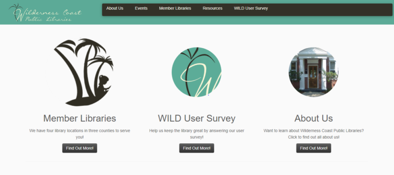
The Wilderness Coast Library System
Main Page
The Wilderness Coast Library System website is the central access site to the Wilderness coast multiple library sites. It is used by the Franklin County, Jefferson County, and Wakulla County libraries to access their own main sites and the larger Wilderness Coast library catalog of books and assets. This site is designed to aid users in searching for information and tools related to the entire library system or to direct users to the appropriate site of the correct library.
User
The user selected for this round of testing was a 17-year-old high school student preparing to end their junior year with their final history project. They are determined to keep a high grade in their courses since next year they are applying to colleges and want to in with a high GPA. They live in a two-parent household with one younger sibling within walking distance of the school. To prepare for the history project, they are planning to do their project work with their fellow group members at one of the nearby libraries so they can be near resources and guarantee everyone has internet access and can do their part, along with communicating in person.
User Testing Method
For studying this website, I will be using the ThinkAloud method of user testing in order to be able to observe the user’s interactions and thoughts on the websites as they explore it and complete their tasks. This method will allow me a good understanding of my user’s interactions with the site, especially since the observation of the tasks will be done remotely using discord to allow me to watch my user move through the site live. This method will also allow me to record insight into the user’s plans and thinking on how to find their goals and walk through their confusion when they get stuck.
Tasks
The following three tasks were planned by the group to test the Wilderness Coast Library System’s usability and focus. For the purposes of my user, it is assumed that they are able to get to any of the libraries in the system for their tasks because their group members can drive them. The library my user will focus on will be discovered by their completion of the first task. Should they be unable to complete the task or not find a specific library, they will be instructed to select the Jefferson County Public Library.
Task 1
Using the Library system, the student will locate a relevant book for their research on the death of Julius Caesar and which library that book is located at.
Task 2
Now knowing what book to look for and what library it is at, the student will look for the available hours of that library that do not overlap with their high school schedule.
Task 3
Find information on the use of computers at the local library to complete their research paper on Julius Caesar’s death. The student will also find out how to print from the library.
User Testing
Task 1
For task 1, the user was sent the URL for the homepage and began streaming their screen to me as they read the instructions. Their first choice was to click on the Member Libraries link and select the Wakulla County Public library, seemingly at random. From there, they used the catalog link to go to the Wilderness Coast catalog and type in the upper search bar “death of Julius Caesar.” They chose the first book of “Julius Caesar/Struan Reid” and started to get confused by their options. First, they clicked the link “Place Hold” and hit a dead end when prompted to log into a library account they didn’t have. After backing up a page, they began scrolling through all the options on the left side of the page before clicking save record, which did not present them with where it was saved. The user then seemed to hesitate on “adding it to cart” but instead clicked print to try and download it, but the site didn’t provide which library it was at still. They backtracked again, and this time clicked “Add to cart,” which still didn’t provide them with the location of the book. From here, the user’s frustration began to show, and asked me to repeat the task prompt; they then returned to the catalog search page to look for more options. When they found none, they returned to the book’s link and began viewing the MARC and ISBD view links with no success. Following this, the user became very lost and frustrated before abandoning the task, declaring the library wasn’t listed on the page.
After completing all tasks, I showed the user the location of the library information, which was spelled under the book’s description as an acronym which clearly confused the user, who was unfamiliar with the libraries already to recognize an acronym. I imagine that while the catalog is designed well for library staff who know the information and acronym meanings, it is too jarring to the new user who needs some more explanation on what each link does.
Task 2
To begin task 2, since the user was unable to find the location of the book in the previous task, the user was instructed to assume the book was located at the Jefferson County Public Library. They were also told to restart from the main page with the provided URL. They began by once again clicking on the member library and now clicking on the Jefferson County public library. From there, they navigated to the menu button on the right side of the page and read through the options before leaving the menu. They then clicked home, which took them to the same page they were already on. They then selected Discover Library Services and read through its contents before going to Get books and materials. They once again read through its contents and then moved on to the COVID-19 section, which mentioned adjusted hours but did not list the actual hours of the library. At the point the user remarks on how confusing it is that the pages have texted highlighted like links but no actual links to more pages, it once again appeared to be frustrating the user. The user then found the tiny Facebook link at the bottom of the page and clicked on it to go to the library’s Facebook page. They clicked on the About link and found the hours of the library, completing the task.
It was very clear that for this task, the user became as confused as my group was with the difficulty of simply finding the hours on the site. However, they also became frustrated with how often the page mentioned the “standard hours” without mentioning what they were, and I can see how this could be very problematic as a design for users searching for very basic information.
Task 3
After exploring virtually, the entire Jefferson Public Library website for task 2, task 3 was completed very quickly by the user. They began by returning to the Discover Library Services page and scrolling through the bullet points on the list to locate the printing services policy for the library. On the same page, they were able to find information on the use of the Library’s Chromebooks for research and internet uses.
While this task was completed in the shortest number of steps, it still took my user a bit of time to review all the bullet points of the site, which they remarked felt very tedious and unhelpful for an informative website.
Design Recommendations
After completing the tasks, I asked my user to list some problems they had with the website as if they were reviewing it. Combining their opinions along with my own gathered observations, I believe that multiple small improvements to the general look and layout of the site are needed. Across all the website’s pages, it is clear that the site was improved from a previous WordPress design to look more appealing with pictures and color, but the information itself is still presented poorly. Relying on bullet point lists to close together, images with no links or explanation, lack of basic information like hours of operation, and the jarring change of designs between each section of the public library system website. Overall, these smaller issues add up to a larger appearance that leaves the user either dreading lots of condensed information or confused about where to search.
Some of the pages should be broken up into separate subsections and incorporate either more graphical designs like pictures of the library or simply a more appealing and larger font. A quote from my user on this matter was, “Aerial is the most basic of fonts, and everything is so closely spaced.” The links used in the site should be placed in order of most use. Currently, they place the link to the individual library pages on the home screen off to the left and the survey on the library system at the center of the page even though they should prioritize its user’s needs, not the survey.
The larger recommendation would be to combine all of the sections of the library system: the main page, each of the individual libraries, and the catalog into a single site with a uniform design. It would allow users to navigate the site more consistently as the same navigation tools and patterns would be used across the site, along with specific standards being uniform to ensure all the correct information for each library and book can be found and recognized easily by each user. While this may take some time, it would allow for a smoother experience overall instead of a bunch of extra tabs being opened by links throughout the site to navigate across the Wilderness Coast Public Library System.