Individual Assignment #3 – Representative User Test

The Website

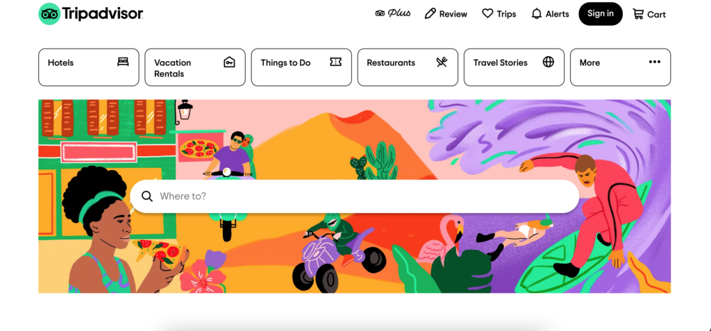
The website our group chose to use in our testing is Tripadvisor. Tripadvisor is a travel website where users can plan out their trip(s) and book all travel-related services. Users can search for hotels, vacation rentals, restaurants, cruises, flights, and more. The website also acts as a travel blog and posts different articles related to travel and specific destinations. Tripadvisor is a unique travel website because it allows users to look at different activities, restaurants, places, etc. and it links to the booking sites so you can accomplish all travel tasks from one website.

The User

When searching for a user for this test I tried to stick as closely to our group tester’s characteristics as possible. Our group had created a user who was 42 years old, female, with three children under the age of twelve living in the Miami metropolitan area.

The user I chose to test in this scenario was a 51-year-old female with three adult children in their mid-twenties. This user lives in South Florida and has lived there her entire life. The user has worked in retail for the past 15 years and does not have the strongest computer literacy. This user has been on a few cruises but has not used Tripadvisor to book or plan any trip before.

For this testing scenario, the user will be booking a cruise for four (herself and her three children) for the week of Thanksgiving since they all will be off work. The budget for the trip is a maximum of $500 per person and for a medium length trip (3-5 days). The destination is flexible as long as it is somewhere in the Carribean. The user would also like to part take in one excursion at one of the ports.

The User Testing Method

The testing method I chose to use was the “Think Aloud” approach. I was unable to accomplish this testing in person so I completed this assignment via FaceTime. Since I was unable to be physically present in the same room as the user it created some obstacles that would not be present if this testing took place in person. For instance, I was unable to see how the user tracked their mouse across the webpage which could be useful in how the user interacts with the website. For the tasks, I had the user talk aloud about what she was was doing and any thoughts or opinions she had while she completed each task.

The Tasks

The user was relatively similar to the group user we had created so only one of the tasks had to be modified. The original tasks were as followed:

Original Task 1: Find a cruise when the kids are on break from school and taking in consideration of hurricane season and to stay within the vacation budget.  

Original Task 2: Pick a cruise that stops in multiple ports.

Original Task 3: Find activities offered in each port stop.

The tasks I chose to test for this user are very similar but there are slight modifications.

Task 1: Find a cruise during Thanksgiving break that goes to the Carribean and stay within the vacation budget of a maximum of $500 per person.

For this task I had my user start on the Tripadvisor homepage. I had the user say out loud what she was doing and I copied exactly what she did so I could provide the screenshots below. The first thing the user did was to type “Caribean cruise” into the search bar located on the homepage. This returned a result of cruises, sailing, and water tours that take place in the Caribean but not a cruise to the Carribean. The user was confused about this result when it popped up.

Cruises, Sailing & Water Tours in Caribbean results webpage

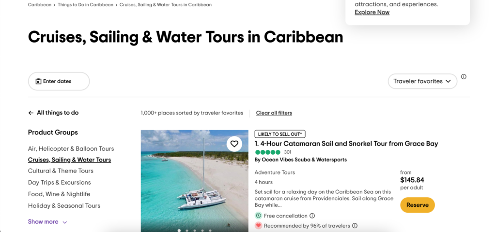
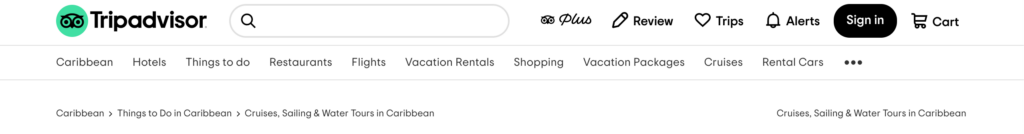
The next thing the user did was to search this results page to see if there was a link anywhere that would take her to the ‘cruise’ page she was expecting. After, exploring the page the user noticed a link to ‘Cruises’ in the navigation bar and she clicked on that to take her to that webpage.

Navigation bar
Caribbean Cruises webpage

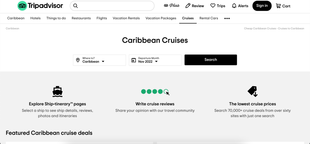
The user clicked search on the above webpage which returned a bunch of cruise results for the Caribbean during the month of November. The user explored the page by scrolling up and down the page. That is where she found she could put in her maximum budget to filter the results for the cruises.

Price filter

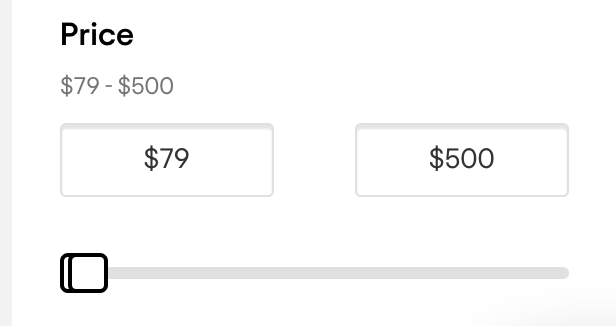
After she filtered the result I told her to pause what she was doing and told her we would be moving onto the second task.

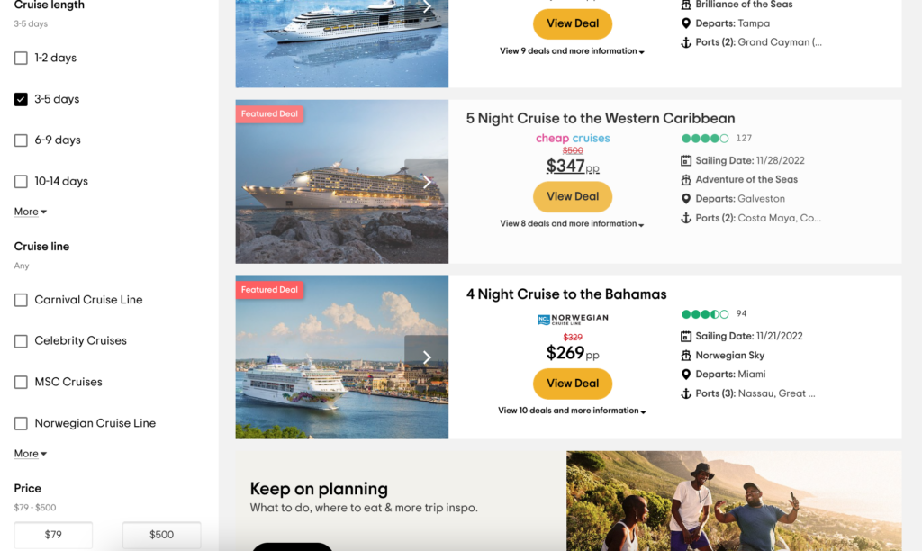
Task 2: Find a midlength cruise that is around 3-5 days (this length of cruise will stop in at least one port).

I had the user complete this task on the webpage she was already on since that seemed to be the logical way to filter down the results instead of starting from scratch. The user had explored the webpage previously so she found the ‘Cruise length’ filter rather quickly and without any problems.

Cruise length filter

Task 3: Find an excursion or activity to participate in at one of the ports

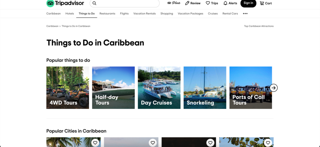
For the third task the user had to find an excursion/activity to participate in. The first thing the user did was to scroll down the page to see if there was an option regarding any excursions or activites. The user did not find anything this way so she continued back to the top of the page. From there she noticed the ‘Things to do’ link at the top of the webpage. She decided to click on that so she could explore that page. From there it took her to the wbpage with different things to do in the Caribbean. She then compared the attractions to the cruise ports.

Things to Do in Caribbean

Recommendations

I asked my user at the end of the testing what she would change about the website if she could. The first thing she recommended was that when searching “cruise Caribbean” that it returned more options that just cruises you can take from the Caribbean. For instance, return those results and also a section for regular cruises to the Caribbean. The second recommendation the user had was when searching for a cruise it would be nice to search by week instead of being forced to search for the whole month. Another recommendation would be to have an option for the excursions/activities located on the same page or highlighted that it exists somewhere on the cruise results page.

Individual Assignment #2 – Heuristic Evaluation

The Website

The website I selected for this assignment was atlasobscura.com. The website’s tagline is “The definitive guide to the world’s hidden wonders.” and users can search for destinations, experiences, food to try, and read stories about different places. The website features destinations that are popular as well as some out-of-the-box destinations/experiences.

Home page of atlasobscura.com

The Scenario

The scenario I chose to evaluate for this website is that I am visiting New Orleans and I want to plan out what attractions to go to. For the scenario, I do not have any food restrictions/allergies and everyone is over 21 years old. Nielsen’s 10 heuristics will be used in the evaluation of this website.

To begin the scenario I decided to search New Orleans in the search bar located on the home page. As I was typing, the search was continuously updated as I typed. For instance, when I had typed out “new” before “Orleans” it recommended destination guides for New York State, New York City, etc., it recommended places such as The New Orleans Treehouse and the New Yorker Hotel, and even a story about New Zealand.

A partial search of “new”

As I finished typing out “new orleans” the search results pulled together the results for information related to New Orleans. The results were broken down into different categories including “Destination Guides”, “Trips”, “Places”, “Food & Drink”, and “Stories”.

A search of “New Orleans”

Instead of clicking any result listed in the search I just hit the enter button which led to “The Atlas Obscura Guide to New Orleans” which I believe is the same page as the “New Orleans, Louisiana” result that showed up under “Destination Guides”. This page had been recently updated in July of 2022 and featured quick links (“Attractions”, “Food & Drink”, “Map”, “Leaderboards”, “Stories”, and “Lists”) that would take you to that part of the page when clicked.

The Atlas Obscura Guide to New Orleans front page

The first task was to pick out 2-3 attractions to visit while in the city. I was able to click a button under the “Unusual Attractions in New Orleans” section that led to another webpage which listed all the places in New Orleans that were added to the website. From that webpage I browsed the different options and settled on three different places to visit (Marie Laveau’s House of Voodoo, Lafitte’s Blacksmith Shop, and New Orleans Pharmacy Museum).

All places in New Orleans webpage

I clicked on one of the attractions I wanted to visit and it took me to a webpage dedicated to that attraction. On this webpage it gave a quick description of what the attraction was, a map of the location and the address, as well as a link to the website and nearby attractions.

Lafitte’s Blacksmith Shop webpage

Usability Flaws

While working through this scenario the overall process was relatively easy but some issues were present. When searching for “New Orleans” in the search bar it was constantly updating to try to find the best match based off each individual key stroke. This led to an overload of information that was constantly changing which is a violation of Nielsen’s 8th heuristic. Another violation occured when I clicked on “Lafitte’s Blacksmith Shop”. This led me to a new webpage dedicated to this attraction but did not provide a back button (which can be seen in the “All places in New Orleans” screenshot). This violates Nielsen’s 3rd heuristic.

Recommendations

Overall, this website was easy to use and was formatted and designed in a way that made sense as a user. I also acknowledge that I am not a novice when it comes to using computers, the internet, and searching webpages. One of the first recommendations I have is to not have the search automatically update results with every keystroke. I know that this is what is used in most search engines but I think for this specific site it makes sense to wait until the user is done typing their search term so they do not get overwhelmed with unrelated results. Another recommendation I have is to create a back link that would take you from an attractions webpage back to the webpage with all of the attractions. This could be a link just like the one seen on the “All places in New Orelans” webpage that is in the left hand corner of the screen (“BACK TO NEW ORLEANS”) but with the wording “BACK TO ALL PLACES IN NEW ORLEANS”. This would provide the user with an easier way to get back to the previous page.

Individual Assignment 1: Designing for Users

The Website and User

For this assignment, I decided to use eBay. As most people know, eBay is an online e-commerce business where people can buy items via an auction-based transaction or a buy-it-now transaction. Users can also sell items through the platform as well. I use this website as both a buyer and seller so I am pretty familiar with the layout and the filters. The image below shows a screengrab of the home page for my eBay account.

Image 1: eBay front page

The user/tester for this assignment is a 23-year-old female. She is a recent graduate and has plenty of experience using technology and social media websites. She has never bought or sold anything from eBay.

The User Test

The first task I had my user perform was to search for a Juan Soto baseball card (her favorite player). I had expected her to just type in the search bar “Juan Soto baseball card” but her response surprised me a bit. Instead of using the general search bar located on the home page, she clicked the “Collectibles & Art” tab located under the search bar and then selected the “Sporting Trading Cards” link. When she arrived on the “Sporting Trading Cards” home page that is when she typed in her search (Image 2).

Image 2: Sports Trading Cards & Accessories Home Page

Her results pulled over 20,000 results and some of the results shown did not feature Juan Soto at all. Now that she had pulled up the results from her search the next action I tasked her with was to find out what items had previously been sold based on this search term. This is a more advanced feature that I had expected her to struggle with a bit since she had never used the site before. She explored the webpage and the filters present on the left-hand side of the results page for a while before she found the right filter to click (Image 3). This feature can be useful for a buyer but it is extremely useful for sellers to compare and check their listings. The user was able to complete both tasks but at a slower rate than someone who is familiar with the website and its advanced search filters.

Image 3: Results of sold items using the search term “Juan Soto baseball card”

Novice vs. Expert Users

Overall the website is user-friendly in the way that a person can find what they are looking for. One thing I noticed that I hadn’t thought of before was the ability to click into the categories to search for something versus just typing it into the search bar. I think that this is a good feature for someone who is doing exploratory searching/browsing. For instance, someone can click on the “Sports Trading Cards” and see what has been recently listed if they do not have a specific card in mind. I think that is a good design to have on the website. One suggestion I have to make the filters easier to use is to put the “Show only” box near the top of the filters instead of all the way at the bottom. Some of the filters located in this box include “Free Returns” and “Authenticity Guarantee” which can be important to new users but they might not know to look towards the bottom of the filters for that information. The site as a whole is set up to be easy and welcoming to a new users which is why it has been around for so long but little improvements can still be made to make it even better.