SARAHMAKER.COM
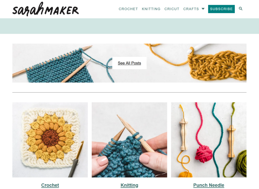
The website I will be testing with my user is SarahMaker.com( https://sarahmaker.com/). SarahMaker.com is an educational website that features classes, articles, patterns, and premium video to help you learn a craft of your choice. Their scope of subject is large and includes, fabric crafts, needle arts, sewing, sculpting, and more. The website includes both free and premium paid content. I say that this is a great website for a beginner crafter in any medium. Crafting, or creating in general, can seem daunting and easily susceptible to information overload, but Sarah has done her best to create a clean and professional appearance for her website.
USERS
My first user is a 29-year-old man, and a coworker of mine. I’ll call him Cam for this analysis. We both work in IT. He is crafty in his own way, but he’s definitely more of a tinkerer and woodworker. He is very well-versed on the internet and is also an avid gamer, and youtuber. So, I will be running with the assumption that he knows how a website is supposed to flow, so he may be a much harsher critic. But he is also internet savvy enough to get himself out a of situation fairly easily. My second user is a 28-year-old woman, who is also a coworker of mine. I’ll call her Fae for this analysis. She is a very competent user and far more interested in “craftier” crafts such as needle arts mentioned on the website. She’s also well-versed in browsing websites, so she also has an expected flow of information architecture.
TESTING METHOD: THINK ALOUD
The user testing method I chose was the Think Aloud method. I chose this method because, most of my user “test subjects” are often my friends, and they are usually not ones to mince words. They are not afraid to tell you what they are thinking and many times you can get a good laugh from their commentary. I usually like to do my user testing in person, but with flu-season rampant and the sickness hitting my household hard, we’re going to use Facebook Messenger to run the test. My user will share their screen with me and have their microphone on as they complete the required tasks.
USER TASKS
I gave my users five tasks to complete:
- Find the beginner crochet section.
- Find information about Sarah Maker
- Find Polymer clay project ideas.
- Find how to use Cricut Infusible Ink for Cricut Machine.
- Find How to make a quilt.
The tasks did not differ greatly from the tasks included in our group. I added more tasks in different areas to see if the problems faced in the crochet section of the website extended to other sections.
Task 1: Find the beginner crochet section.
In this task, both Cam and Fae were tasked with finding a section dedicated to the basics of learning crochet. In Cam’s test he utilized the top menu option for, “Crochet”. The proceeding page is the page we are familiar with. I mentioned this issue in my previous post:
“However, the main crochet page opens to a wall of text, that I immediately skip, to go to what I believe are the lessons or beginner content separated into sections (or cards) below. These are all sponsored ads for crochet pattern packs. That’s not going to be very beneficial to someone who is a complete beginner. The stitch tutorials for beginners are found in a link in the middle of the wall of text I’ve already skipped over. The links are also a muted shade of green that is very similar to the color of the basic text. I think this is a violation of rule number 7: Flexibility and efficiency of use. “
Both Cam and Fae did the exact same thing coming to this page, skipping over the entry text, and thus the link that takes the user to the beginner crochet section. They eventually did scroll back to the top and find the link. Fae did mention that learning to do something is a vital reason someone would visit this site. The link to that information should be large, visible, and available to reach from several different sections of the site. A separate section in the header navigation for sub-navigation items that showcase big pieces of user journeys would combat a lot of frustration on the users’ part.
Task 2: Find information about Sarah Maker herself.
I neglected to mention that both Cam and Fae were doing these tasks on mobile devices, so their difficulties were ramped up a little. While on desktop view, this task is extremely easy. The answer is on the same page right next to the information the user was just looking for. On mobile view, that information is removed. Both Cam and Fae knew that at the top of most websites, there is an “About” section. They went to the hamburger menu expecting an About section to be there, but there wasn’t. Cam being the slightly more advanced user voiced that the information is also in the footer sometimes. He was correct and found the About section. Fae took a few moments longer to scroll all the way down to the page and find the link in the footer information. Both agreed that if you’re marketing your website based on yourself, information about yourself should not be difficult to find. In revisions of this website, I would include an About section in the top menu, so the information is readily available for users on all screen sizes.
Task 3: Find Polymer clay project ideas.
This task was general in its wording. I did have to do some prompting that I wanted them to find an article containing “Polymer Clay Project Ideas”, specifically. That’s something I will have to watch for in the future. This is where the users took different paths to find this information. Cam actually went back to the front page, because he recalled seeing information about clay projects. The article is right on the front page, “21 Polymer Clay Ideas and Projects”. Fae first looked for clay or polymer clay in the topmost menu. She did not see the option at first, so she scrolled down on the front page to where the six categories were, and still did not see it. She tried the topmost hamburger menu again, but this time she saw that “Crafts” had a dropdown section. She clicked and saw the option for Polymer Clay. When she was brought to the polymer clay craft collections, she scrolled down, and the fourth article was the “21 Polymer Clay Ideas and Projects”.
While both completed the task, both were unhappy with the lack of organization of the polymer clay page. Instead of there being a table of contents or some head navigation, the page is presented as a list of articles. So, they have no idea how long this list will be until they find the correct article.
Task 4: Find how to use Cricut Infusible Ink for Cricut Machine.
By this task, both users had begun to understand the odd flow of this website. They’d seen Cricut showcased on several sections of the website. Cam utilized the “Cricut” option in the top menu and scrolled down until he saw something that mentioned Infusible Ink. Fae took the same route. Fae did mention, again, how this section had pages of articles and they don’t seem to be in any type of order. While the information we were currently looking for was easy to find because it was on the first page, what if the information was on the 4th page? The user has no way of knowing where in the list of articles the information they’re seeking will come up. As mentioned before, this section and the other sections would benefit from a table of contents or category list of some sort to help with sorting and filtering information.
Task 5: Find How to make a quilt.
The final task was probably the most challenging task for them. This information is hidden. Cam began by retreating back to the front page and choosing the large “Quilting” option under “Knitting”. This page only has 2 pages of articles. After looking at all of the articles and seeing that they all have to do with quilting patterns, he chose the last article, “50+ Free Easy Quilt Patterns for Beginners”. After a short bit of scrolling the title, “How to make a Quilt” titled one of the sections. Fae decided to try out the search function on the website. The search was not as definitive as she’d hoped. She also wondered why when she searched, “How to Quilt” options for circuit were coming up. But, searching the results brought her to the same article, “50+ Free Easy Quilt Patterns for Beginners, and within that article she found, “How to Quilt”.
Again, Fae had the right questions for this task. If you already don’t know how to make a quilt, why would you look into a section about free quilting patterns to learn? And again, this section would benefit from a table of contents or categories to help navigate your learning around the craft.
CONCLUSIONS
SarahMaker.com is packed full of amazing information about crafting, but the disorganization of the site could put off potential users from staying very long to see all that information. For this website, search crafting subject should be broken down into at least three different sections: A “Getting Started” guide for absolute beginners, A “Materials and Techniques” type of section and a “Patterns” section. That way a crafter can see the core aspects of each craft: the process, the materials, and the projects. Then the user can choose which aspect they would like to learn more about.
Also, Sarah makes use of articles for the bulk of her website. If she is going to do that, she absolutely must utilize the tags, and categorize her articles correctly so the search function on her website is more robust and accurate. This also allows users the freedom to learn more about a specific topic that may not be covered by the core aspects of the craft. This website can become a fantastic resource if the organizational issues are addressed.

