
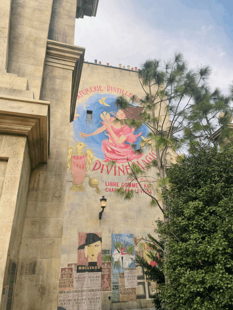
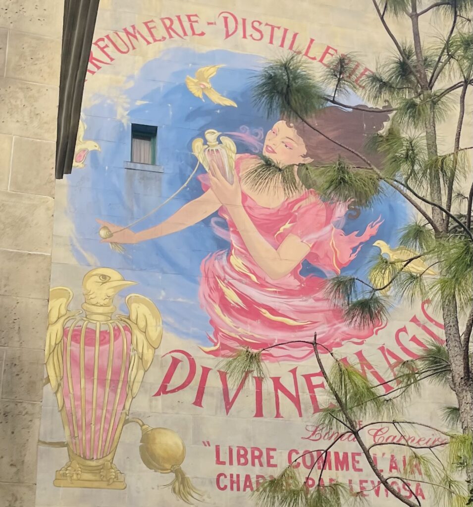
While visiting Epic Universe with my family last December, I took this photo of the phoenix gate alleyway upon entering The Wizarding World of Harry Potter’s Ministry of Magic. I was immediately struck by the dazzling mural on the wall and had to snap a photo. In cropping the the full image on the left, I was able to emphasize the magical artwork by zooming in on the mural and removing unnecessary background details. The woman’s face then became the focal point, and is placed in the top-right intersection point of the frame, following the rule of thirds. The derivative image on the right shows the details of the mural more clearly, and makes the text easier to read. “Libre comme l’air charme par Leviosa!”

Hey Kayla,
I honestly thought this was street art somewhere and had no idea this was at the new addition to universal studios. I think that the meaning does change slightly in your crop. The original contains much more of a street scene with other art works and some trees and details of the building. I find this image to be much more interesting., However since your focus is on the mural it makes sense to focus on that. It’s a shame that those tree branches got in the way of the shot. In my selectiveness, I would have probably avoided using this photo for that reason. But since we are here, I may have cropped it in a horizontal rectangular crop instead of the square that you chose to go with. In my opinion this would add more dynamics of the building and more elements of the tree, which would sort of balance out the image better. This would still focus mostly on the mural without having awkward tree branches fighting the final product.
Hi Kayla!
First of all, love this mural! I recently started playing Harry Potter Legacy, so safe to say I’m fully back in my Harry Potter era. The first image looks like exactly what it is, you happened to walk by cool art and snap a photo of it. The second looks more intentional, with a clear focus and use of compositional techniques. I do agree with Kenneth that the first is slightly more interesting as you can see other works of art and can see more of the scene, but could benefit from being retaken with composition in mind. However working with what we’ve got, I would also be interested in seeing a more horizontal crop. That way you would have part of the building to the left and part of the tree to the right to sort of frame the mural, and would provide more context as to where the mural is. Plus the angles of the building and branches could serve as leading lines.
In the original image, there is a lot going on, in particular, I am personally drawn towards the face near the bottom left/center of the image. In the crop, the tree provides an interesting framing device around the woman, however, my eye is still personally drawn to the perfume bottle. The crop does not change the meaning exactly, but I do think it does a good job of changing the focus of the image. I won’t harp on the ways the image in general could have been improved, and instead focus on the cropping elements. I think the amount of wall left of the left side is a bit confusing (hard to tell exactly what it is) so to improve I would recommend either removing that section entirely, or including more of that column of the wall to provide a bit more environmental context for the image. Due to how busy the initial image is there are several ways you could have gone about cropping it, focusing on the materials towards the bottom, focusing on the architecture of the building, etc. but I think you did a good job of picking your focus and utilizing the tree in such a way to frame and emphasize your intended focus area.