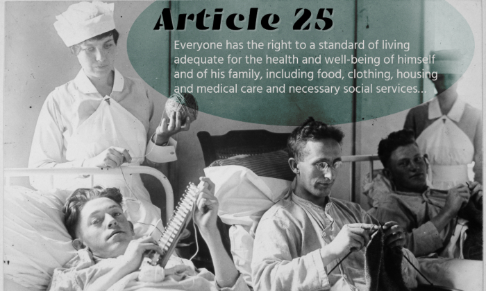
More than Medical Care Bed-ridden wounded, knitting. Walter Reed Hospital, Washington, D.C. Harris & Ewing., ca. 1918-1919 by the United States Department of War, from the U.S. National Archives and Records Administration. No known Copyright restrictions. I used the Befunky photo editor to create this image. Tags: human rights February 11, 2025 by instructor Student Posts 3


Hi Theo,
With the vintage photo, your choice of fonts pair well with the image and the message it conveys when the text is added to the image. The font choice for “Article 25” feels nostalgic, but strong, which accentuates the image and text pairing very well. I appreciate your choice of the font of the body of the text. By using a sans serif font, the text readable for the viewer.
The fonts are quite different, but work well together. The font for “Article 25” draws the viewer in and captures their attention, while the other text ensures the meaning is conveyed well.
The only suggestion I have would be to change the font color for the text in white or to darken or make the oval less transparent. This may improve the readability as some of the text and background colors blend.
Overall, you’ve done a great job!
Hi Theo! Nice vintage aesthetic, it almost looks like you put a grainy overlay on top of your text as well, overall the text and color palette you chose work really well with the photo. I also chose Article 25 and considered shortening it as you did, as the length of the body gave me some problems when it came to formatting my image. However, I didn’t feel like I was able to shorten the text and keep the original meaning. I think that, although on first glance the photo you chose only highlights one of the aspects listed in Article 25, upon closer look not only are the patients being treated but are also enjoying knitting and comfort, not just the bare necessities, which I think makes the photo a great interpretation of the Article.
Hey Theo, I enjoy the overall feeling the image gives with the fonts. For Article 25, you chose to go with a very outspoken font that pairs well with the image. It is not too crazy that you can’t read what it says, but enough that it stands out. As for the font of the body of the text, you chose to keep it simple to get your message across. Two things that caught my eye were the aligning of the title with the body; I feel the title might be a little too far left. Another thing is the text slightly going over figures in the picture, which puts a slight strain on the text. Other than that, I liked the pop color you chose to highlight the text, and the fonts pair well together.