
“Those who deny freedom to others, deserve it not for themselves” ― Abraham Lincoln
I know we are not required to have any additional text in this post but I hope this does not offend anyone…I have nothing against piercings but somehow this row of piercings in combination with the subject’s head tilted down made me think of defeat. This is why I chose this picture to represent article 13 which is about slavery. With only black and skin tone colors in the photo, I decided to use yellow and white for high contrast against the black hair. The article number is in Allerta Stencil and the text is in Open Sans which I used Canva to create this postcard. The stencil look of the font for the word article adds to the topic representing a sort of “broken-ness.”
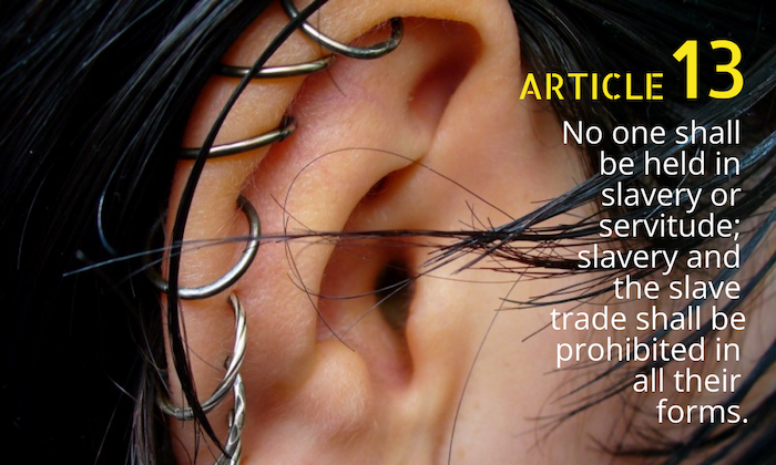

Jessica, I know we weren’t required to write for this post, but I really enjoyed your insight. I loved knowing the typeface names you selected because they were both very appealing. The stencil look is eye-catching and bold, and the use of the yellow contradicts nicely with the person’s dark hair. The use of the yellow and black made your post one that I was immediately drawn to when scrolling, and similar to a bus or street sign, the use of yellow on black would work nicely if this post card was enlarged.
I also understand your vision when you say the stencil feature reminds you of brokenness. The earrings reminded me of chains and/or handcuffs, so when I see the image with the article description, they pair together nicely.
Overall, your two fonts were visually pleasing. Neither took away from the other, and the right justification helped the viewer to also focus on the earrings and their symbolism. I do not have any suggestions for improvement at this time.
Hi Jessica!
I’m not sure if I understand the image, but I appreciate the contrast in color on the black hair background. The yellow and white stand out on the black well. I feel the stencil lettering is absent on the “13” but the casing for the fonts evokes a power struggle as the yellow text feels more authoritarian. In contrast, the white text feels more democratic and personable. The weight of both fonts also expands upon this idea. I think without understanding the verbiage, the image is aesthetically successful.
After reading your post, I think the image choice is creative, but when I think of earrings or accessories, I think of having money or opulence. Perhaps choosing an image with crops, chains, or monarchy might have made the image pair slightly more understandable.