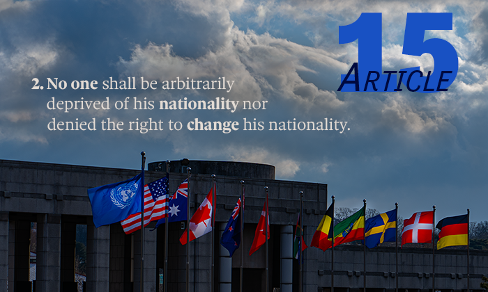
A Nation for All

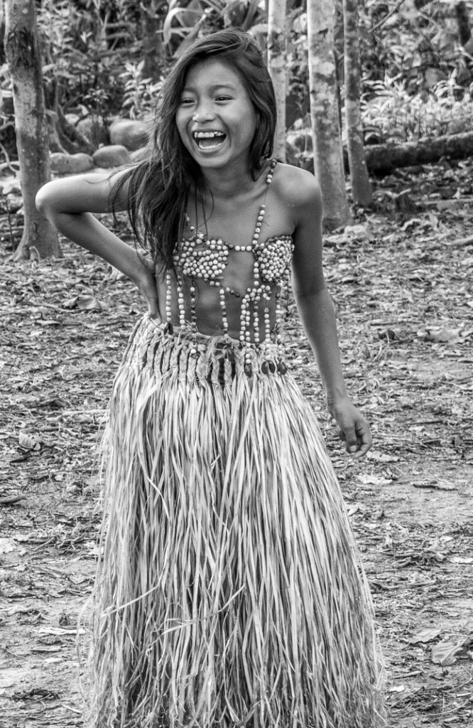
One of my favorite things to experience day to day is smiles and laughter. I love to run across a picture of a beautiful smile, or one that you can tell they were in the middle of a gut-busting laughter session. This beautiful scene shows what appears to be siblings, having a great laugh about something. I’d imagine they are trying to entertain the baby, or even laughing at something the baby did. The young lady in the middle, with her radiant smile and relaxed stance, embodies the most joy!
“There is nothing in the world so irresistibly contagious as laughter and good humor.” – Charles Dickens
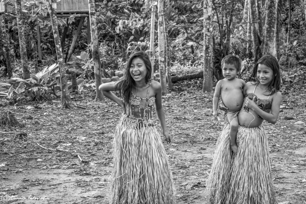
It’s moments like these that remind us of the simplicity of joy found in everyday life. Whether it’s a playful joke, a tickle fight, or the innocent antics of the youngest among us, laughter has the power to transform our day, uplift our spirits, and bond us in a shared experience. Laughter truly is a universal language that everyone speaks fluently.
Amauta Fotografía, CC BY-SA 3.0 https://creativecommons.org/licenses/by-sa/3.0, via Wikimedia Commons
https://commons.wikimedia.org/wiki/File:Laughter_Time_(256952705).jpeg

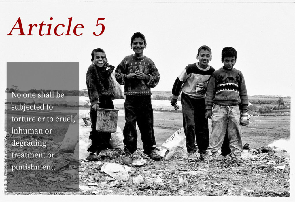
“Innocence” by Megan Holkup is a derivative of “Laughing! #Gaza” by achimvoss which is licensed under CC BY 2.0. Originally downloaded on 1/30/2024 and edited with Adobe Photoshop.
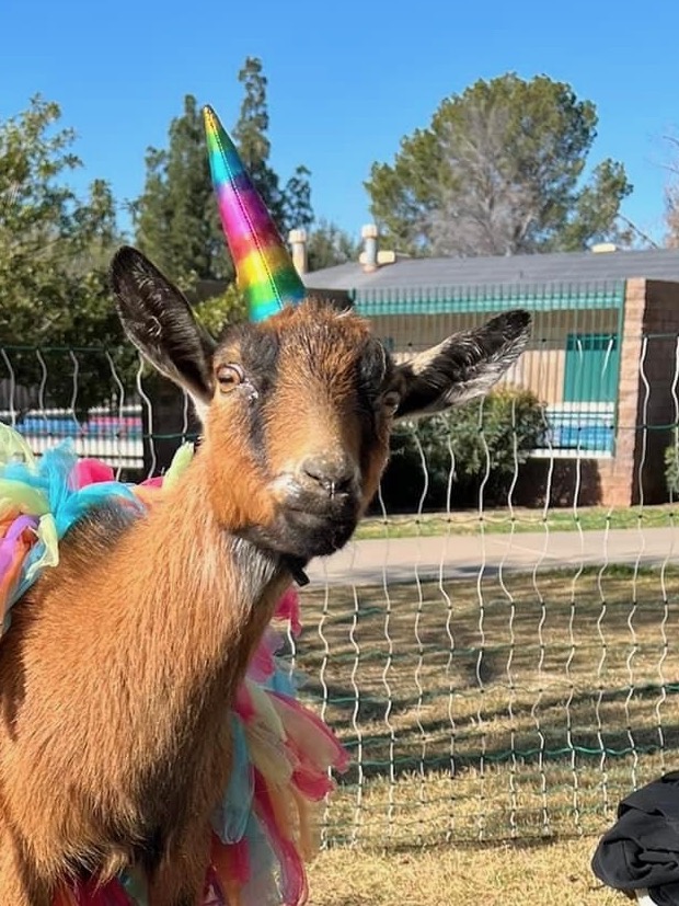
About two years ago my friends and I tried “goat yoga” for the first time, and if anyone has not had the opportunity to try it out, I highly recommend it! We had a blast and got so many amazing pictures throughout the session. Some of the photos were amazing, some were completely embarrassing (yes, they are on Facebook for the world to see), and some were just blah. The photo that I’ve chosen to crop is one that was just blah – it’s not a bad photo, but I have so many better photos from that occasion. Since it’s not the most amazing goat yoga photo, I thought it might work better as a funny goat expression photo. You would be surprised how many emotions are conveyed in photos of goats…
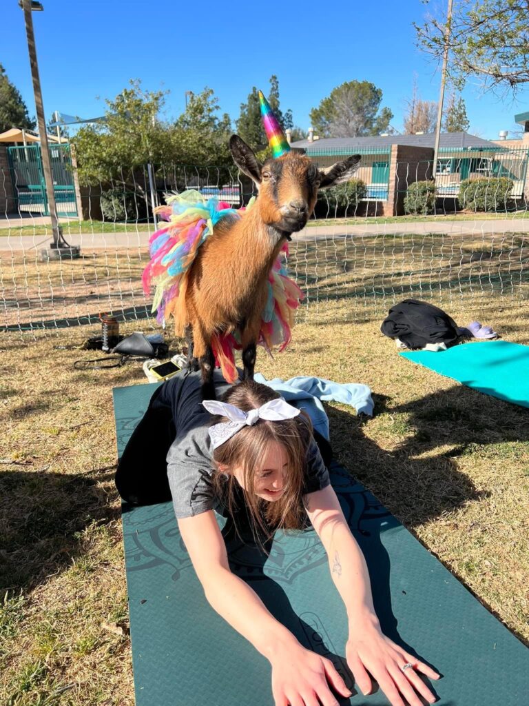
In this photo, “You goat games on your phone?” by Delanie Ornstein (myself), this goat looks like she’s staring directly at you with an expression that looks a lot like a child asking if you have games on your phone. If this had been one of my favorite photos from goat yoga, I would not have felt comfortable cropping it because the crop takes away from the viewer’s awareness of the event. Since it was one of the less interesting photos from that day, I now much prefer this edition for the humor it provides.
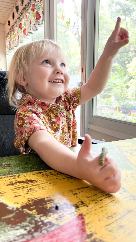
For the last couple of summers, I have raised monarch butterflies. From May to September, I hunt for monarch caterpillars to move inside and take care of. My goal is to further the population of monarchs and limit exposure to OE (a deadly parasite that causes defects, lack of flying capabilities, and even death). This past summer was the first time my daughter, Catherine, could understand the concept of Bradley Miller’s quote, “Teaching a child not to step on a caterpillar is as valuable to the child, as it is to the caterpillar.” I ended up teaching her a lesson about the butterfly life cycle for her and she was amazed!
For context, I don’t think there was anything wrong with the original, but the balance was off because the caterpillar isn’t focused. When I originally took it, I was so focused on her love and care for the caterpillar and the other photos from that day focus intentionally on the caterpillar crawling on her hand. However, her eyes spoke differently to me when I looked at it through the lens of this assignment. Thus, I cropped it this way to focus on the sense of wonder in her eyes. She was learning, experiencing a new “thing,” pointing out all of the butterfly stickers on our back porch, etc. – it was a moment to hold on to. I hope she never loses that sense of wonder, and I hope to remain a witness of all the moments that take her breath away.
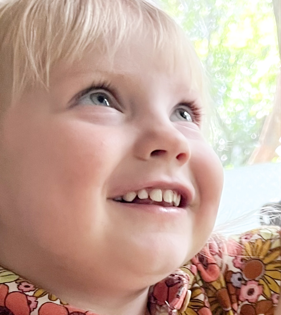
For this assignment, I was inspired to crop her into a different position in the frame. I wanted to focus on her emotion and use the rule of thirds to mark the twinkle in her eye as the focal point. She is also uncentered, which helps build ambiguity of what she’s looking at above. Finally, I took out all of the background so she is the sole focus of the image.
At the end of everything, it was no longer about the caterpillar, but rather about what the caterpillar had done for my child.
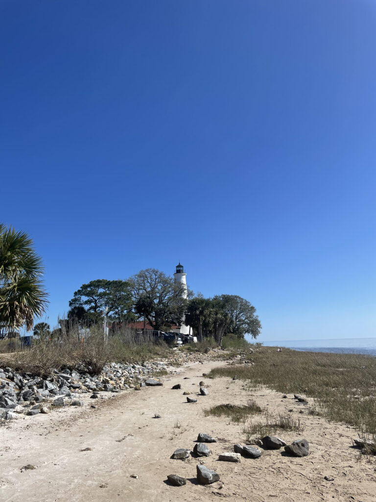
In February 2022, I had the opportunity to immerse myself in the natural beauty of the St. Marks Wildlife Refuge and Lighthouse, all under the brisk yet tolerable weather that characterized Tallahassee during that time. Eager for a day outdoors, my friends and I opted for a laid-back picnic on the sandy beach area, where we could soak in the serene ambiance.
As we enjoyed our picnic, the surroundings came alive with the sights and sounds of nature. From playful wildlife bustling about to dedicated anglers casting their lines into the water, there was a vibrant energy in the air. The distant image of the St. Marks Lighthouse, subtly emerging through the dense foliage, added a touch of enchantment to the scene. The chilly air seemed to enhance the sense of tranquility, creating a perfect setting for us to appreciate the natural beauty that surrounded us. The sound of waves lapping gently against the shore provided a soothing backdrop to our afternoon, accompanied by the occasional cries of seabirds overhead. For anyone living in Tallahassee who has yet to explore it, this is a definite must-see!
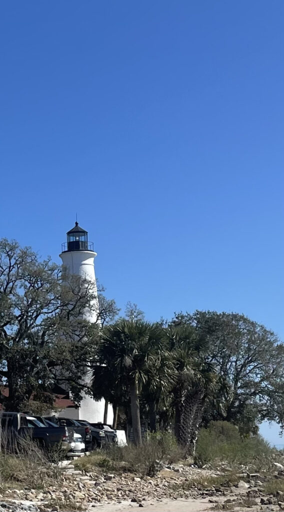
I opted to crop this recent image, placing a spotlight on a different focal point—the lighthouse, in contrast to the previous picture, which showcased the expansive beach and water. The intention behind this adjustment was to bring the viewer’s attention squarely onto the captivating presence of the lighthouse itself. By cropping the image, I had the opportunity to eliminate unnecessary details, resulting in a simplified and more focused background. This serves to declutter the visual narrative, allowing the viewer to engage more intimately with the primary subject.
Furthermore, the new composition adheres to the principles of the rule of thirds. Placing the image more to the left, this technique adds a dynamic quality to the overall presentation. This choice serves to accentuate the lighthouse’s significance, providing a fresh perspective that highlights its architectural charm and historical importance. The refined composition invites the viewer to appreciate the subject in a new light, fostering a deeper connection with the captivating essence of the scene.
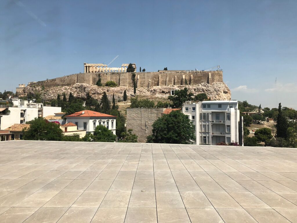
Nearly six years ago I took a trip to Greece and as every other tourist before me and since I had to stop and see the Parthenon. I took the original photo below from the Acropolis Museum during my trip. As you can see it is hard to see the main focus of the picture as there is a lot of buildings that are distracting your eye from the Parthenon.
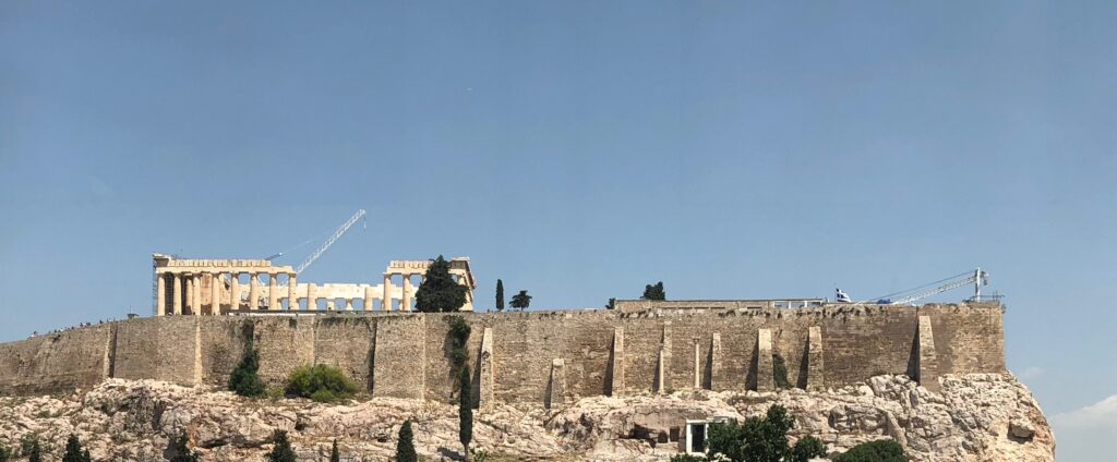
The cropped picture leaves out all the extra stuff that I don’t care about! I was able to crop the buildings out and have the Acropolis and the Parthenon be the main focus of the photo. I also decided to keep the cranes in on the right side of the picture because it emphasizes the construction zone that has become this great temple.
A few weekends back, my local sailing center hosted an Optimist (sailing dinghy) Team race. I clued you into the fact that these little plastic tubs are indeed sailboats, as I would understand completely if you thought they had a lid somewhere and could be used to hold cargo being shipped internationally. Of course, the sails give them away, but still. The day of the regatta, I learned that they actually originated in two places, Clearwater being one of the two. Optimists are designed for youth sailors, have a displacement of 70 pounds, and look about as seaworthy as any plastic tub. I only had my android cell phone to capture this photo, plus, it was very cold and windy (gusts up to 35 MPH), and the race marks were set too far out in the Intercoastal Waterway to have a good view of the action. So, after “snapping” a few photos, I sought the shelter of my abode and made a warm, hearty breakfast. I was sure that things would get interesting and one or two of the kiddoes would end up in the proverbial drink but my own feeling of being chilled prevented me from sticking around to see if my prediction came true.
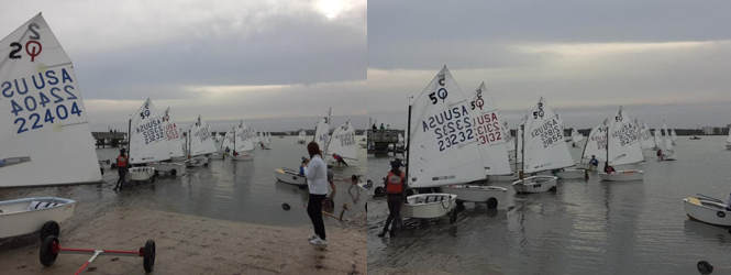
I cropped the photo on the left so that the picture was more focused on the boats already in the water; this also focused more attention on the woman wearing a red vest, seemingly reinforcing her helping move the boat into the water, as opposed to standing in front of it (her son who came running along and got in the boat to sail it was half her size). I hope that removing the concrete ramp made the water look even more uninviting and helped cue the viewer to the direction the wind was blowing and the direction the boats would be headed as they left shore. I thought it was interesting that they all seemed to be pointing to the committee boat in the deep background. Finally, I found it interesting that the hull numbers (assigned at the factory) grew more clearer. I was sure there wasn’t sufficient data for that to happen.
Why the title? Many years ago I took some art classes for personal enrichment: drawing, painting, and design. Design I managed to finish, but I realized that this was not a strength of mine.
I think I accomplished these goals:
Told a different story;
Changed the focal point;
Simplified the background;
Altered the human (helper) to eye level; and,
While there may not be room for the moving objects to travel (there were over a hundred boats in the water at that moment, and boats on the water in close quarters – sailing term – is typical of a heavily-populated race), I do feel the cropping reinforced the narrow open space as a directional to where the racing would take place.
“View from a dockside bar” original photo by L. Lemley, 26 January 2019, shared and used with permission under CC BY-NC 4.0 Deed
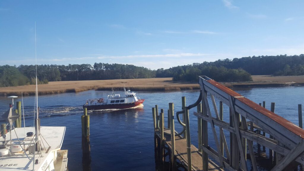
One of the benefits of having a smartphone with a camera is being able to take lots of photos and instantly share those pictures with family and friends. The original photo I have chosen is one that my mom shared with me from a trip she took several years ago to the North Carolina and South Carolina coast, near Myrtle Beach. While most people might think of the Myrtle Beach area as a party scene, the surrounding little coastal towns are much quieter, especially in January. She snapped several photos that afternoon of boats coming up the river, one by one…
The original picture needed several corrections. First, the boat that is moving through the water appears too far away to be an effective focus, and the big white boat docked on the left, as well as the poles and other dock structure in the right foreground, are distracting from the calm water and the marsh grasses on the other side of the river. Also, the moving boat is almost centered in the original image, so it doesn’t follow the rule of thirds.
In order to create the derivative image, I used the cropping tool in Photopea to remove the distractions from the foreground. Then I moved the image around so the little boat is near the bottom third and on the left side. This not only changes the focus on the boat to follow the rule of thirds, but it also allows room for the boat to move through the water as it heads home at the end of the day.
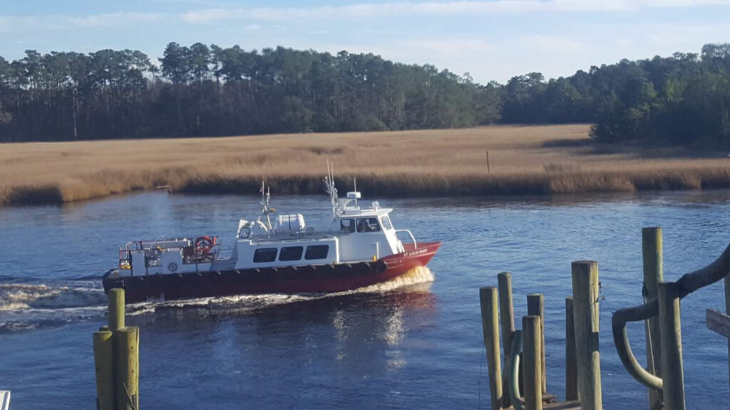
“Heading Home” by Carole Lemley, licensed under CC BY-NC 4.0 Deed. This work is a derivative of ‘View from a dockside bar’ by L. Lemley, licensed under CC BY-NC 4.0 Deed.