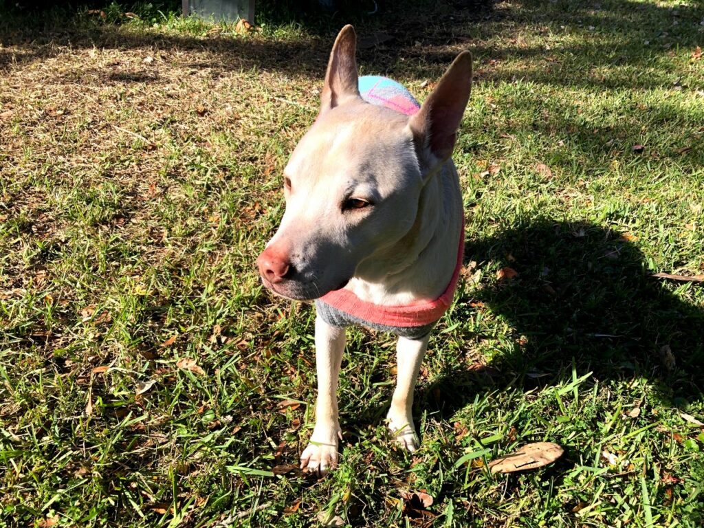
My dog isn’t a fan of the cold, so putting a sweater on him is a must! I snapped a photo of him outside in the grass, and although it was a great photo of him, he could really capture the spotlight more with some editing!
The original image was a bit messy, with distractions like his shadow and uneven lighting. I adjusted the temperature to cooler colors and decided to use less contrast. I also made sure to crop the photo make him the focal point. I cropped the image using the “rule of thirds.” Instead of keeping him in the center, I positioned him at the top right intersection of the imaginary grid. This made him instantly more dynamic. Cropping also allowed me to remove his shadow and some of the distracting background.
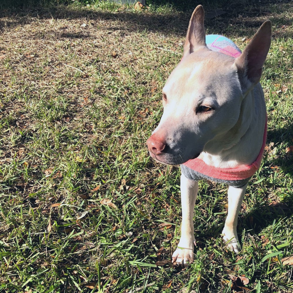
The edited image is much better! He is definitely the main character now.
When looking for an image, I chose to look through pictures through my photo gallery. It was very easy to choose my pets as inspiration. This image looks even deeper now that it looks like he is looking out into the far distance.
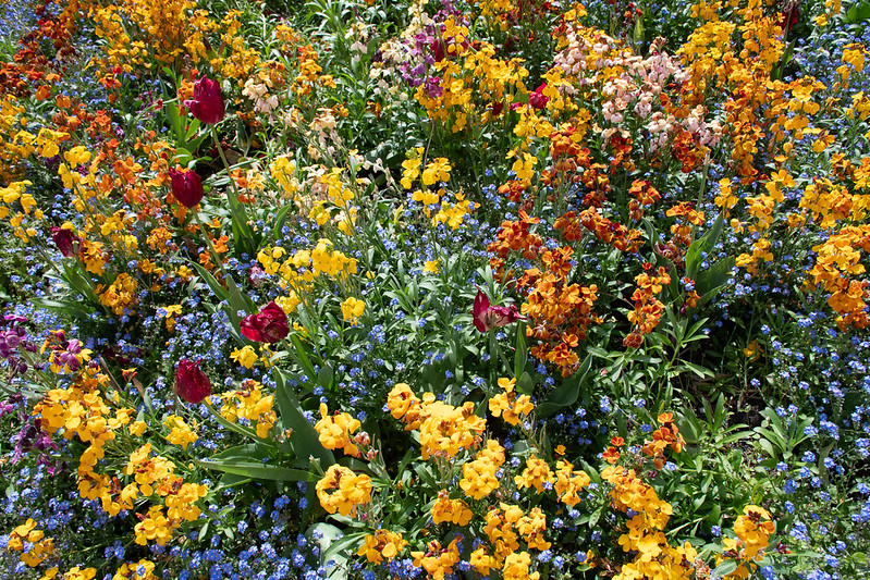
I chose this image because it grabs my attention immediately. The colors were beautiful and calming. The title of the song Nature Sounds spoke directly to the image i choose. The soundtrack enhances the reality I sense, it felt as though I was walking through the flowers. This invites you to immerse yourself into the beauty of nature. Especially for me because I love walking through nature. So hearing realistic sounds made it easy for me to imagine walking through a field of flowers near a highway.
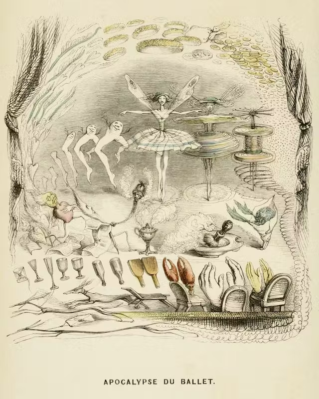
I studied art history during my undergrad, and the movement I came back to over and over again was Surrealism. It spoke to the part of me that has always been fascinated by dreams and everything that remains mysterious about our experience.
Although Surrealism proper started in the 1920’s and probably has quite a few works in the public domain, I wanted to look further back, partially to be sure my image would be copyright-free and partially to find some art I had not seen before. I was very excited to find out about J. J. Grandville, a French illustrator who lived during the first half of the nineteenth century and inspired many artists and authors who came after him.
The image you see here is called “Apocalypse at the Ballet,” and I love it for a number of reasons, the primary one being that it’s just fun. Everything in it seems like it’s in motion, and I get the sense that Grandville genuinely enjoyed playing with similarities in forms here. It seems like the kind of fun you have when you let your mind wander while doodling on the side of your notebook. Another reason is that I love seeing different interpretations of an apocalypse. Whether it’s literal or metaphorical, it’s always revealing.
When looking for an accompanying sound, I started browsing freesound.org’s “weird” and “experimental” tags to get some ideas. I figured I would find something in those places that could compliment surreal imagery well. Timbre’s “2024 Remix…” really emphasized the movement that felt so strong in Grandville’s illustration. I’m struggling to find the words to describe the music other than “fast-paced” and “electronic.” It reminds me of hyperpop, but I have no idea if that label is correct. Overall, I think that when the music is added, it makes the whole thing feel less like a strange night at the ballet and more like a wild rave.
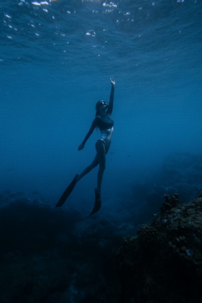
How “Yesterday’s Rain” Transforms the Underwater Scene
Initially, the image of the woman snorkeling struck me as hauntingly beautiful, capturing the essence of life’s struggles. With her head submerged beneath the water, it evoked a sense of isolation and the weight of challenges that often feel overwhelming. In that moment, I could relate to the feeling of being underwater, grappling with the currents of life that sometimes pull us down.
However, as I listened to “Yesterday’s Rain” by Andrew Stanton, everything shifted. The upbeat techno rhythm infused the scene with a sense of energy and optimism, transforming my perception of the image. The pulsating beats and vibrant melodies encouraged me to embrace a more hopeful outlook, reminding me that while life can be difficult, it is also filled with moments of joy and resilience.
As the techno track plays on, I envision myself breaking through the surface, my head finally above the water. The vibrant energy of the music mirrors the sunlight shining down, illuminating the path ahead and filling me with a sense of freedom. The combination of the upbeat sound and the image of the woman snorkeling creates a powerful narrative of resilience and hope. It reminds me that while life may have its depths, there is always a way to rise, to breathe, and to embrace the beauty that lies above.
In this way, “Yesterday’s Rain” not only enhances the visual experience but also transforms it into a celebration of survival and triumph. It encourages us to acknowledge our past while looking forward to the future with optimism. As I reflect on both the image and the song, I am filled with gratitude for the journey that has brought me to this moment—one of clarity, strength, and the promise of new beginnings
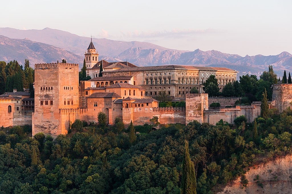
During my trip to Europe this winter break, I had the privilege of seeing the Alhambra from the Mirador de San Nicolás viewpoint in Granada, Spain. As the sun was setting, the glow of the Alhambra was one of the most picturesque sights I have laid my eyes on. In the background of my view, the snow-capped Sierra Nevada mountains glistened as the sky turned from blue, to pink, to complete darkness. As I was watching the sunset from this lookout, there was a group of three Flamenco artists playing the guitar and singing a traditional Andalusian song. Flamenco music and dancing can be found everywhere in Granada and the addition of this part of the culture made my experience more memorable. After hearing the three men play that night, I was hooked and knew that I needed to adventure to a traditional Tablao for a Flamenco show. I chose Jardines de Zoraya and was blown away by the synchronicity and fluidness of the performance.
With that in mind, I chose this audio because it reminded me of the song that I heard the day I visited Alhambra. Without hearing this music, the image is stunning, yet the addition of the sounds makes it hard not to crave being there. The music enhances the rich cultural aspects of Granada and ensures that the Alhambra is more than a beautiful monument.
Terms of Use: “Sounds of the Alhambra” by Kyla Cacoilo is licensed underCC BY-SA 4.0
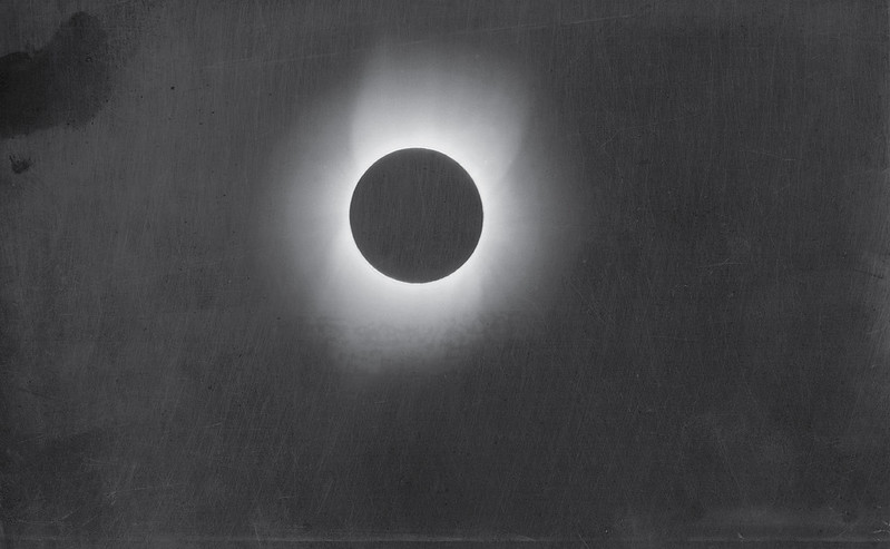
I’ve been seeing a lot of news stories about the planetary alignment that is supposed to happening over the next few days. When I began to research for this assignment, I began looking for astrophotography. I ended up settling on the above photo, taken in Wadesboro, NC by Thomas Smillie in 1900. There is a large collection of his photographs and cyanotypes on display on the Smithsonian website; Smillie was the first official Smithsonian photographer and the first curator of photography at the museum. I’d highly recommend looking at his work if you’re interested in early photography or the history of the Smithsonian.
This particular photo caught my eye because of the striking composition, but also the scratchiness of the background. The combination of the subject matter and the way the film was processed gives the photo an eerie, unsettling quality, not unlike that of early horror films. When I was searching for an audio track to include with the photo, Apparitions felt like it appropriately captured that sense of unease. The combination of these two works together, to me, feels evocative of the kind of superstitious dread you might feel when you’ve just watched a scary movie and then have to walk up a dark flight of stairs.
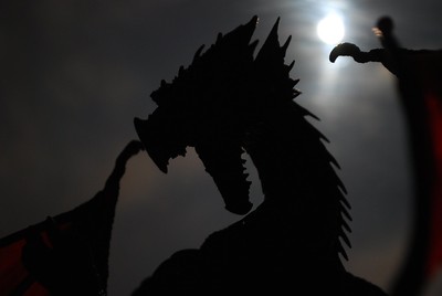
I chose to include an image of a dragon because this week I have been engrossed in the newest addition to the Empyrean Series written by Rebecca Yarros. This series is a romantic fantasy about dragons, wyverns, gryphons, and more magical creatures. I coupled the audio of pages turning with this image to convey the feeling of an onlooker watching me read this series. This series is intense and has its dark moments, and it’s strange to think about how the soothing the sound of turning pages is all that can be heard as I am transported into this magical realm of dragons.
Originally I thought to accompany this image with sounds of war, fire, or ‘fantasy music,’ but I think the juxtaposition of pages quietly turning is more impactful.
Terms of Use: “Physically Present, Mentally Elsewhere” by Grace Bayliss is licensed underCC BY-SA 4.0
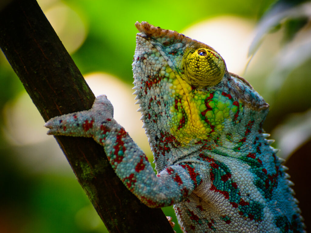
I wanted a fun, colorful and funky photo to use for this assignment and the first thing that came to mind was a chameleon. Chameleons are my favorite reptile as well. This image specifically stuck out to me due to the composition, the contrast of colors, and how vibrant it is. The background also stuck out to me due to the colors and the bokeh like blur that is making the background out of focus. This puts more of a focus and emphasis on the tree limb and the chameleon. The jazz guitar sound adds to the funky look of the chameleon as the chameleon is very vibrant and colorful. I wanted to use a rainforest sound but then I changed my mind because I wanted to go with something more outside of the box. I looked at rave music, lo-fi, and house music but then I found this Jazz sound. The sound titled “more Jazz guitar.wav,” is a 120 beats per minute which creates the relaxed and upbeat ambience Then calm jazz guitar music created a different vibe and ambience which helped to change the meaning of the photograph and how you look at the chameleon.
Terms of use: “The Colorful Jazz Chameleon” by Katie Kimberly is licensed under CC BY 2.0. It is attributed to the photographer, Michael Kuhn. The sound originally created by Sub-d is licensed under CC0 by 1.0.
Just yesterday, I finished reading One Flew Over the Cuckoo’s Nest by Ken Kesey and sought to craft my post in relation to the novel. I came across an image of a vintage Electro-shock therapy (EST) machine from the 1930s and felt it would be a fair representation of the novel since EST plays such a significant role in the tale. The title of the post, “He Who Marches Out of Step Hears Another Drum“, comes from the novel as well. The line refers to someone who is going against the established social norms and doing his own thing. Those who march to the beat of their own drum run the risk of colliding with hospital staff and being sentenced to EST. To enhance the image, I sourced two audio files, the first is the sound of a hydraulic hammer press starting up and the second is the sound of electricity buzzing. The sound of the hydraulic hammer press was included because it augments the foreboding feel of the image in conjunction with the sound of sparking electricity. I used Audacity to merge these two audios in a way that allowed the hydraulic hammer press to rev up to full speed prior to the crackle of the electric shock and created a new master audio file for embedding into the post.
Terms of use “He Who Marches Out of Step Hears Another Drum” by Sara DeRoo is licensed underCC by 0 1.0
I had the “Boop Oop a Doop” song stuck in my head for a few days – the one from Betty Boop. I’ve only seen the cartoon a few times, but it is certainly catchy. There is this one version on YouTube, and then I thought it would be a fun bit of audio for this assignment. Helen Kane sang the linked YouTube version, but I noticed many comments referred to an “Esther Jones.” I didn’t think too much of it then and continued my search for a song for the assignment. The search Betty Boop on Internet Archive guided my journey, and I found the results “Mae Questel, the voice of Betty Boop” and then the track “Don’t Take my Boop Oop E Doop Away.” This was the song. After retrieving the song, I thought, huh, that’s strange – Mae Questel is another name. My history teacher senses tingled, and it had been a while since I did a Wiki deep dive, so I searched for Betty Boop on Wikipedia, and sure enough – Mae Questel was a Jewish actress who played Betty Boop and Olive Oyl. So that was one name down – Who, then, was Helen Kane?
The Betty Boop Wiki explained who the other voice actresses were, and further scrolling led me to a reference about the Helen Kane Lawsuit. Helen Kane sued Fleischer Studios and Paramount in 1932 for allegedly copying her distinctive “baby” singing style to create Betty Boop. Another handy, dandy Wikipedia search later for “Baby Esther” led me to the page of Esther Lee Jones – the same Esther Jones of the YouTube comments from earlier. Baby Esther was an African American child singer and entertainer in the late 1920s known for using a distinctive “baby” or “boop-oop-a-doop” vocal style. During Helen Kane’s infringement lawsuit against Fleischer Studios over Betty Boop, evidence showed that Baby Esther had performed this style earlier and, in fact, was the inspiration for both Fleischer’s Betty Boop and Kane’s flapper persona, weakening Kane’s claim that she originated it. This testimony helped lead to the dismissal of Kane’s case in 1934.
There is little known about Esther Jones; unfortunately, there are no recordings of her songs or voice. What a piece of history that would have been—the first Betty Boop on record. But alas, we live in this timeline. And there was my little wormhole, peaking back through history over an unfamiliar topic. As for the rose pictured, Betty Boop has her own flower as well, a floribunda rose, to be specific, which was produced by rose grower Tom Carruth.


