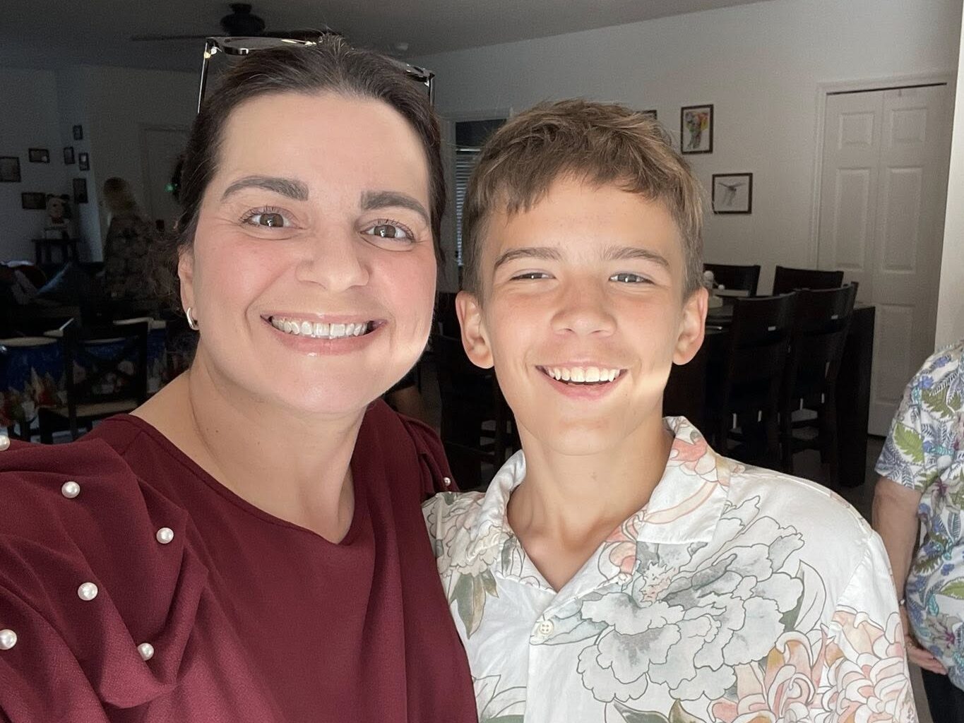
Hello!!! My name is Ana Vega, and I currently live in Miami, Florida, where I was born and raised. For those familiar with the area, I live closer to Pinecrest! I’m truly a Florida girl at heart. I also share my home with my wonderful son, Cacio e Pepe, though everyone simply calls him Pepe.
I completed a dual major in History and Art History, graduating from Rollins College in May 2025, and I am now in my second semester of the MSI program. I aspire to become an archivist and work with museums and special collections, as this is something I genuinely love. During my undergraduate years, I completed several archival internships, and I found the work incredibly rewarding, which is why I’m so passionate about archives today.
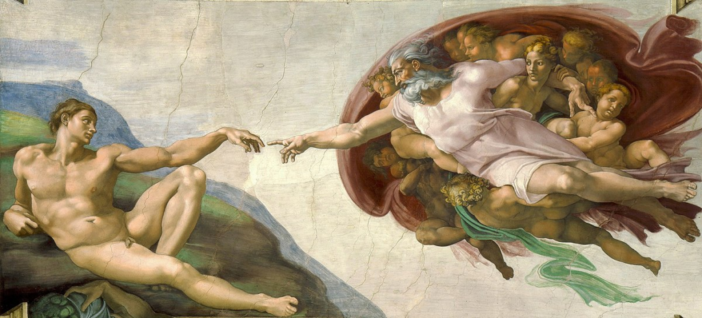
I also wrote an Art History honors thesis during my undergraduate studies titled “Locating the Archangel Saint Michael in Michelangelo Buonarroti’s The Creation of Adam.” If anyone is interested in reading it, I’ll be linking it here!
Art history is a major passion of mine, as evidenced by writing an entire thesis, but outside of academics, I also enjoy drawing. I do freelance art commissions every other month and will be including a link to my art blog as well here, in case anyone would like to see more of my work!
If you would like to learn more about my background and experience, please visit my LinkedIn profile for a more comprehensive overview.
My name is Danielle, and I live in between DeLand and Sanford in Central Florida. Until the end of last year, I served as a media specialist at a K-8 charter school. I truly loved my job, the students and my colleagues. Although it breaks my heart that the position was eliminated due to budget cuts, it revealed an unexpected silver lining. By increasing my course load, I’m now on track to graduate this May, an entire semester earlier than I originally anticipated.
After graduation, I am looking forward to applying for positions anywhere and everywhere. I am a single mom and my son, Jasper, will start high school (what!?!?!) in the fall. Looking for opportunities over the summer to begin a job before the new school year would be ideal. The idea of moving is both terrifying and exhilarating. I have worked so hard for what seems like so long, I almost can’t believe it is happening. Returning to school librarianship is my main focus, but I am not ruling anything out. This field has so much to offer that I am looking forward to seeing what all the possibilities are.
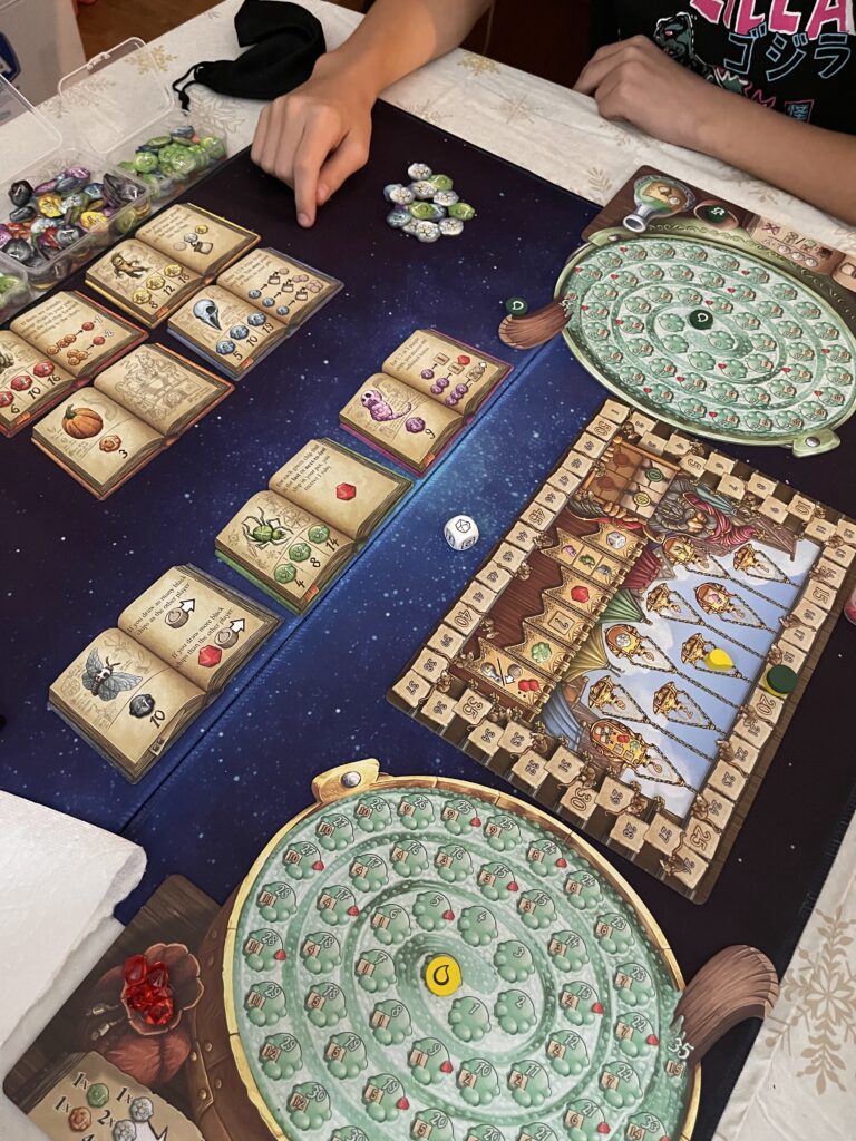
I’m a board game enthusiast. I was introduced to board gaming a few years ago and have since built a diverse collection. I’m particularly drawn to tile-placement games like Harmonies and Azul, as well as engine-builders such as Mycelia and the Century Road series. I attend local meetups as often as I can. Much like the librarian community, I’ve found board gamers to be incredibly welcoming and always ready to share their expertise with others. My collection of games can be viewed on my profile on the Board Game Geek website. As I get more into the hobby, the games get more challenging and usually significantly longer (and more expensive!). I’m looking forward to attending my first board game conference this year!
I have made hundreds of digital graphics for various reasons, but I have found that I tend to use one application over others. I am ready to learn how to use various other platforms to create. I have only created a few projects using both video and audio. Last semester I designed a book trailer for a young adult novel on Canva. I was pleased with the outcome, but it wasn’t something I was confident in making. Having little experience creating with video and audio, I am both nervous and excited to learn how to integrate more of these aspects into my work.
In the poem Harlem, Langston Hughes asks, “What happens to a dream deferred?” As someone who delayed finishing their undergraduate education for 30 years, I understand this question all too well. One of the driving forces in finishing my undergraduate degree was my career change in my 40s into library services, and my desire to become a “real” librarian. I knew that to do this, I would have to earn my Master’s, and thus began my journey to completing my education.
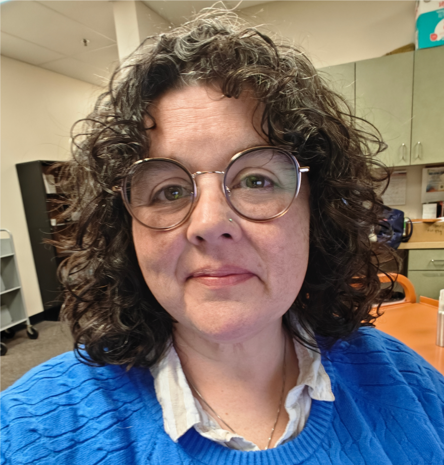
Photo: Kristi Mosac
My name is Kristi Mosac, and I am currently halfway through my MSI program. After graduating with my undergraduate degree in English and Writing from Eastern Oregon University in 2024, 30 years after my high school graduation, I applied and was accepted into the program here at FSU. I moved to Spring Hill, Florida, from the Atlanta area in 2020, after my father’s passing, to help care for my mother, which afforded me the opportunity to restart my educational career. I transitioned from retail management into library services in 2017, and am now working in the Hernando County Public Library System as a Library Information Specialist II, which is just another way of saying I am the assistant supervisor of my branch. One of my roles in supporting my supervisor and the library system has been to create a range of marketing materials, including brochures and social media posts. Our system has been working to increase social media engagement, and our branch has been a driving force behind it. My hopes and goals for this class are to become more adept at creating engaging content for our patrons and to remain the driving force behind our small system’s growing online community.
Libraries really are a special interest for me, with readers’ advisory being a key element in that arena. This allows me to connect with my patrons about my other favorite hobby, reading, while simultaneously using my skills with Canva to create engaging graphics and printables that can both entice and encourage them to read, either more of what they enjoy or, even better, outside of their comfort zone.
Salutations. My name is Troy Mosac, and this semester marks the halfway point of my MSI program. Currently, I am the Systems Assistant for the Hernando County Public Library System, where I support the Systems Librarian with the library’s IT needs. If you had asked me 10 years ago if this is where I’d be, I would have been surprised. I got my undergrad in Geology from the University of West Georgia and even went so far as to become state board-certified. However, when I graduated, geopolitical changes made locating a job all but impossible. While waiting for the geology market to stabilize, I took a job with Apple as a Tier 2 Senior Technical Advisor, serving as an intermediary between consumers and engineering teams. I had to relocate to Florida to help take care of my family, where I took my current position.
I have no formal background in IT; it’s always been a hobby. Growing up in Silicon Valley, my friends and I would dumpster-dive at tech companies for spare parts to build a computer. We spent our spare time tinkering and figuring out how programs worked, something I still do today.
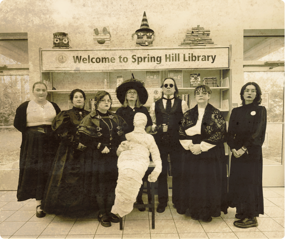
Group Photo: Spring Hill Library, Halloween 2025
As much as I love technology, music has always been my passion. Transitioning from the gloriously awful pop music of the 80s to the grunge scene of the 90s, I found myself embedded in the goth scene. Contrary to what you may hear in the mainstream media, goth music is surprisingly diverse. Though dark and atmospheric aesthetics persist, it can draw on other genres, significantly diversifying its offerings. My musical tastes have evolved and expanded since those days, but I always find my way back, and I still update my goth/industrial playlist from time to time.
A timeline of myself starts with understanding the plight of an island girl, from Trinidad and Tobago, as she acclimated to the American culture. From a flight to Miami, leaving behind my original homeland to venture into a new culture. I found myself and understood this challenge, as well as how change is directly important for my parents and the future me. The dynamic American system of education felt different, but I pressed on. Matriculating through middle and high school, as a private person understanding the daunting task of processing who I was, who I will be, and now who I am.
From Interior Design to History Refined
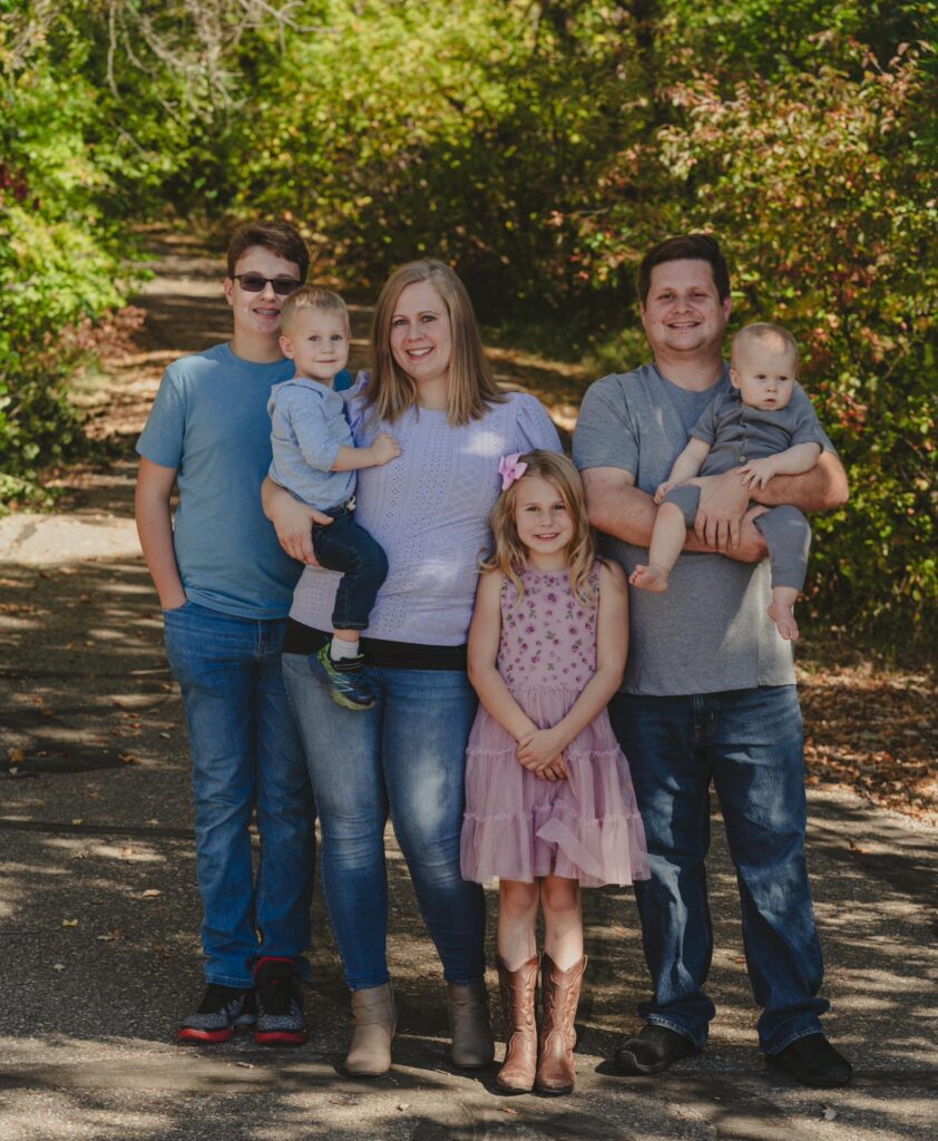
Fast forward, after a degree in Interior Design, a bachelor’s degree in Anthropology, and many years working both sides of the experience a patron might encounter (visitor and employee), I finally feel connected to my calling as a librarian. With the help of my amazing husband, of now 19 years, and my supportive sons (11 and 14), as well as my husband’s family, this pursuit of a Master’s degree has been not only an experience that has uplifted my values but also an opportunity that has improved my fit with the county library system, in Coconut Creek, Florida, or the Butterfly Capital of the World. My parents taught me to strive for the best, my immediate family encouraged me to branch out, and my library family has brought my creative side out through the offerings, programs, displays, and activities that are composed by yours truly.
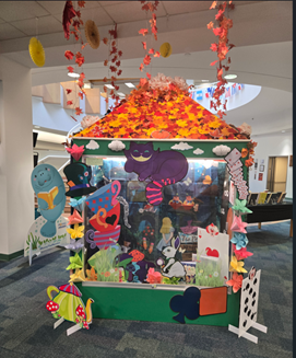
Halloween: Capture the Cheshire!
As a special interest, especially one that I dive deeper into, thematic displays have fostered my creative application skills and have sparked the interest of many of our library’s patrons. Some are simply related to holidays, some are related to a national focus of a concept like Autism Awareness, but all displays are designed to bring to life the impact that literature and content can have for young readers, which are my area of focus at the library I work at. These are important features of my work life, but not the only part of who I am.
Natural Born Investigator
In fact, my home life, my interests in crime and forensics has guided some of the reading for pleasure, as well as some of the content I have looked over for the requirements of FSU’s Master’s in Library Science Program. However, this is not the only part of me that makes me unique, as I am the mother of two boys, who are just as amazing. Both are active learners, both are vigorously thorough, and both are the apples of my eye, alongside my husband. Now that you have gotten to know a little about me, it is important to know that lifelong learning will continue to guide my decisions.
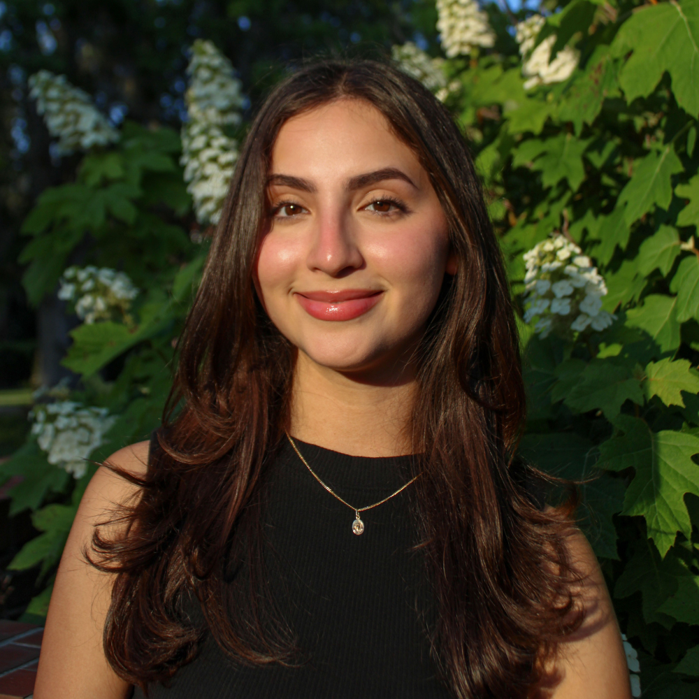
Smile: This is Kelly!
Kelly John-Strate, a person who has continued to discover more about herself because of those finite moments of directionality and dedication. Thus, an avid and altruistic persona, but represented by my spirit cat, Luna who is an all-black British Short hair with both sass and grace. You will find me where information, inquisitiveness, and ingenuity are central to an experience worthwhile. Though I am not a digital media person, this course will afford me the opportunity to dive deep into my own ability to engage with social media, support digital resource use for patrons, and hopefully feel more confident as I continue to evolve as a librarian.
Can everyone hear me? Yes? Okay great! Hi, my name is Alih Rosa and I am super excited to be taking Digital Media Concepts and Production with you all this semester.
I grew up in New Jersey and moved to Florida in 2013. I graduated with a Bachelor’s in Communication Sciences from USF, and I am currently in the second semester of my Master’s in Information at FSU.
I currently work at the USF library as a Digital Scholarship Support Coordinator for the Ornithology Archive, a cool collection of journals documenting the study of birds in North America over the past century. One time, I read a journal entry about someone observing a crow take a shower. He said he had been watching crows ever since he was a kid, but this was the first time in his life he’d seen the bird do that. He was so endearing expressing how even at 90 years old, you can still experience something new that it almost moved me to tears (dramatic but true)! That feeling I get from accidentally finding an inspiring book or text is what draws me to the serendipitous nature of libraries (and maybe I’ve been let down one too many times by book-tok – but hey, now I know better than to take book recommendations from an algorithm).
When I’m not working or studying, I’m checking out new coffee spots, watching movies, or capturing moments on my camera. Recordkeeping is something I enjoy in both my librarianship work and hobbies, and my personal recordkeeping practices have covered a wide range of ground. Whether it’s filming daily vlogs, taking photos, or creating super specific music playlists, I love all the fun ways I can capture memories. Admittedly, I take a very DIY approach to these personal projects, and don’t always look into the “right way” to do things. For example, I am terrible with audio, and rarely plan for videos (I mostly go off of vibes).
I’d like to be more thoughtful about recordkeeping so I have better quality memories to look back on. I’m looking forward to learning foundational digital media techniques when it comes to documentation practices in my library work and personal life!
Hello class! My name is Kayla Cardenas, and I am currently a masters in information technology (MSIT) student at Florida State University. I received my bachelor of science (BS) in media communication studies from FSU in December 2024. I was born and raised in Miami, FL but currently reside in Tallahassee.
I work at FSU in the Paul Dirac Science Library as a Graduate Research Assistant in the Teaching, Learning & Engagement (TLE) department, specifically with GEOSET Studio. GEOSET (Global Educational Outreach for Science Engineering and Technology) is a nonprofit initiative founded by Nobel Laureate Sir Harold Kroto in 2006 with the aim of providing media creation resources to scientists, educators, and students worldwide through an (at the time) ground-breaking video hosting website. The GEOSET YouTube channel features an archive of a few of the hundreds of videos formerly located on the geoset.info website. Today, GEOSET at FSU offers free media production services for the entire FSU community.
Outside of my job and classes, I am the president of the UX Collective, a student organization dedicated to promoting the field of user-centered design and offering students from all backgrounds professional development oppotunities. In my free time, I enjoy playing video games and currently play on FSU’s collegiate esports team for the popular hero-based shooter Marvel Rivals.
As someone who produces academic videos for work, this class piqued my interest as a way to strengthen my skills and enhance my portfolio. By the end of the spring semester, I hope to have a media project under my belt that showcases the wide-range of skills I’ve picked up both through this class and my work.
I look forward to creating and learning alongside everyone!
I’m Nicole Davis and this is my final semester in the MSI program at FSU (and hopefully my last semester of school). Before this I was an English major, and you can likely already tell I have an over-fondness for parentheses. For some it’s the oxford comma, others the em dash, but you can pry parenthetical statements from my cold dead hands.
I am looking forward to this class (which I have already started affectionately calling “digital arts & crafts”) as a creative outlet for my last semester, at the very least compared to my other courses. I have some minor (mostly self-taught) experience with digital creative tools (for example, I had a media productions class in high school where we experimented with Premiere Pro video editing) but I am excited to refine and improve these skills (and new ones) over the course of the semester and looking for potential ways to apply these skills at work. Speaking of work…
Starting in December of last year (so very recently) I finally got a part-time job in a library. I work the reference desk at Tallahassee State College. That link should take you to the staff page for the library, where you can see a picture of me because I will not be including one of myself here (I prefer to keep as few pictures of myself on the internet as possible). I currently live in Perry, Florida (which if you’ve heard of it’s likely only because you’ve driven through it) but because of the new job I am actively looking to relocate to the Tallahassee area.
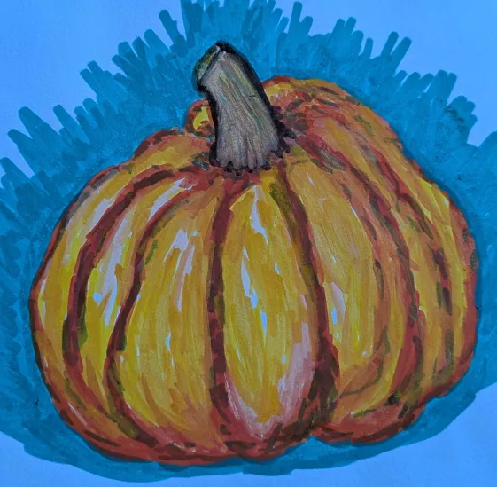
Pumpkin Art Example
Now for the fun stuff, I love to collect hobbies, especially creative ones, such as painting, writing, photography, music and so on. For seven years in school I played clarinet, hence why I decided to allude to music in the title (honestly I just couldn’t think of anything better and “all that jazz” has been my recent default filler phrase). Technically speaking reading is my biggest hobby because I read almost everyday (but that is such a cliche hobby to talk about as an English major turned future librarian). So instead, none of that is what I am going to focus on here, rather I will mention my growing love and fascination with lost media. I’ve linked to the wiki “about us” page for lost media in case anyone is interested. As a busy college student I do not have much time to participate in searches for lost media myself, but I am always interested in learning more about how media goes missing, why, and most of all the often odd ways this media is found again. I think lost media searches are also fascinating because they encourage people to participate in archiving practices, and the growing popularity helps bring more attention to archival institutions like the Internet Archive and it’s Wayback Machine.
My name is Christy Heiple, and I am in my final semester in the MIS program. I live in Bismarck, North Dakota. My husband, Kris, is a middle school counselor, and we have four children: Wesley (15), Bre (10), Graeme (4), and Levi (2). We also have two extremely snuggly and slightly mischievous cats (Rajan and Lego).
I have been in education for 17 years, with 14 years spent as a classroom teacher and 3 years as a Library Media Specialist. I have had the amazing opportunity to teach in various locations, including Bronx, New York; Erie, Pennsylvania; Detroit, Michigan; New Delhi, India; and for the past 12 years, in Bismarck, North Dakota. Right now, I am a K-5 Library Media Specialist in two public elementary schools.
I am passionate about digital literacy and cybersecurity. I love every part of my job, from teaching students how to find good-fit books to coding, creating different kinds of digital media, finding and citing reliable sources, and so much more. Watching the students grow in their curiosity and confidence is a constant reminder of why I do what I do. I also enjoy sharing new ideas and tech tools with the teachers in my buildings and providing professional development within the district.
Most of my free time is spent supporting my children in their activities. Wesley plays the trumpet in the high school marching band and is involved in DECA. Bre takes horse riding lessons and ballet. Graeme plays soccer and wants to start T-ball this summer. Levi’s favorite pastimes are unloading all the kitchen cabinets, climbing onto the kitchen table, and trying to flip over the back of the couch, but I’m sure he’ll be in organized sports in the near future.
When I do have time to myself, I enjoy building a puzzle (specifically the Dowdle brand) or reading a book. I also dabble in writing and aspire to be a published author someday.
Fates, we will know your pleasures: That we shall die, we know; ’tis but the time, And drawing days out, that men stand upon. —Shakespeare, Julius Caesar
Life’s not over until the fat lady sings. And I don’t hear her yet.
A midwesterner for decades, my husband and I moved to Florida in 2020. All five of our children are grown and flown, delightful humans and my best contribution to date.
A fiber artist since 1996, I used to publish a knitting blog (called Living and Dyeing) back when blogs were shiny and cool (2003-2008) using Typepad (I’m really dating myself here. Good thing I’m a fun date). I own three spinning wheels, two weaving looms, multiple spindles, countless knitting and dyeing supplies and my knitting goal for 2026 is to make a Dale of Norway sweater. I’ve done some traveling, skiing, boating and I even co-piloted a small two-seater plane from Chicago to Idaho and back. I’ve lived a pretty good life and I’m grateful.
Why, do you ask, am I here?
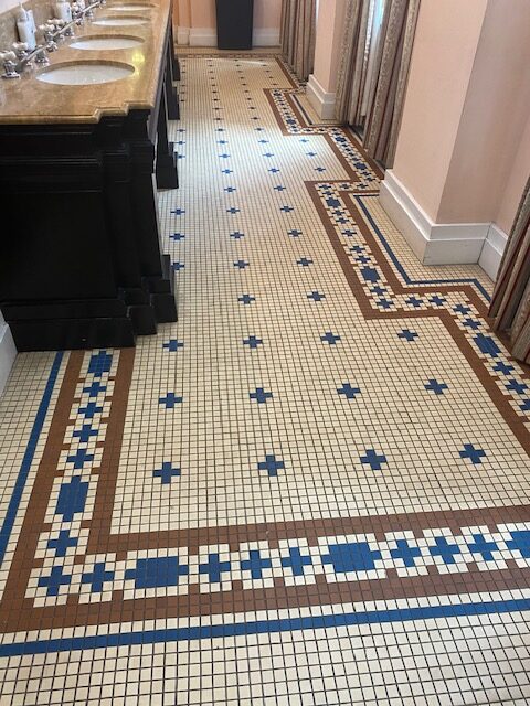
Many years ago as my kids became teens, I was an Office Manager in downtown Chicago, on track for a higher level admin job when one of my teen daughters was diagnosed with anorexia. It was serious and required me to be closer to home. I pivoted to a position nearby at a tile store where I catalogued, organized and sold architecturally significant and historically accurate tile to designers and homeowners alike. I fell in love.
There was something about this small detail of the past that was precious and worth saving. The experience took me by surprise and I realized I loved serving these clients by providing them with the information they needed to make the world a more beautiful place.
Suddenly my husband’s employment swept us away to Florida, and I dealt with a health situation which began in 2021. Here I am, alive for now, facing mid-life with hope, excited to increase my digital content skills through this class and hopefully head into a world where I can direct people to resources that educate and bring meaning to their lives. Whether at a museum, an archive or a library, I look forward to “drawing days out” for this next act, whatever time is allotted.


