Garrett The Garbage Man Garrison
Introduction
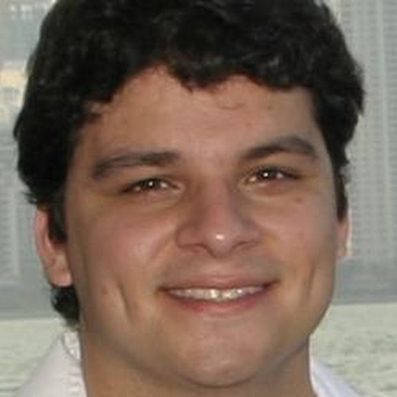
Good afternoon, everyone! My name is Jorge Sanchez. I was raised in Miami, FL and have been living in Orlando, FL, where I went to the University of Central Florida for what my parents thought was way too long to complete a dual degree program for Public Administration and Nonprofit Management!
That was a few years back, though, and I decided to jump back into school here at Florida State University to practice the arts of librarianship! That’s right, I am a Librarian in training too, yes just like Rachel Weisz, in my second semester of my Masters of Science in Information! I’m also on a couple of volunteer boards, where I work with museums and marginalized groups to bring about a little culture and belonging into the scene, it’s good fun.
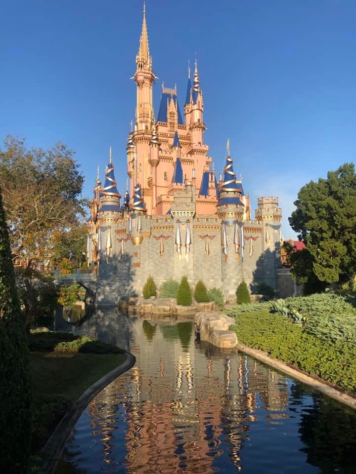
In the meantime, I’m picking up and sharpening skills working at a library in Orlando, with a pretty sweet Makerspace. Typically I’m teaching classes, or doing some 3D modeling, or showing people how to use a laser cutter without setting anything else on fire. Up there is me with one of my creations. Down here is a 3D printable unknown box we found on the internet that we use to stuff some tools into, and that’s just one of the few capabilities of the Makerspace!
I’m looking forward to this class due to its focus on design in digital media. As someone who is constantly working with digitized everything, learning the aspect of production for what I see in my everyday life is an exciting prospect.