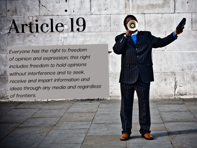
Hear My Voice “Hear My Voice” by Christina Mumpower is a derivative of “With A Megaphone By A Wall” by garryknight is licensed under CC BY 2.0. Originally downloaded on 02/10/26 and edited with Befunky. Tags: ml4 February 10, 2026 by Christina Mumpower Spring 2026 Student Posts 3


Hello Christina,
Perfect image choice for Article 19! The gentleman holding the megaphone certainly correlates with having the right to freedom of expression and opinion. The room he’s in, with its stone walls and floor, also ties in with the right to freedom to hold opinions without interference. The room signifies the Article’s protection of those (in this case, the man in the photo’s) who would like to speak their minds without fear of punishment.
Your typefaces do support the overall message. I really liked that you made sure to add the grey background to the text, because the words would have blended into the picture if you had not done so. Your fonts blended well with each other, the mood of the photo and the Article.
-Kelly
Christina,
This is a great visual for article 19. The image is perfect as it seems this man is expressing his opinions out in the open for all to hear. This carries the message the article is trying to get across without having the explanation written on it. I feel like the typeface used for this image is perfect as it is easy to read and doesn’t distract from the message the image shares. I think the gray background was a good design choice for the text since it makes the text easier to read without making it take over the whole image. I think had you of used say the blue from his suit it would have over taken the image and not allowed it to stand out enough. Nicely done!
Hi Christina,
This was a really solid image choice for Article 19; the megaphone idea makes the message of freedom of opinion come through right away. “Article-19” is aligned with the head and gives the illusion that it is written on the wall. Your typeface also works well with the photo chosen.
The gray box behind the quote was a good call; however, I would have made it so you can see through it and show some of the wall’s texture behind it. However, the box is tilted and aligned with the unevenness of the wall bricks, which is nice. The two font choices don’t feel too similar either, although I would have liked to see Article 19 in blue to color-match his shirt as an alternative that would stand out a bit more.
Overall, I liked how clean everything looks and how true to the image the message is. Good job!