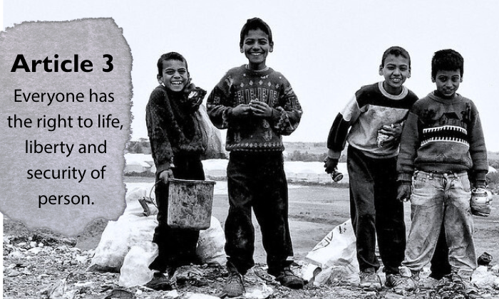
“Humanity” by Jaclyne Jones is a derivative of “Laughing! #Gaza” by achimvoss which is licensed under CC BY 2.0. The image was originally downloaded on 02/08/2026 and was edited using Canva.

“Humanity” by Jaclyne Jones is a derivative of “Laughing! #Gaza” by achimvoss which is licensed under CC BY 2.0. The image was originally downloaded on 02/08/2026 and was edited using Canva.

Hello, thanks so much for sharing your work! I really like the visual line and alignment of what you created. Especially for an English speaking community that reads left to right this alignment works very well for a reader to read the text before moving on to “read” the image that accompanies it. I do think your font choices are very similar, to me they nearly look the same, but I do think they work well together, and the bold on the heading help keep them as separate entities. I like the background element you placed behind the text and I do think it matches the feel of the rest of the image, however, it does seem to extend a little beyond the rest of the base image to create a slightly jagged right edge, maybe my brain is just playing a visual trick on me, but for improvement I would recommend looking to smooth out that edge.
Hello Jaclyne,
Your image really gets straight to the point. It delivers the message clearly and without any unnecessary distractions. I did notice the fonts—they look very similar at first glance, even though I’m sure they’re technically different. The background behind the words is especially interesting. It gives me the impression of a page torn straight out of a book or article, which adds a raw, authentic feeling to the message. I also really like the contrast between the image and the text. You chose a simple but powerful design that communicates the idea effectively.
Hi Jaclyne! Thank you for sharing your image. I looked at the original through the citation you provided, and I really like your cropping choice. Centering the children makes them the emotional focal point, while the negative space on the left creates balance and gives your text room to stand out. The torn or burned effect along that edge is especially effective; it visually echoes the destruction in the scene and strengthens the overall theme. The article you chose is powerful, particularly given that the image was taken in Gaza. The pairing of image and text adds depth and urgency to the piece. The only element that feels slightly off is the typography. The title and body fonts are very similar, with minimal contrast beyond thickness. Creating a clearer distinction between them would strengthen the visual design. Overall, this is a thoughtful and compelling composition, great work!