“Sweet Home” by Oi Kwan Lui is a derivative of “Pavement Between Modern Apartment Buildings” by Volker Thimm, which is licensed under the Pexels free to use – some rights reserved license and originally downloaded on 2/9/26, edited with Canva.

“Sweet Home” by Oi Kwan Lui is a derivative of “Pavement Between Modern Apartment Buildings” by Volker Thimm, which is licensed under the Pexels free to use – some rights reserved license and originally downloaded on 2/9/26, edited with Canva.

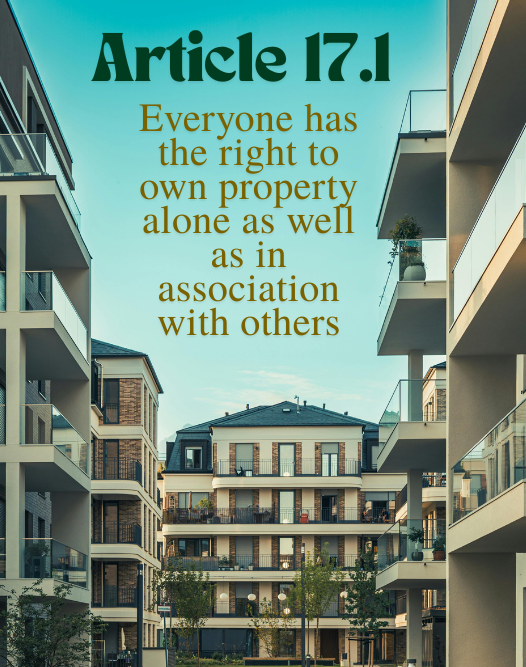
Hello, thanks so much for sharing your work! I really like how you used the type to fill the space of the sky in the image, I think composition wise, that choice really works for me. I also think the color choice on the type fits with the image, and reflecting the positive aspect of housing as a right. I think the fonts are a little similar, but in such a way that it still works because the font for the “Article” heading is more illustrative to show stylistically that it is different. The one improvement I would suggest is to adjust the line spacing a little, the “y” in “property” is touching the two “L”s in well in a way that might cause confusion when reading. If there was just a little more space between lines though this would be fine and the letters wouldn’t cross over like that.
Hi there!
I really like the image you chose for this distinction. While it encompasses property ownership and housing as a human right, it also supports both individual home ownership and ownership that is ‘in association with others’ by highlighting what we know as group housing, or apartment buildings. The association with others, in my opinion, contextualizes the aspect of dignity and human rights, which is really touched upon by the centeredness of the text, reinforcing this attribution. This combination of meaning is particularly emphasized by the font choices as well, which involves the colors within the picture and draws attention by means of attractiveness. I think all in all, the font choices do well to articulate the message, and the placement reinforces the human rights aspect. I’d only suggest a wee bit of spacing below the ‘y’ in ‘property’ to reduce any longing concentration on the words, as it somewhat blends together with the ‘well’ below it.
Hi ! Honestly, I think you have a real eye for graphic design. I clicked on the link, and the way you cropped the original image and centered the text was stunning. The placement feels intentional and balanced, and it immediately draws the viewer in. The color you chose for the text enhances the image beautifully; it complements the overall palette rather than competing with it. The fonts also work really well, giving the piece a chic, advertisement-like quality. Everything feels cohesive, and the overall color scheme is both beautiful and pleasing to the eye. Amazing job, this was such a polished and visually striking composition!