Migration, a Natural Process “Migration, a Natural Process” by Jazmin Jimenez, licensed under Attribution-NonCommercial 4.0 Generic (CC BY-NC-SA 4.0) is a derivative of “Snow Geese Migrating” by Amit Patel, licensed under Attribution 2.0 Generic (CC BY 2.0). The image was downloaded 2/7/26 and edited using Canva Tags: ml4 February 9, 2026 by Jazmin Jimenez Spring 2026 Student Posts 3
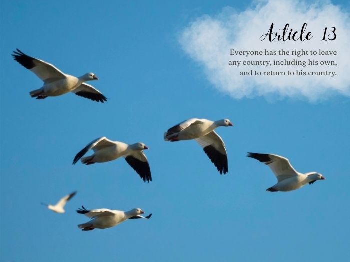


Hi Jazmin, Aww wow I really love this! The image is fresh–quite creative for this article and I feel like it works well. It encourages the reader to think about the freedom birds have, and to consider that humans ought to also have this sort of freedom. Beautiful. The image itself is lovely. The birds are facing the text so one’s eye naturally moves from bird to text. The shape of the birds is a triangle and fills the space nicely. The fact that the text is placed into a cloud is the icing on the cake! The font you chose for “Article 13” is light-hearted and almost hand-written which again evokes the thought (for me anyway) that humans are free by nature, like birds. The grey color of the text matches the grey in the birds’ feathers, another thoughtful feature. I feel like the “Article 13” would be more impactful if it were a bit larger. It almost seems like an afterthought in the small corner of the larger photo. As well, the text of the article itself could be larger. I like how you aligned the text of the article with the edge of the number 3 on the right hand side. It creates a nice appropriate border for the eye, mirroring the border that the bird’s wing provides on the left. Overall a really nice job with a beautiful image!
Hey Jazmin! I really love what you posted, and while strolling through the class posts, yours stood out to me! The typefaces that you used in the image really do support your overall message, essentially saying that no human being has the right to leave their country and to return, if they choose to. The font you chose for “Article 13” appears bold and is easy to read, which draws attention to it immediately. The second font for the additional text is simpler and readable, which allows us as the viewer to easily understand the information. It also doesn’t take away from the rest of the image. I also wanted to point out that the contrast between the text and the title is an element that worked really well. It created a clear, visual hierarchy where they both complemented each other. It was also cool that you placed it perfectly on the cloud, which allowed the image to speak for itself. Both fonts blend well and are compatible, and it is a good thing that they aren’t too similar. If I had to suggest anything for improvement, I would say to increase the spacing between the lines or between the letters so that it doesn’t look too close together. But I assume that it was purposeful so that the text could fit on the clouds. Overall, I think you did a great job!
Dear Jazmin –
I like that we had two posts in our feedback group on Article 13, and that you both took different ideas for it! While Destiny had a historical photo showcasing mass immigration from Europe to Argentina, you took the nature approach. I think I prefer yours because the photo is a bright blue sky; while this naturally conveys feelings of freedom and flight, from a practical standpoint it makes it really easy for us to read the black text you selected due to the perfectly framed white cloud. Well done!