
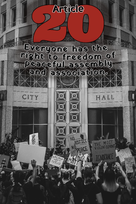
I knew I wanted to do Article 20 from the start. When I went searching for images, I found so many photos. This one stood out to me because it is already following the 1/3:2/3 rule and I absolutely love the the juxtaposition of concave and convex lines that the building creates. I chose to put the Article number on the top because I didn’t want to cover the protesters. I used a font called Ultra because it was thick and had curves to it. The text font, Yatra One, reminded me of how a fat, chisel tip marker would write on posters or signs. Using the curve feature, I again used the lines of the building to anchor the lines of text. I also used the glow feature to make them stand out just a bit against the monotone photo.
Application: BeFunky
Original Photo: “Black and White Photo of Crowd of People Protesting in Front of City Hall” by Connor Scott McManus CC BY 4.0

Hey Danielle! I agree with you, the concave and convex lines that the building creates are very aesthetically pleasing (and the way the article text curves complements this feature nicely). The placement of the text at the top instead of covering the protestors is a great artistic choice. The big red 20 stands out clearly and contrasts with the other text, and I think your comment about it looking like it was written with a marker on a poster is so creative!
Hey Danielle. That is a great pairing of the article and photo. Though the image depicts a modern protest, the black-and-white treatment gives it an older, more historic feel. The font choice, I think, further emphasizes that feeling. The fonts work well together and are easy to read, and the use of red on a black-and-white image works well and draws attention to the article number. I’m not sure about the glow effect; it does make it easier to read, but it feels off. I wonder what a black box with the same level of transparency across the top would look like?
Hi Danielle, Your work is nice, the photo is a conventional choice for the Article. To disagree with Troy, I like the glow. However, I think what is “off” about it is that you curved the text up. Not having it in front of me I wonder what the effect would have been if you had curved it down? (That is the “danger” of these assignments, it is like going to the optometrist, one or two?)
I really liked that you chose Article 20 because the right to peaceful assembly is such an important and timely issue. The protest image makes the message feel immediate and grounded in real life. I personally have mixed feelings about protest spaces because they can be powerful but also complicated, so I found the tone of your design interesting. The bold red “20” stands out strongly against the black-and-white background, and the rounded font adds an accessible feel. Overall, your choices feel thoughtful.