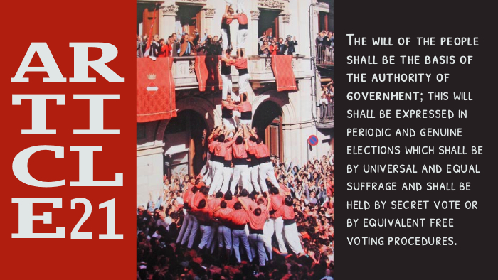
“Article 21: Basis of Authority” by Calvin Whalen is a derivative of “Primer 2de9 amb folre i manilles descarregat de la història“ by Colla Vella dels Xiquets de Valls which is licensed under CC BY-SA 3.0. Edited with Photopea.com.

“Article 21: Basis of Authority” by Calvin Whalen is a derivative of “Primer 2de9 amb folre i manilles descarregat de la història“ by Colla Vella dels Xiquets de Valls which is licensed under CC BY-SA 3.0. Edited with Photopea.com.

Hey Ella,
I was really drawn to your post. The way you laid out all the design elements works super well together. I especially liked how you presented Article 21 and how the two typefaces complement each other; they really strengthen the overall piece. Splitting the design into three sections was a clever idea too, and I like that you chose a different shade of red so it wouldn’t blend in with the image.
If I had one suggestion, it might be to play around with the box sizes a bit. Keeping the outer ones a little more consistent could help the design feel even more balanced. Overall, great job! Definitely one of the standouts in the class, in my opinion.
Hi Ella! Awesome job with this assignment! I really liked the photo and text you chose. The fonts are similar and match with one another quite well, and their boldness highlights the photo. I liked how you made the backgrounds for the text within a similar color palate to the photo. I like how they largely align with the tower of people in the photo. I also liked how you formatted the word “Article” to fit in the box, I thought that was really unique. If I had any suggestion to make, it would be that I wish the text boxes were the same size; it feels like the body text is slightly larger (as in, the text is taller) than that of the Article 21 text. I think having them align would make the text even more cohesive.