The Spirit of Brotherhood “Afghanistan Border Police hand out blankets in Kandahar [Image 8 of 10]” by DVIDSHUB is licensed under CC BY 2.0. Article 1 from Universal Declaration of Human Rights on the United Nations Webpage Edited on Canva Tags: human rights February 11, 2025 by instructor Student Posts 3
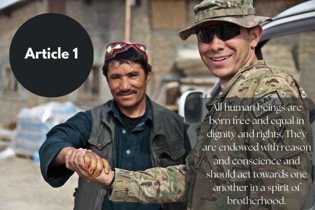


Hi Sarah. Nice job on the typeface selection for your image. I think that the boldness of Article 1 combined with the images in the photo pair well together. The image depicts two human beings showing dignity towards one another and it looks as though they are acting in the spirit of brotherhood.
I like the circle and square shapes that you utilized as a background for the font in the photo. I also like the title of the blog post as it pairs nicely with the theme of the photo.
I like both fonts together. I think the Article 1 shows the boldness and the font with the square behind it is clear and is different from the font in the circle.
Overall, I think you did a great job with pairing everything from the blog post title, to font and photo selection.
Sarah, your selected fonts contrast each other, and I like how you put the darker shapes behind the white text—it helped draw my attention to the text instead of getting lost in the image. This also indicates to me that the heading and body are related even if they are not close in physical proximity. What I think worked particularly well here is placing “Article 1” in the negative space next to the two people. This immediately drew my eyes to the upper left portion of the image, and I was able to logically take in the heading, then the two people at the center, followed by the corresponding message at the bottom right. All these elements flowed into one another.
A few suggestions: I would switch the fonts between the heading and message, as it was a bit straining to read the entire message with serif font. I think the opacity of the background shapes should match as well, so that it is even more obvious that they are related to each other. Lastly, I would change the text alignment to the right edge, instead of the center.
Sarah I really like this one! It evokes some emotion for me, even passion for how we treat other humans around us it’s an excellent choice in imagery. The font for both I think works together and for the image, I especially like the font you used for the header font, the font you used for the text is not as bold I wish it were a little thicker or bolder because it is a little harder to read even with the dark background element and bright color you chose. Overall though the placement or both is excellent and the image really captures the message. Well done!
Thanks!
Kiani