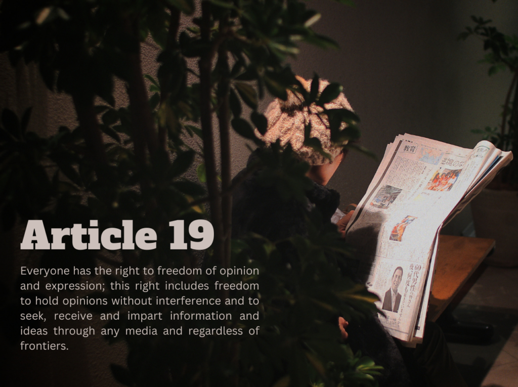
Original image: Newspaper. by Miki Yoshihito some rights reserved. CC by 2.0.
Derivative image created using Canva and text from Article 19 of the UN Declaration of Human Rights

Original image: Newspaper. by Miki Yoshihito some rights reserved. CC by 2.0.
Derivative image created using Canva and text from Article 19 of the UN Declaration of Human Rights

Hi Leslie! I think the image you chose for this assignment works perfectly. I like how it has some space on the side with the branches to tuck in your text. I think the fonts you used work really well. They are serious enough for the issue but still eye-catching. They go together well. The blocky text for the article number is very attention-grabbing, while the other font is simple and easy to read. Just a minor suggestion for improvement, I saw you linked the image but not the artist’s page. You can hyperlink the artist’s name to open to their page.
Hi Leslie,
The image you chose to represent Article 19 is perfect. Article 19 discusses free speech, and the image represents that well. I like how there is a lot of negative space drawing the viewer’s attention directly to the wording of Article 19 and the newspaper shown. The colors and alignment of the wording are well done. I can see that you got the color from the picture, and it is aligned with the shadows of what seems like a person reading the newspaper. The two fonts you chose for your words seem to blend well together. They are two different fonts, but I like their contrast towards one another. The use of bold lettering in the Article 19 title is also a nice touch and makes Article 19 stand out to the viewer. My only suggestion is in your copyright captions. You have the image credits and author credits on the same link, taking you to the image. There should be a separate link taking you to the author’s page. Other than that, you did a great job!
Hey Leslie,
Great job! I also worked on Article 19, and I think your design nails it. The bold sans-serif font for the title really stands out. I love how the statement font and color make the message about the right to opinion and expression pop against the black background. It’s modern, easy to read, and gives the text a strong presence. The font color blends nicely with the grey tones in the newspaper image, making everything feel cohesive and balanced. The image of someone reading a newspaper ties in perfectly with the idea of freely sharing information. One suggestion: maybe adding a faded background behind the statement section could help it stand out even more, but honestly, this looks great overall!