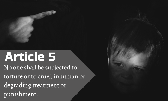
Be Kind “Be Kind” by Kaleah Gonzalez is a derivative of ”Photo” by Artyom Kabajev which is licensed under Unsplash License. Originally downloaded on 02/10/2025 and edited with Canva Pro. Tags: human rights February 10, 2025 by instructor Student Posts 3


Hi Kaleah,
I think your font pairing works very well together, especially when incorporated into the image. The placement in the bottom left corner highlights the message of “Article 5,” as the placement aligns with the child’s face, drawing the viewer’s focus to both. The arrow on the background of the text also helps add to the overall message.
The message of “Article 5” and the image you have paired with require a strong, more formal font pairing due to the seriousness of the message. These are great choices. They both pair well together. While the fonts are different, they work well together.
While I think the monochrome theme works well given the topic, it would be interesting to see if the text or text the background was in color. I wonder if this would change the focus or accentuate the text differently.
Great job!
Hi Kaleah! I really appreciate your choice of photo for this article, as my first thought when reading this particular article was conflicts between grown adults. As someone who works with kids though, I have come to understand how they are often made to feel as lesser-than members of society, more often directed or scolded than appreciated and heard. I imagine you chose the shape of your text box to emphasize the point in the left hand side of the photo, which I think is a good choice stylistically. I also appreciate how the right side of the text nicely aligns to the shape. I think the monochrome look was the best choice, as I was trying to think of what colors would look the best and make the most sense for the emotion of the photo, and came up with nothing.
Hi Kaleah,
I love your image choice here. The strong shadows really emphasize the distress of the child’s face and the sternness of the adult’s hand. I also like how the shape of your textbox flows with the direction of the image. If I had to suggest a change, I think that I would choose a slightly different font for “Article 5”. While it’s a good contrast with the body text, I think that it could be more serious or harsh.