
Terms of Use: “Everyone” by Olivia Samimy is licensed under CC BY-NC-ND. It is a derivative of “Otay Detention Center” by “BBC World Service” from Flickr licensed under CC BY-NC 2.0.
This image was edited using Canva. Article 14 is from the Universal Declaration of Human Rights.

Hi Olivia,
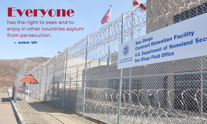
Your image and article complement each other well. The fonts you’ve chosen for both the title and the body of the article work nicely together. However, I noticed that the font for the word “everyone” seems a bit different. It might just be due to the size or thickness of the word, but if it is a different font, I recommend using the same font throughout the entire article to maintain consistency. I also really appreciate your creativity with the article titles and their wording, changing the size, shape, and thickness of them. The image you selected is a great choice and perfectly ties into the overall theme of the article. One suggestion would be to crop out the text of the San Diego Contract Detention Facility from the image. The words tend to draw the viewer’s attention away from the article. Your copyright citations are perfect! Overall, you did a great job!
Hi Olivia,
I think this photo really adds depth to the meaning of Article 14. The font colors matching the American flag help tie everything together visually. The bold, red serif font for “Everyone” really grabs attention and highlights the universal message, making it stand out. The smaller sans-serif font for the rest of the text is clear and easy to read, balancing out the design well. The fonts contrast nicely; they’re different but still work together, creating a smooth flow. The text on the left side also contrasts well with the detention facility image on the right, adding to the tension of the theme. A couple of small suggestions that could make it flow better, like making the body text a little bigger and adjusting the line spacing for easier reading. The article number also appears quite small and could be increased to stand out more. Overall, great work! The design does a great job of supporting the right to asylum, and the visual choices strengthen the message.
Hi Olivia! I love the fonts you chose for this posting. Like Amanda said, the bold red, white and blue colors you chose coordinate really well with the colors in the image. My only real concern is that for me, the type is a little small, especially where is says “article 14”. You have a really cool opportunity here to play with the font size. Adding a sheer layer of beige (or another color) over part of the image and then layering your font on top of it could really help your font pop without losing the background image. Overall, I think this photo and color scheme works really well with the article you chose and creates a poignant critique of our immigration system. Great work!