“Say I Do” Drive-thru wedding chapel by bigweasel. Downloaded on 2/4/24. Licensed under CC BY-NC-SA 2.0 Deed. Edited using Canva. Tags: human rights February 6, 2024 by Jane Barrager Spring 2024 Student Posts 2
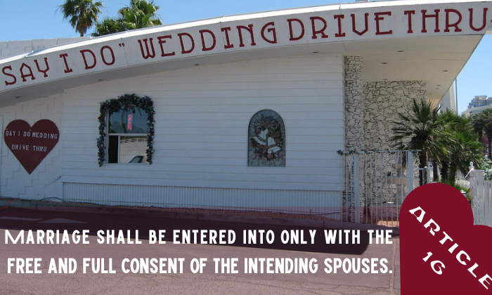


Hello! I like you creative take on this article! Looking at your text in the photo you have a lot of different visible texts in the signs, then in your article title and in the in the article text itself. It becomes a little more tough to figure out a combo that really jives perfectly. I like your font choice for the article text but for the title, I wondered if something more simple and clean would have been a good contrast to everything else on the page? I had a hard time reading Article 16, so maybe that would have helped. Great job at using the rule of thirds and drawing attention to the lower third with your text. The “E” in article got a little cut off on the right side, and on the left side with the article text, would it improve spacing if it had the same amount of spacing to the left of the text as the bottom? If you brought it down a little bit, the whole thing might fit into the darkness of the parking lot in the photo which might help it stand out. I like your use of a heart to help your text stand out in the picture too! Great job!
Hi Kendal! The font you used for the text complements the font used for the name of the wedding chapel. I think it’s visually appealing that both are in all caps. The font used for the article number is a little difficult to read, and it doesn’t give off the same seriousness as the accompanying text. The white of the font is easy to read, though, and I can tell that ‘Article 16’ goes with the text next to it. The photo and the text placement work well together. The image you used already had some blank space, so it wasn’t necessary to include a background shape behind all of the text. The image also allotted you the ability to easily use the ⅔, ⅓ rule. The heart shape you included complements the heart that is on the side of the building, and the color complements the building text nicely. With the image and the added text, it really gives the feeling of a foreground and background.