
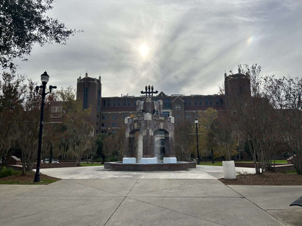
This picture was taken by me when I was returning to the stadium to my department where I work, I saw a very beautiful view, so I took out my phone and clicked the picture. Usually, I take my time and set my camera to a particular angle, look after various factors such as lighting, and then try my best to take a good picture. This was not the case in this picture as I was in a hurry, so I didn’t mind any of those factors. In the picture above the first thing that seemed off was the symmetry in the picture. On the left side, you can see the lamp pole but there is no pole on the other side, the next thing that I found that is not symmetrical is the towers on the top left and the top right. We can see one tower on the top left is visible but the tower on the right is getting covered by the tree.
The picture above also does not have any subject in focus. When we look at the picture, we see a lot of ambiguousness we can’t focus on a subject. The sun on the top also acts as a distraction. The proportion in the picture is also uneven, the land, the stadium at the back, and the sky looks very disproportionate.
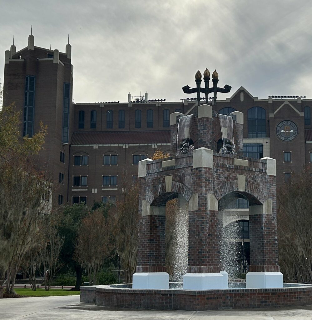
My main goal before I began to crop was to bring the focus of the viewer to the fountain as the original image failed to do so. I removed the lamp pole from the left side of the image making the image symmetrical. I also removed the excessive land from the bottom as it was making the image disproportionate. I removed the sun from the image as the sun was covered by clouds making it blurry and not visually appealing. The left tower helps balance the image as the rule of thirds is applied to the fountain. The Florida State University (FSU) logo becoming clearer helping viewers to inform the image is from FSU. I believe the cropped image really changes the perspective of the image. The first image just looks like a random image without any focus or subject just showing the beautiful FSU campus on the other side the second image shifts the subject to the fountain changing the narrative of the image.

Hi Pritish – I love the way you cropped this photo to focus on the fountain. My eye goes to the three torches on top, which are silhouetted against the sky, a powerful image. There is also some diagonal symmetry with the taller part of the stadium on the top left balancing out the fountain on the lower right. I wish there was a little more contrast between the foreground and background, but that’s a minor suggestion. Great job!
I really like the grandiosity in the original, but you are right in that it is difficult to focus anywhere. Focusing on the fountain is a good choice, but I wish the right edge of the fountain wasn’t clipped off (most likely to crop out the right lamp post). I also hate losing so much of that interesting sky though I agree with your reasoning to remove it. The three torches against the background of the sky works great with the remaining skyline you have left though. The cropped photo does a great job of highlighting them, and it is a fun transformation for it!
Hi Pritish,
As someone who hasn’t been to an FSU game yet (even though I’ve always been a fan), I appreciate this. I obviously know the torch is a common emblem at FSU, but I wouldn’t have necessarily known that it was on campus without your cropped image. I particularly like how you quieted the background and worked to produce a symmetrical photo in the “After” shot. For an even more dramatic shot, I wonder if you could have left more of the building out to really “zoom” in on the fountain and its features. I see gold parts on top of the fountain, but never having seen it in real life, I can’t quite distinguish if it’s part of the fountain or a tree behind it. Oops. I would have also liked to see the images next to one another for a more intense effect. Overall, well done! I’ll see it in person eventually, and I’m eager to do so now because of your picture!
Hi Pritish! First off, it’s a joy to have you in another class. You really made my first semester of MIS great.
Moving on, I love the photo you selected for this assignment. It brought back many memories I have at FSU from undergrad. I agree with your discussion on issues with the before photo. The before photo lacked a focal point and almost seemed busy because there was so much to look at. The way you cropped your image allowed the viewer something to look at and focus on. Additionally, it allowed the viewer to see the intricacies and details of the structures included in the cropped photo better. Great job!