
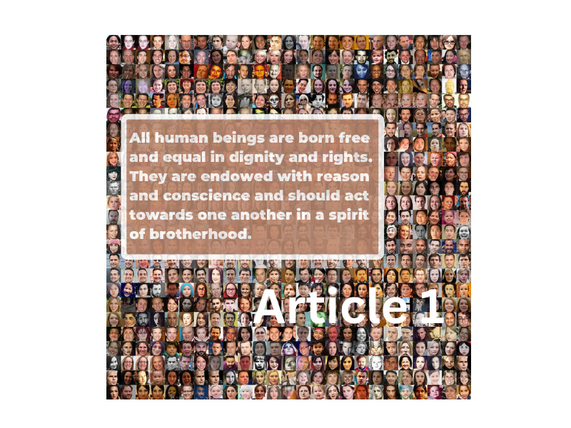
It is worth mentioning that to capture the idea behind the United Nations Declaration of Human Rights, Article 1, it took a long time to just get it exactly right. There were images I took of Model MUN at the American School Foundation in Mexico City, images of barbed wire, and even an image of a young child as a refugee escaping into another border under barbed wire. The difficult issue was trying to find an that captured the MOST of what Article I was about, more than just one person. My only objection would be the use of the word brotherhood, as many of the articles and aspects of the U.N. Declaration were changed to represent all human beings, women and men.
The difficulty I found was trying to involve aspects of Contrast, Alignment, Repetition, and Proximity. Similar to the aspects of a podcast, there are several layers of editing, and this was edit after edit after edit to achieve the effect I wanted. Settling on the fonts of Montserrat Extra Bold for the text inside the textbox, as well as Canvas Sans for the Heading for Article 1 involved sifting through several fonts to achieve the desired impact of being able to see the text, represent an emotion, as well as fall into the Rule of Thirds effectively while performing the previous three actions. Additionally, working against a busy background and worrying about what would attract the viewer’s attention more all came into play. It certainly patience and many edits to perfect the result you want to attain from the public, and is one worthwhile taking your time on when representing a serious topic.

Hey Harry,
I must commend you for your choice of picture for the Article 1 universal declaration of human rights, it definitely resonates with it. One can easily paint a picture of the two easily corresponding properly with one another. Also, putting the “Article 1” on the bottom and the text up top is surely unique and doesn’t look awkward, brave of you to attempt that.
Hi Harry,
The color and the style of the fonts were good choice. And the image you used for the postcard was a good choice representing the meaning of Article 1 of the Declaration of Human Rights. However, in my opinion, I think the texts, especially “Article 1”, doesn’t look noticeable because of the background image. The complex-looking image behind it tends to bury the text. Compare to the text “Article 1”, the textbox with the background color is more eye-catching. I thought about what if you added a layer of background color (maybe with less opacity?) to reduce the focus on the image. Great work!