Systems of Inequity “Living in a brown body” by Dahlia Thomas is a derivative of Police Officers Talking on Parking Lot by Kindel Media which is licensed from Pexels under Free To Use. Originally downloaded on February 6, 2023, and edited with Adobe Photoshop CC. Tags: human rights February 6, 2023 by Jane Barrager Spring 2023 Student Posts 3
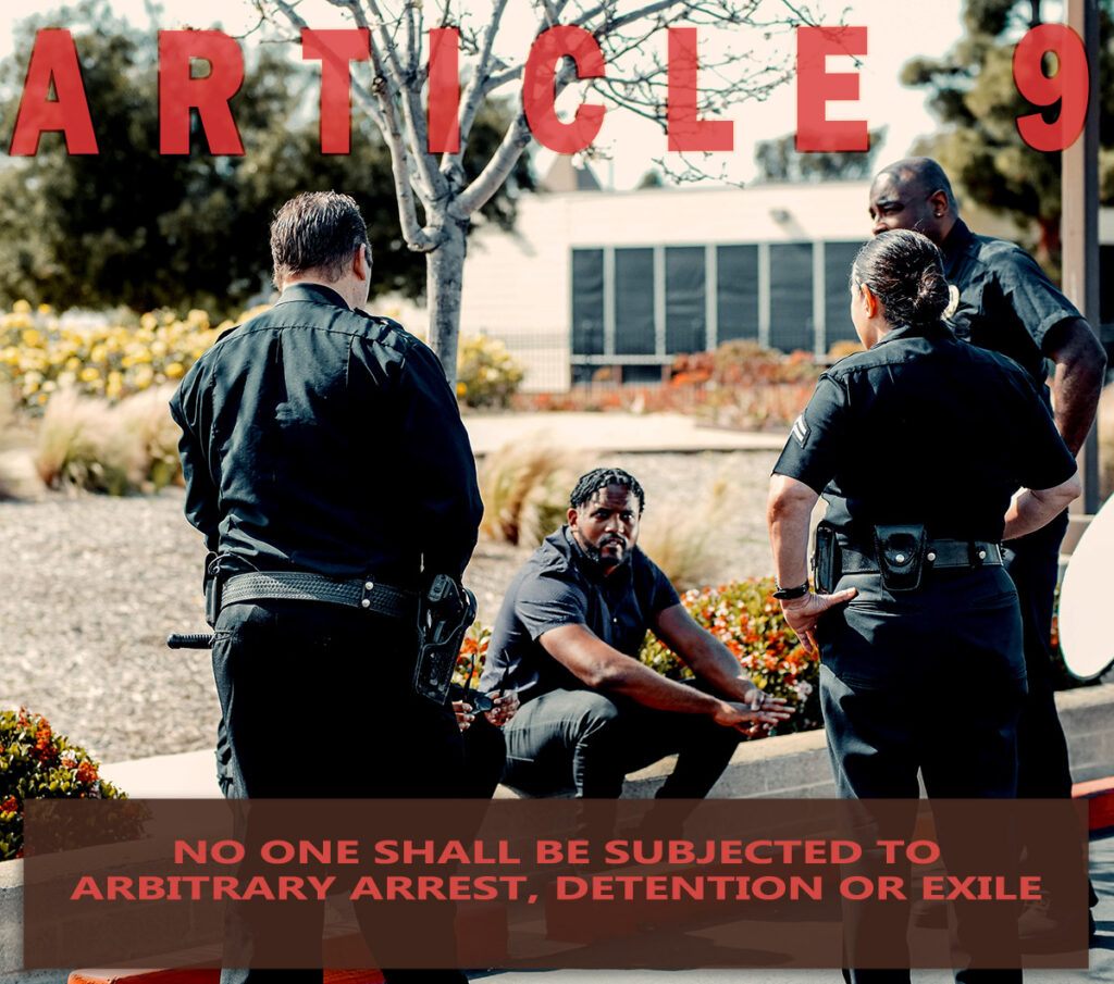


Dahlia, I believe the typeface you selected sends a bold message. Although caps lock can come across as yelling, your use of capitalization made me feel like I needed to take attention to what was being stated. It established importance. I also think placing the text top to bottom with the image in between made it easy for the viewer to take in the full message. I was able to read the post exactly like I would read a picture book. With the words framing the image, my attention was drawn inward. Even though the man sitting down is not placed in the rule of thirds, the officers on both sides are following the rule, making the civilian even more prominent.
Overall, I do not think your fonts are too similar. There is a good sizing difference between the article number and the article details. Because they are consistent, I am not distracted from the message. As for suggestions, the only recommendation I would make is to alter the transparency on “Article 9”. I think it would benefit by being darker, but I also realize that is a personal preference.
Hi Dahlia, I think the typeface you chose for article 9 is good although it could stand out some more with more of a drop shadow or an outline. It seems to be a bit opaque. The picture you chose fits well with the topic and like Taylor mentioned, even though the subject of the photo is not in the rule of thirds, the officers are which make the subject stand out more…especially with their backs to the viewer and the subject being the only person facing forward. There are browns and reds in the photo but I am not sure the brown box with red text is contrasted enough. I think the brown box is too dark. Also, the all caps makes it harder to reader the main text though this topic is quite serious. The last thing I think could improve would be the spacing which does not appear to be equal between the main text and the edge of the brown box. Also, article 9 does not appear to be centered which is why there is more space to the right of it than to the left. I think with just a few of these small adjustments, your image could be enhanced.
Correction: article 9 seems to be a bit translucent not opaque.