
This derivative is licensed under the Attribution-NonCommercial 4.0 International (CC BY-NC 4.0).
National Park Tips is a weekly podcast created for people who love to travel. Every week is a different National Park where you can gain insight and tips for your adventure!
I used audacity to combine the sound elements for this podcast. I started with a forest ambience, birds chirping and then faded in an acoustic guitar. I tried to think of music that could relate to the Rocky mountains! Then precisely at the fifteen second line I started speaking. A little before the end I faded the music as well.
Audio Credits:
- forest summer Roond 022 200619_0186.wav by klankbeeld is licensed under Attribution 3.0 Unported (CC BY 3.0)
- D_G_C.wav by ValentinSosnitskiy is licensed under Attribution 3.0 Unported (CC BY 3.0)
Photo Credits:
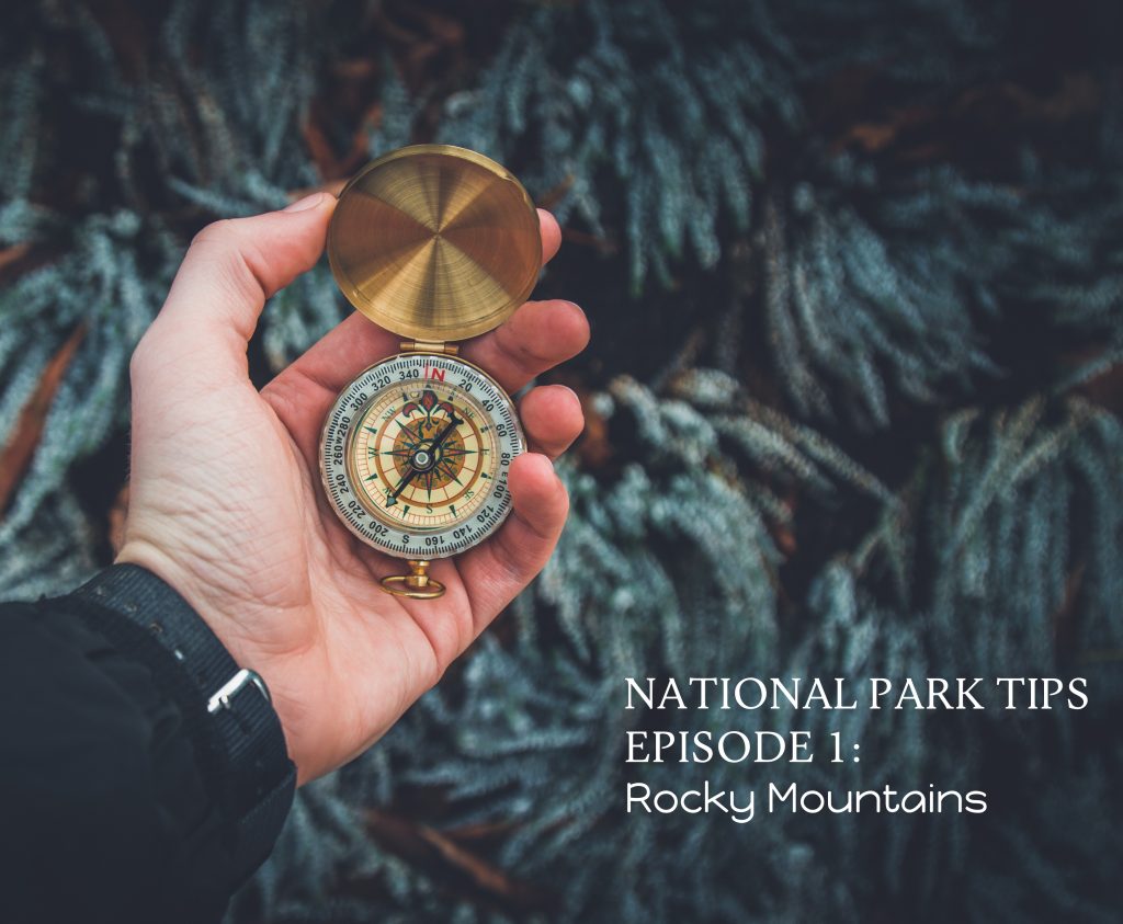
- Person Holding Compass by Valentin Antonucci (Public Domain per Pexels Photo License)

Hello Sarah!
The ambient noise and soundtrack of your podcast clip made me feel as though I am approaching a serene and quiet spot in the forest. I really enjoyed how gentle the narrator was – it really centered that feeling of peace within the podcast. Admittedly, based only on the description of the podcast, I believed the podcast would be recorded live at various national parks! I really enjoyed this and look forward to this becoming a real podcast one day!
Goof Evening Sarah!
I love to travel so this is a podcast I would definitely listen to. You did a great job on picking a wide topic and then narrowing it in on something specific. People would find these National Park tips useful especially if they spend a lot of time in the parks. Great use of the birds and relaxing music in the audio. It is very soothing and sets the tone of the podcast. You did a great job on the graphic. It is simple but lets the viewers clearly know what the podcast is about. The text placement is also in a good spot because when viewers look at the compass their eyes will lead to the text since it is right next to it. The font is professional and something you would possibly see on a park map or a sign which is nice and the rocky mountain font is fun which makes it stand out more. These fonts both work very well together. I also like how the image is blurred in the back so the text is not difficult to read. Great job!
*Good